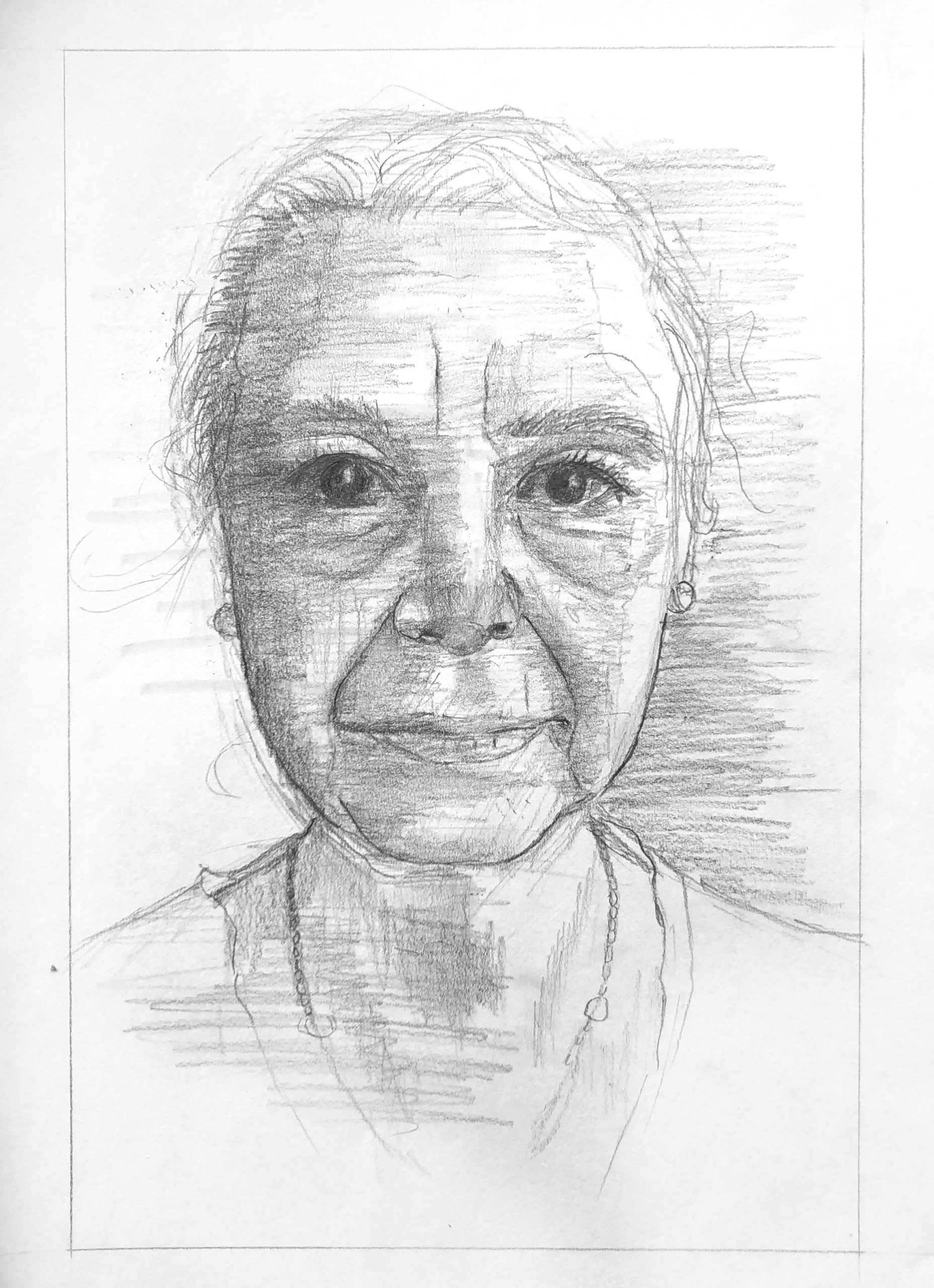
I had a love/ hate relationship with this drawing. I restarted three different times and the end result does not resemble person who I was drawing, but because I spent so much time on this I can’t help but see how it has helped me. The first portraiture piece really helped me feel out the planes of the face and visualize what the light would look like on the skin, and I applied the same concepts here. I thought that the framing outside of the right side of the face helped show the highlights on the skin of the model, and the forehead and cheeks really show dimension. I think I could have approached the shading more systematically. For my next portrait I will try a differently position light source.
I felt that the right side of the face looked for some reason more true to the person I was drawing. So out of curiosity I mirrored the right side of the face in an editing app just to see what it looked like, and it looked way more accurate. I think this may have been due to the light and detail that the right side holds as opposed to the dark shadowy side.
This is a great portrait! The facial features are very defined and thoroughly crafted which I find extremely impressive. I agree with what you said about the shading, but I think this method definitely works too. I like the shading behind the left side of the race, I think it really makes the woman pop out of the frame, highlighting your subject. The eyes are particularly impressive to me. They look extremely realistic, almost too realistic. I feel like the woman is looking right back at me, something that very few artists are able to accomplish. The left side of the face does appear to be a bit droopy as you mentioned, but this is a very minor problem which I didn’t even notice until you pointed it out. Overall very nice work!