Author: sscaplan
Sara Caplan – Portraiture Prep
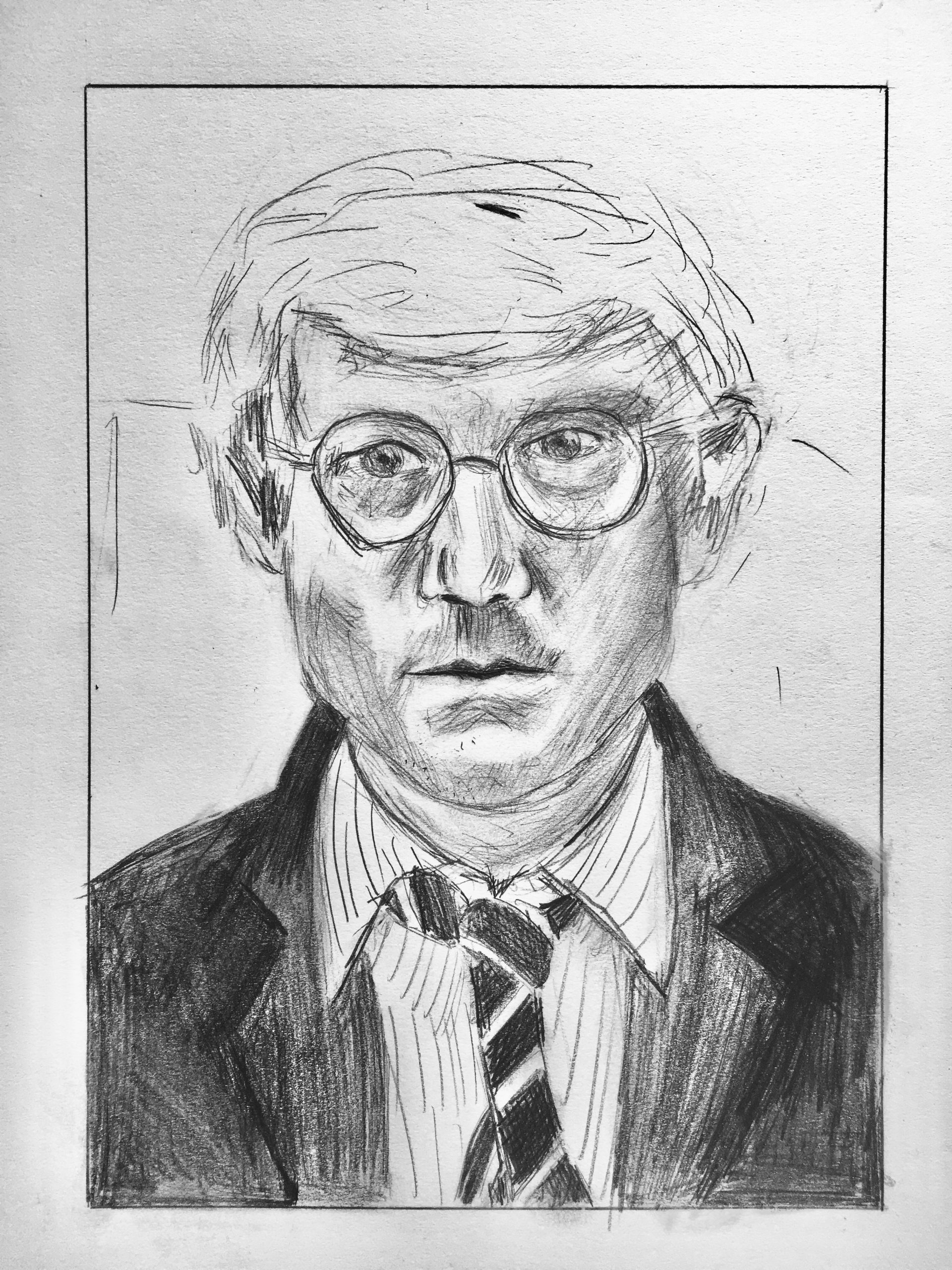
Great job, Sara. My only suggestion is to learn from his example about line weight. There are far fewer lines in the hair and more openings between them. The background lines also need to be fainter to allow them to fade back. You did much better with the pinstripes on the shirt, but otherwise this drawing suggests you need to develop more range in your line weight.
Great job channeling his slightly louche and insouciant drawing style; a perfect fit with this pose, disheveled look, loosened tie, etc.
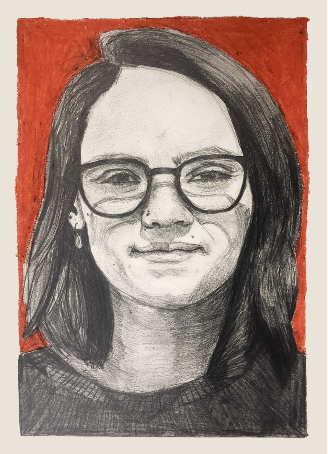
Sara – Value Drawing
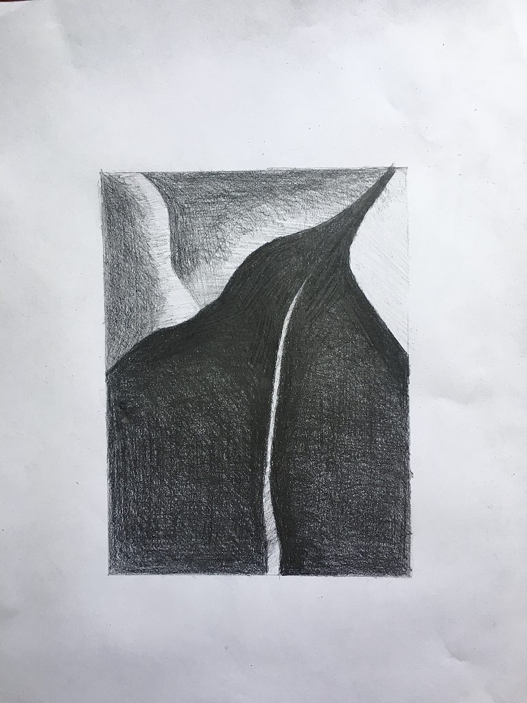
Very good
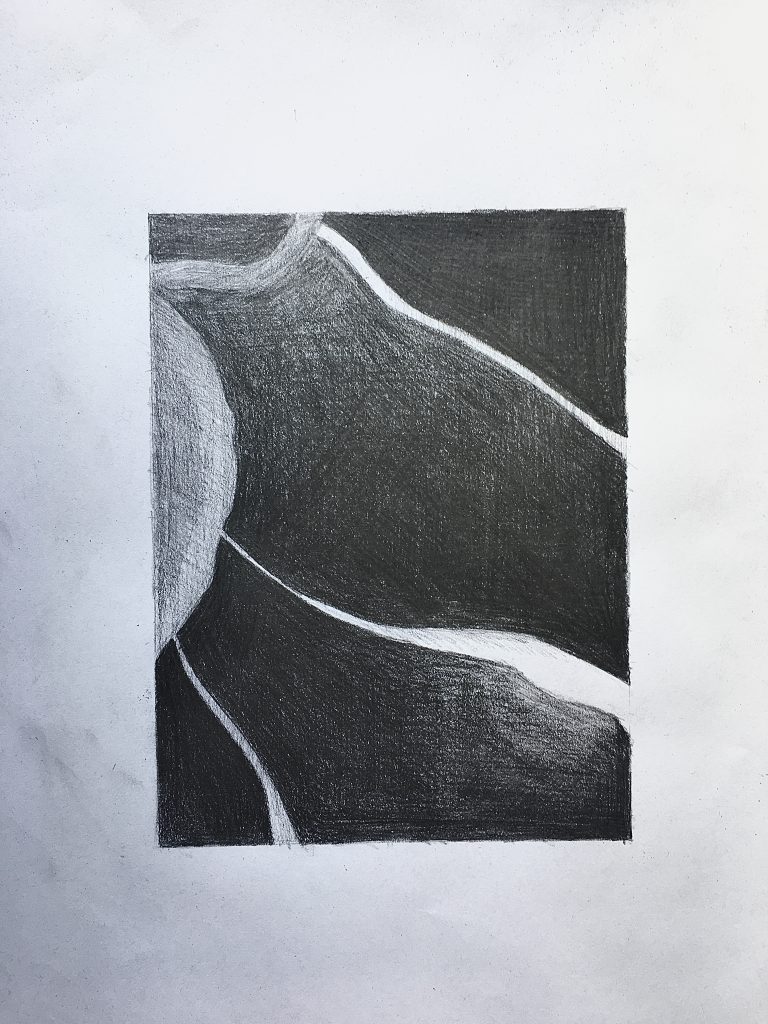
Very good but values in upper left corner and in the semi-circle shape should be darker.
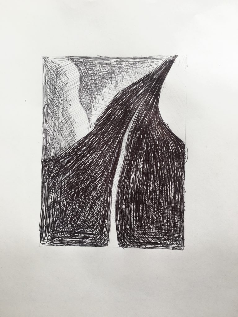
Could be much darker overall. Even the lightest values are a shade darker and the darkest values near black
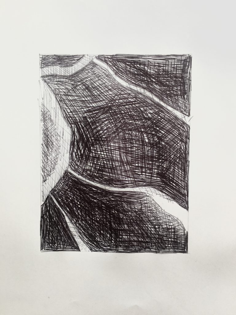
Very good in the lower left but the rest of the values are more similar to that. I suspect you were worried about over-working the hatching but you’re a long way from that.
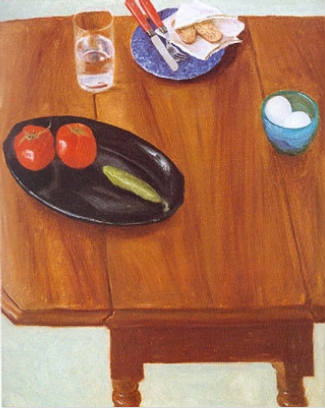
Sara Caplan – Time Capsule
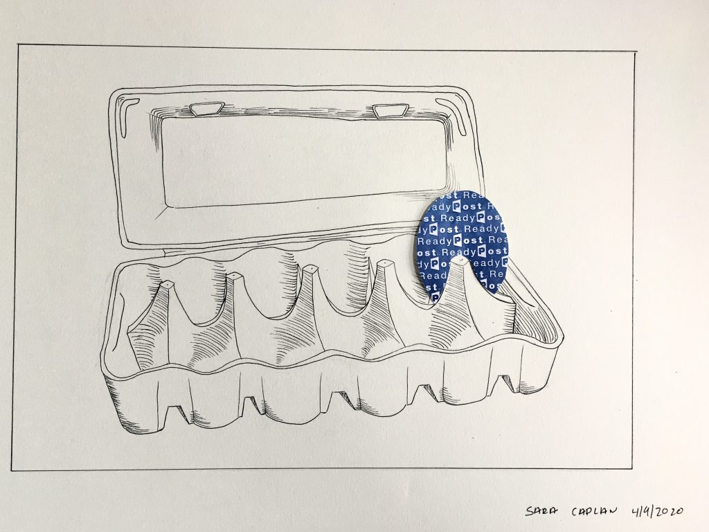
I agree with Isaac–the top of the egg carton is wonky. This wouldn’t be an issue except that it twists the space just behind the egg. In addition, the carton wants to be the “straight man” (as in a comedy act) and a foil to the star–the egg. In other words it needs to be normal. I’ve taken a pass at correcting it below:
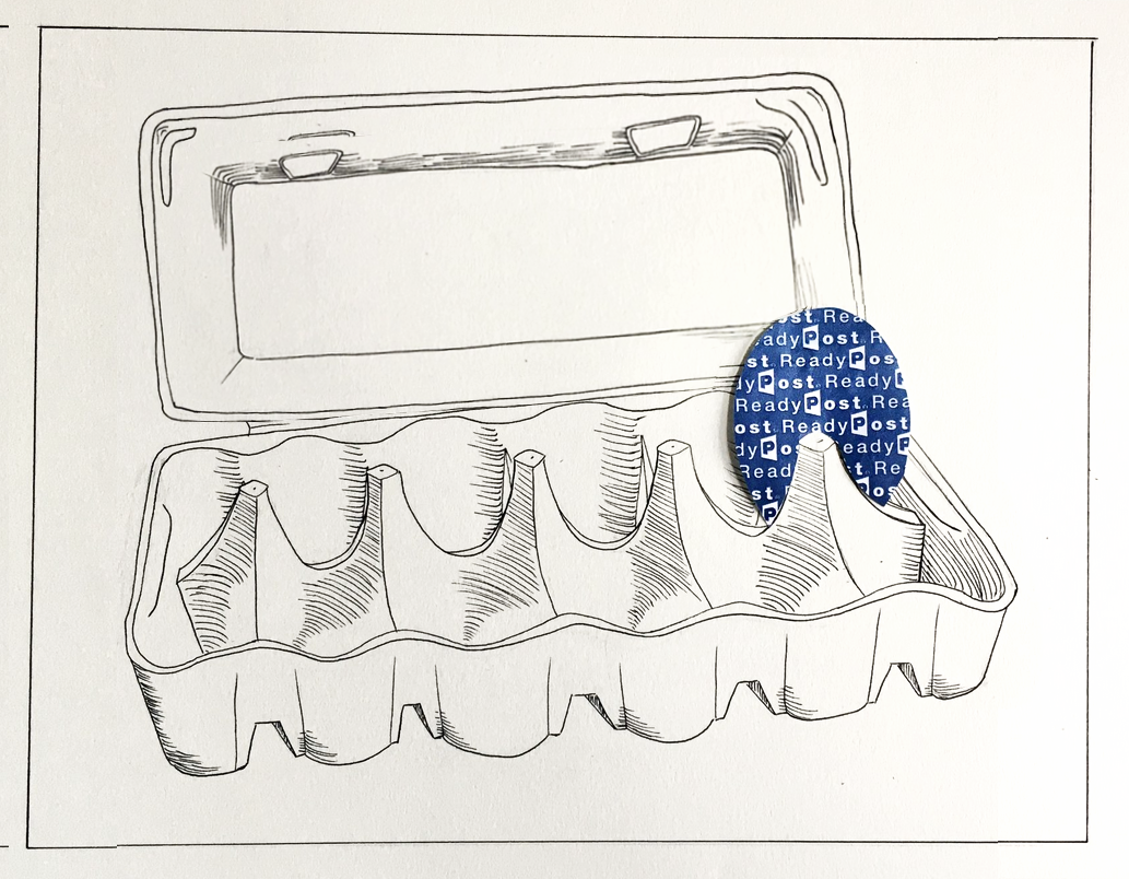
I also tweaked the embossed rectangle inside the lid, and let the egg eclipse it a little more; again, foregrounding the egg a bit. I suspect you drew this directly with your pen, rather than using a pencil under-drawing, so the distorted lid has a certain honesty–but in this case there are other virtues in the drawing to protect.
I also brought in the left and right side of the drawing. This image isn’t so much a still-life as something more iconic. The spaces to the left and right begged the question of what space it was in–bringing in the borders and neutralizing the implied environment (or the lack of one) makes that a moot point and again, foregrounds the carton and its sad egg.
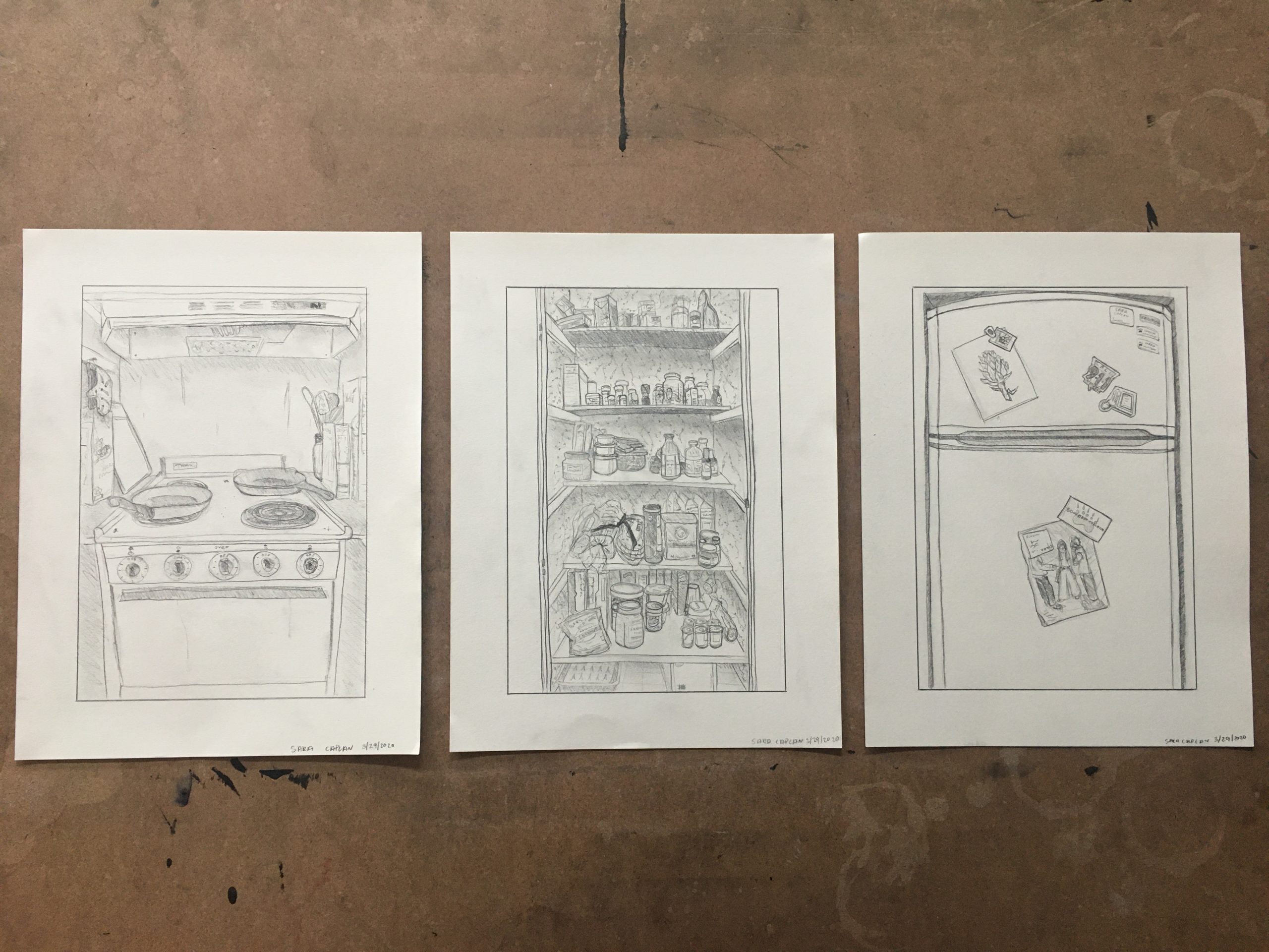
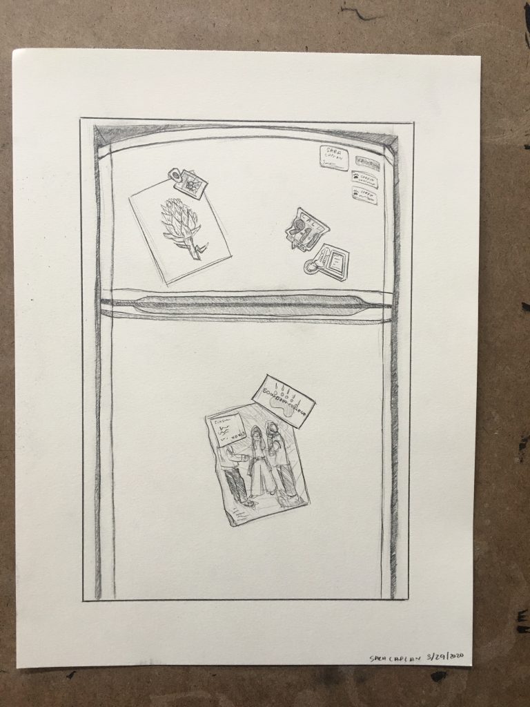
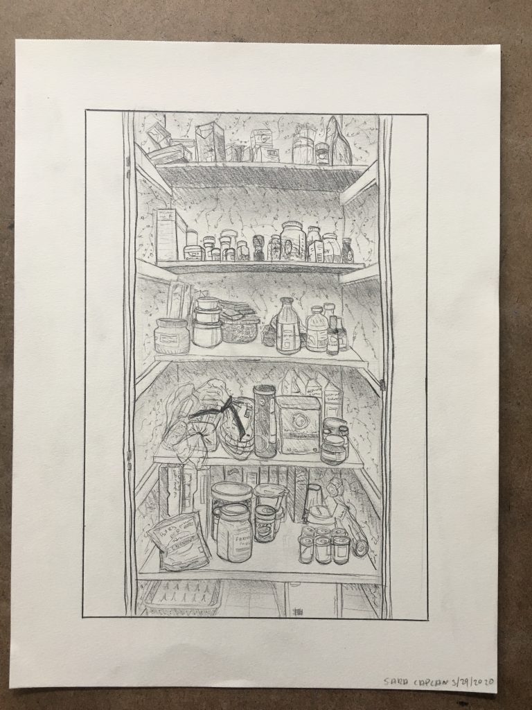
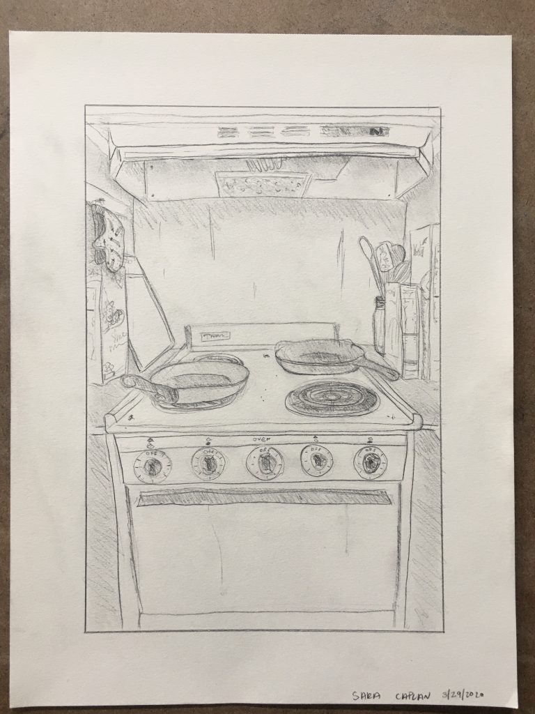
Sara – Drawing in Place
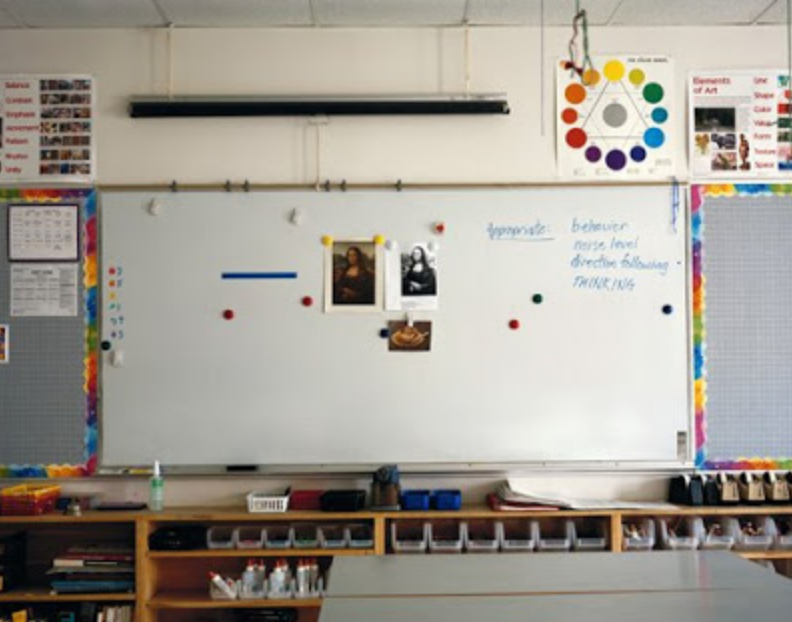
Photographer Meggan Gould’s photo series of white boards….
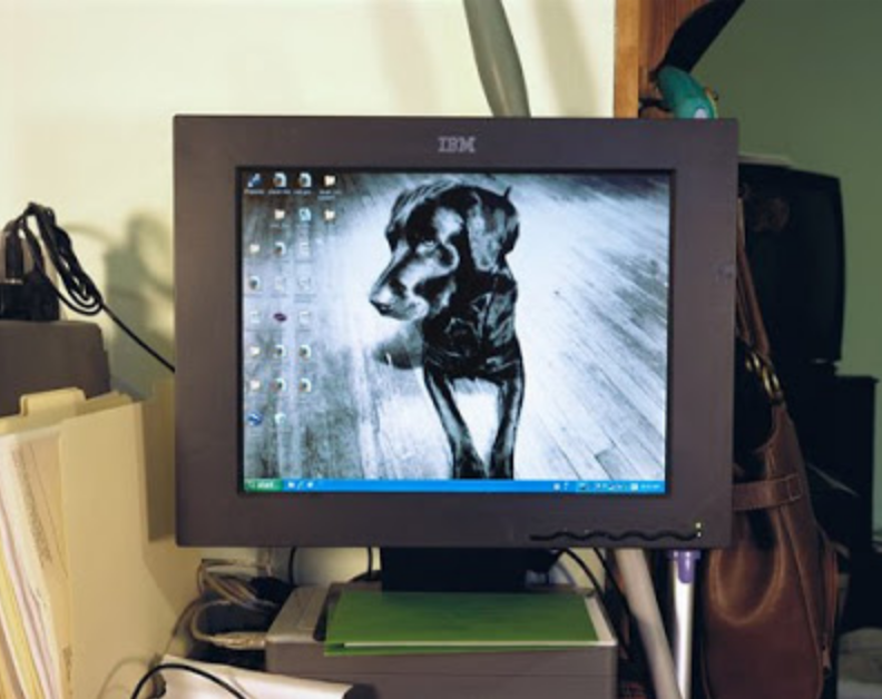
….computer desk tops….
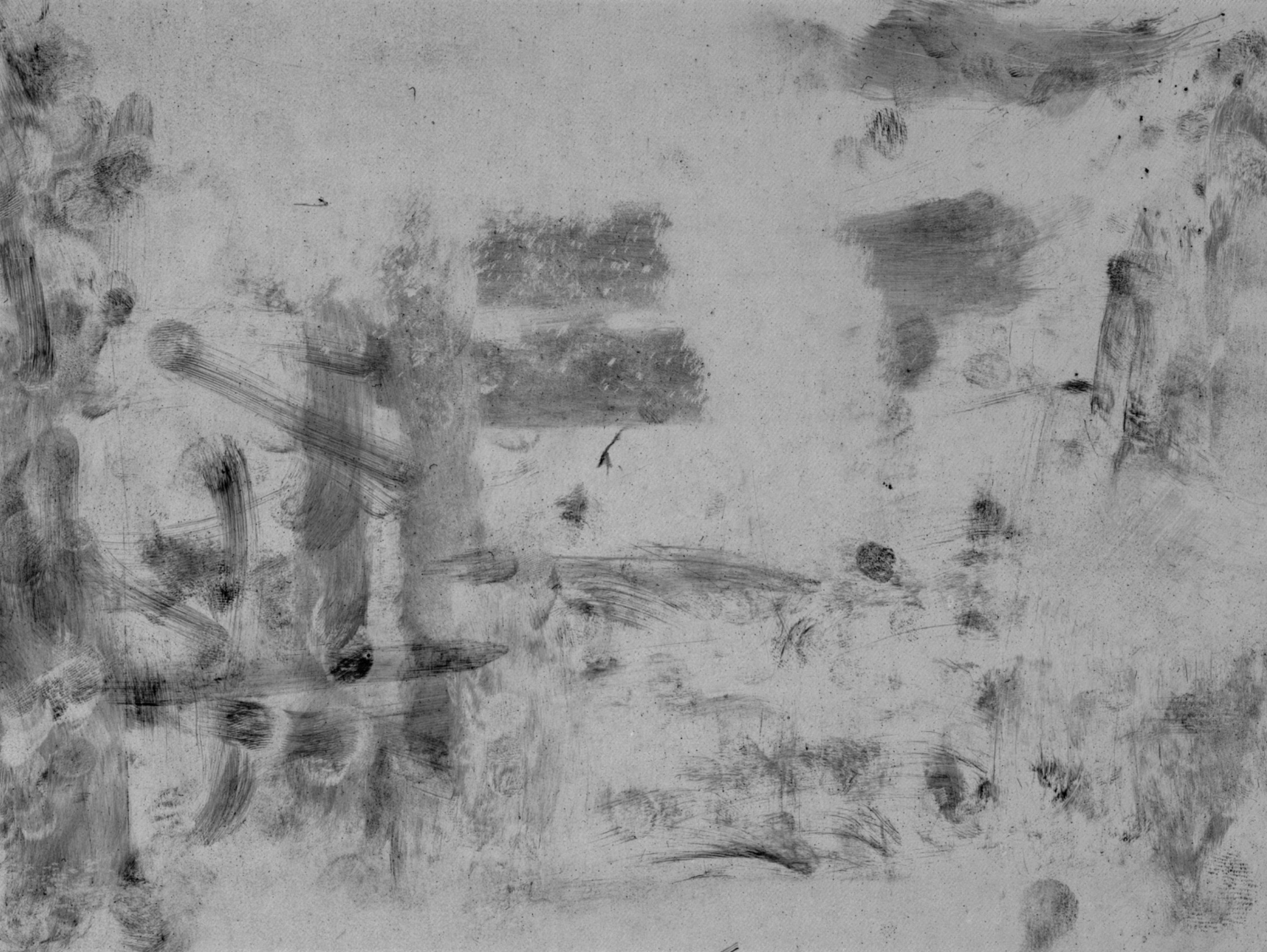
…and the finger marks on iPad screens, independent of any image on the screen.
 Avigdor Arikha
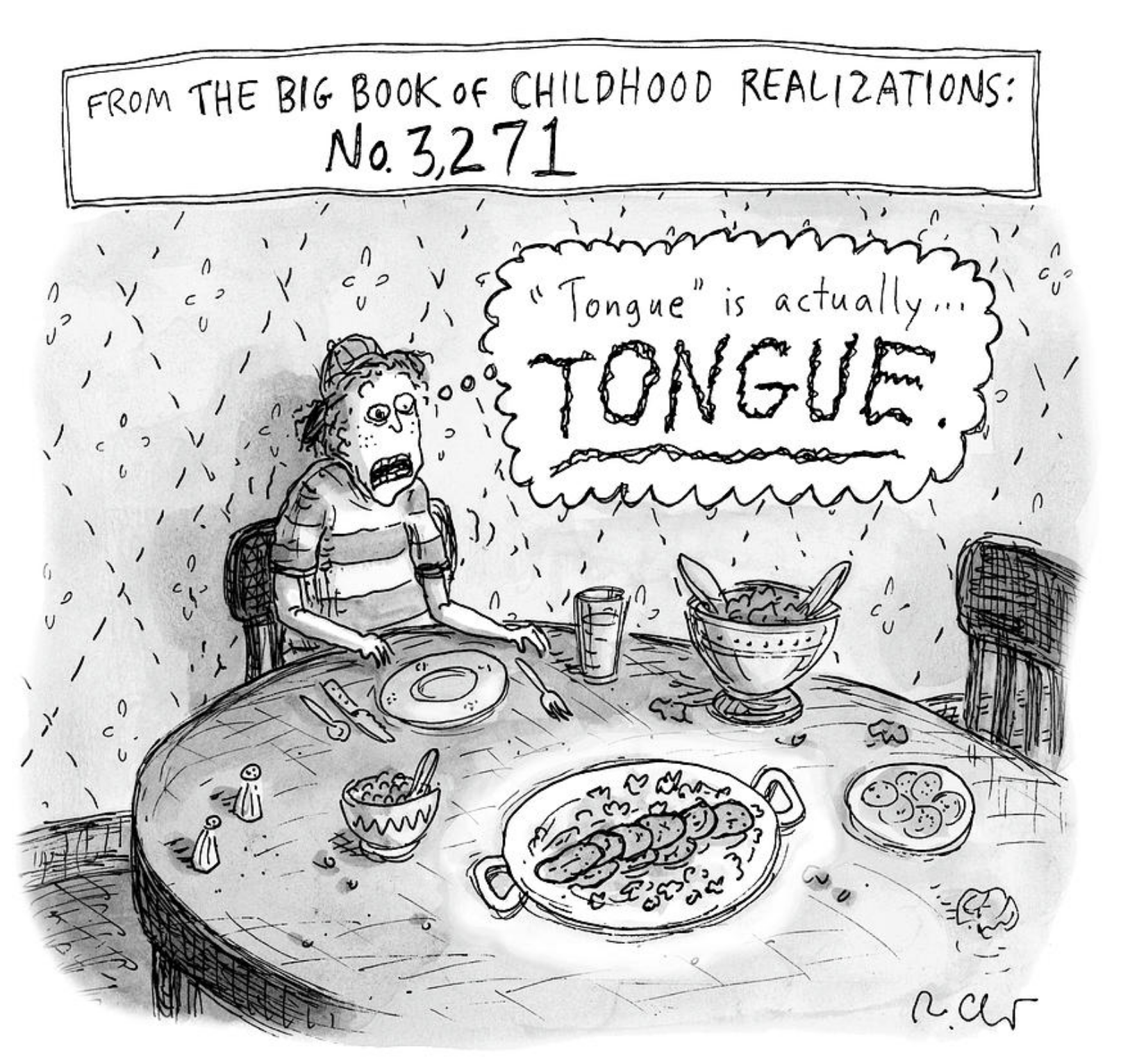 Roz Chast