Author: glbukows
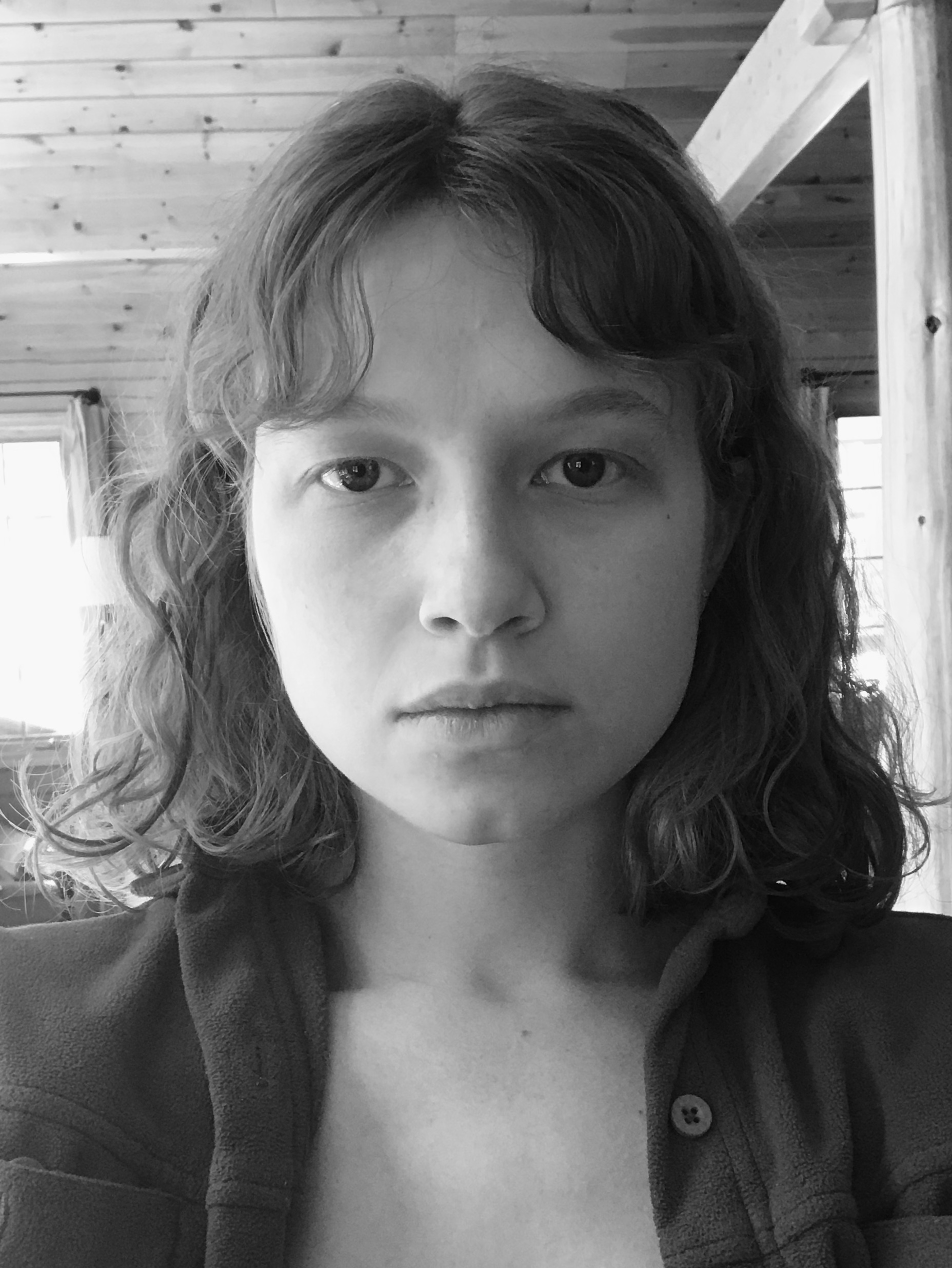
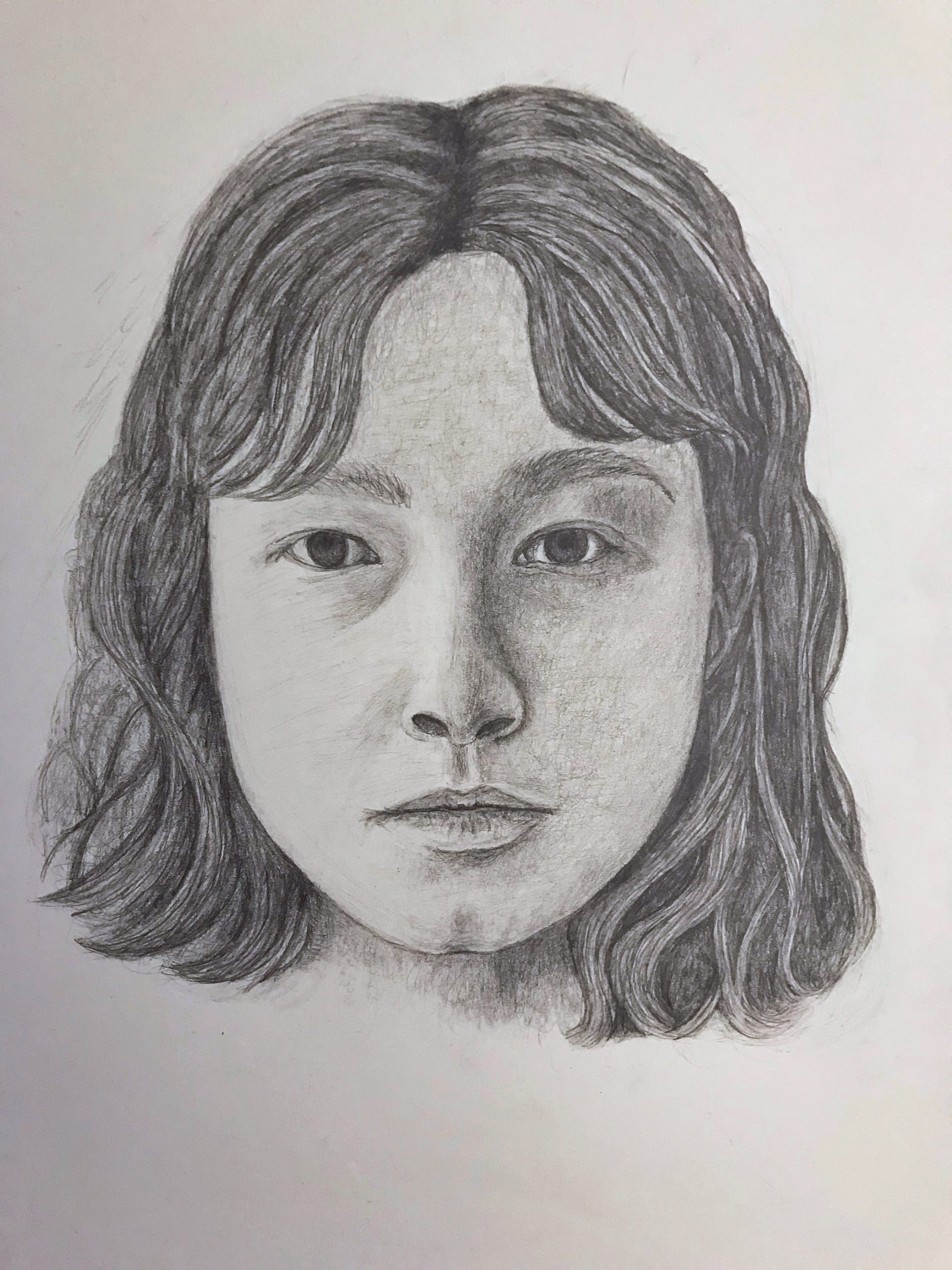
Portrait copy
Fine work, Grace, from locating the image and its proportions during the schematic to your very fine touch, emulating Degas’—very much what I was hoping this exercise could offer.
A few notes:
You’ll note that Degas’ model has a more inward expression, like she’s lost in thought, while yours feels very attentive to us and engaged. It’s because his upper lids are lowered just a scintilla more, eclipsing more of the irises, which are also slightly larger in his.
Her eyebrows are not the continuous arched curves that you show, but rise from the center outward on a straight axis (the darker portion) before bending downward more abruptly, and at a slight angle as they also become lighter in value (they’re turning back onto the side of the head).
The shadow on the bridge of the nose isn’t quite as dark, and curves slightly. The upper bridge of her nose, just below the brow, is also narrower.
Good work on the hair, but still a tendency to add a lot of hair-like lines. Note there are very few in the original—mainly diagonal hatching to establish a value, and then a few select hairs.
The shadow on her hair band is too dark and defined. It wants to frame her face and add volume (as a cross-contour line) but not draw too much attention to itself.
Great job keeping all of your edges soft and your touch light. Wonderful to see.
Well done, Grace—I commend your patient attention and sensitive interpretation.
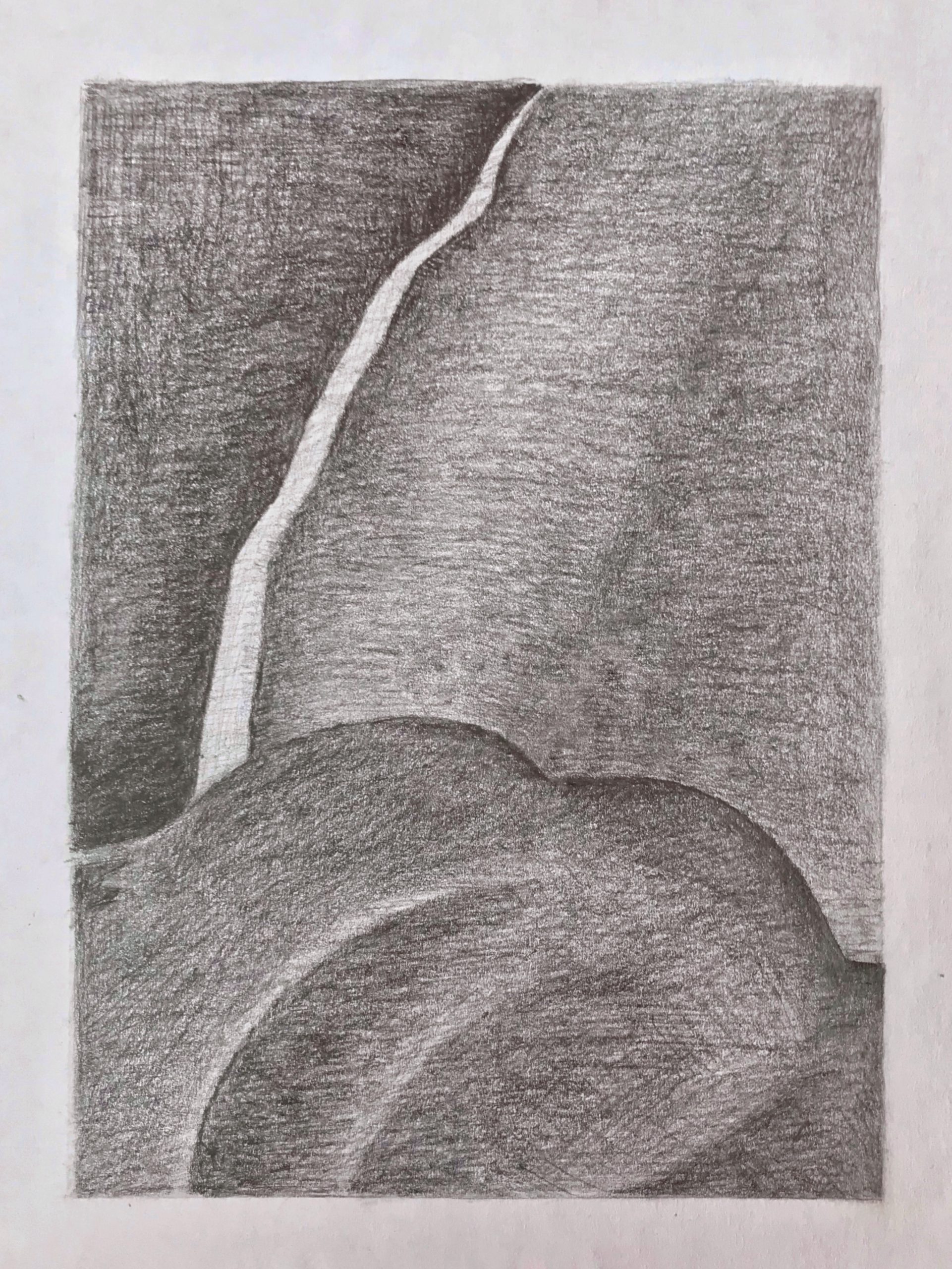
Grace BT Value Drawings
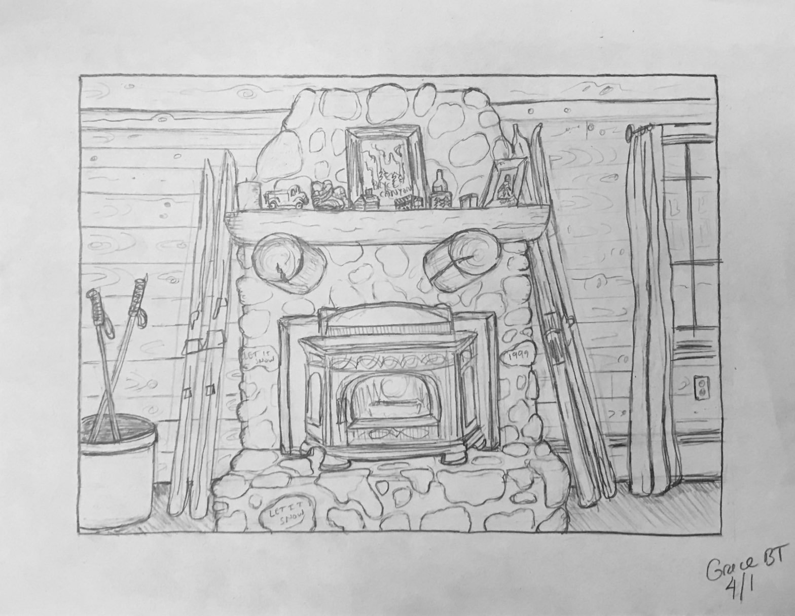
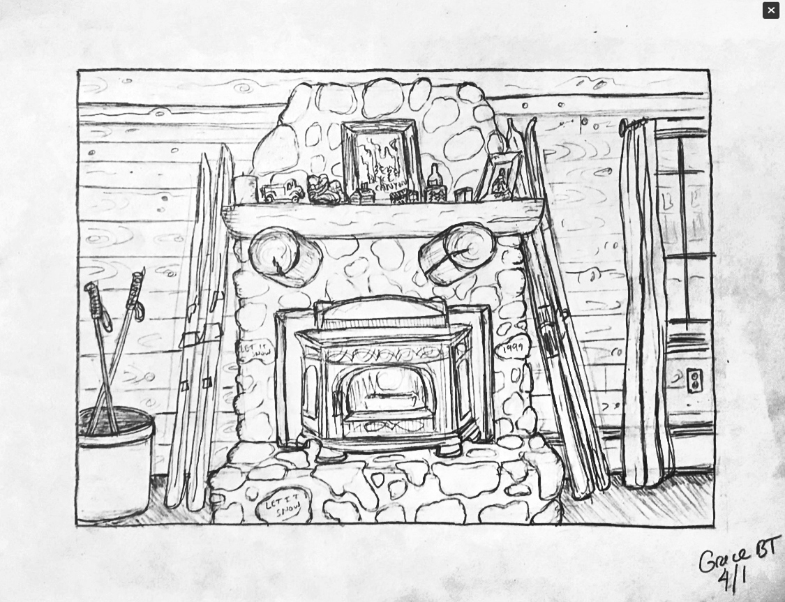
Grace BT Time Capsule Drawing
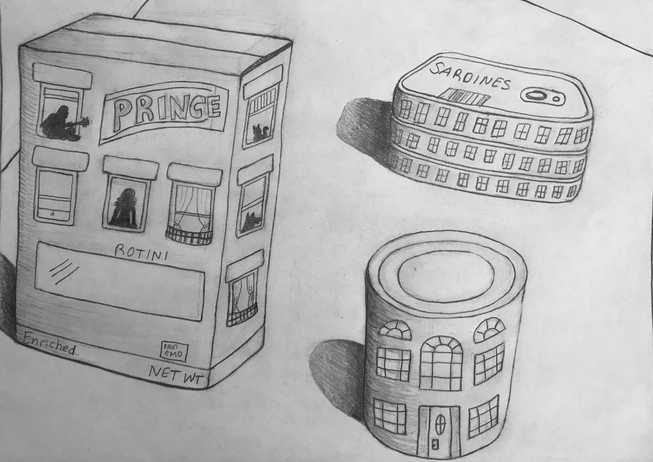
The cast shadows darkened a bit in the process, but here’s a lighter, higher contrast version to make it easier to see (I added the outline):
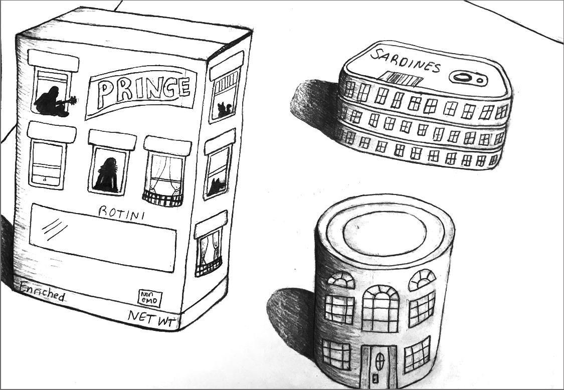
And here’s a version (below) with a little more space around the objects and straightening them up, so they’re not sliding off the table. There’s a certain charm in that, but it does make for an unstable composition. I think the added space around them gives them a stronger sense of what you’re after–objects isolated not only from one another but from the border (space around them) as well.
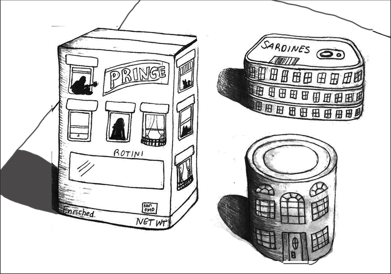
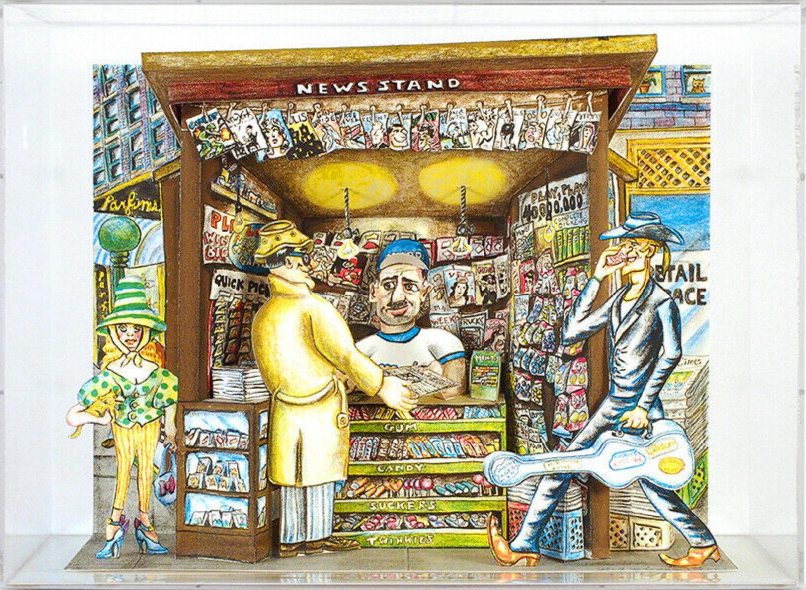
This reminds me of the famous Saul Steinberg drawing (a New Yorker cover from 1976), of a New Yorker’s view of America. Your objects have a similar child-like charm, and even your style and lettering (as well as the eye level, looking down) are reminiscent of his–great company to be in:
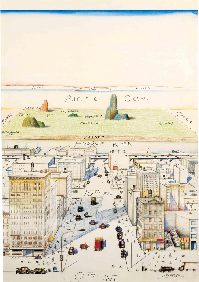 (that empty space at the top is for the name of the magazine).
Yours also reminds me of the work of Roger Brown, especially the silhouettes in the windows, but also that view from above:
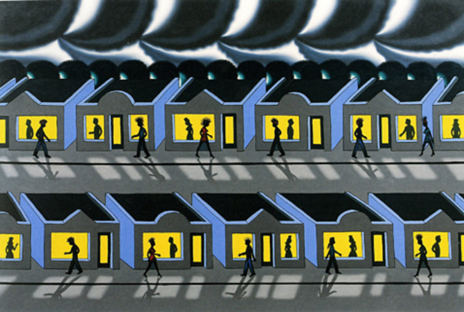
His was done years ago (1991), but has a prescient sense of social isolation.
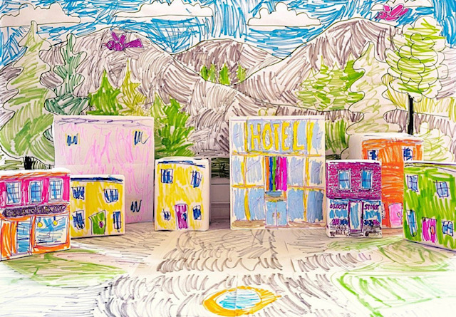
Finally, yours reminds me of a tableau that our daughter made a couple of weeks ago, using paper-covered cereal boxes and such, suggested by Mo Willems on his Lunch Doodles telecast:
Grace BT Drawing in Place
First, use Details/Structure, Highlights, and Selective (in Snapseed) to increase the contrast and strengthen the reproduction:
And in the drawing itself…
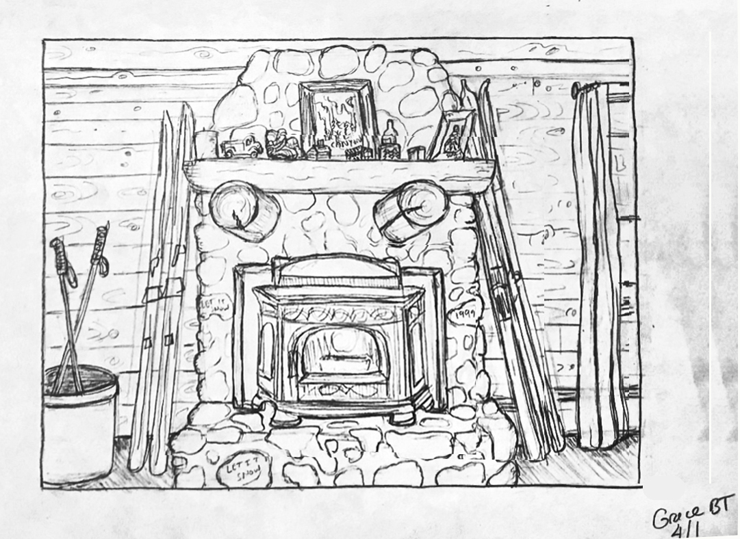
1. Use a barrier sheet to avoid smudges.
2. Make horizontal lines horizontal and the few vertical lines vertical. This would create a more uniform visual pressure across the whole composition, the better to examine the compartmentalized “evidence” in this tableau of faux rustification (to pick up on your take).
3. I suggest cropping it on the right (as I’ve done in my version, just FYI) so that the fireplace is centered. A composition that’s almost symmetrical but not quite feels like a misfire (just as a point of view that’s almost parallel to the picture plane but not quite also misses the mark). By squaring up and balancing the image our attention moves more easily to the real subject–your graphic interpretation of all those great textures and visual anecdotes.
Cropping the window also reduces the eye’s temptation to slip out the window–you want to keep our attention indoors with all these visual clues.
 Red Grooms
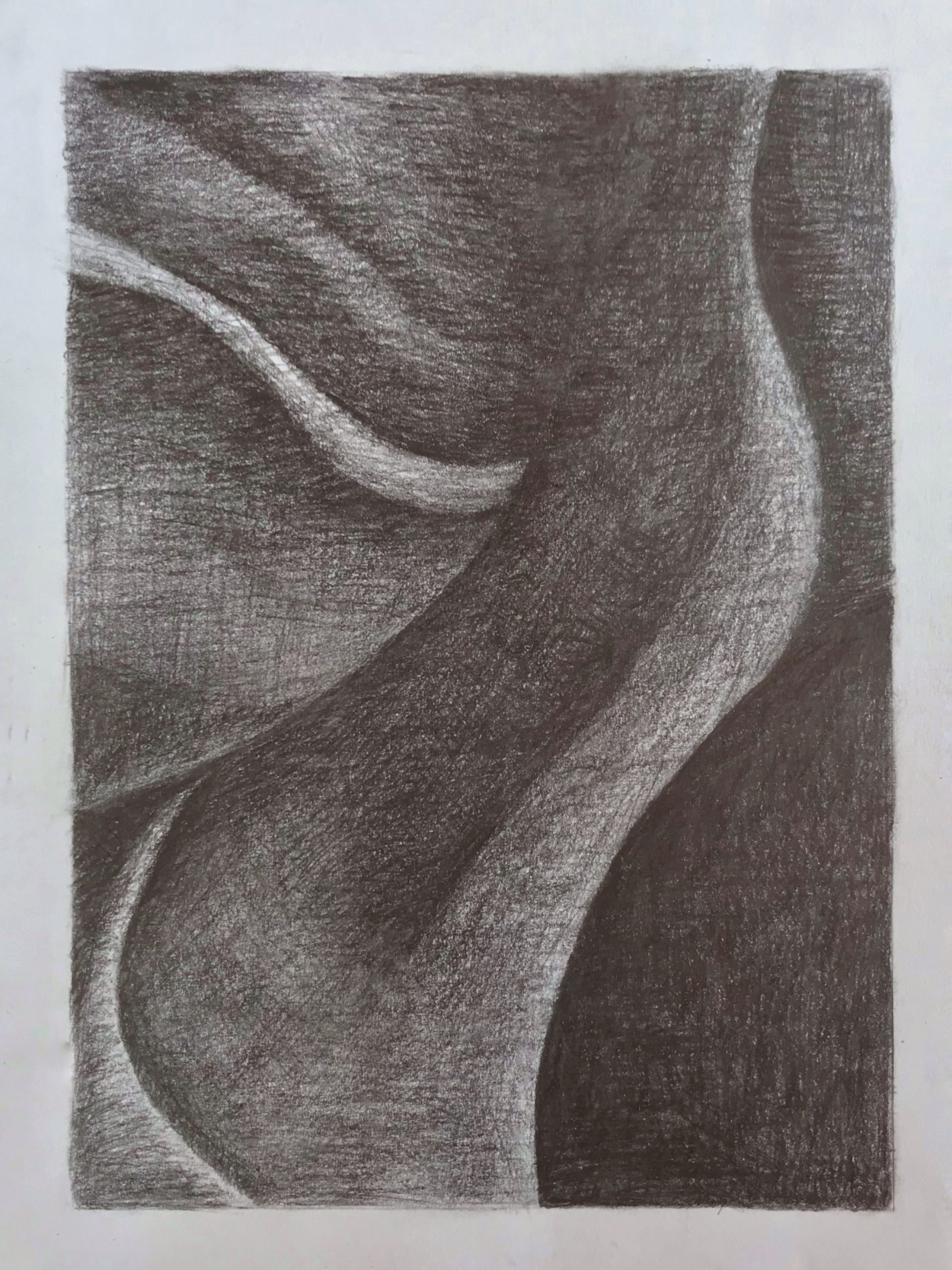