Author: ogreuel
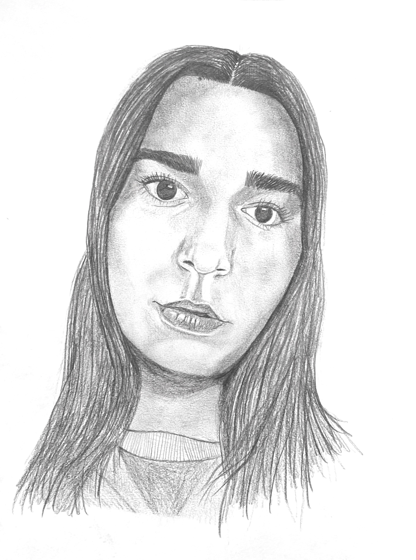
Olivia Portraiture Prep
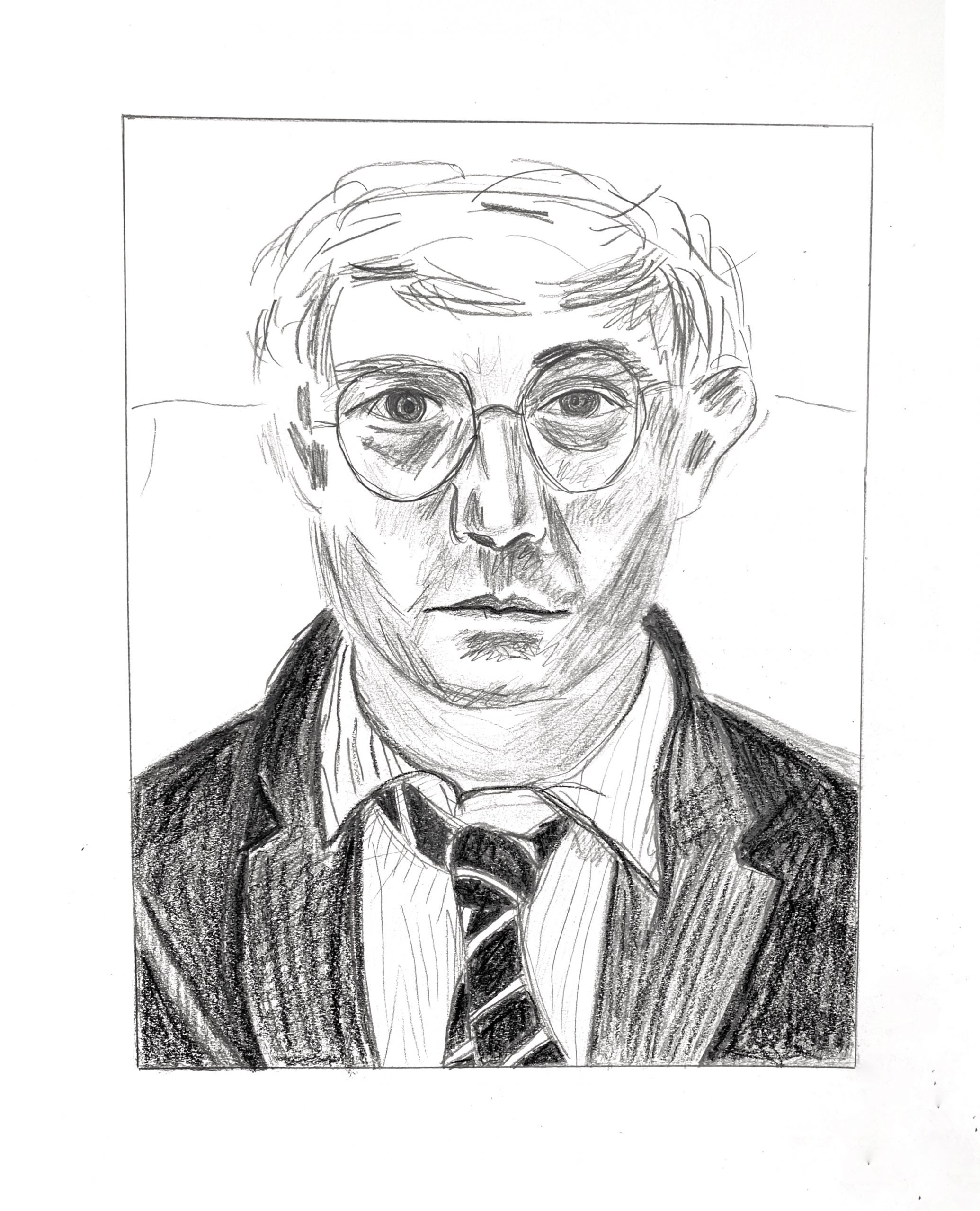
Good for you for going after this twice. The second one is definitely better, for the reasons you mention, but see my additional notes, below.
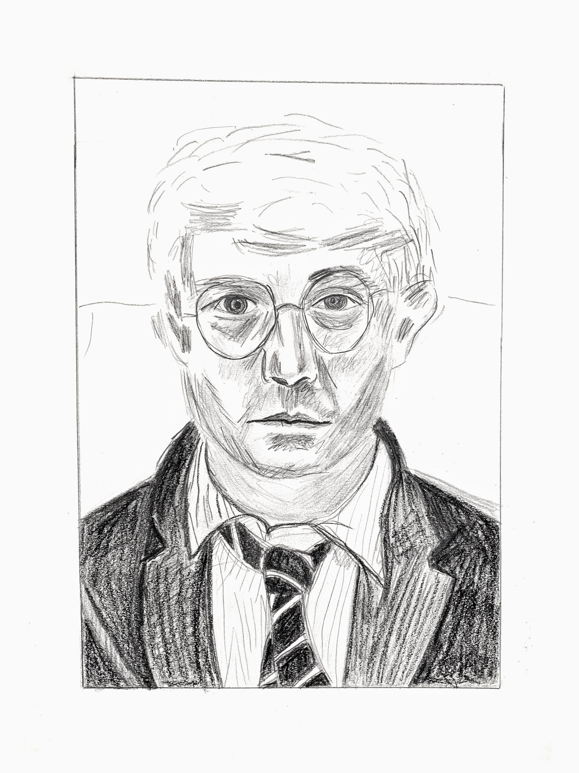
Good work, Olivia—this is unmistakably a David Hockney drawing with good composition, good configuration, and the lively, insouciant spirit of his mark-making—but these also appears a bit rushed, or at least not slowing down enough to take in more of the nuances. A few notes:
Great improvement to the proportion of the hair in the second version.
Both eyes are too large, but especially the eye on our left.
His glasses have a different shape and are more similar in shape.
The nose is a bit too long.
The comers of the mouth turn down slightly, not straight across. This is not just a matter of his expression–that slight curve connotes the volume of the lower face. By making it straight it flattens the head a bit.
The distance from mouth to bottom of chin needs to be greater.
His cheek on our right, below the frames is light grey, not white, achieved with a smudged tone. Same is true for the entire neck, which is entirely in shadow (also light grey–no whites). You seem to have trouble embracing the lighter greys, jumping from white to almost a middle grey. There’s a range of tones in between in the Hockney, and following his lead is a good way to get over this hump. These values are best obained by a pencil held loosely with repeated light hatching (and in this case, abetted by smudging under the hatching).
Lastly, you need a softer touch—your marks are harder and higher contrast.
The point here isn’t about exactitude but what you can learn from his drawing to expand your own understanding, sensitivity, and range, and there’s more there to glean from him.
Olivia Pen 2
Very good
Olivia Pen 1
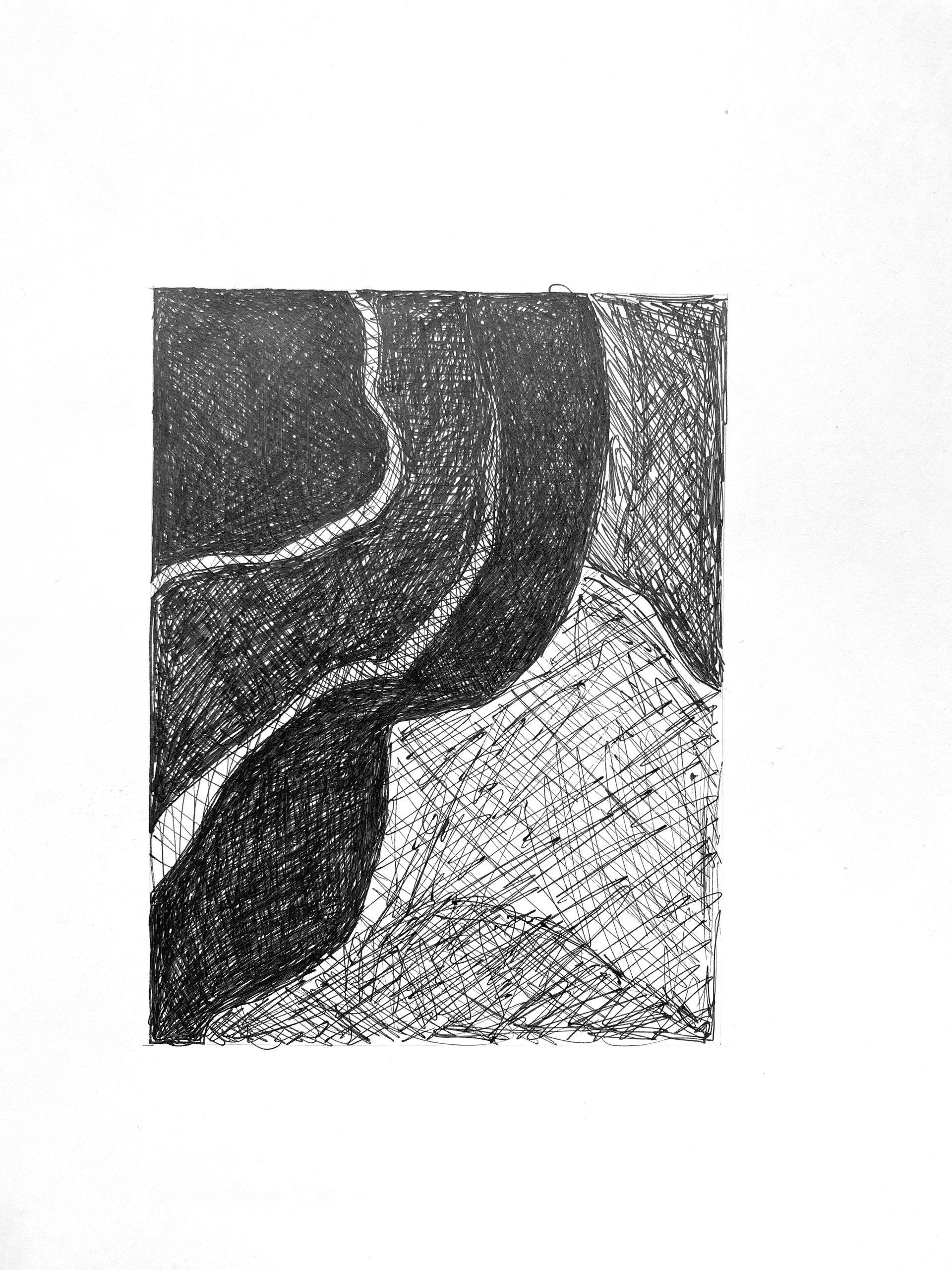
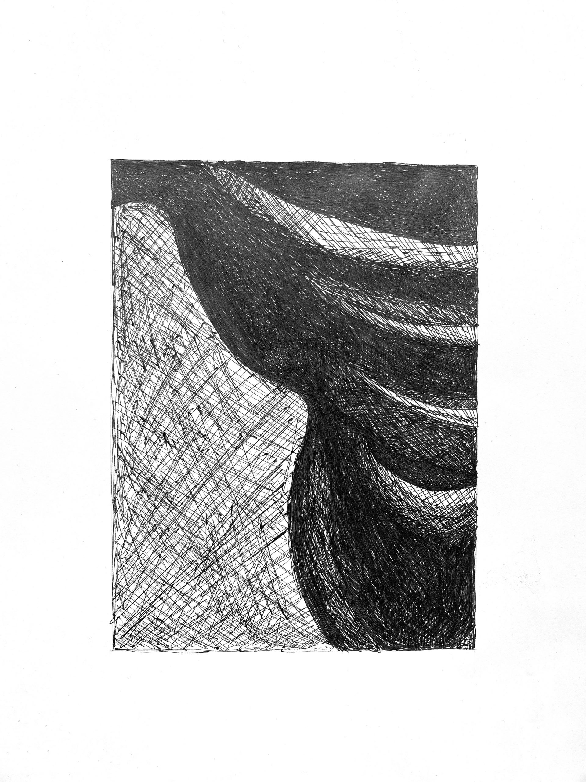 Very good. The middle grey to the lower left could be a shade darker, but this is good.
Olivia Pencil 2 (edited)
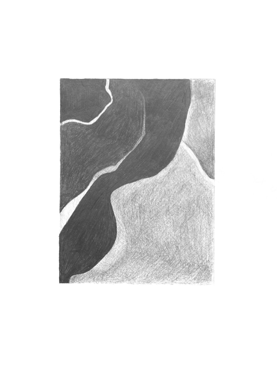 Good, but the mid-tones in the right half should be altogether darker. Try hatching at a slightly different angle as well to avoid that mottled look. The upper right corner is significantly darker; although this might be glare–I notice the dark areas on the left also get lighter along the top, when they should be the same as the other darks on that side. The lower white stripe, especially as it approaches the left edge is also darker–not nearly the value of the paper as it is here.
Olivia Pencil 1 (edited)
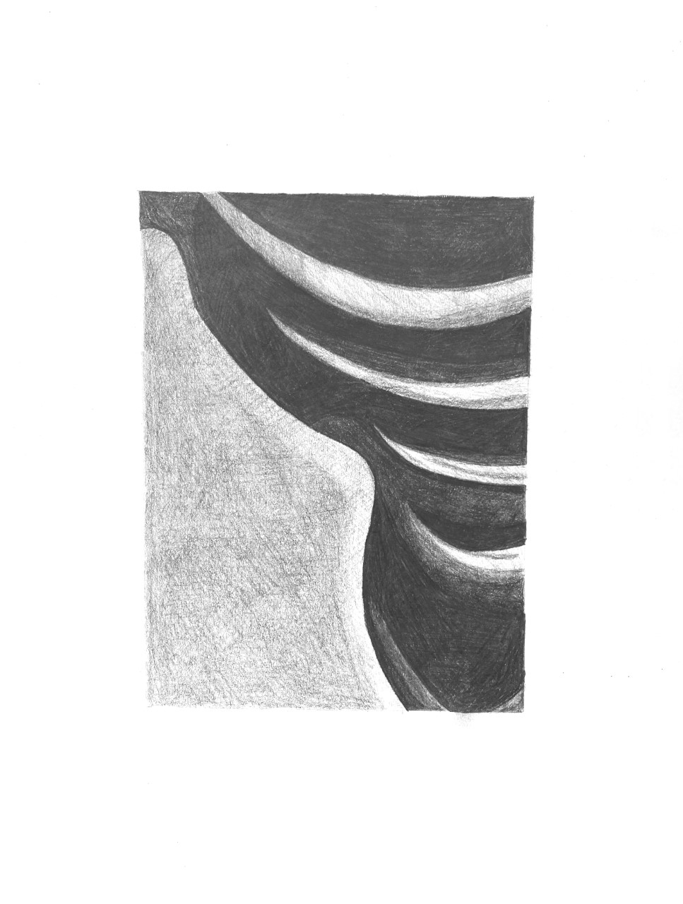 Like the other pencil drawing, the middle-grey shape to the lower left needs to be much darker–also a chance to hide those horizontal rows of overlapping shading. Just change up the direction of the pencil. As noted in my demo, multiple layers of hatching, each at a slightly different angle to the last, will even our the texture and the pencil strokes. Also, the four very light shapes in the upper right are much darker. Compare them to the white of the paper.
Olivia Greuel Time Capsule
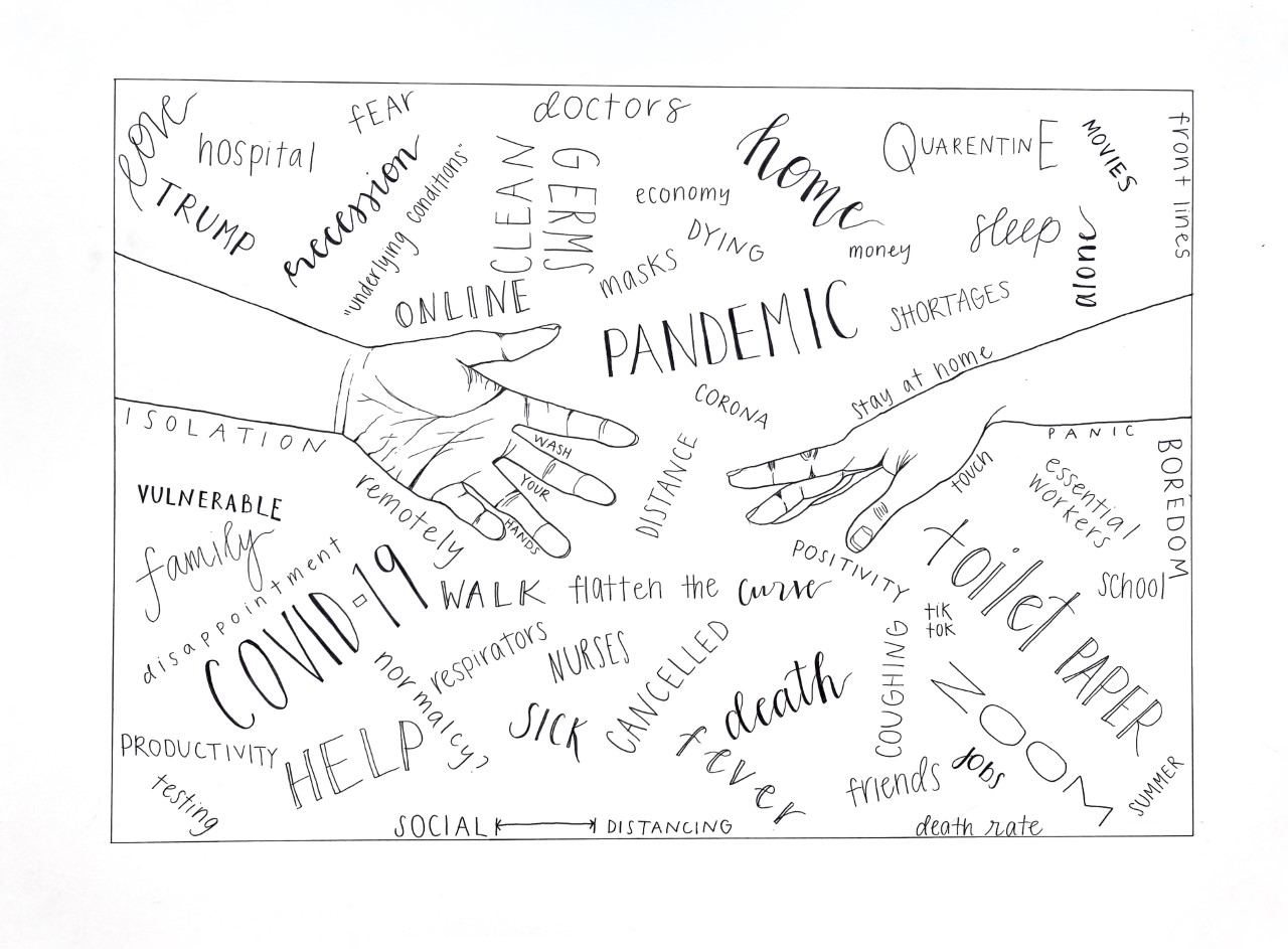
I was going to suggest the following cropping for the sake of the hands alone–I think your drawing includes too much of the forearms at the expense of the more expressive hands (wonderfully drawn, BTW), and the blank areas inside the forearms don’t go with the overall style of filling space uniformly (i.e., no resting places). But then I noticed that the words look interesting going out of the frame, as if they go on indefinitely–more of a sea of words and associations rather than just a “pond.”
But this wasn’t meant to exclude any of the words in the cropped sections–my main idea is to keep all the words just as they are but enlarge the hands in proportion to the rectangle and/or change the proportions of the rectangle itself.
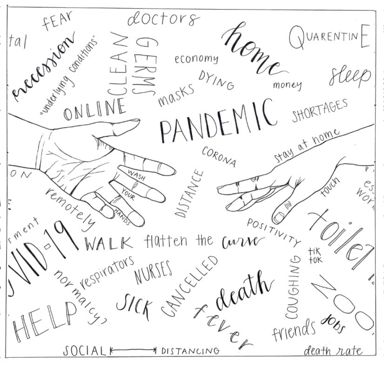
In the process, however, I also happened on a square format, which might also have its advantages. Squares are equilateral–that is, they move in all four directions, rather than left/right only–making the sea of ideas more infinite. Horizontal compositions connote landscape space (and vertical compositions connote figurative space) but square compositions are equivocal, and more inclusive.
But whether you like these ancillary suggestions or not, my core suggestion is to have made the hands more prominent by cropping the forearms (a purely academic speculation, by the way–this version of the drawing is fine as is).
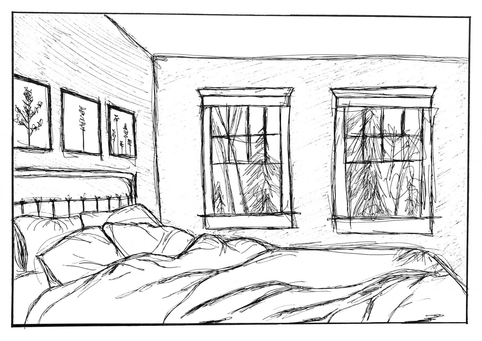
Drawing in Place- Olivia
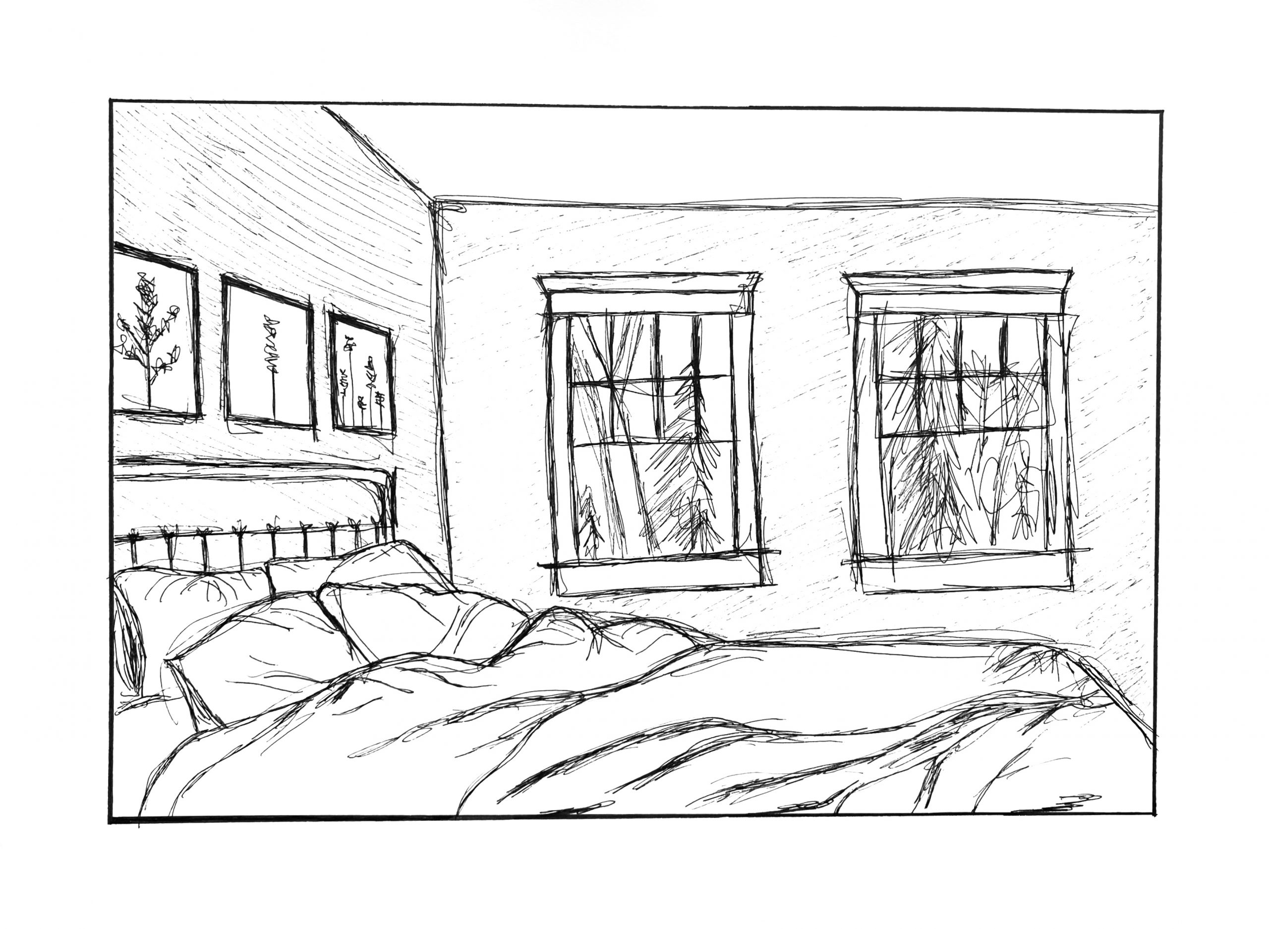 Just a couple of suggestions. I know they can’t be made once the ink is down (well, one of them), but the lower window sills are angling up to the right, pulling our attention away from the cozy bed. By leveling them, or even dropping them on the right just a little, as I have below, they harmonize better with the silhouette of the bed and keep the focus in the room.
The second thing could still be added, which is carrying the trees all the way to window frames, so that the windows eclipse the view out the window, create a stronger, clearer sense of overlap, and create more depth (as I’ve done here in Photoshop). Yours also suggests that nature doesn’t continye beyond what we see in the window.
MW, Miami, 1974, Graphite on paper, 9 x 12 inches