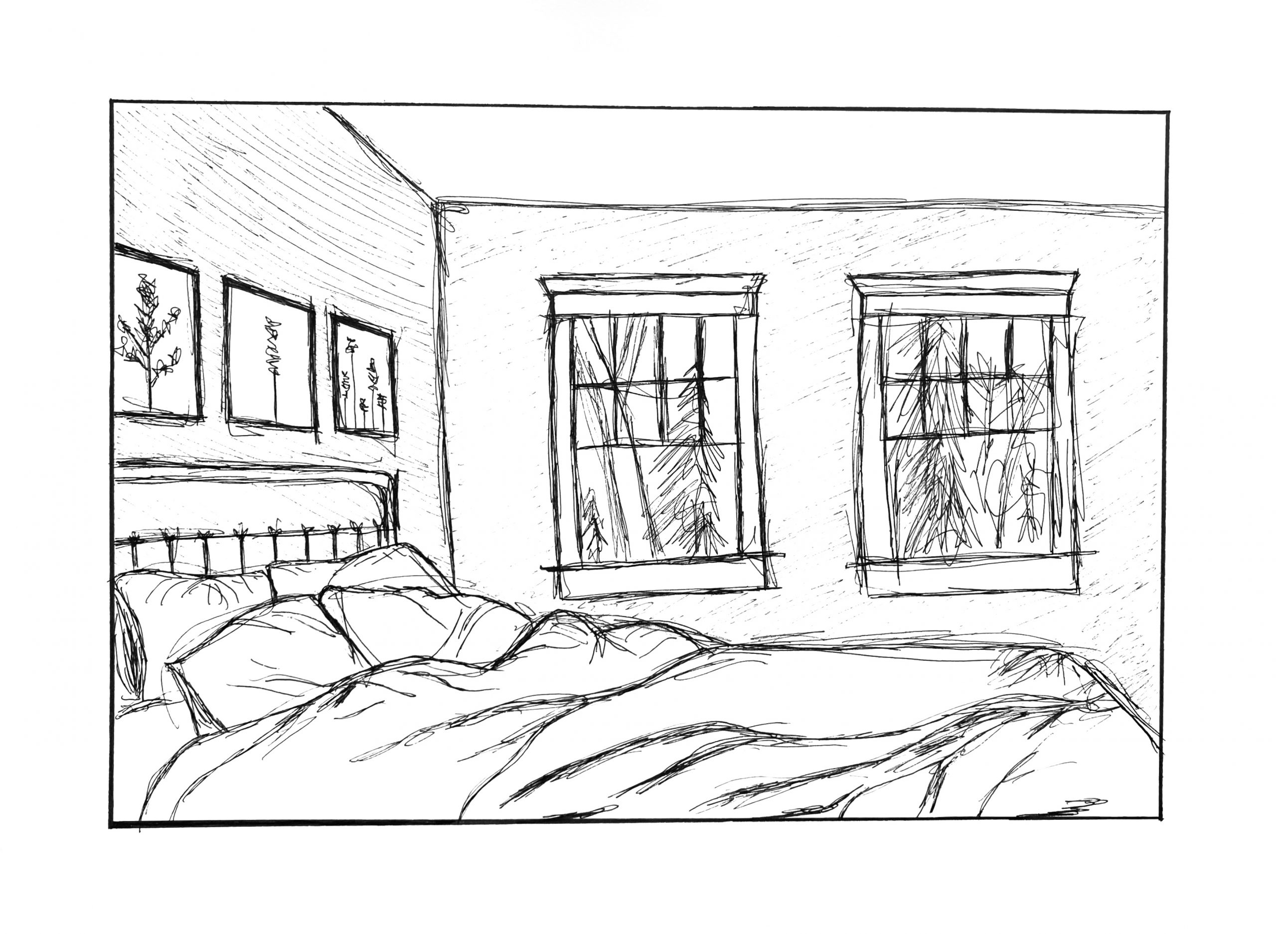
 Just a couple of suggestions. I know they can’t be made once the ink is down (well, one of them), but the lower window sills are angling up to the right, pulling our attention away from the cozy bed. By leveling them, or even dropping them on the right just a little, as I have below, they harmonize better with the silhouette of the bed and keep the focus in the room.
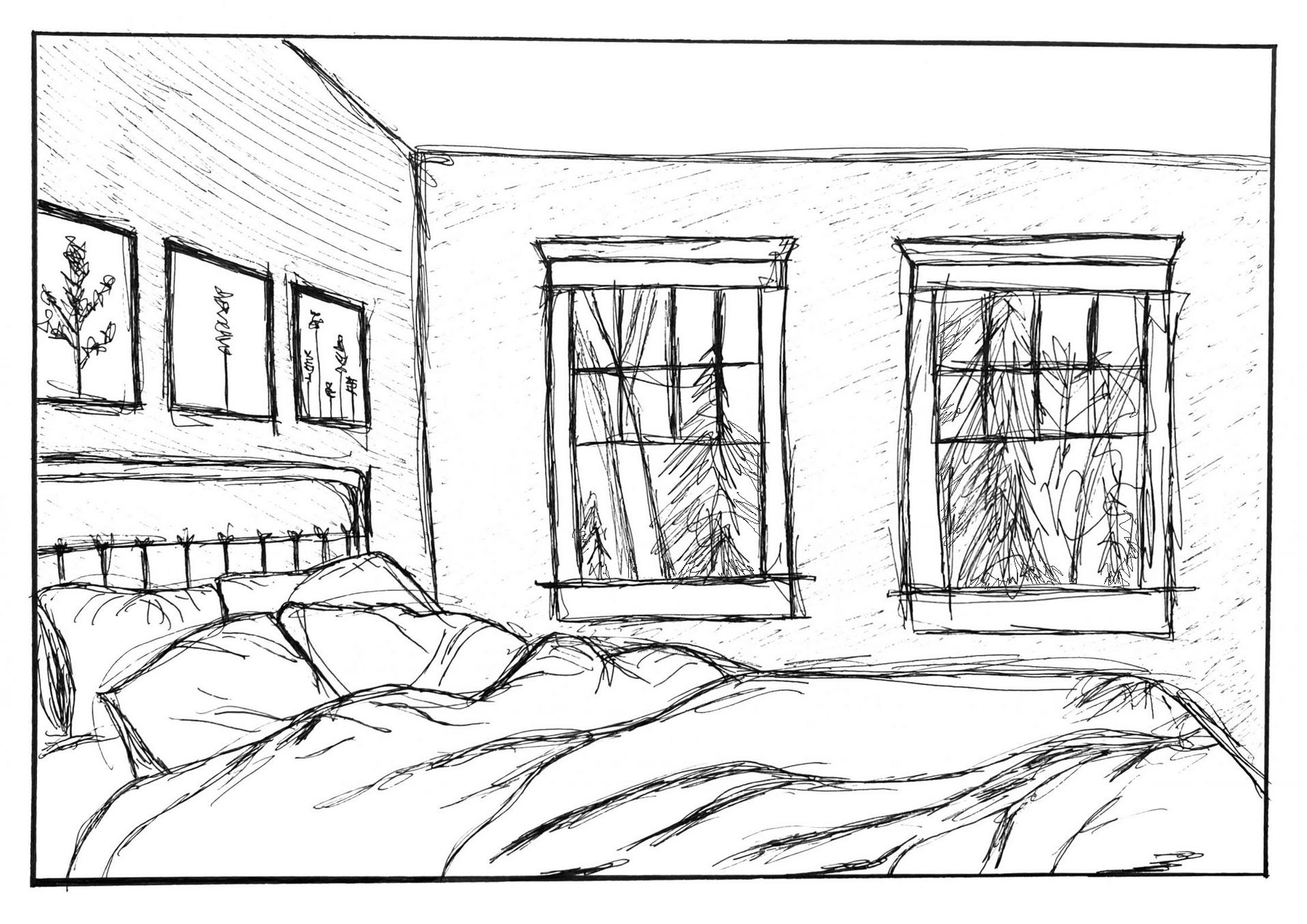
The second thing could still be added, which is carrying the trees all the way to window frames, so that the windows eclipse the view out the window, create a stronger, clearer sense of overlap, and create more depth (as I’ve done here in Photoshop). Yours also suggests that nature doesn’t continye beyond what we see in the window.
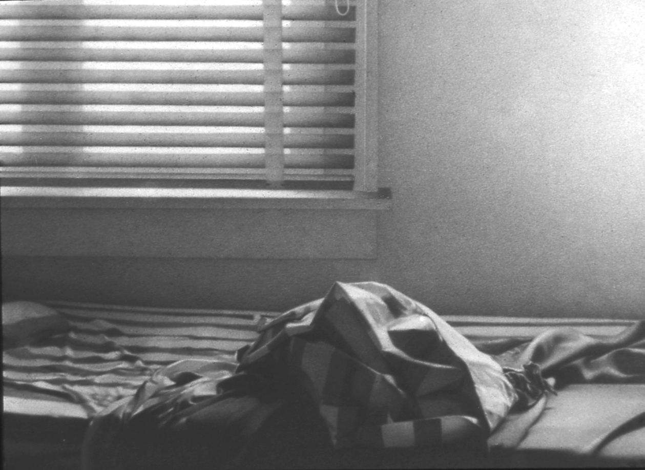
MW, Miami, 1974, Graphite on paper, 9 x 12 inches
I chose to draw my bedroom for a few reasons. First, it has become an oasis among the chaos in the world right now. It is the only space that is completely mine. The art on the walls, the colors, the level of cleanliness is all dictated by me. I found the process of drawing to be quite therapeutic. I originally thought I would have a clean, neat and “safe” contour drawing. I was inspired by demo #2 to break out of my comfort zone and embrace the messiness of that method. I enjoyed the boldness of the pen and embracing every line as it is while rejecting the idea of mistakes. I’m happy with the end result, and I think it accurately portrays the space.
I think this is a really impressive drawing which manages to maintain a lot of precision despite your use of looser, more expressionistic lines. You did an amazing job highlighting the folds and creases on your bed, which look even better with the looser lines. I also really like how you added texture to the walls of the room with lighter pen lines. The only issue with this drawing is that some of the verticals are more diagonal than they should be, but in a way this fits in with the charm of the drawing and doesn’t distract from the overall aesthetic of the composition.
I love this piece, and I especially love how you combined pen with a more sketchy feel. The use of pen means that all of the lines are forced to be intentional. I think you did a great job with the folds of your sheets/comforter and also with the pillows. The perspective looks correct, but I agree with Isaac about the one vertical in the back. However, I don’t think this takes much away from the success of your drawing because it fits in with the looser, expressionist feel. Also, the detail of the trees outside of the window completes the drawing, juxtaposing with the cleaner feel of the sheets and walls in your room.
Great job, Olivia, and I love your reasons for choosing this scene. Good job as well incorporating the changes (cropping) we spoke about when this was in progress. I think it works much better for it (but even here the corner of the pillow is tangent to the border—better if it were either in or partially cropped. Note how the pillow is pulling toward us rather than resting back in space).
Great comments from Isaac and Anika, and I join them in commending you for trying something new and different. I might use words like “looser,” “freer,” or “more spontaneous” than “messy,” but I take your point about this approach to drawing. As both Isaac and Anika indicate, in this type of drawing the usual rules (about verticals, etc.) don’t apply, in favor of something warmer and livelier.
When the “rules” still do apply is only when they help the drawing on its terms, rather than for their own sake—and that’s the sense of my notes next to the revised version of the drawing that I’ve added.
Finally, I’m adding a drawing of mine that yours brought to mind. Please know that this is a 9×12” pencil value drawing that I worked on for 3 months or so, so I’m by no means comparing our techniques—only our shared vision for a place that brings (or brought, in my case) a sense of peace and comfort.