I’m only guessing about the original, of course, but it felt like this needed more contrast–
Professor Mark Wethli – Spring 2020
I’m only guessing about the original, of course, but it felt like this needed more contrast–
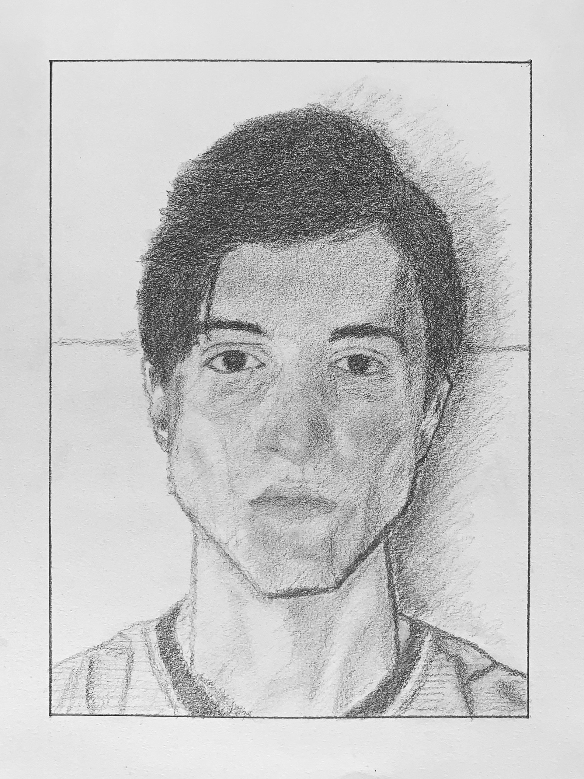
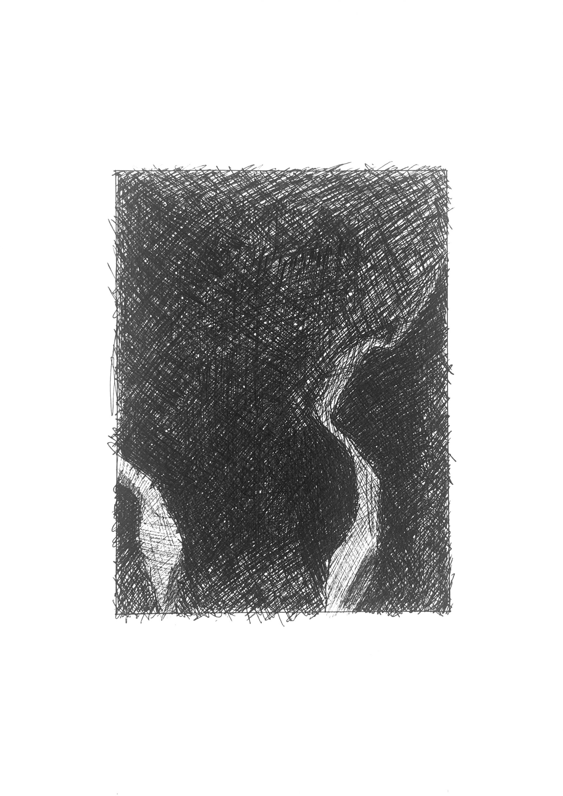
Good work, Max, with a good overall configuration and good progress so far, but it has room to grow richer and subtler. Just a few notes:
It didn’t affect other proportions too much (although it did make your face a bit narrower than his), but the negative space on the left is narrower, and the silhouette of his hair (and the shape of that negative space) is different. It might not seem to matter but that shape is sending a subtle signal about the foreshortening and volume on that side of the head.
Related to this, the darker marks inside the silhouette of the hair—especially those ones on our right—are telling an important story about the volumes and overlapping planes within the shape of the hair. Yours could be more specific and descriptive.
The shadow lines on the jaw should be wider and softer, and the shadow from his chin on his neck should be darker, which helps the chin and face to project more.
Your darkest edges—the eyebrows, irises, edges of the hair and shadows around the jaw and neck are too focused and hard. Everything in the original is fairly soft edged. Great job on the nose and ears in this regard, for instance.
His mouth is wider and upper edge of upper lip softer and less dark. Look for outer edges of mouth to be directly below the irises, as his are.
There’s nothing off about this–it’s good and very much on track but could go further.
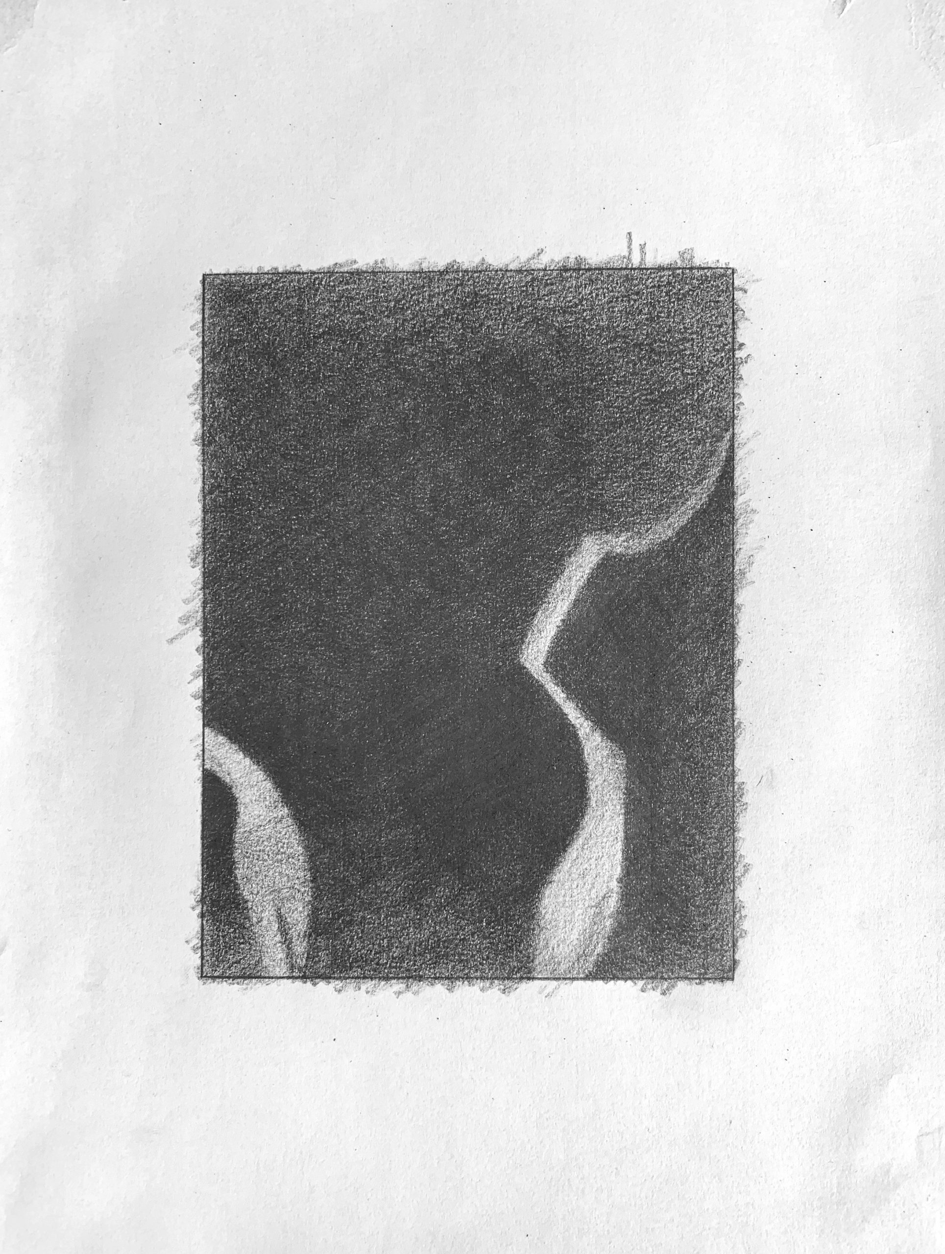 Very good, but the upper right corner and top edge aren’t nearly that much lighter than the areas below. That slight value change is nearly imperceptible, and much too exaggerated here. Note also that the bottom portion of the lighter shape on the left shades into a darkness almost as dark as the black on either side of it. The top end of this shape is darker as well.
 The better of the two versions of this one, but the upper edge and upper right corner are darker still. Better on the light shape in the lower left as well, but its lower portion is still darker.
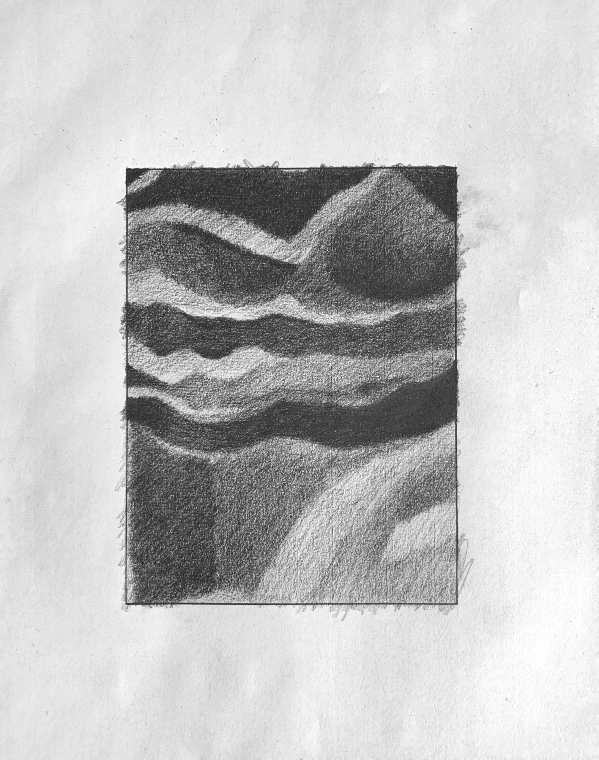 Good, but the mid-values are all darker than this. The darker greys in the upper half are all closer to black than this. The light shape at the lower right is altogether darker as well–not nearly as light as the lightest areas in the upper left. Just to the left of this shape along the bottom edge, is a small shape that you’re making much lighter than it should be.
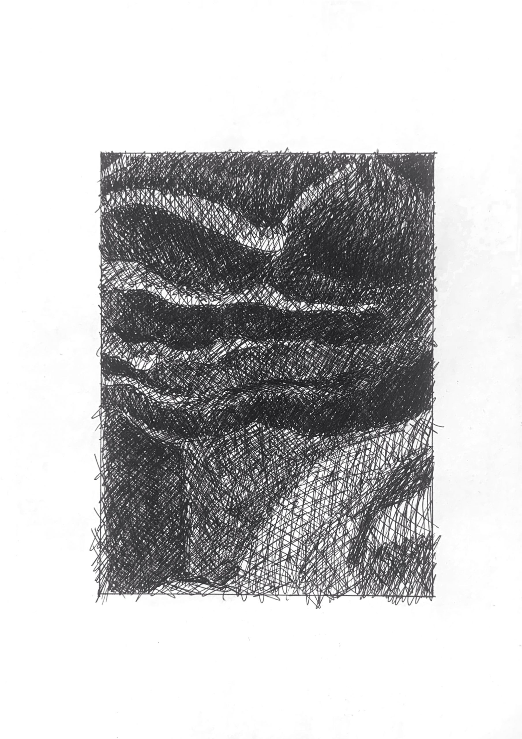 You’ve almost lost the lights in the upper left, but otherwise this is very good–exactly what I was trying to describe above in the pencil version. Don’t worry about those whites–you’re all set.
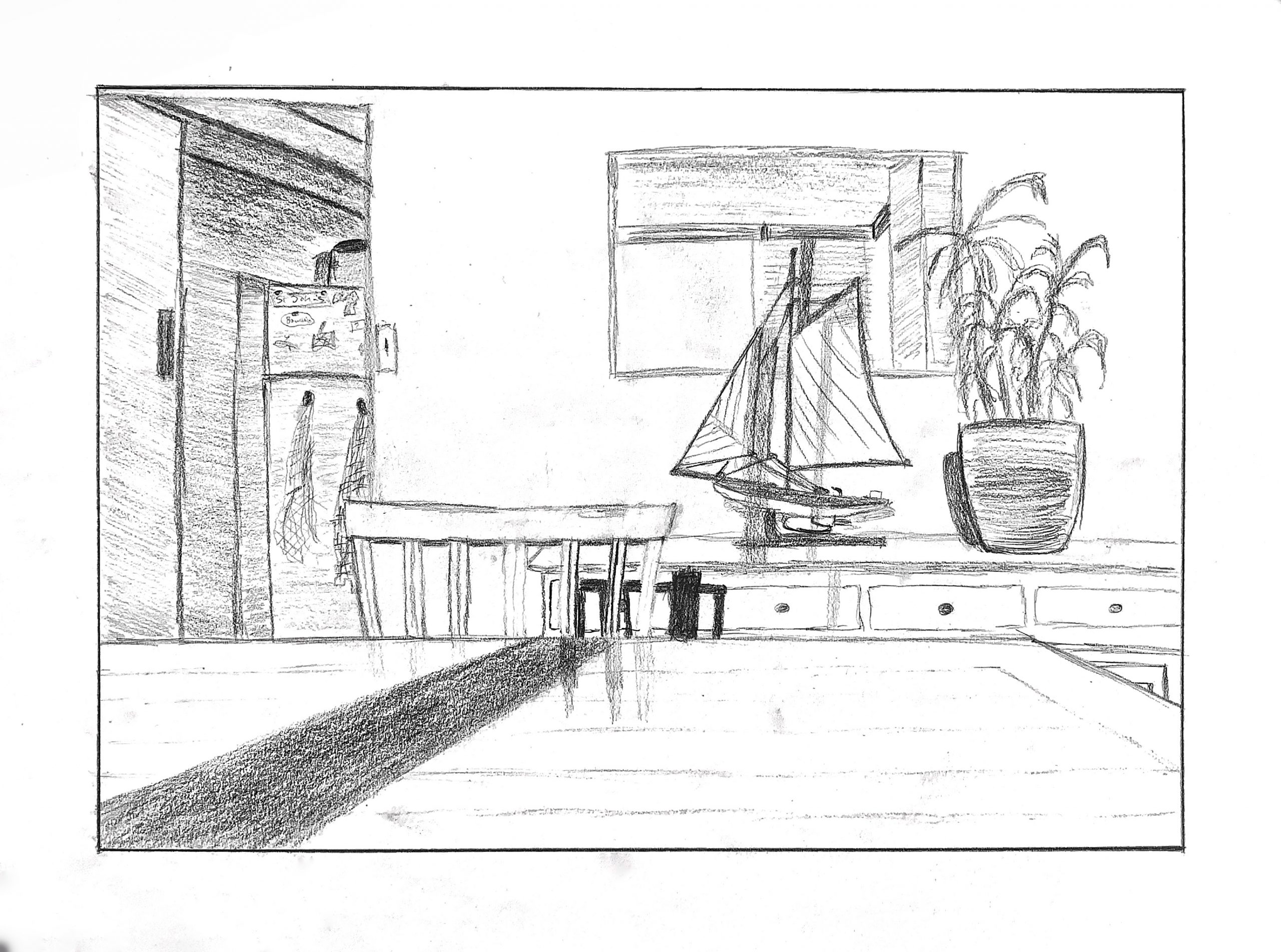
Here’s one way (below) to depict faces if you don’t want to deal with them–at the very least show us the planes of the head. To exclude them entirely in a drawing in which all other planes are at least minimally indicated actually draws more attention to them; conspicuous in their absence. A face (at this distance) can be broken into 4 main shadow planes–the two eye sockets, under the nose and the shadow on the upper lip, as I’ve done here:
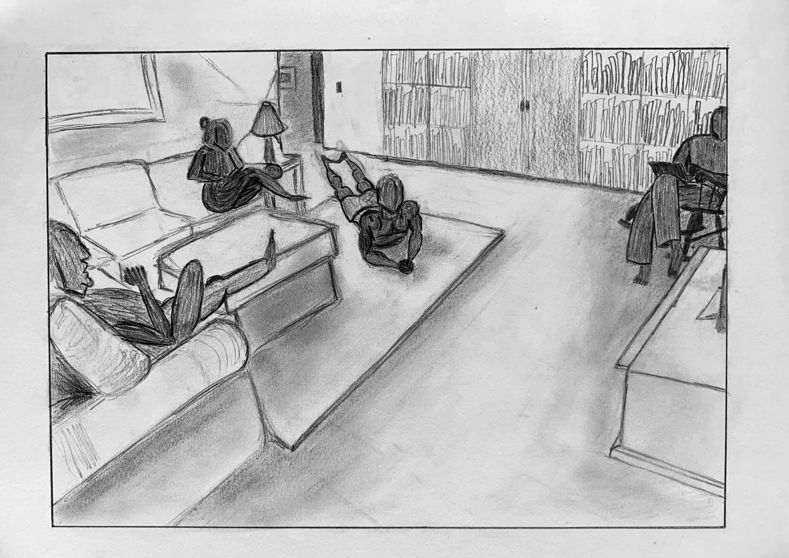
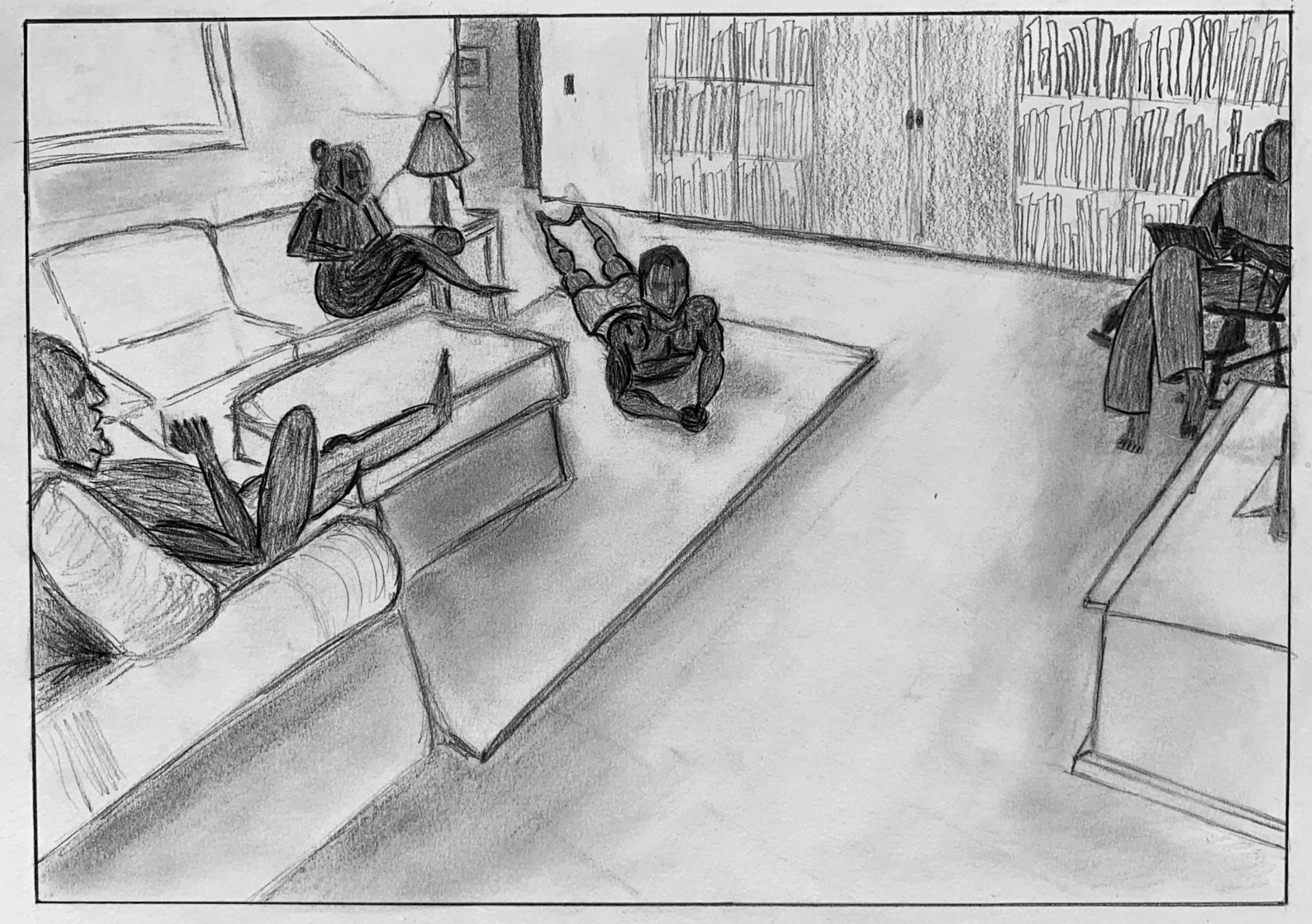 You’ll notice the one I didn’t add to is your brother, who’s actually your best figure in my estimation. The way he’s cropped and the half light he seems to be in is all you need.
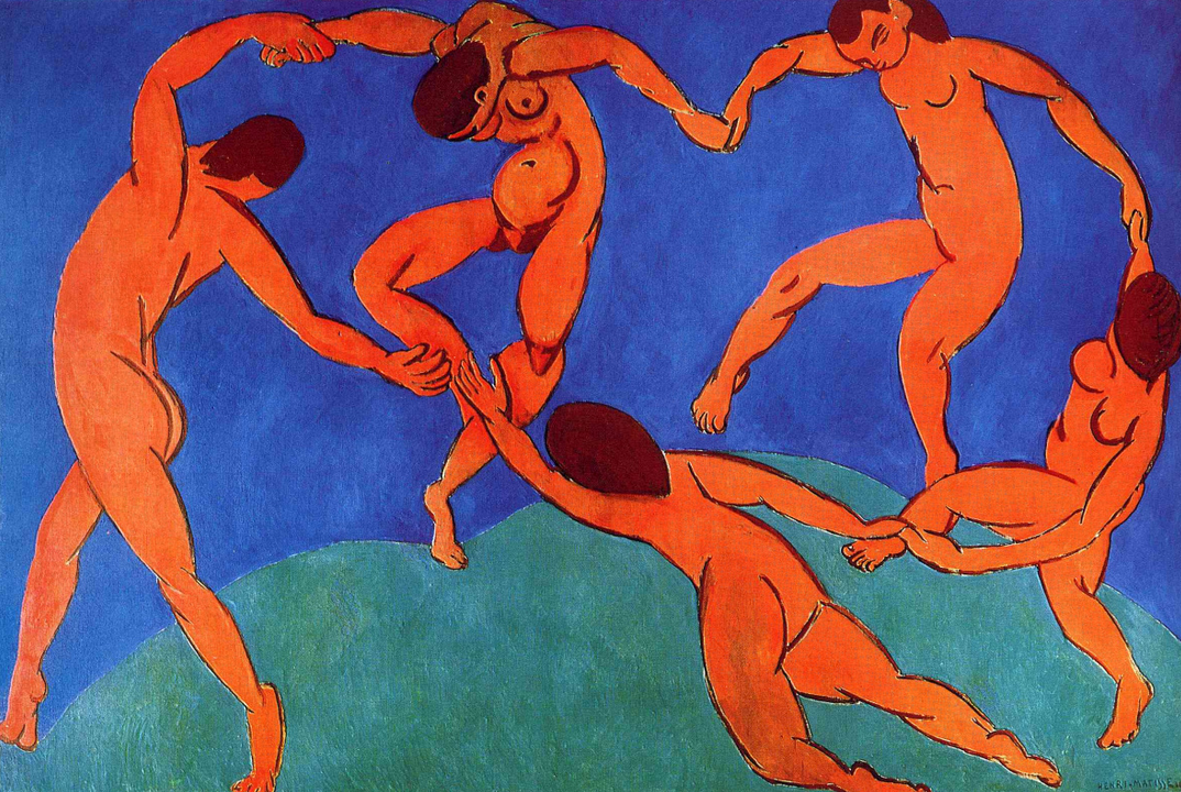
A painting that came to mind, oddly enough, is Matisse‘s The Dance. Here the figures aren’t distant from one another at all, but Matisse goes out of his way to hide their faces. He wouldn’t have been daunted about painting them, so he had another reason–my guess is to make them more universal, and focus attention on their bodies and movement over their identity. But you’ll notice, when he’s forced to deal with that one toward the upper right, that he hits the planes I just mentioned, quickly and simply–also volumetrically, wrapping the planes around the head rather than painting a 2D mask.
I also thought of Fairfield Porter, who often downplayed the features into shadow planes. Note in his and the Matisse how much description you can get out of the shape of the hair alone–
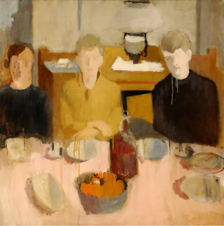
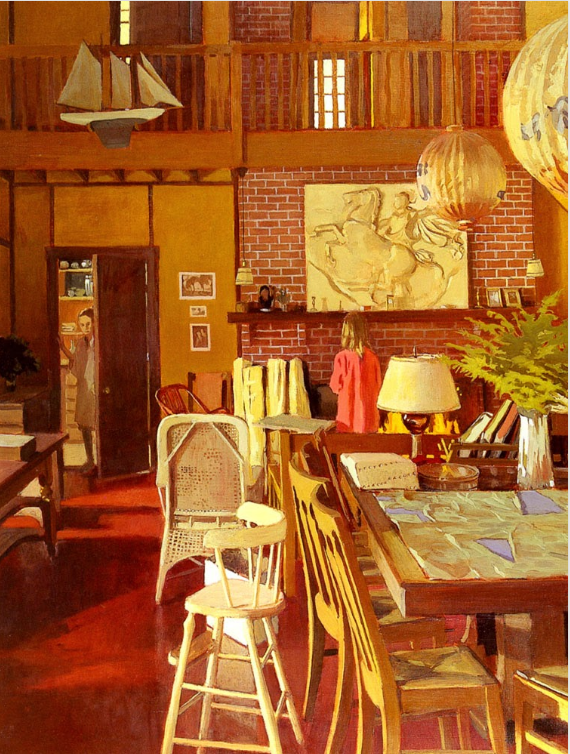 Fairfield Porter