Here’s one way (below) to depict faces if you don’t want to deal with them–at the very least show us the planes of the head. To exclude them entirely in a drawing in which all other planes are at least minimally indicated actually draws more attention to them; conspicuous in their absence. A face (at this distance) can be broken into 4 main shadow planes–the two eye sockets, under the nose and the shadow on the upper lip, as I’ve done here:
 You’ll notice the one I didn’t add to is your brother, who’s actually your best figure in my estimation. The way he’s cropped and the half light he seems to be in is all you need.
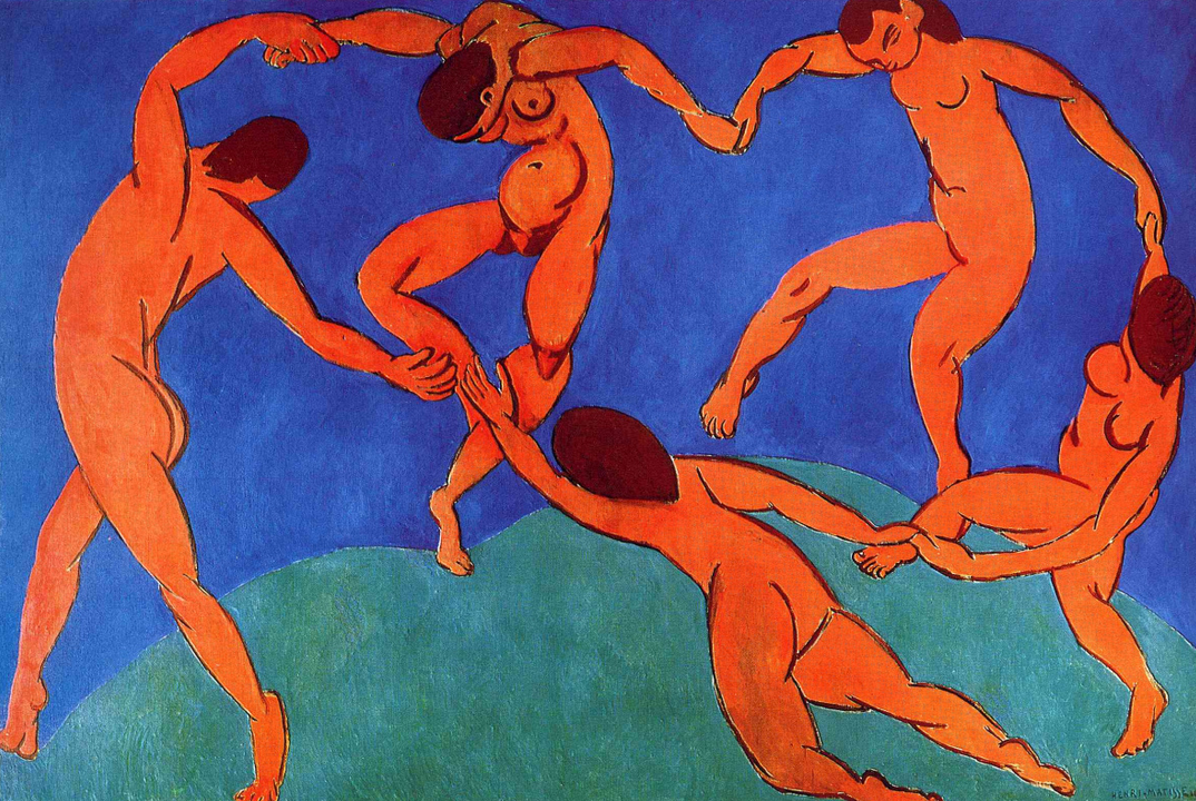
A painting that came to mind, oddly enough, is Matisse‘s The Dance. Here the figures aren’t distant from one another at all, but Matisse goes out of his way to hide their faces. He wouldn’t have been daunted about painting them, so he had another reason–my guess is to make them more universal, and focus attention on their bodies and movement over their identity. But you’ll notice, when he’s forced to deal with that one toward the upper right, that he hits the planes I just mentioned, quickly and simply–also volumetrically, wrapping the planes around the head rather than painting a 2D mask.
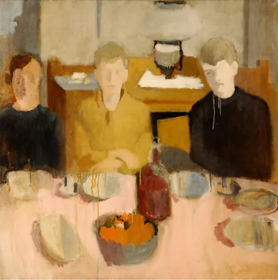
I also thought of Fairfield Porter, who often downplayed the features into shadow planes. Note in his and the Matisse how much description you can get out of the shape of the hair alone–
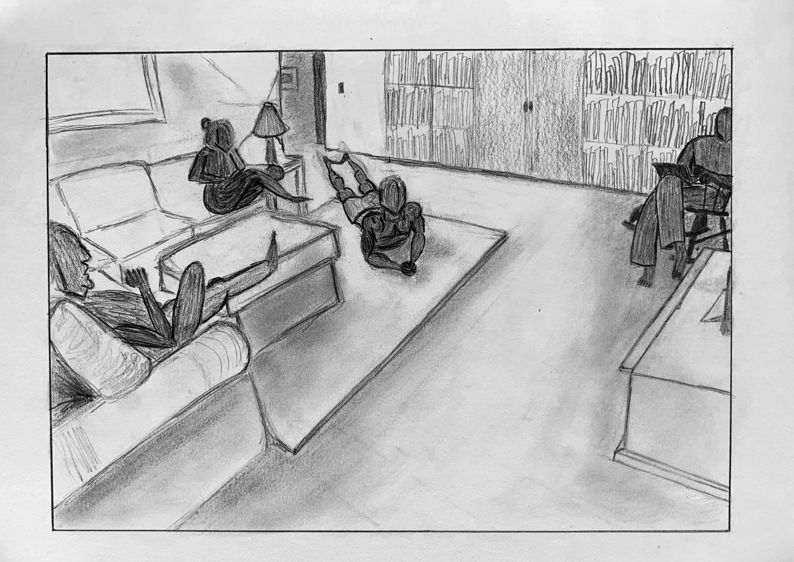
With COVID-19 my family has taken to sitting away from one another when we are in our living room, this drawing shows that. I decide to draw the people the way I did because I think it makes the drawing more mundane and casual, exactly what the scene is depicting. Also, I wanted to focus on the shapes of bodies rather than details of faces. Furthermore, I do not think that I would be able to draw 4 faces and not want to pull my hair out. I am happy with how this came out. This is one of the first times I have tried making more than a stick figure and I think that I was able to capture how people fill space well. I had a very hard time with my brother, the figure in the far right of the drawing. I think this was because all of his appendages are touching which made it difficult for me to create depth as well as his use of a laptop and him sitting in a rocking chair. I think my use of value in this drawing is better than my last. This is because I think I focused more on it as well as not doing it during a time that covered the object in light.
This drawing is intriguing to me. It’s really interesting that the people seem much more finished than the room, as if the surroundings are being constructed around them. I think the most interesting and characteristic part of your drawing is your composition. It feels balanced enough, with the upper right and bottom left corners kind of contrasting each other. I love the empty space around the center of the drawing, it leaves some anticipation and mystery in the image. I feel like your drawing would be improved if you stuck to a consistent style. It feels like some lines you smudged, but others you kept more sketchy. It makes it feel like the drawing is not one coherent drawing. Great job!
Really enjoy the style of the drawing in that there are some aspects of the room that our left for our own interpretation and imagination. As the meticulous details in the room are difficult to capture and not necessary to include, I feel as though the message is made more clear with the style that you used. I agree with Lily’s point describing the emphasis on the people in the room as well as the balance that the drawing establishes. Honestly don’t really have any suggestions or critiques as any changes would be altering the style that you chose for the drawing. There are inconsistencies in the line type but once again you did a really good job.
Hi Max,
Apologies for my belated reply. This is a great idea and a strong composition with an effective use of perspective. I’m guessing it was done from a photo? (which is fine, and a smart move for a multiple figure composition).
It reminds me in a distant way of the Degas family portrait we looked at weeks ago (the Bellelli family) with its various tensions between the figures.
You mention an ambition to create depth in your brother’s figure. But other than the perspective depth of the room, all of the figures seem to be in silhouette. This, like the absent faces, mainly reads like a way of dodging the challenges of figure drawing. This is understandable, especially with four of them, but if this is from a photo, as I suspect, it’s just a matter to transcribing shapes—which for the most part you seem to have a good handle on.
Your brother is the best, and the foreshortening on you (the guy on the floor) also quite good. In the other two you lapse into more symbolic or stereotypical approaches—the near figure’s thigh as a balloon or hot dog shape is one of these, when I’m betting the photo (if there was one) had a fresher, simpler shape there.
That figure’s arm is also cartoon-like, when a moment’s more attention would have brought it up a notch.
Good to see you pushed further with value, but you’re still overthinking it. My hope was the Team Value drawing would help to address this—not worrying about what a value represents but simply how light or dark it is. You did well with this on that project—same principle here.
An ambitious approach that you’ve handled well for the most part, but there’s further to go—see my notes with the drawing.