Author: gabilode
Portrait Prep – Grace Bilodeau
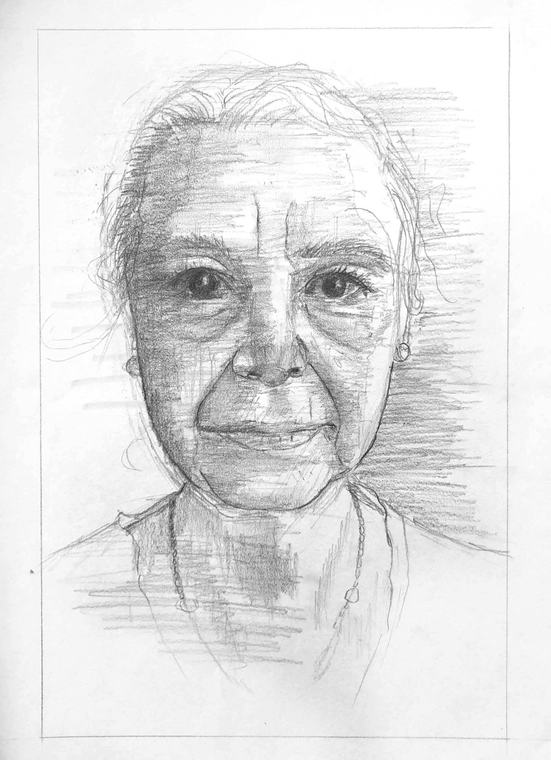
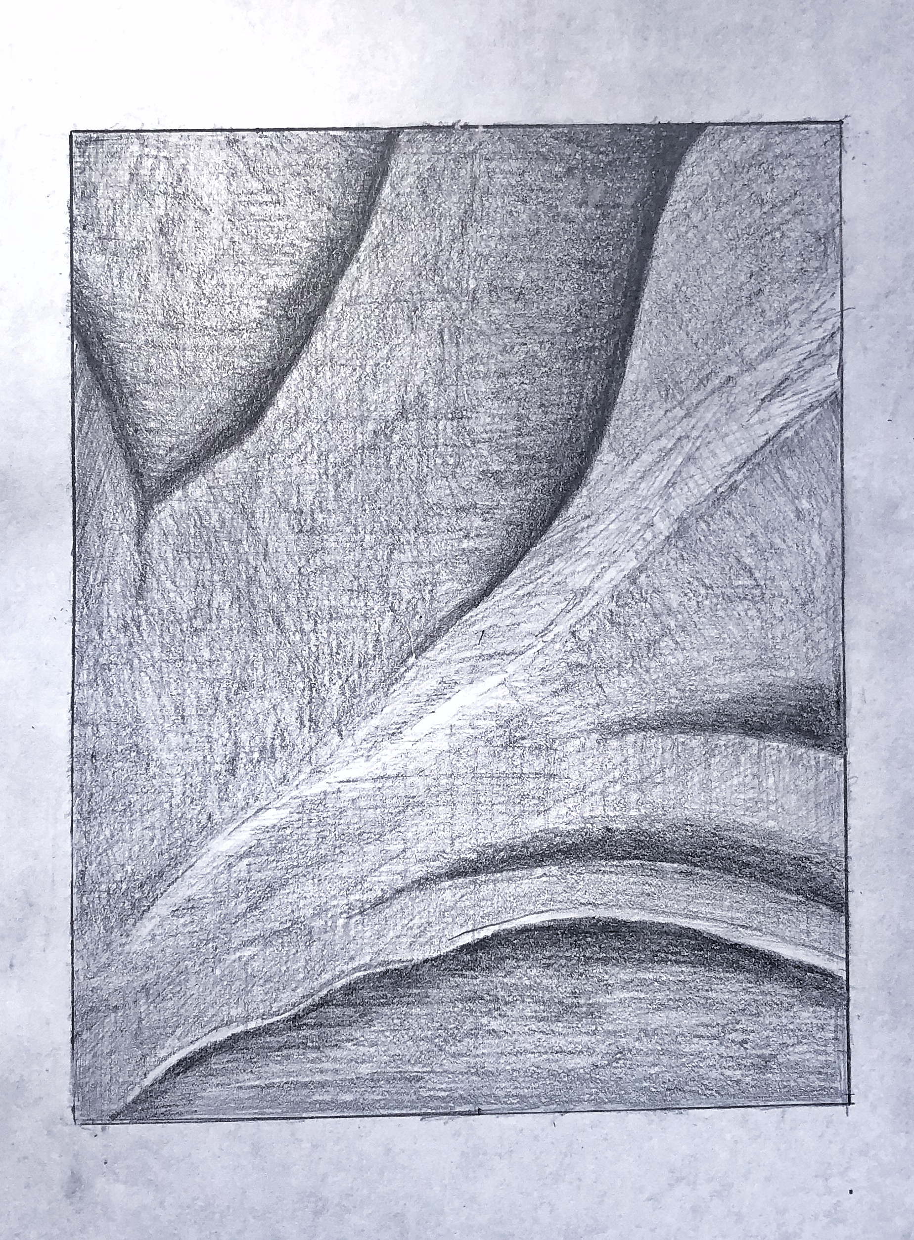
(MW): Beautifully done, Grace, from finding the image on the page to drawing the contours and line qualities with great sensitivity, to your subtle and consistent modeling of values. I’m struck that you think it’s too dark. Some of your mid-tones are maybe on the verge of being too dark but they aren’t, and there are much darker values yet to go in the eye socket on the left, which is such a focal point, under the tip of the nose and at the corners of the mouth.
The eye on our right is just a bit too dark, I’ll grant you that. It appears he went over that area with vertical swipes of his kneaded eraser (judging by their width).
This was a topic in your O’Keeffe as well. You might be overly concerned about going too far and messing up, but you haven’t yet–and until you do you’ll never learn when you’ve crossed the line. But this is much closer to the original than the O’Keeffe–good progress.
Two notable differences about your shading from his—the shadows have much subtler and softer gradations into the adjoining highlights—especially on the cheekbones (there’s a modulation between your lights and the next darker value–a very light grey–that you could still use more effectively)—and you’ve introduced an overall horizontal hatching, as well as his vertical hatching, that I don’t see in the original.
The fact is you do it so well that you’ve made it all your own—a strong unifying texture.
Can’t say enough about the line quality of your contours, however—truly exquisite, and your finest work yet. Every bit as subtle, nuanced, and confident as the original.
Fine work–
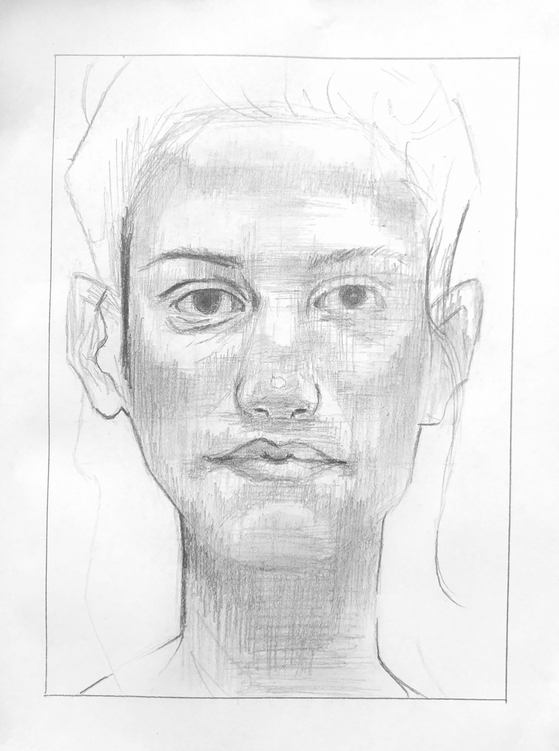
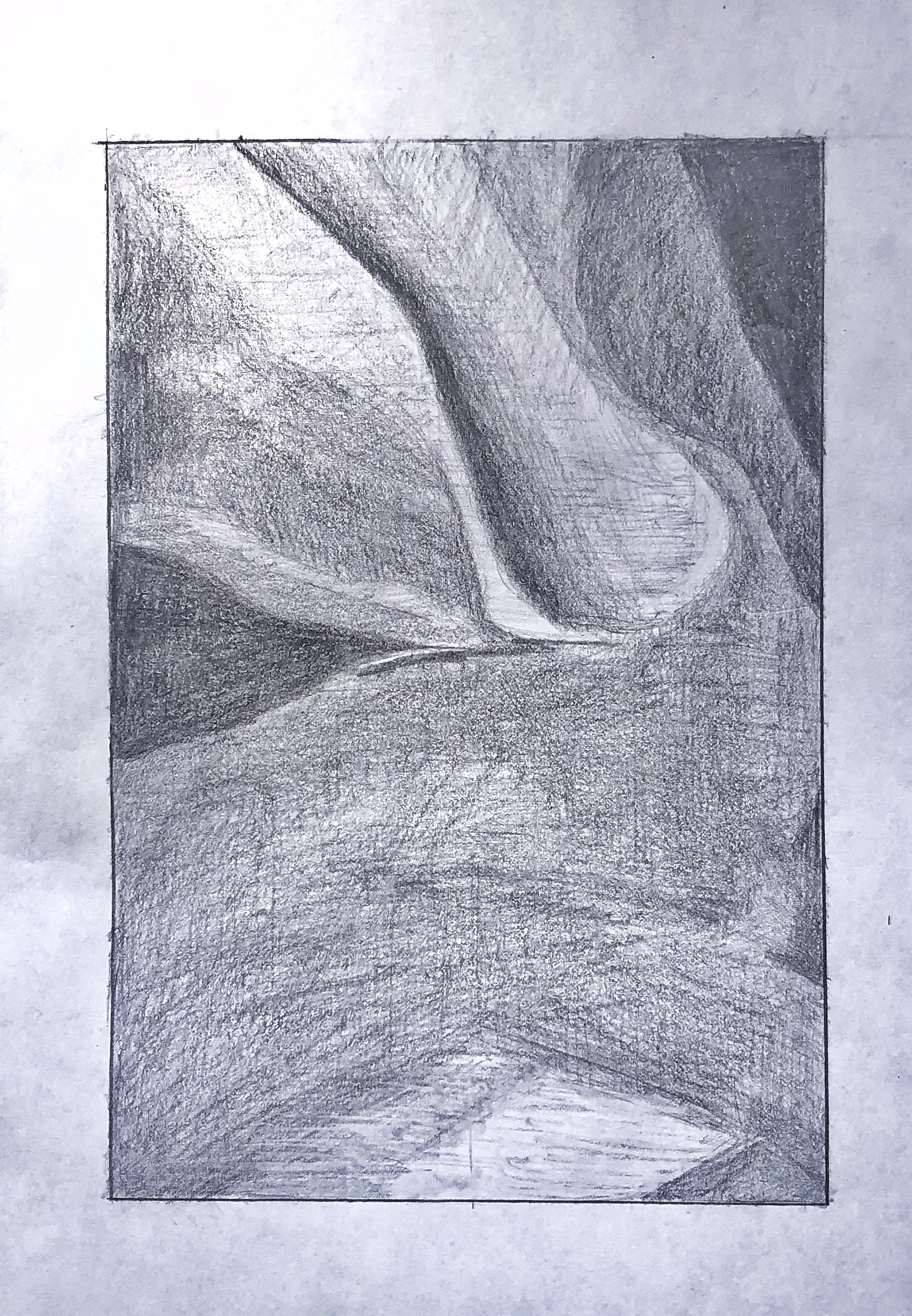
One thing that I was worried about going into this project was my ability to find and distinguish the various planes of the face. For example, in my past attempts at drawing faces I have always been unreasonably frustrated with cheekbones. I was never able to reflect the actual angles and appearance that those shadows create. One tip that really helped me from Proko (and actually surprised me with how well I was able to do this) was the simple idea that you should shade the the dark areas first and leave the highlights of the image as what remains. I think the instructional video about the plains of the nose also really helped me, especially when talking about the “Wings” of the nose and how the shadows vary there. I am proud of this drawing, but I do think I over did the shading, as the original that I was copying is overall much lighter in value. I did try the technique of smudging pretty tentatively, but I think in the areas that I did apply it, it turned out alright.
Grace Bilodeau – Revised Value drawings
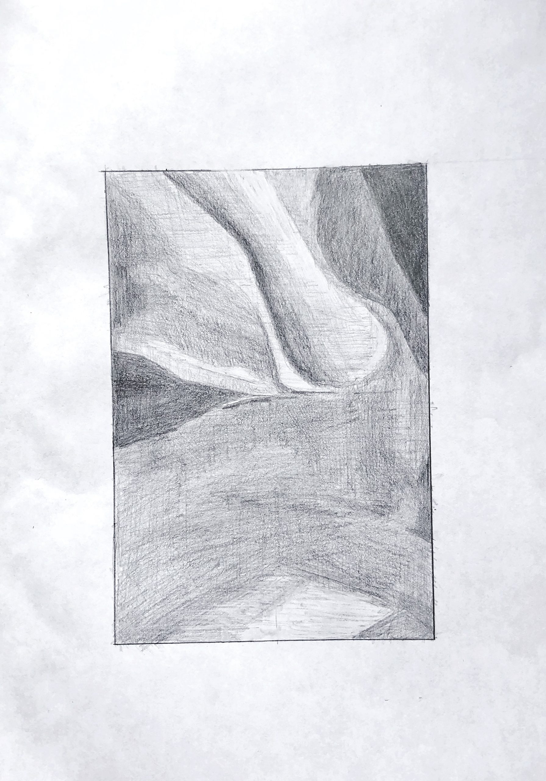
grace bilodeau – Team value drawing
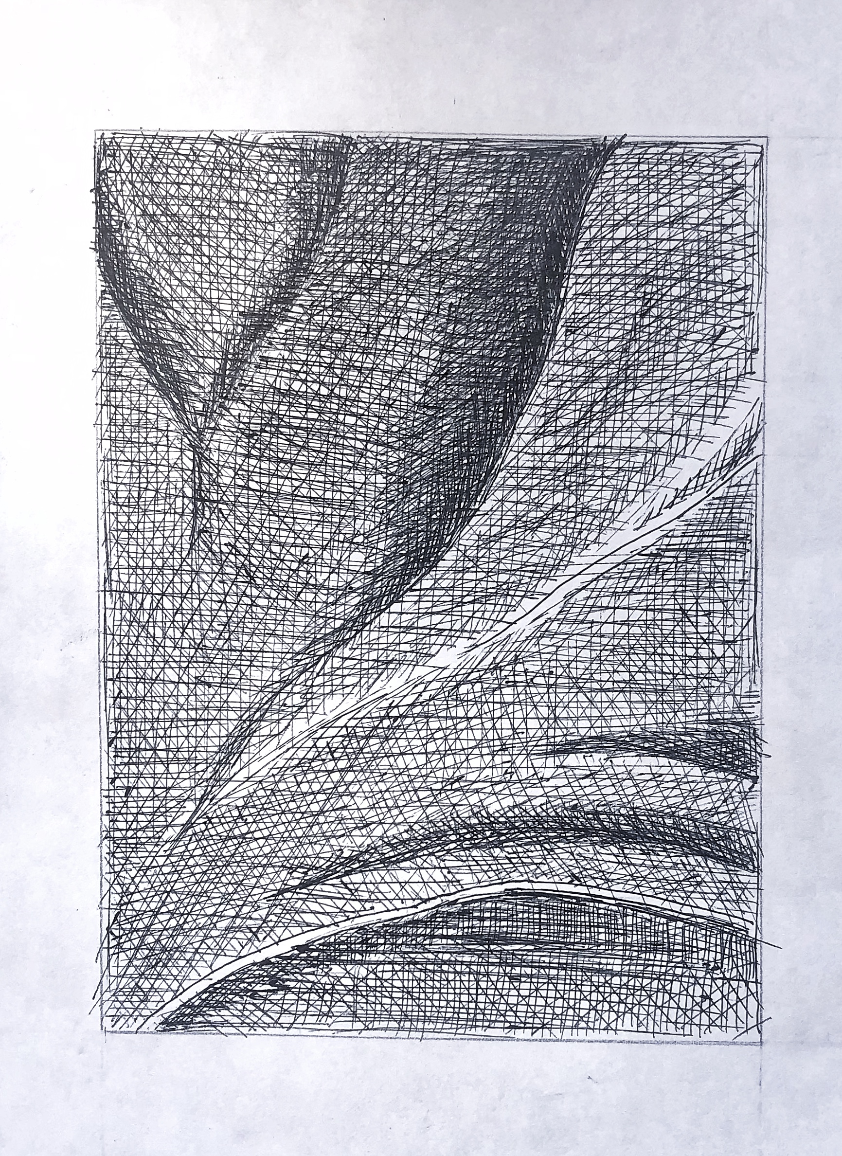
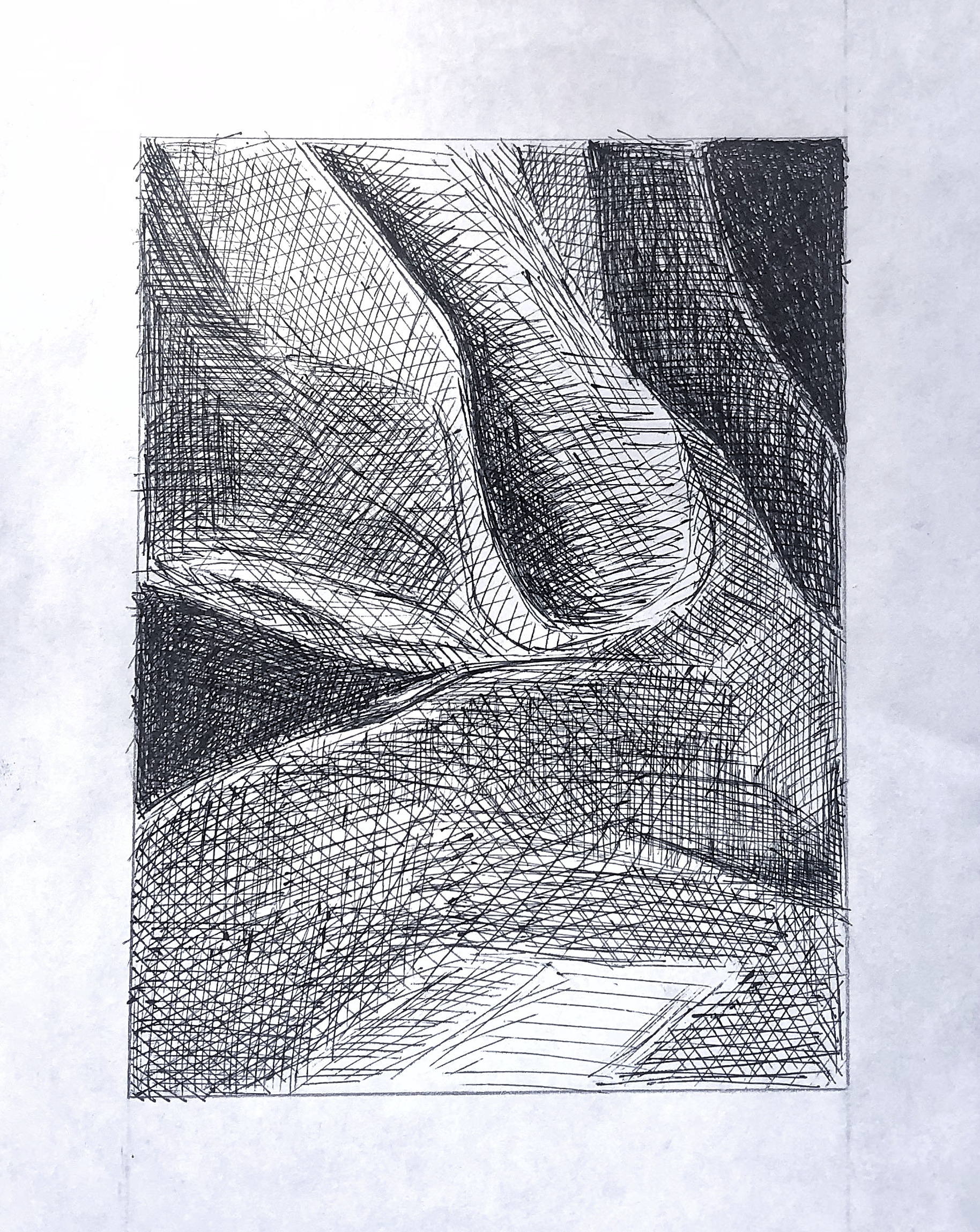
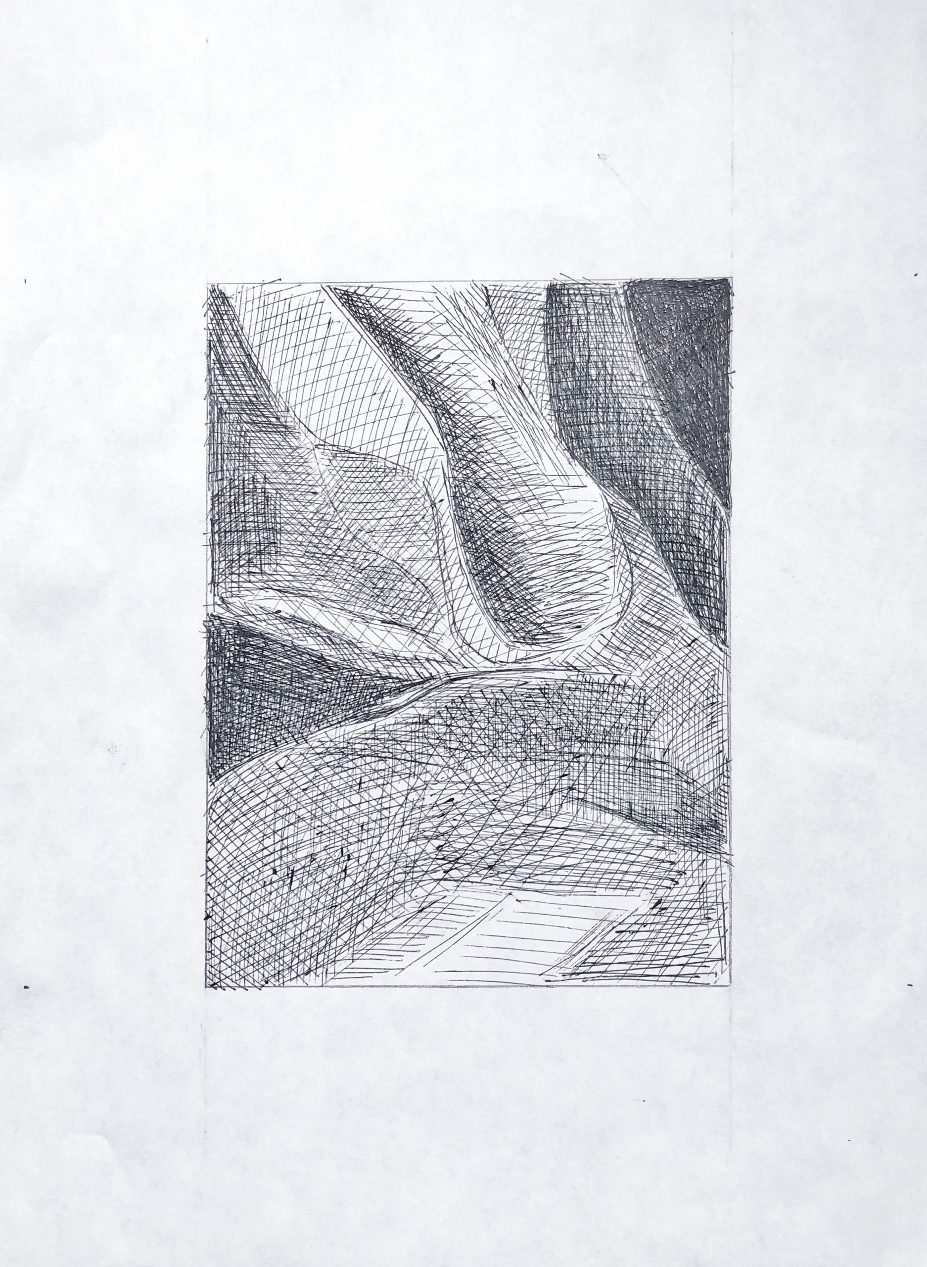
This process was an emotional roller coaster for me. I think the most difficult part for me was definitely the pen drawings. I was finding that that with pencil it was far easier to vary the intensity of the line weight. Additionally the wider expanses of similar toned (light gray) areas I struggled with making a consistent tone. I think my biggest worry was not leaving enough space for the highlights and lighter areas in my pen drawings, as I was afraid that they would darker too quickly.
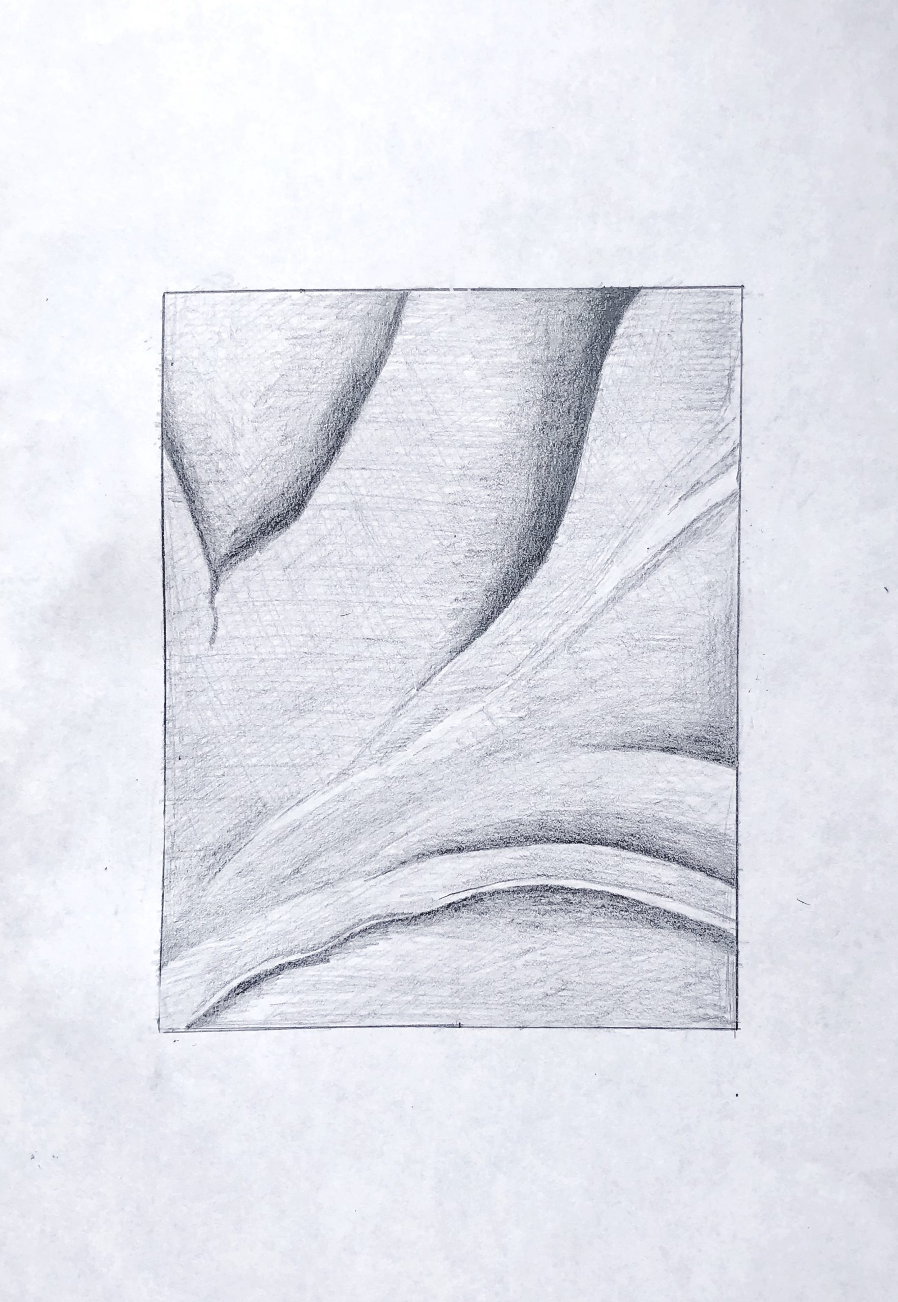
My suggestions here are the same as I mentioned in my email. In the process you could tighten up the resolution by hatching lightly from many angles rather than just two, as suggested in the demo.
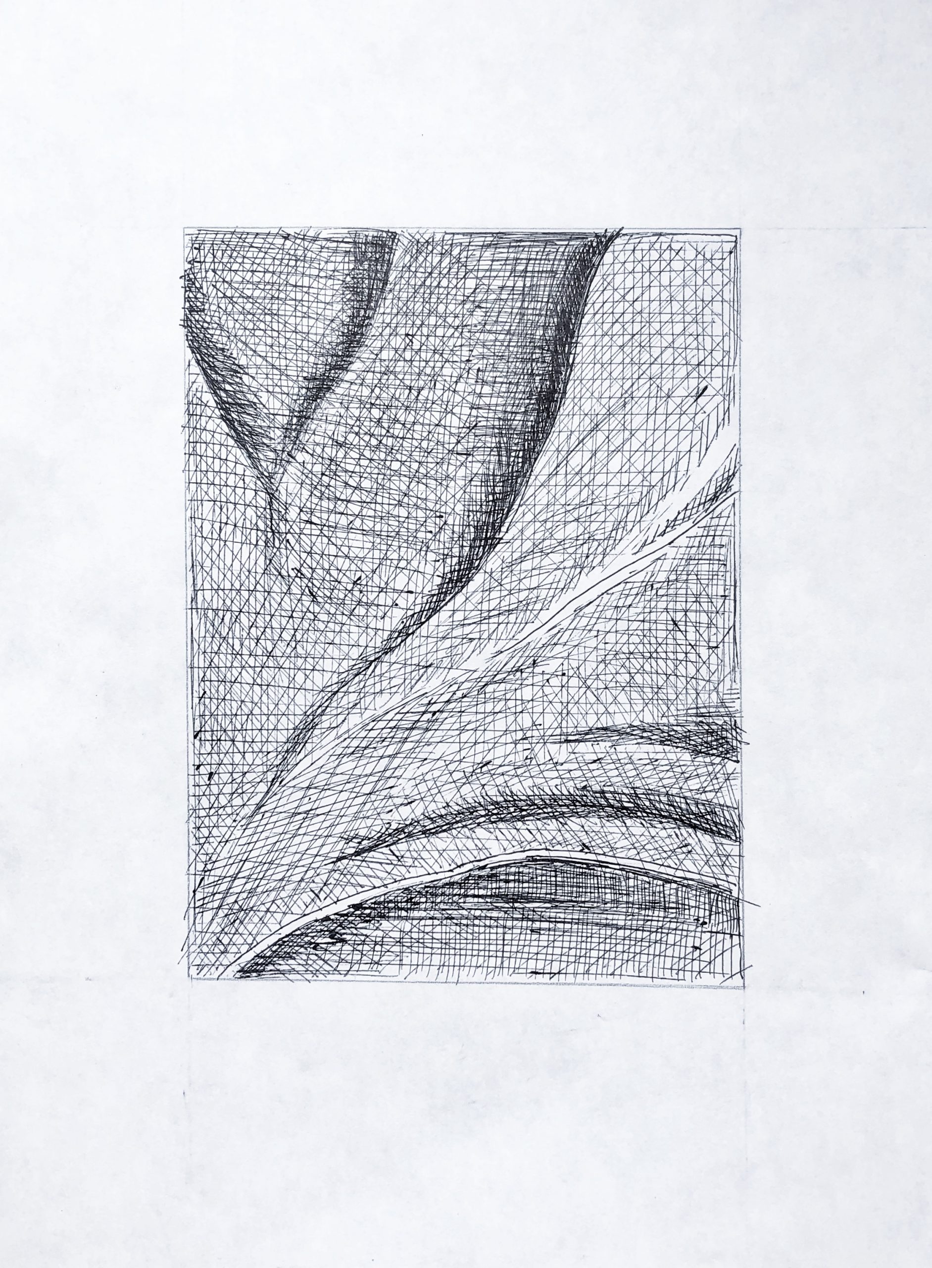 The hatching in the pen drawings is fine, but as before, these need to be several shades darker overall.
Time Capsule drawing
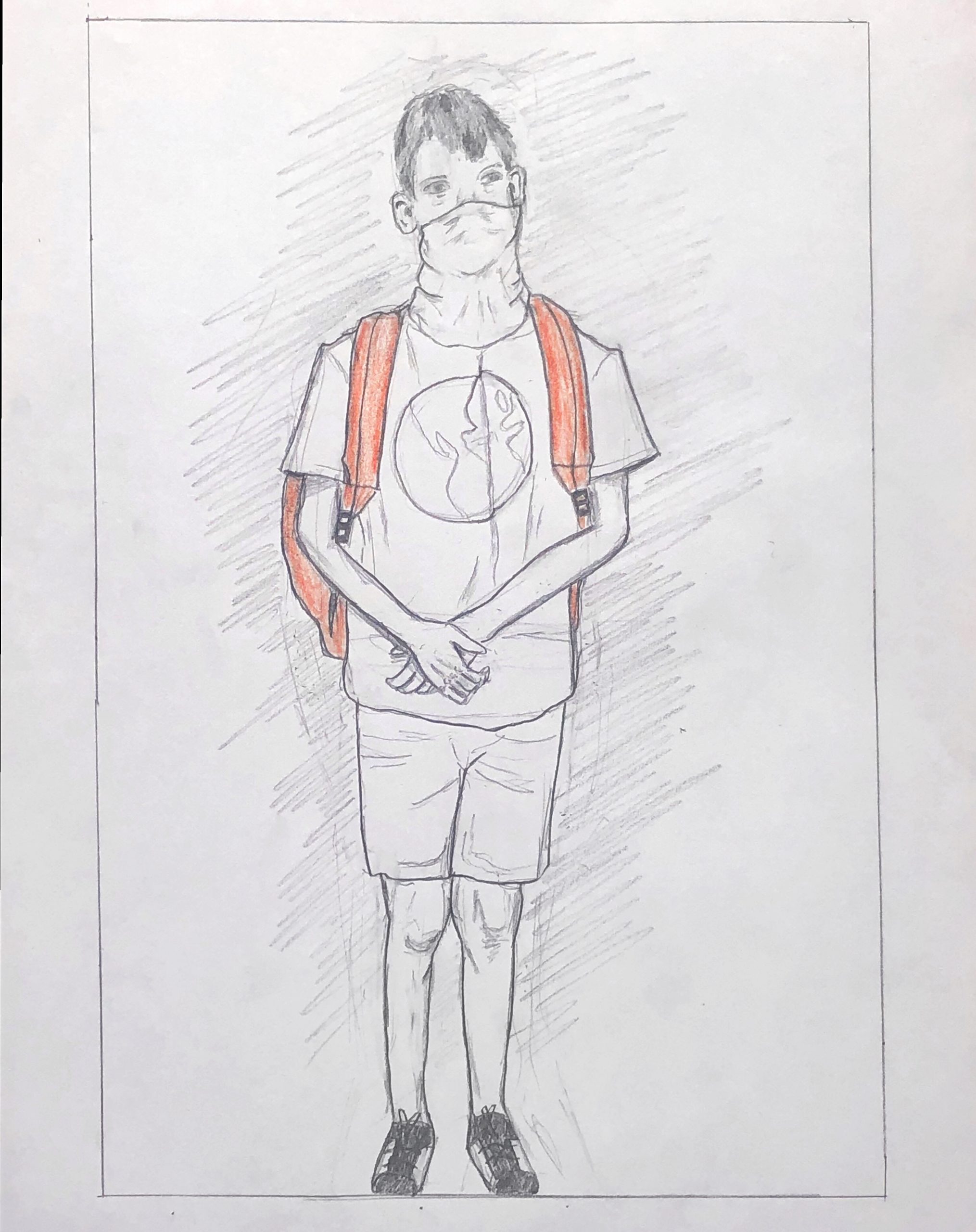
Grace Bilodeau, Pencil, 9×6.5
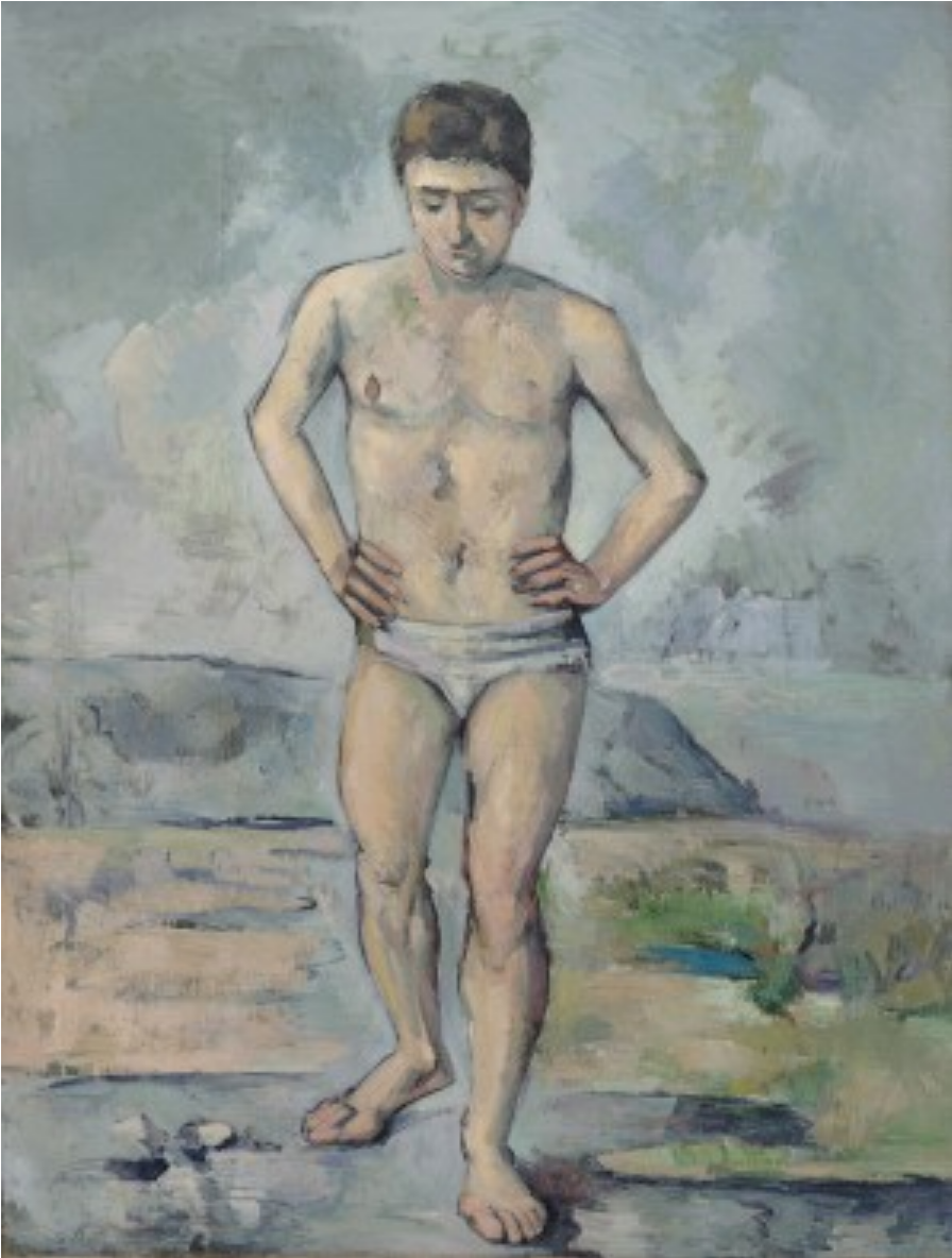 Cezanne, The Bather, 1885
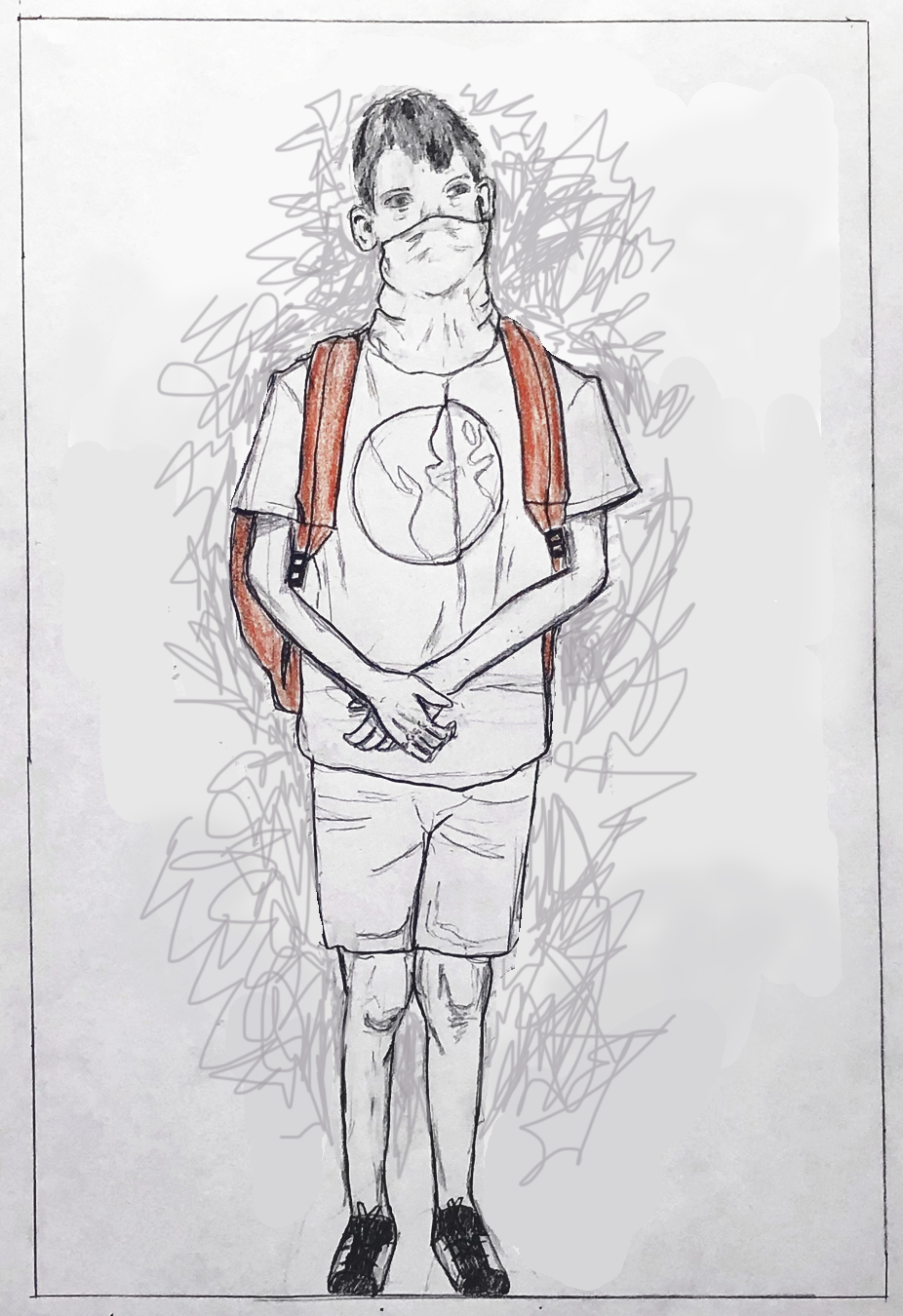
Instead of meaningless background hatching (see my comment to Ian Strudwick about this as well), better to leave it blank…
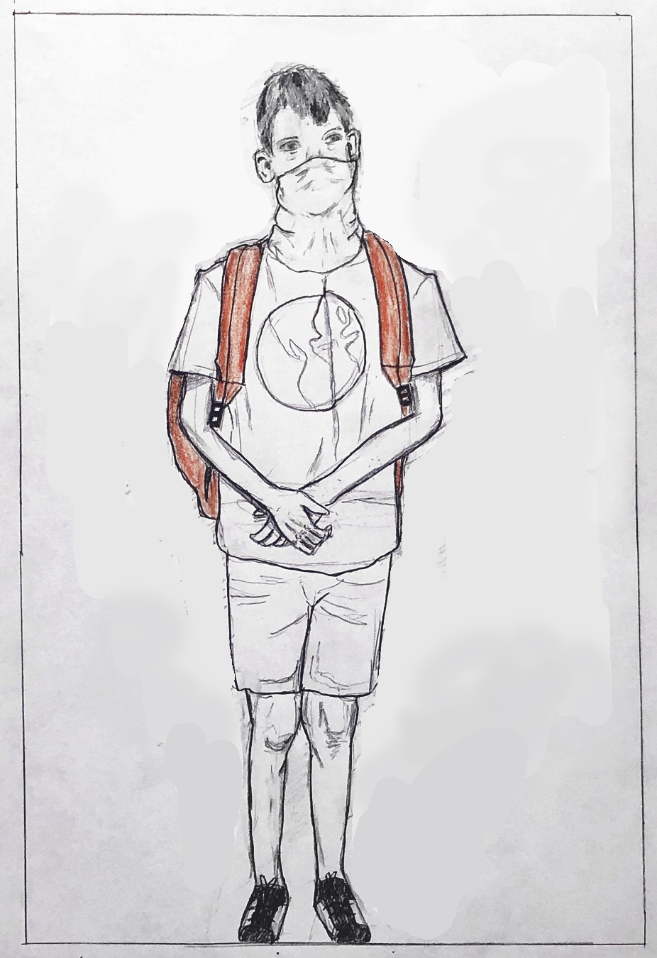
…or, with just a hint of space around the figure (below). I’ve chosen a line that might represent the bottom of a wall, “trapping” him between a wall behind him and the picture plane that you’ve so effectively placed him up against. Remember how Juan Gris used a nameless shape behind the Max Jacob portrait in a similar way.
I’ve set the line at a slight angle to make the space less stable and also since it’s about 90 degrees to the angle of his head, as well as that crease down the center of his shirt; a quiet way to connect the top to the bottom.
I’ve also darkened the exposure, by the way, which I suspect is closer to the original (but I might be wrong). If not, the drawing should be (agreeing with Isaac).

Or, if you prefer an energized field of marks, at least make them “autographic” and not neutral. In this example I tried to pick up on the kind of marks (good ones) I see in the folds of the clothes. Note how they also bristle with a barely contained energy.
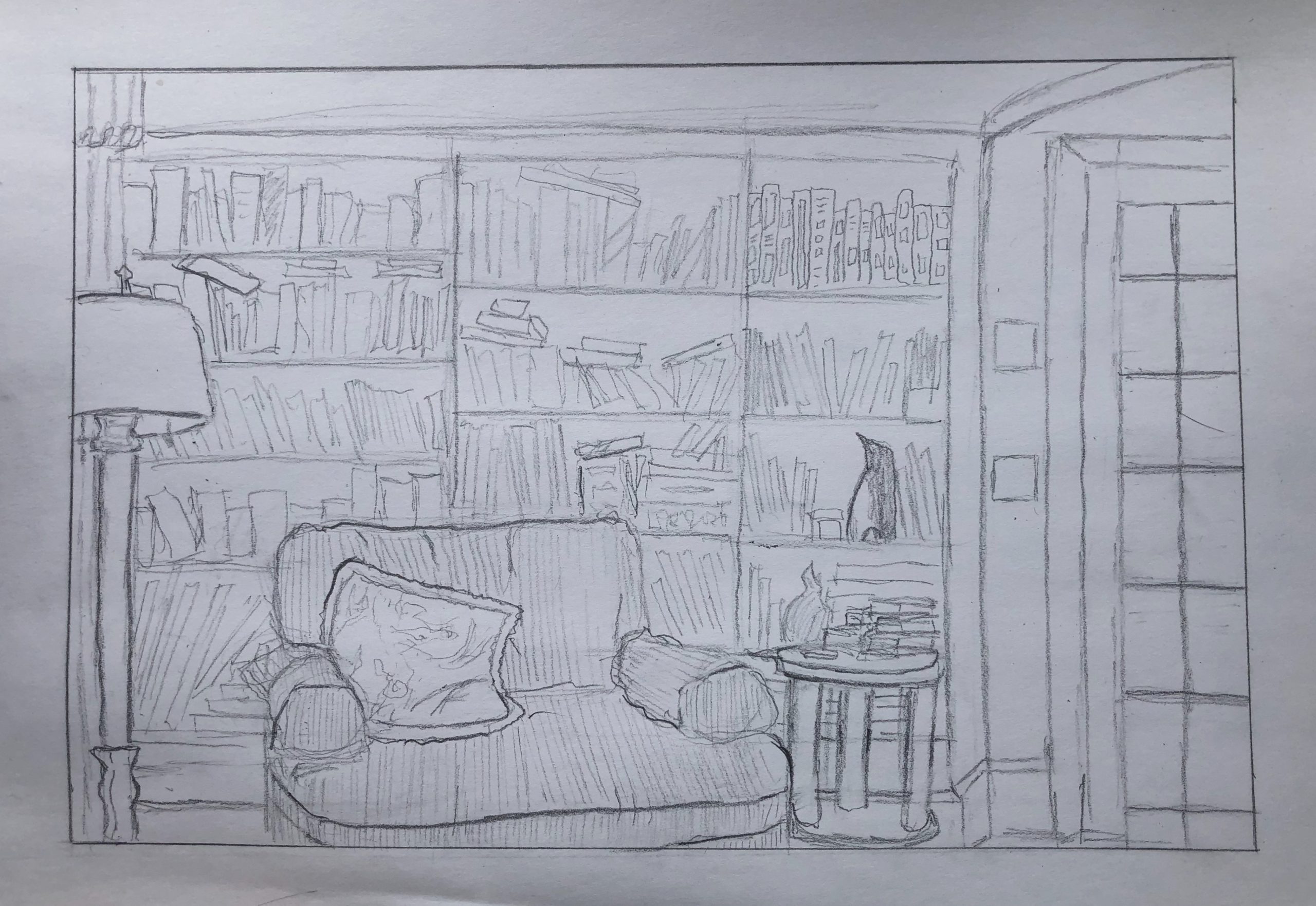
Grace’s Living Room
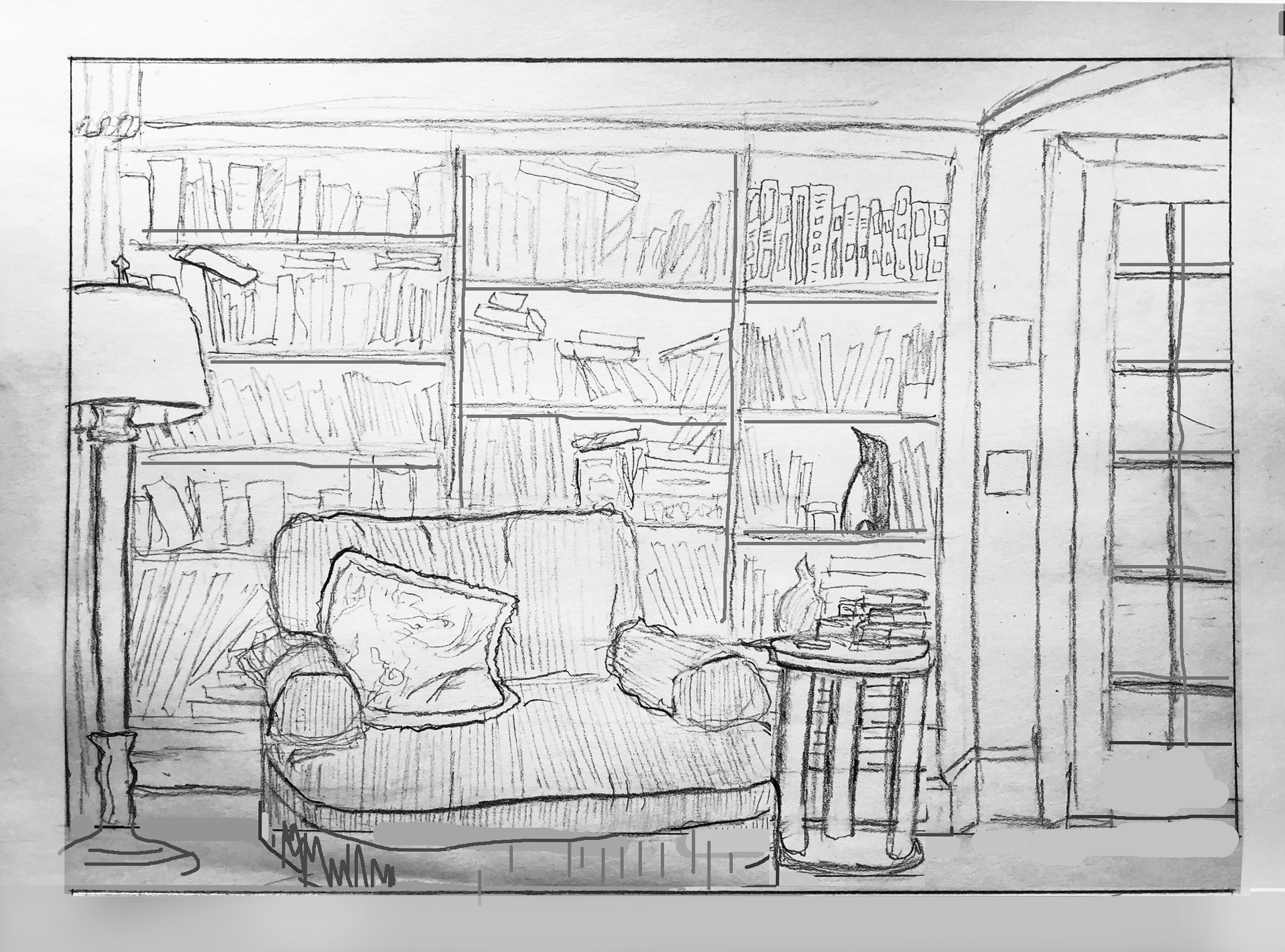
I’ve made some adjustments in Photoshop to show you how the following suggestions would look.
Notes:
Opening up the foreground just a bit more gives a better foundation for the furniture and bookcase and gives the viewer a visual “foothold” in the space.
Bookshelves aren’t paper thin–showing their dimension helps to divide and articulate the space, strengthen the character of the room, and make it more convincing. Likewise the mullions on the French door.
The base of the side table needs to be lower than the baseboard–otherwise it appears to be floating.
Making the base of the side table tangent to the bottom edge inhibits the perception of space; neither in nor out of the picture.
In yours, the bottom of the French door extends well beyond the bottom of the door opening. By correcting it it moves back in space, more unified with the plane of the bookcase.
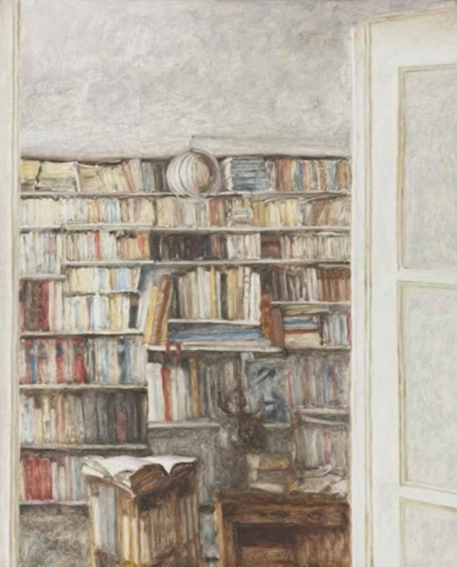 Avigdor Arikha, Books, 1977, Oil on canvas, 39.5 x 31.75 inches
A similar composition by Avigdor Arika (1929-2010). You’ll note he also crops out the floor, but he does it a little higher so that its more decisive and not teetering on a tipping point (i.e., is it in or is it out?). Note too the slight angle of the French door (which happens to be more in the foreground than yours) to urge the eye into the scene. You do this nicely with the top of the door frame in the upper right, but better had it been drawn without a bow in it–oh, unless it’s an arched door opening, in which case that could be more convincing as well.