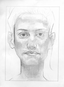
(MW): Beautifully done, Grace, from finding the image on the page to drawing the contours and line qualities with great sensitivity, to your subtle and consistent modeling of values. I’m struck that you think it’s too dark. Some of your mid-tones are maybe on the verge of being too dark but they aren’t, and there are much darker values yet to go in the eye socket on the left, which is such a focal point, under the tip of the nose and at the corners of the mouth.
The eye on our right is just a bit too dark, I’ll grant you that. It appears he went over that area with vertical swipes of his kneaded eraser (judging by their width).
This was a topic in your O’Keeffe as well. You might be overly concerned about going too far and messing up, but you haven’t yet–and until you do you’ll never learn when you’ve crossed the line. But this is much closer to the original than the O’Keeffe–good progress.
Two notable differences about your shading from his—the shadows have much subtler and softer gradations into the adjoining highlights—especially on the cheekbones (there’s a modulation between your lights and the next darker value–a very light grey–that you could still use more effectively)—and you’ve introduced an overall horizontal hatching, as well as his vertical hatching, that I don’t see in the original.
The fact is you do it so well that you’ve made it all your own—a strong unifying texture.
Can’t say enough about the line quality of your contours, however—truly exquisite, and your finest work yet. Every bit as subtle, nuanced, and confident as the original.
Fine work–
One thing that I was worried about going into this project was my ability to find and distinguish the various planes of the face. For example, in my past attempts at drawing faces I have always been unreasonably frustrated with cheekbones. I was never able to reflect the actual angles and appearance that those shadows create. One tip that really helped me from Proko (and actually surprised me with how well I was able to do this) was the simple idea that you should shade the the dark areas first and leave the highlights of the image as what remains. I think the instructional video about the plains of the nose also really helped me, especially when talking about the “Wings” of the nose and how the shadows vary there. I am proud of this drawing, but I do think I over did the shading, as the original that I was copying is overall much lighter in value. I did try the technique of smudging pretty tentatively, but I think in the areas that I did apply it, it turned out alright.
