(MW) Unless this was drawn on grey paper (and let me know if it was), I wanted to give it a better chance to be seen. The exposure above is too dark.
Professor Mark Wethli – Spring 2020
(MW) Unless this was drawn on grey paper (and let me know if it was), I wanted to give it a better chance to be seen. The exposure above is too dark.
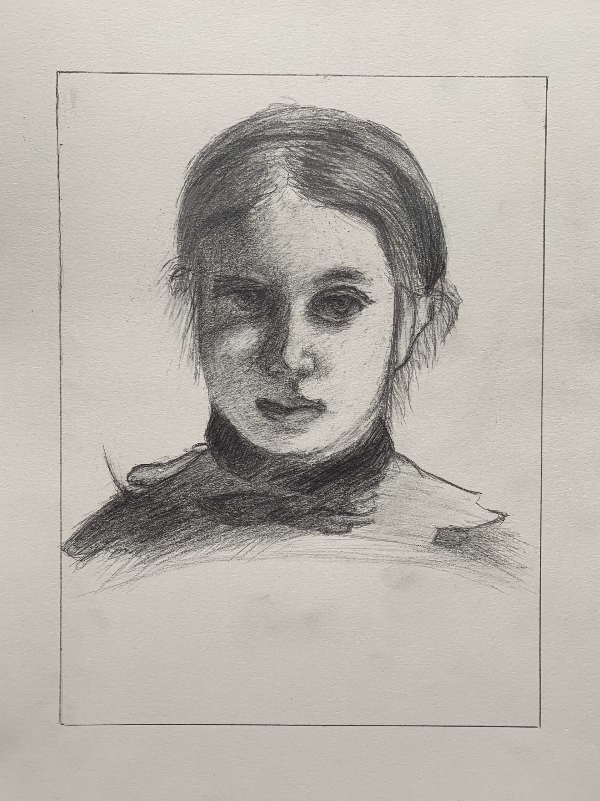
Beautiful drawing, Ian, and a very thorough exploration of the Degas. Curiously, like Ben’s treatment of the same image, your features are oversized. Also like his they’re nevertheless almost physiologically possible, but just a bit too large—those eyes could never fit in those sockets, but it’s a distortion that makes them very expressive. Also very well modeled.
One consequence is that that they take up more than their share of the face, so that the space between the nose and the ear, on our right, should be wider. This is also true because you made the head somewhat too narrow to begin with (the negative space on the left is too wide).
Great exploration of value and of Degas’ touch, including that reflected light on her upper lip. That tells me you were really looking. I commend you for not trying to show us more of the eye on the left than he did—it’s hidden in shadow. Allowing the “whites” of the eye to get the dark is a good example of overcoming a major preconception.
The light on her cheek on our left is a little too light; the shadow on the nostril on our right a little too dark; and the highlight on her lower lip a little too dark, but small matters—nicely done.
Good job on the hair as well, although you’ll notice the lines representing hair disappear in the highlight on his. Don’t be so dogged in reporting all the strands. Note how few of those lines he actually includes.
Good work–
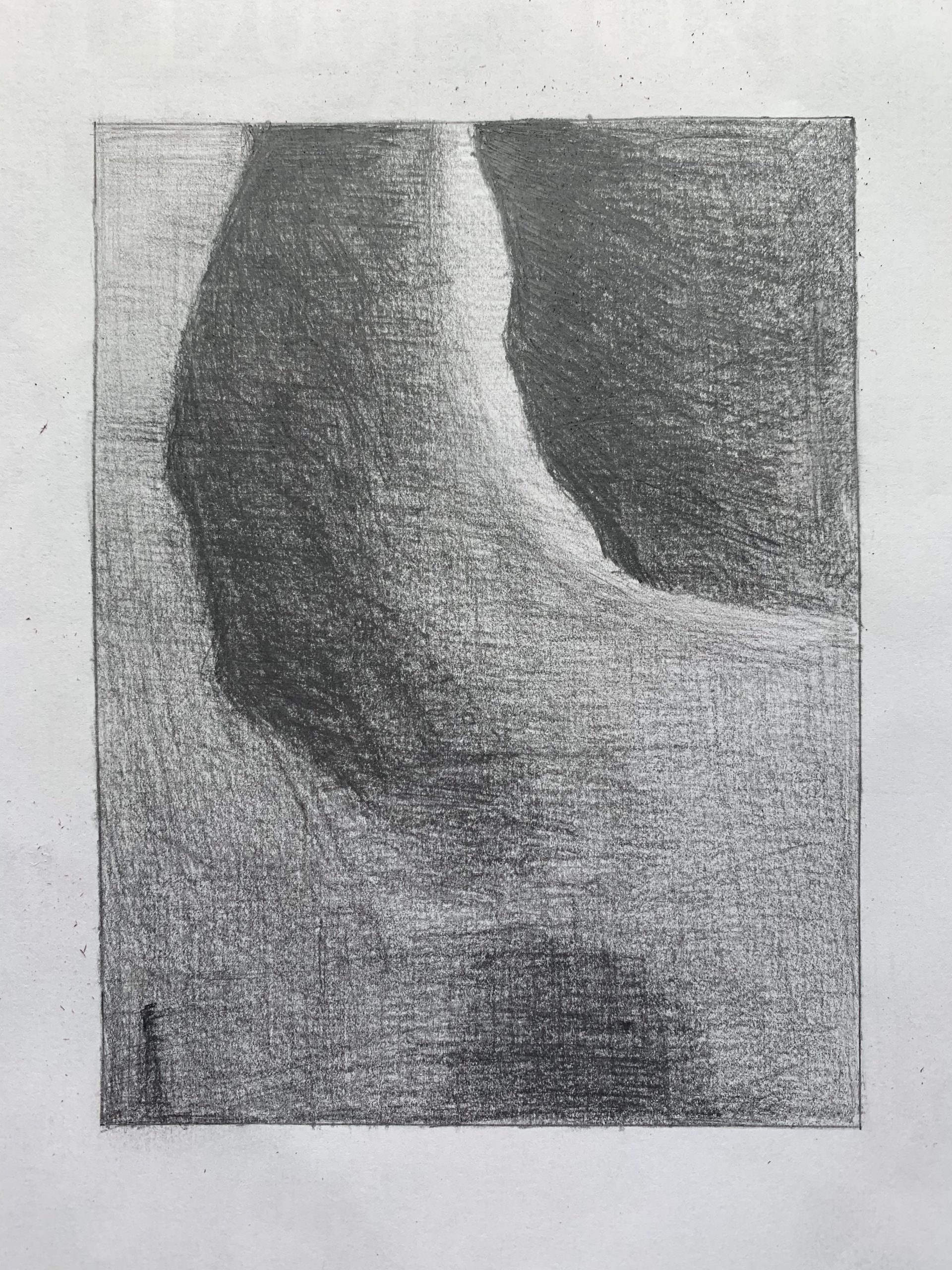
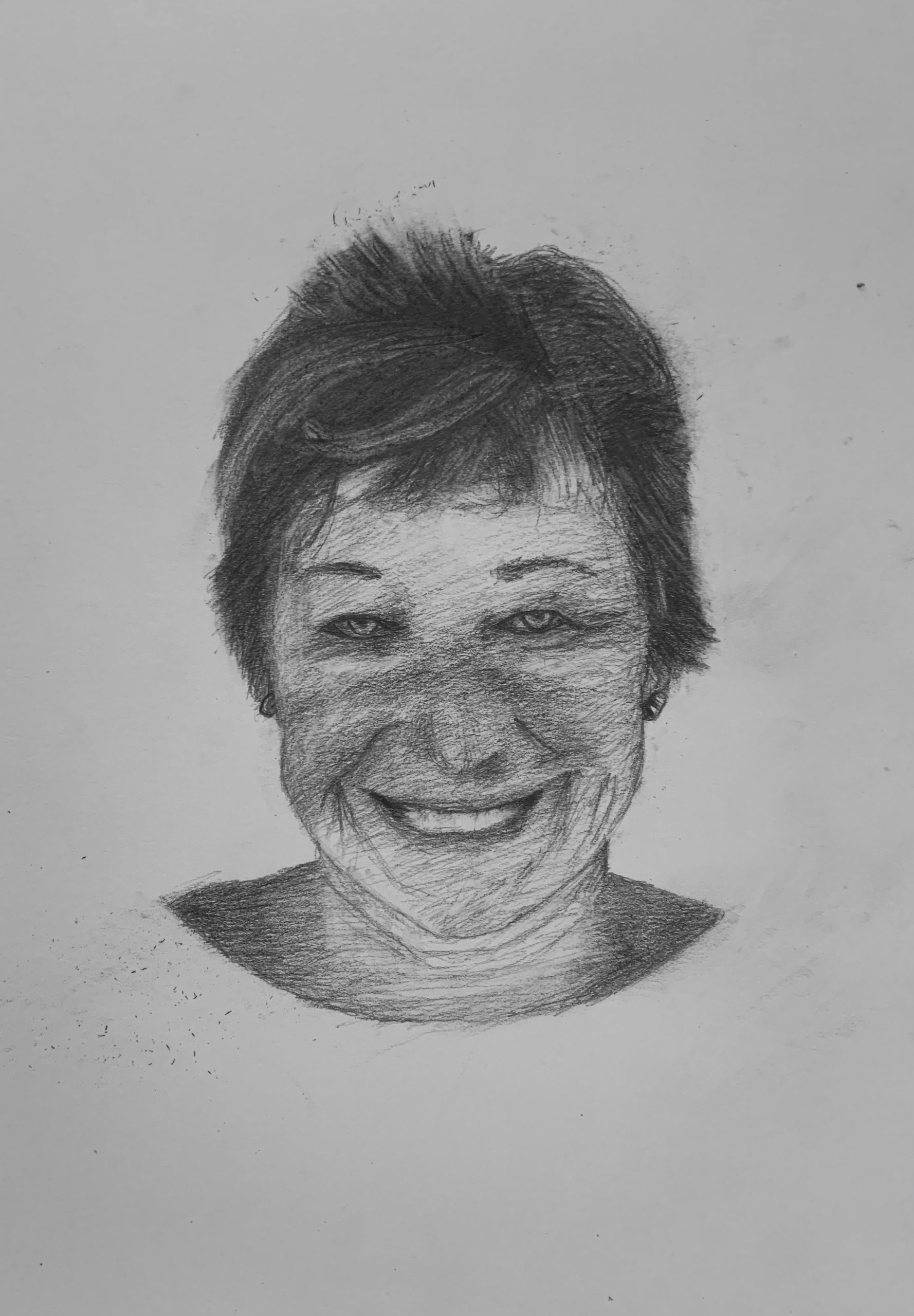
Dark values are fine and the light values are fine (actually, could be a little darker) but the mid-tones (which dominate this section) all need to be darker. That sliver of light in the top center needs to stand out more, as it does in the reference, by having all the other values get darker.
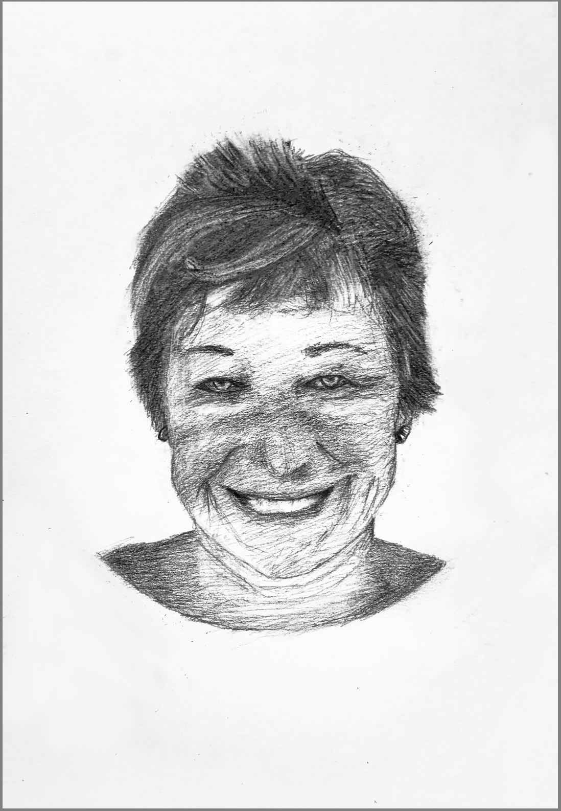
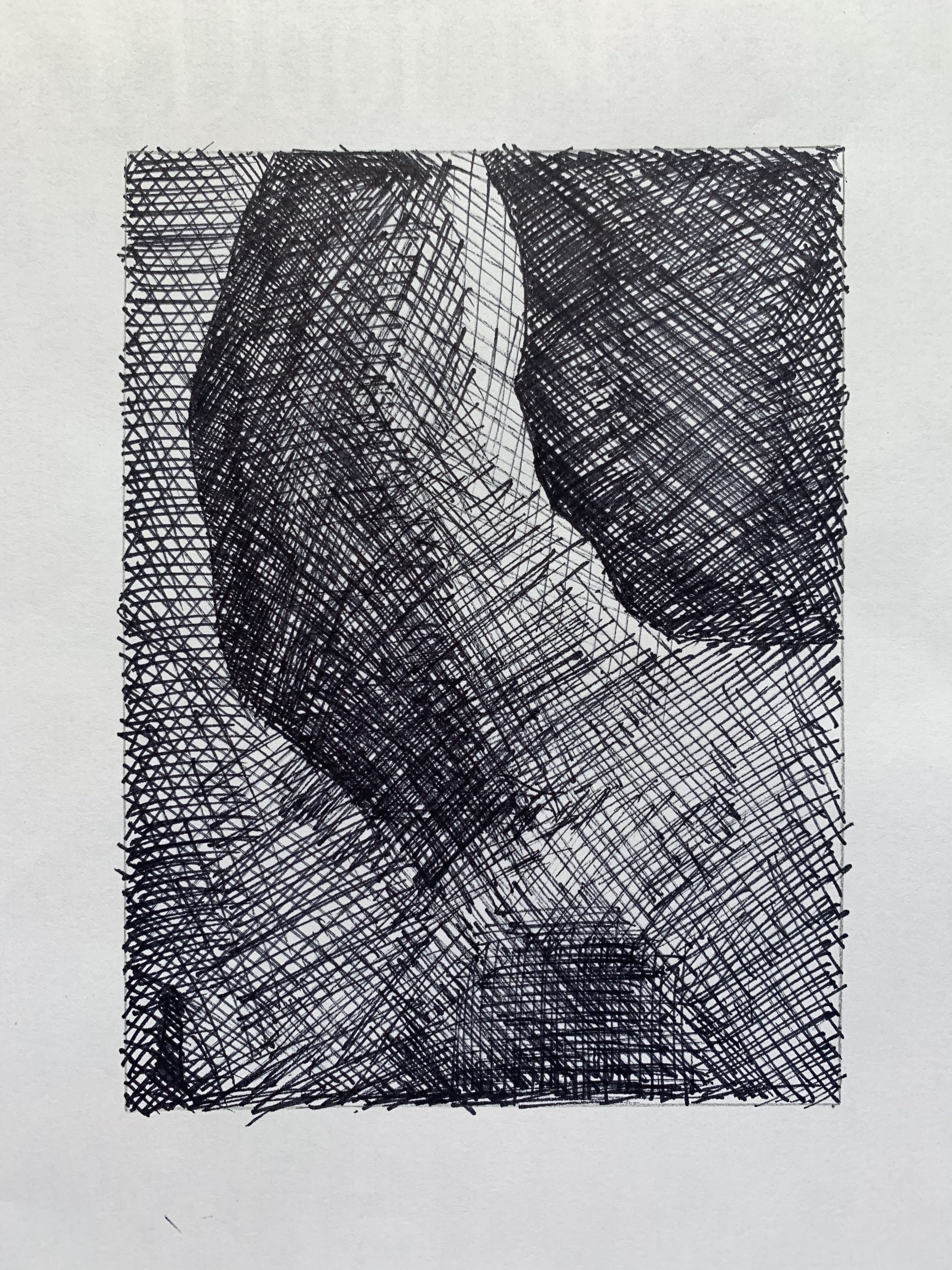 The better of the two of this image, but the midtobe in the lower right quadrant and lower half in general needs to be darker. The tonal shifts in the lower half of this image should be almost imperceptible; you’re bringing them out too much.
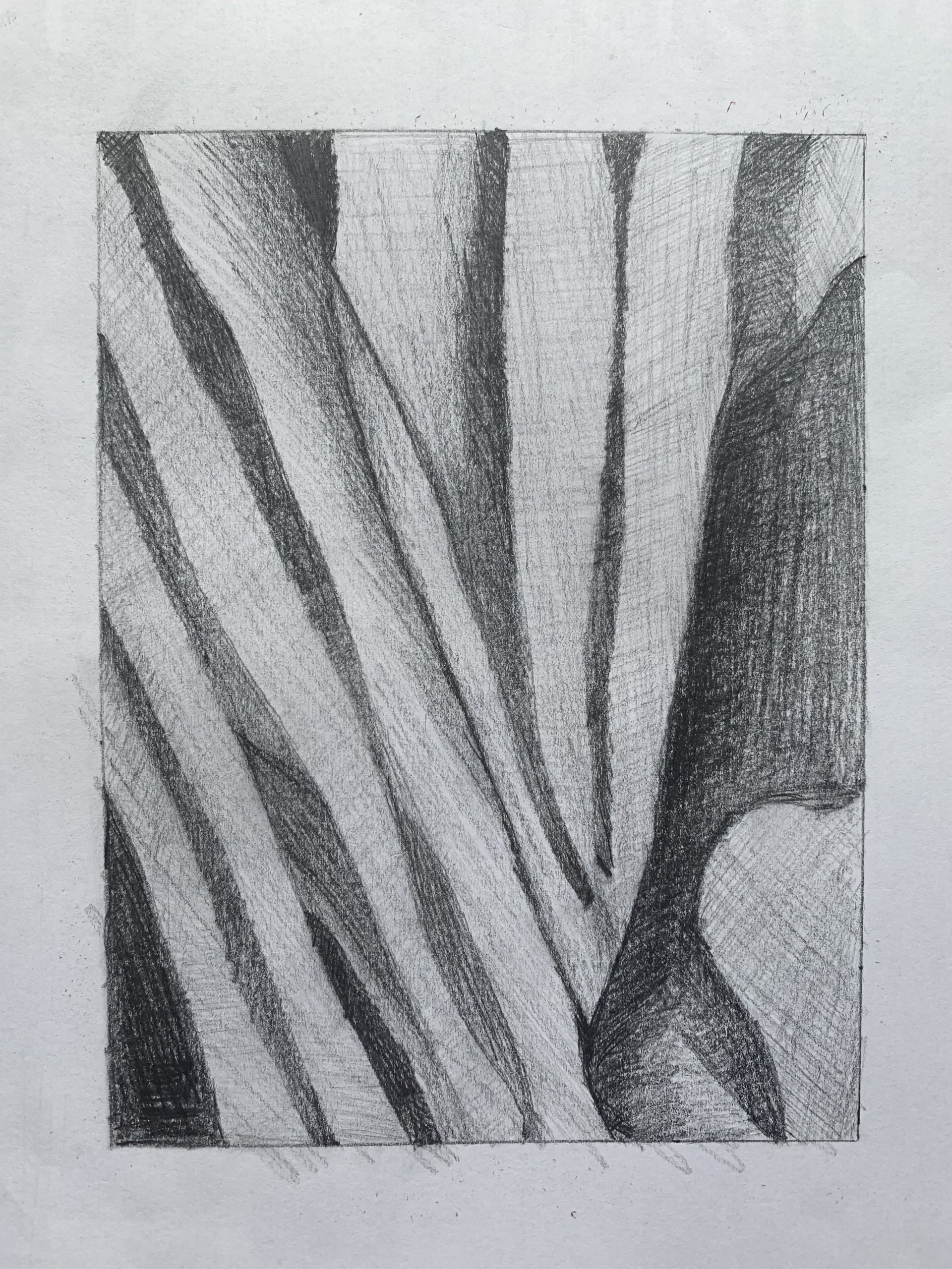
Great configuration but same as above–your mid-tones (which dominate this section) are much too light. Yours are hardly darker than the paper, when almost all of them should be a middle-dark grey. Only a couple of spots that I would describe as a lighter mid-tone. Especially true of those shapes in the lower right, which are much darker.
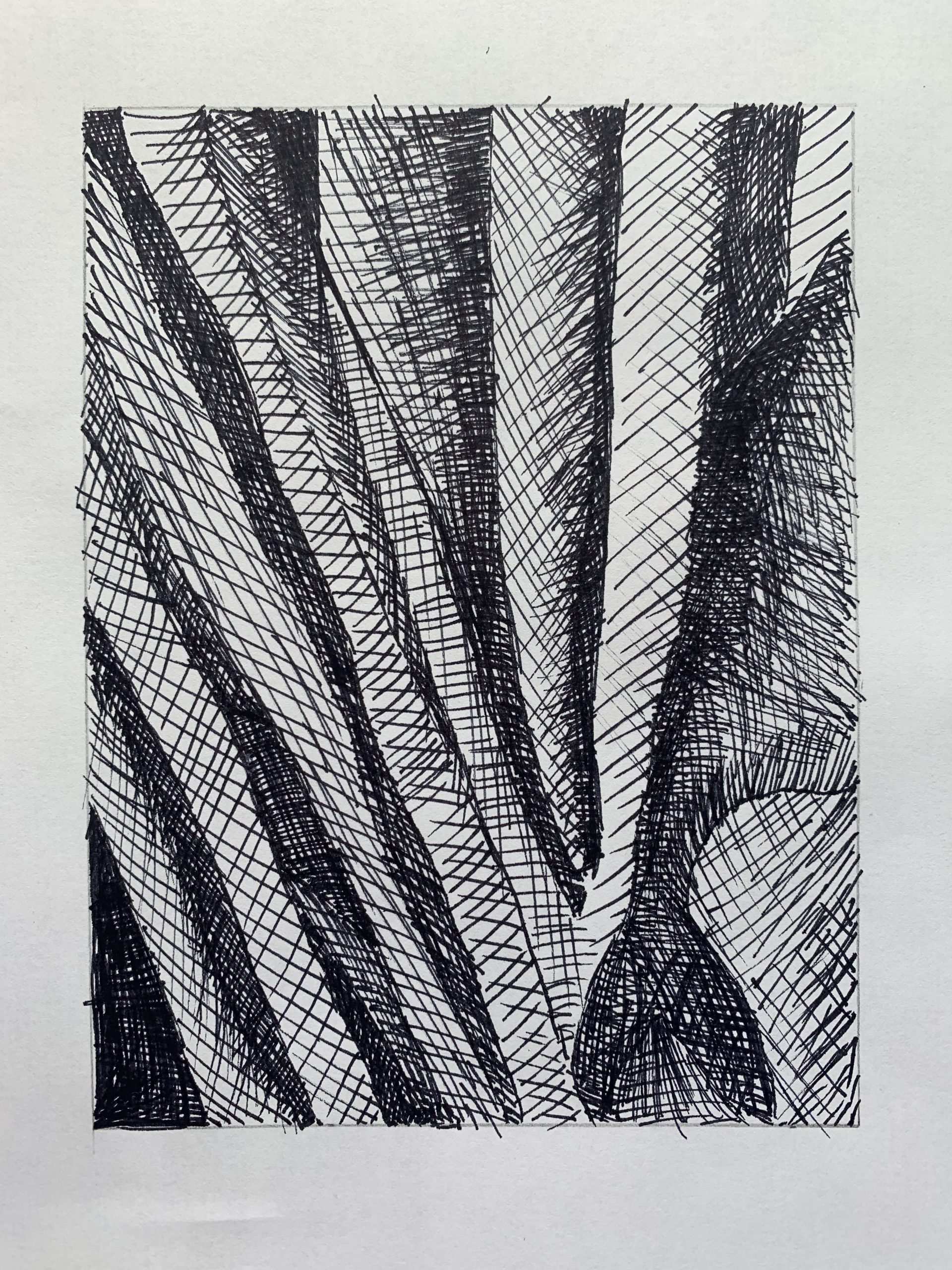
Better value range than the pencil version. Only that lower right shape needs to be darker. The shape at the center right edge also needs to be darker. That section is better in the pencil version.
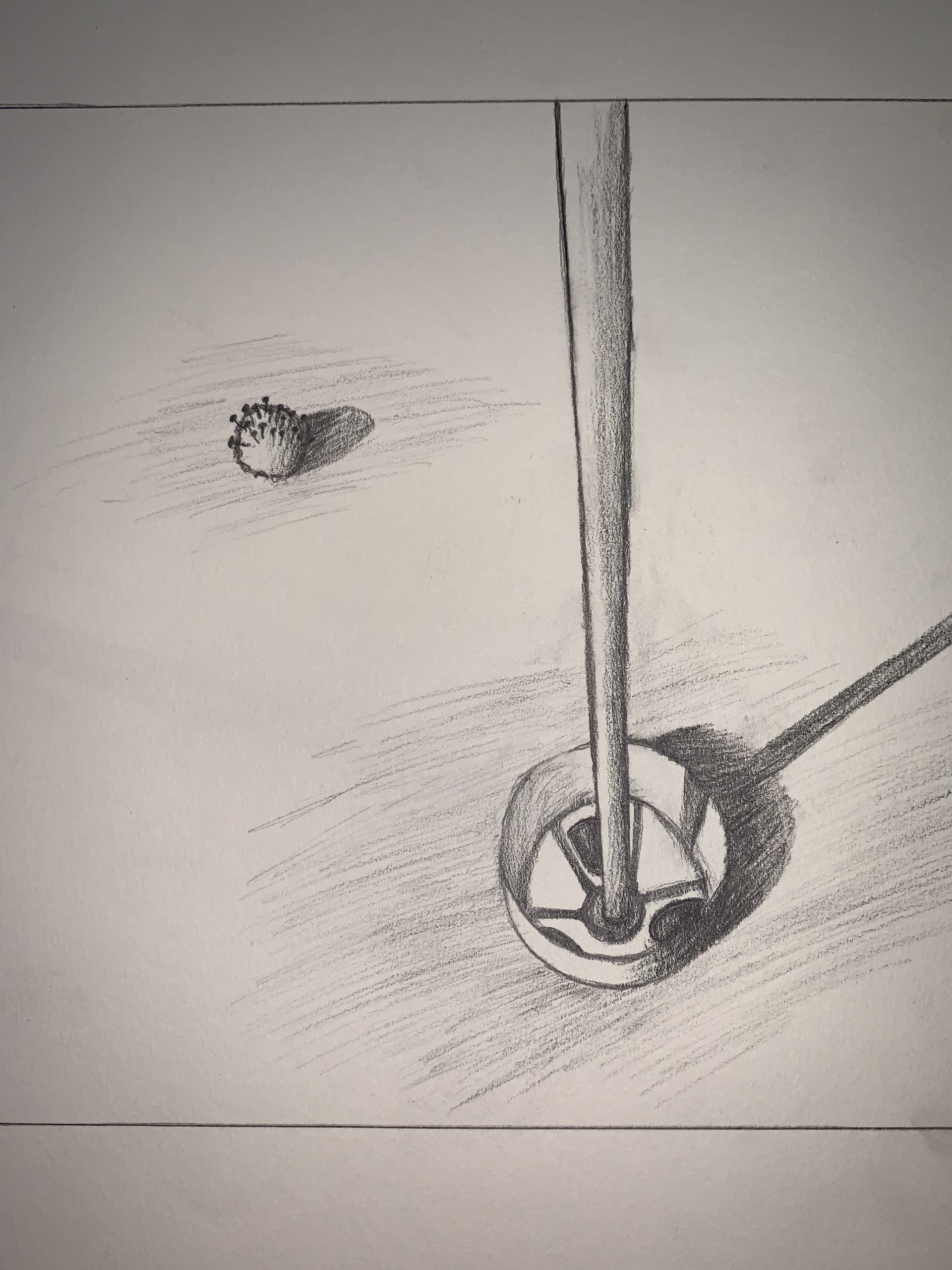
You need to up your game when it comes to photo editing. I don’t know the original, of course, but my guess is that it’s closer to the following (I made all these adjustments in Snapseed using the tools I’ve outlined in my notes here on Blackboard):
I’m also guessing the spaces above and below the image are borders. If so, they don’t work as borders if there are none to the left and right, but start to look like they might be part of the drawing. My guess is that they’re not (so I trimmed them off) but correct me if I’m wrong.
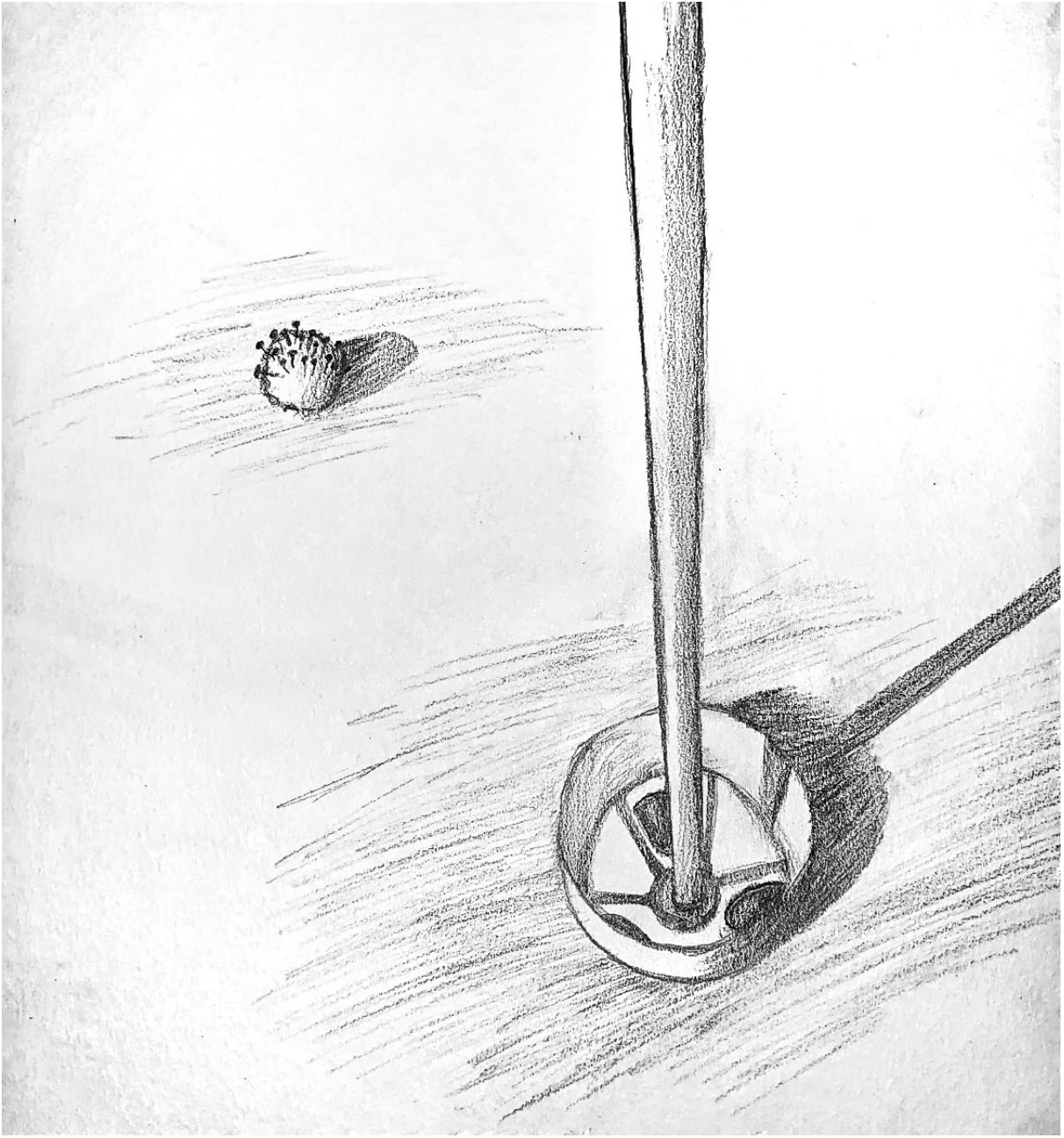
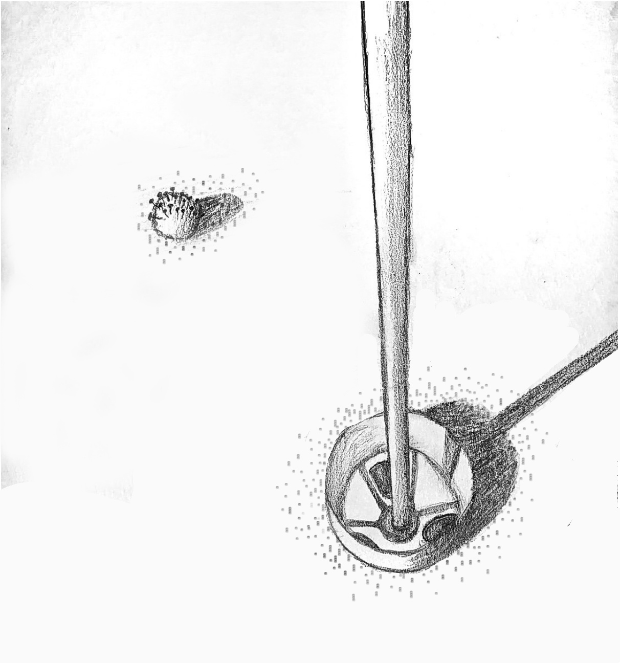
Next suggestion: replace that mindless, all-purpose shading around the ball and the cup with something that says more. I’m suggesting a stipple of dots and dashes that suggest the texture of a putting green. I only did enough to give you the idea, but there could be more (like in yours). You could also replace the hatched shadows (which are fine) with the same texture but darker and denser. The same way you can still see the grass in the shadow this would give a stronger sense of the light falling on the green.
But as an added dividend, the tiny dots look a bit like clouds of germs.
After squaring the image and increasing the contrast:
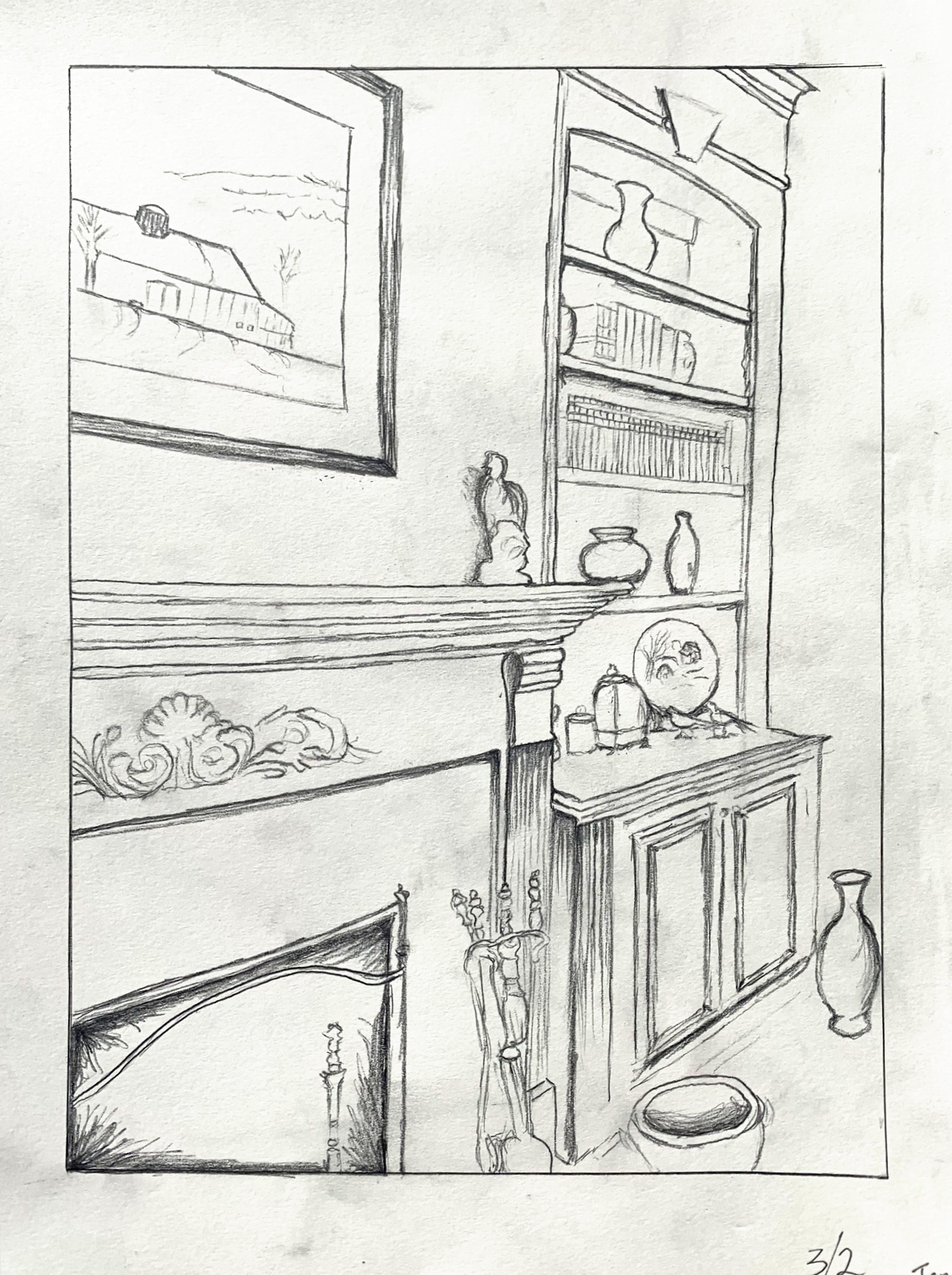
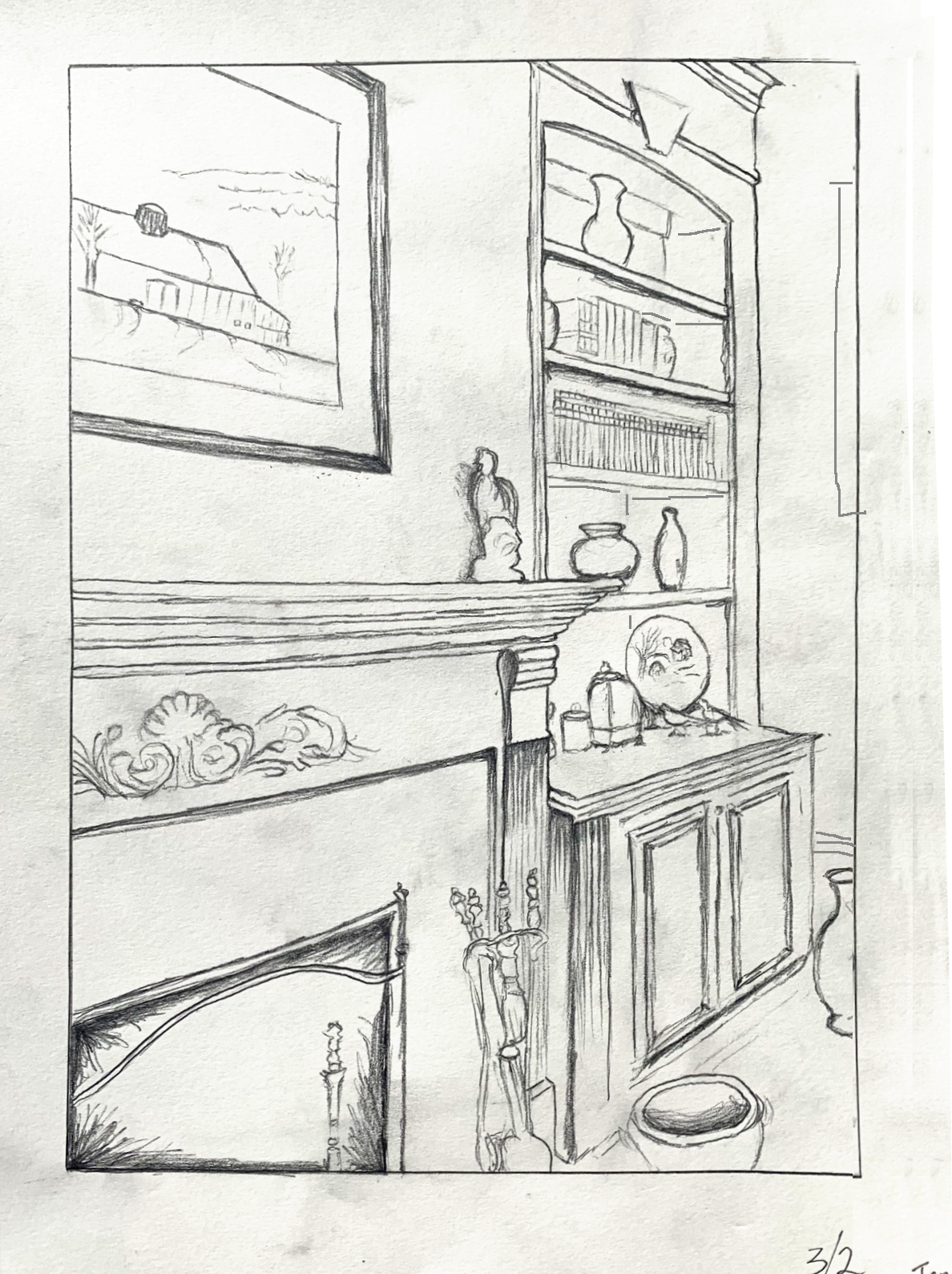
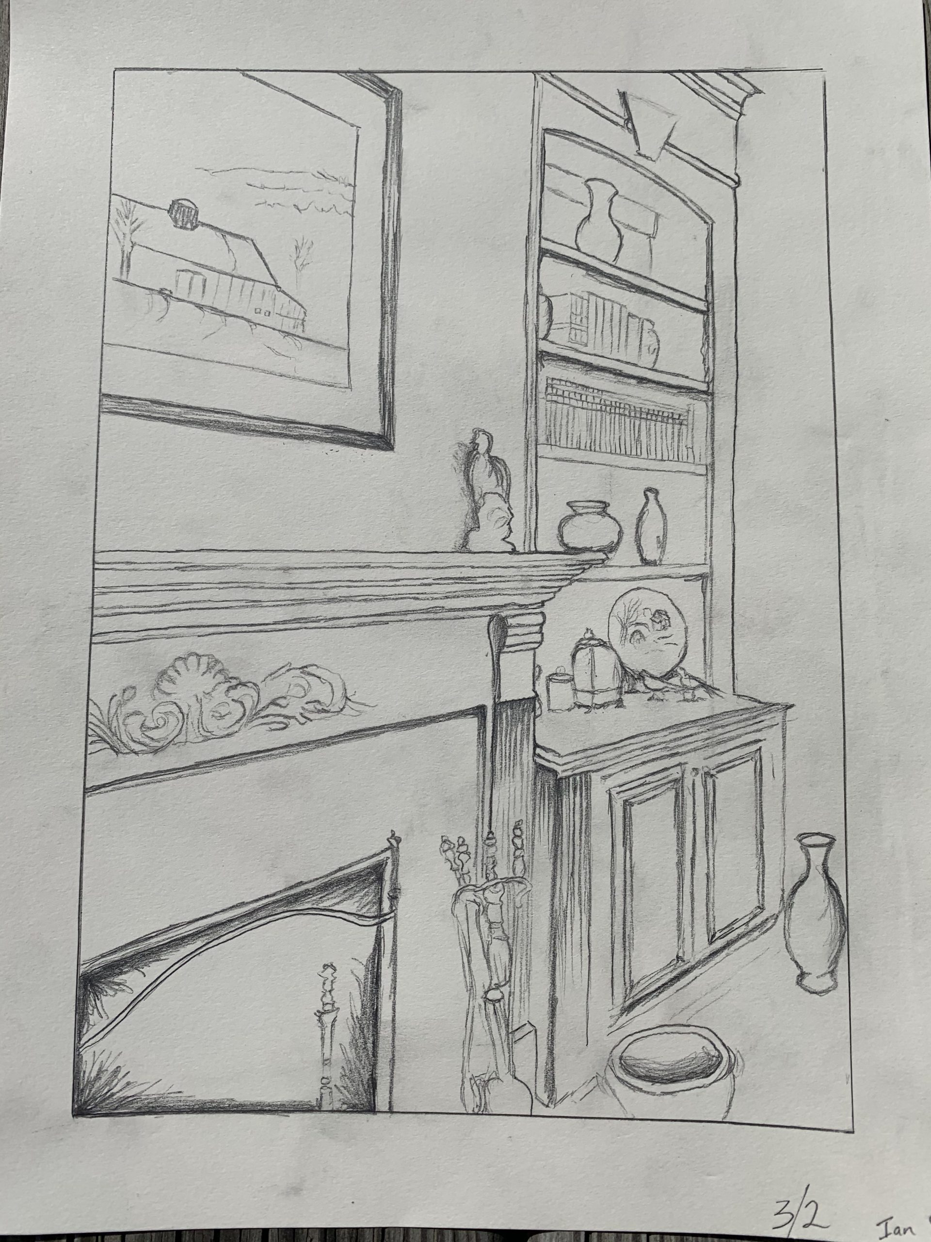
After straightening the verticals, adding perspective lines in the disaplay cabinet, cropping the vase, and adding a baseboard and glimpse of picture frame to the far wall: