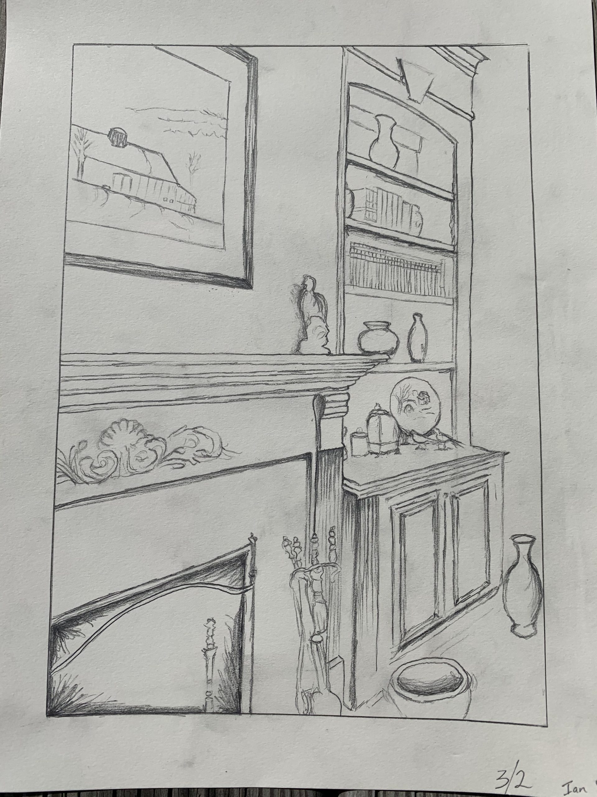
After squaring the image and increasing the contrast:
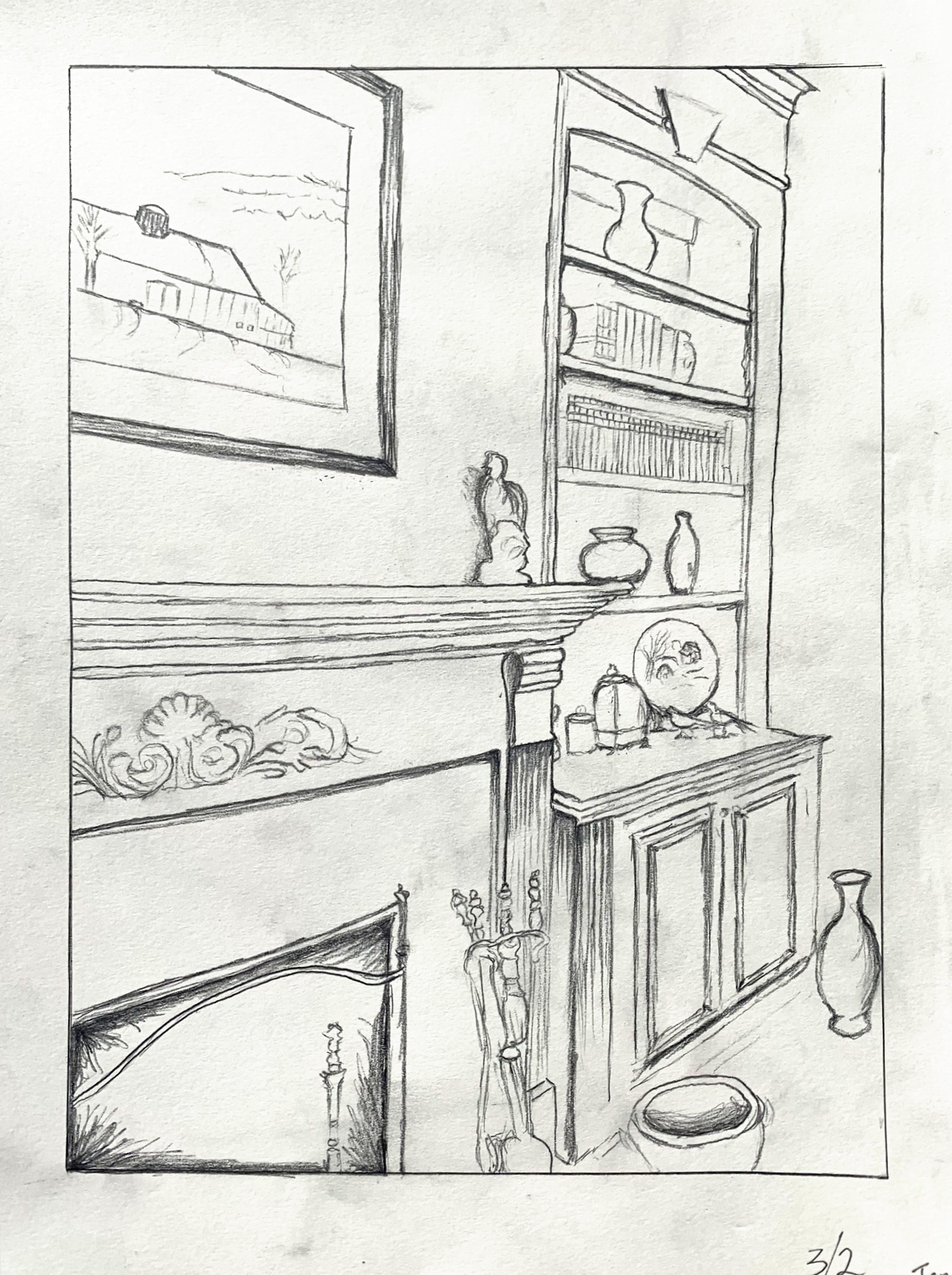
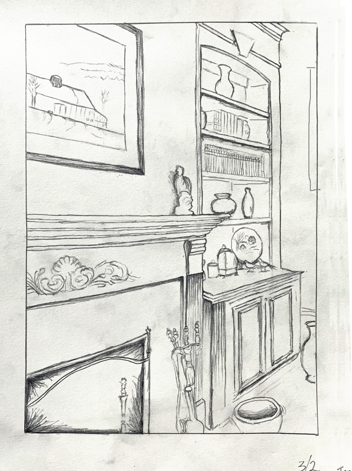
After straightening the verticals, adding perspective lines in the disaplay cabinet, cropping the vase, and adding a baseboard and glimpse of picture frame to the far wall:
Professor Mark Wethli – Spring 2020
After squaring the image and increasing the contrast:
After straightening the verticals, adding perspective lines in the disaplay cabinet, cropping the vase, and adding a baseboard and glimpse of picture frame to the far wall:
You must be logged in to post a comment.
The hardest part of this drawing assignment, to my surprise, was deciding exactly where and what I wanted to draw. Once I started a drawing, I immediately began to struggle to fully capture the details of the architecture in my home. After feeling as though I captured the proper angles in the drawing, I finally began to go further into detail by including some shading and depth. In general I am very happy with how the perspective aspects of the piece turned out but still feel as though I can create a much better sense of depth and volume. Certain minuscule details within the decorative pieces in my living room were very hard to capture but felt as though I gave my best effort.
Hi Ian! I think this is a really great perspective drawing. The detail on the mantle and the far bookcase is really impressive to me. I can really see the depth of the room and imagine the design details of the room. I think that your “best effort” on the details in your living room was a good one! I can really see the small pottery and the statue on the mantle. I think the light shading you used is effective, as I can really see the depth of the fireplace and the basket on the ground. The shading behind the mantle statue is really great. I don’t have much to critique, I think this is great drawing of where you are. Maybe just one thing is that the vase in the bottom right kind of looks like its floating, if you carried the baseboard line all the way down the wall, maybe it would anchor it more. Great job!
Sorry for the delay! I agree with Hannah, that you did a great job with this drawing. I particularly admire how you used dark lines that quickly fade to represent the varying light on the grooves in the mantle. I wish I used that technique in the drawing I did of windows in my room, as it is much gentler on the eye than completely drawing each line. I think the details on the cupboard-like area (in the lower right corner) could be lightened more to emphasize atmospheric perspective/ depth. I also think darkening the lines on the mantle that are coming towards us (doppler effect) would help add depth. I admire that the fireplace is darkened to help bring it forward and establish it as the darkest area in the drawing. Compositionally, I think this is also a wonderful drawing because of the repetition of nestled rectangles that create unity in the piece. A suggestion for the composition is to move the right border more to the right to avoid tangency with the vase. Other than that, this is great!
Hi Ian,
My apologies for the slow turnaround on this comment. Getting this week’s assignment out eclipsed my time for comments–just catching up.
First, you need better photography and editing. At the very least square up the image, but your contrast could be better as well. Please work on this for next week (I haven’t seen your Time Capsule yet).
Also take care to keep your work neater and smudge-free.
Great comments by Hannah and Aadhya. I agree with Hannah about anchoring the floating vase and adding the baseboard detail. I also agree with Aadhya’s comment about the vase being tangent (Rule #1: NO TANGENCIES, especially with the border). You can see in my annotated version of the drawing I’ve addressed both, as well as the need for stauncher verticals so that image doesn’t seem to wilt to the right; exacerbated by the fact that there’s nothing on the far wall to arrest that movement. In my sketch I’ve added a make-believe picture frame to identify that space as a plane (a wall).
I agree that your attention to the details of the room is winning. I also commend the progression of elipses from the vessel in front of the fireplace to the vase at the far right. Nicely done.
The objects in the display case could use more of this constancy, and the case itself would have some useful perspective lines as well. As is, it has the odd effect that someone has made a painting of a display case in that spot–an odd combination of appearing flat and in perspective at the same time: like the framed artwork over the mantle.
But very strong perspective and detailing over all.