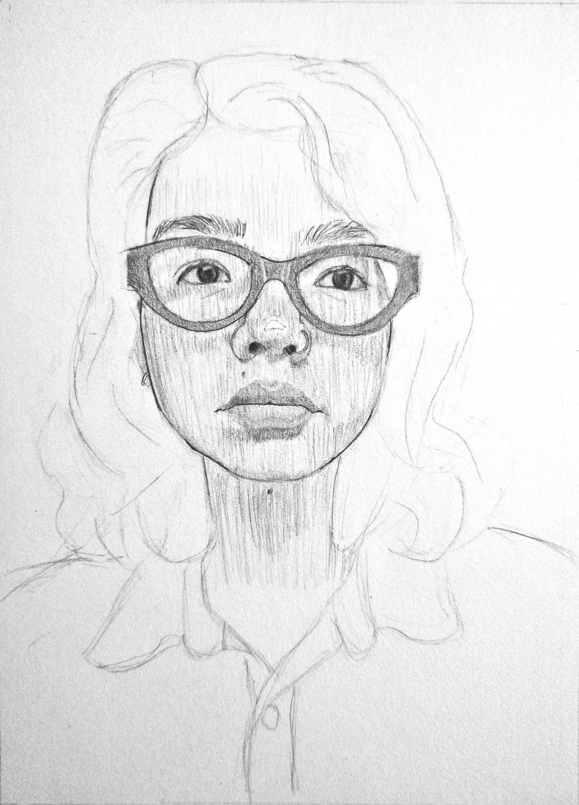
I had a lot of difficulty fighting my preconceptions about what my face looked like in order to draw myself. It definitely helped to flip the paper and photo to compare, which I remembered to do a bit late into the process (the eye area was the most frustrating part). My head is oh so slightly tilted down to the right which made it hard to align features. I still think the eye area (glasses included) looks a bit wonky and I’ve just noticed that my head doesn’t seem to be tilted enough to match up with the orientation of my features. However, I’m pretty happy with the contrast I was able to achieve through value and I had a lot of fun trying to emulate H. Craig Hanna’s style from the master portrait.
This is some great work Amanda! There is a lot of really impressive features that you were able to create with this drawing, in particular the lips, the hair, and the eyebrows. I think you aren’t giving yourself enough credit for the eyes. From the looks of it, the yes may be too spaced apart, but for the most part I think this is some very impressive work and it is definitely clear that your head and eyes are tilted in the same direction, looking out to your left. I’m unsure if this way your intention, or if you ran out of time, but I think some sort of shading in the hair would bring the drawing to life a bit more, making it appear more realistic. The way you have it now certainly works, but I think that would compliment the portrait even more.
Amanda I love this portrait! I think it is beautifully done. The nose you have drawn is spectacular. The highlight on the tip and the shadows surrounding it really give it dimension. I also especially like you choice of composition. The dark glasses in the center of the face create a focal point that the viewer immediately looks at, but that dark value is then balanced by the fading of the rest of the body. The contrast between the detailed face and the contour/sketchy lines of the hair and shirt make this drawing so interesting to look at. The shading for the lips doesn’t have any harsh demarcations and that makes them look all the more real. I think you could have added more shading of different angles, but it looks great as is too!
I had a lot of difficulty fighting my preconceptions about what my face looked like in order to draw myself. It definitely helped to flip the paper and photo to compare, which I remembered to do a bit late into the process (the eye area was the most frustrating part). My head is oh so slightly tilted down to the right which made it hard to align features. I still think the eye area (glasses included) looks a bit wonky and I’ve just noticed that my head doesn’t seem to be tilted enough to match up with the orientation of my features. However, I’m pretty happy with the contrast I was able to achieve through value and I had a lot of fun trying to emulate H. Craig Hanna’s style from the master portrait.
Also my forehead is too big.
This is some great work Amanda! There is a lot of really impressive features that you were able to create with this drawing, in particular the lips, the hair, and the eyebrows. I think you aren’t giving yourself enough credit for the eyes. From the looks of it, the yes may be too spaced apart, but for the most part I think this is some very impressive work and it is definitely clear that your head and eyes are tilted in the same direction, looking out to your left. I’m unsure if this way your intention, or if you ran out of time, but I think some sort of shading in the hair would bring the drawing to life a bit more, making it appear more realistic. The way you have it now certainly works, but I think that would compliment the portrait even more.
Amanda I love this portrait! I think it is beautifully done. The nose you have drawn is spectacular. The highlight on the tip and the shadows surrounding it really give it dimension. I also especially like you choice of composition. The dark glasses in the center of the face create a focal point that the viewer immediately looks at, but that dark value is then balanced by the fading of the rest of the body. The contrast between the detailed face and the contour/sketchy lines of the hair and shirt make this drawing so interesting to look at. The shading for the lips doesn’t have any harsh demarcations and that makes them look all the more real. I think you could have added more shading of different angles, but it looks great as is too!