Author: Ben Kiritsy '23
Portraiture Prep
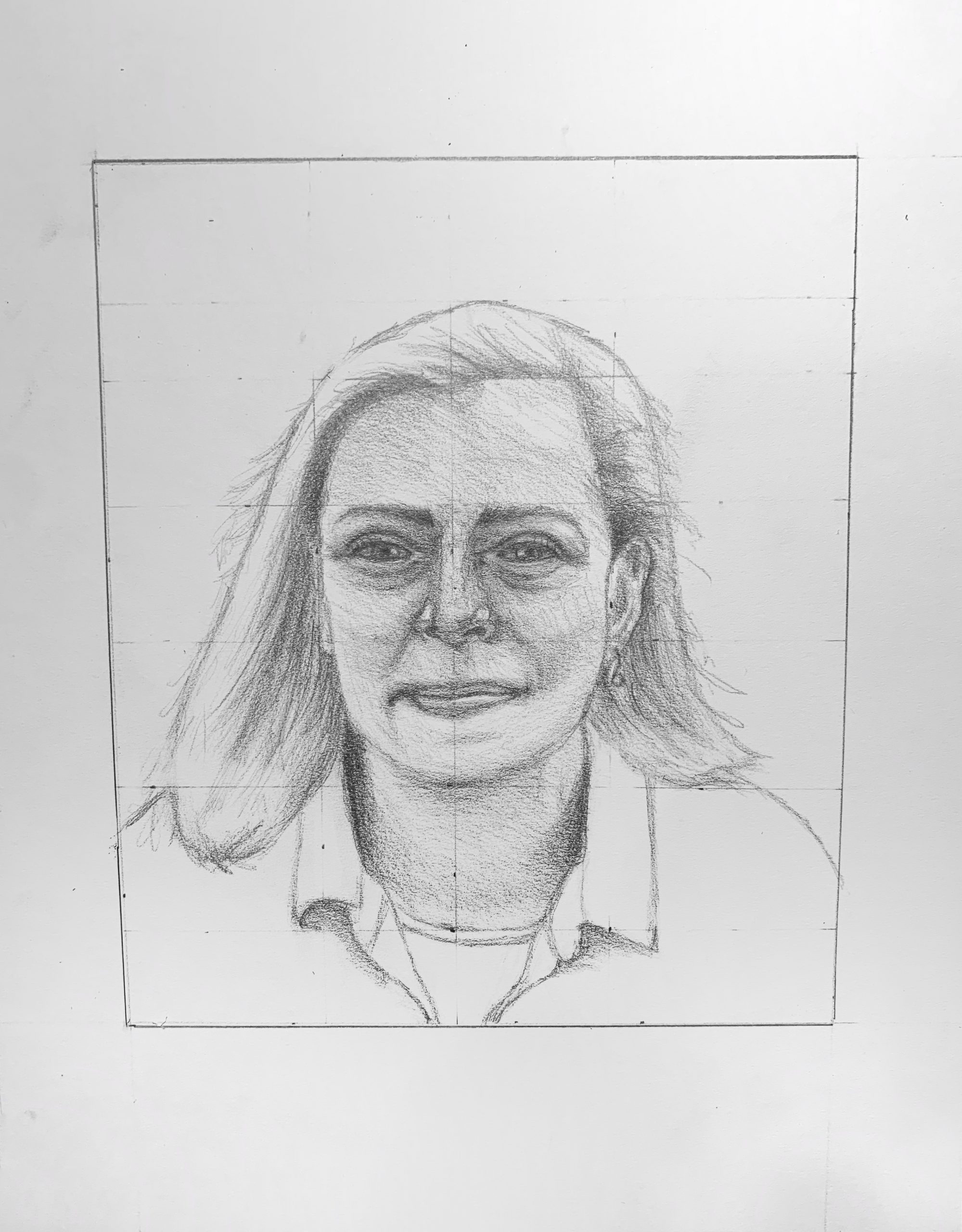
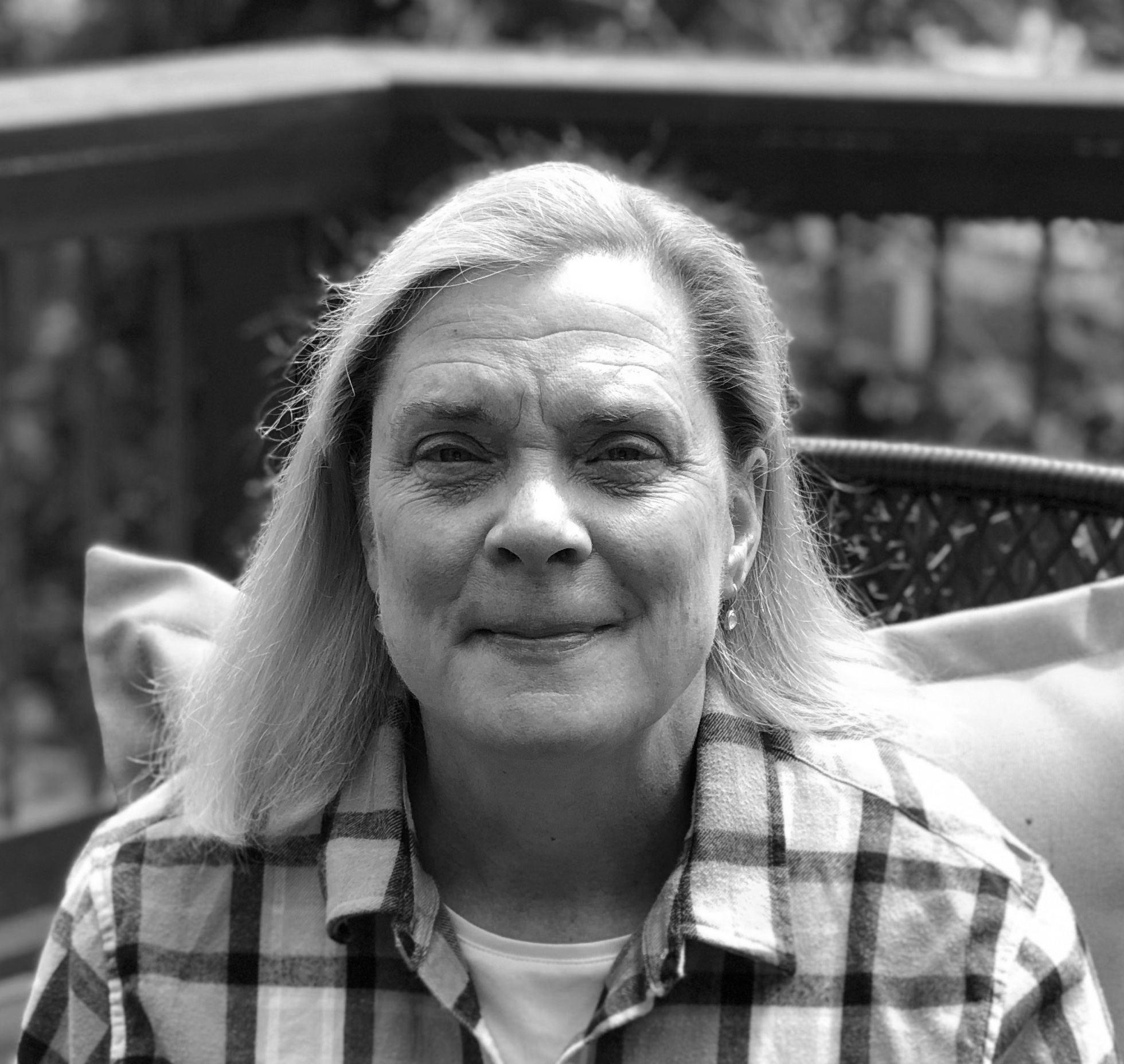
Good work overall, Ben, notably the lovely texture and subtle value gradations you’ve achieved with the side of your pencil (I assume). Just a few notes:
Your features are all too large, something that needed to be ironed out in the schematic. Because you’ve done this uniformly you still have an almost physiologically plausible portrait, but the eyes are impossibly oversized (if very expressively so) for those eye sockets.
Nevertheless, the eyes are very well drawn, including the less defined and slightly obscure eye on our left. The eye on our right is missing a tear duct, and the distinctive shape it imparts to that part of the eye.
The edge of the shadow on the bridge of the nose is too firm—that’s a softer gradation—and that shadow is a bit too dark.
The mouth is beautifully and very sensitively drawn—including that delicate reflected light on the upper lip—gorgeous—but it’s overall much too large, as mentioned earlier.
The modeling on the chin and her profile on our left are too dark and absolute-they should be subtler.
The contour of the ear on our right is lighter and thinner, to help it go back.
The strands of hair and whatever that is on her shoulder, as well as the contour of her shoulder on our right, need to be lighter and more delicate.
Great job on the hair, but the shadows on the hair are the same or darker than the shadows on the face.
Despite the above, many important achievement here. Just stay with the schematic longer until all is in order.
Team Value
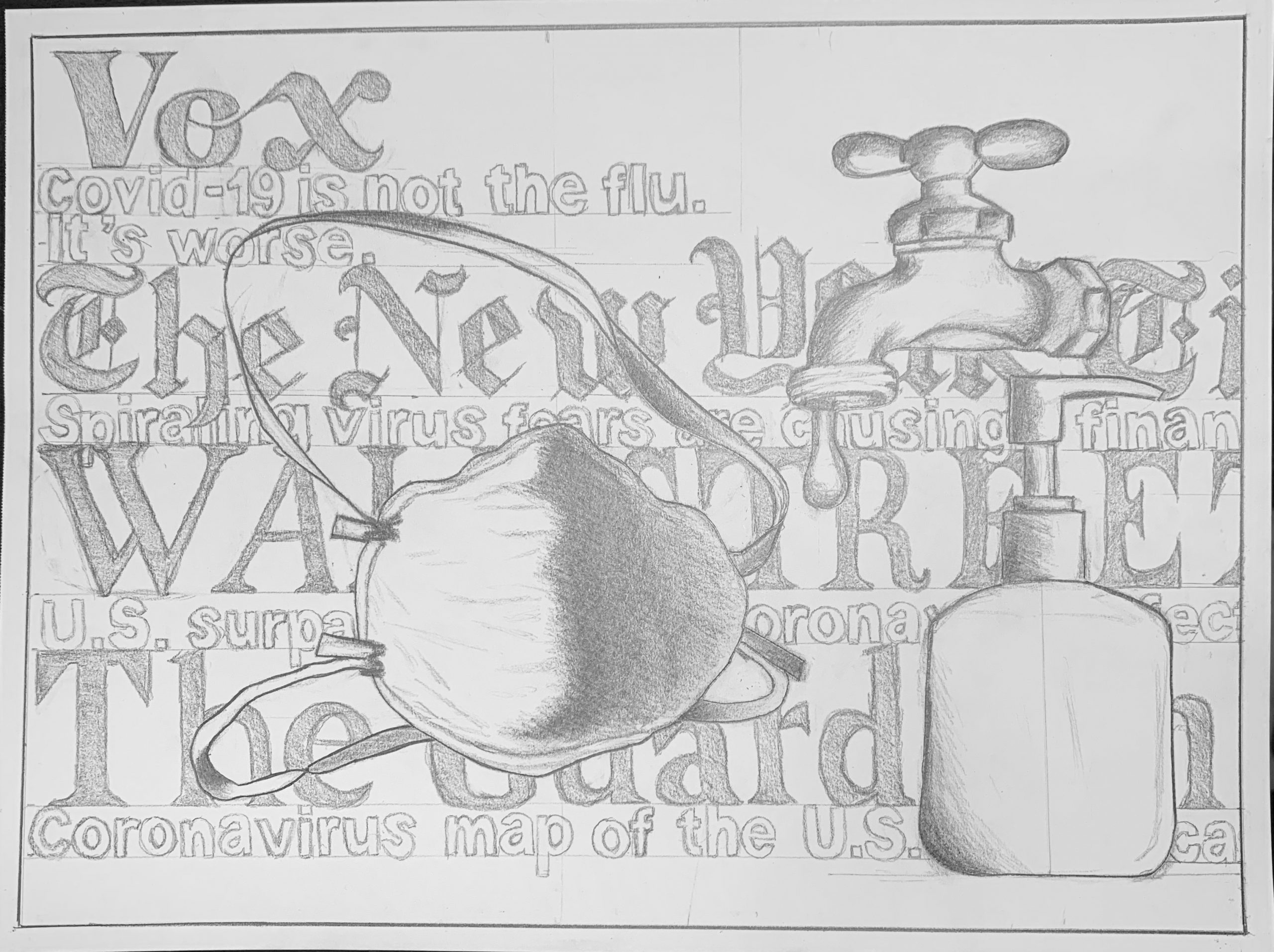
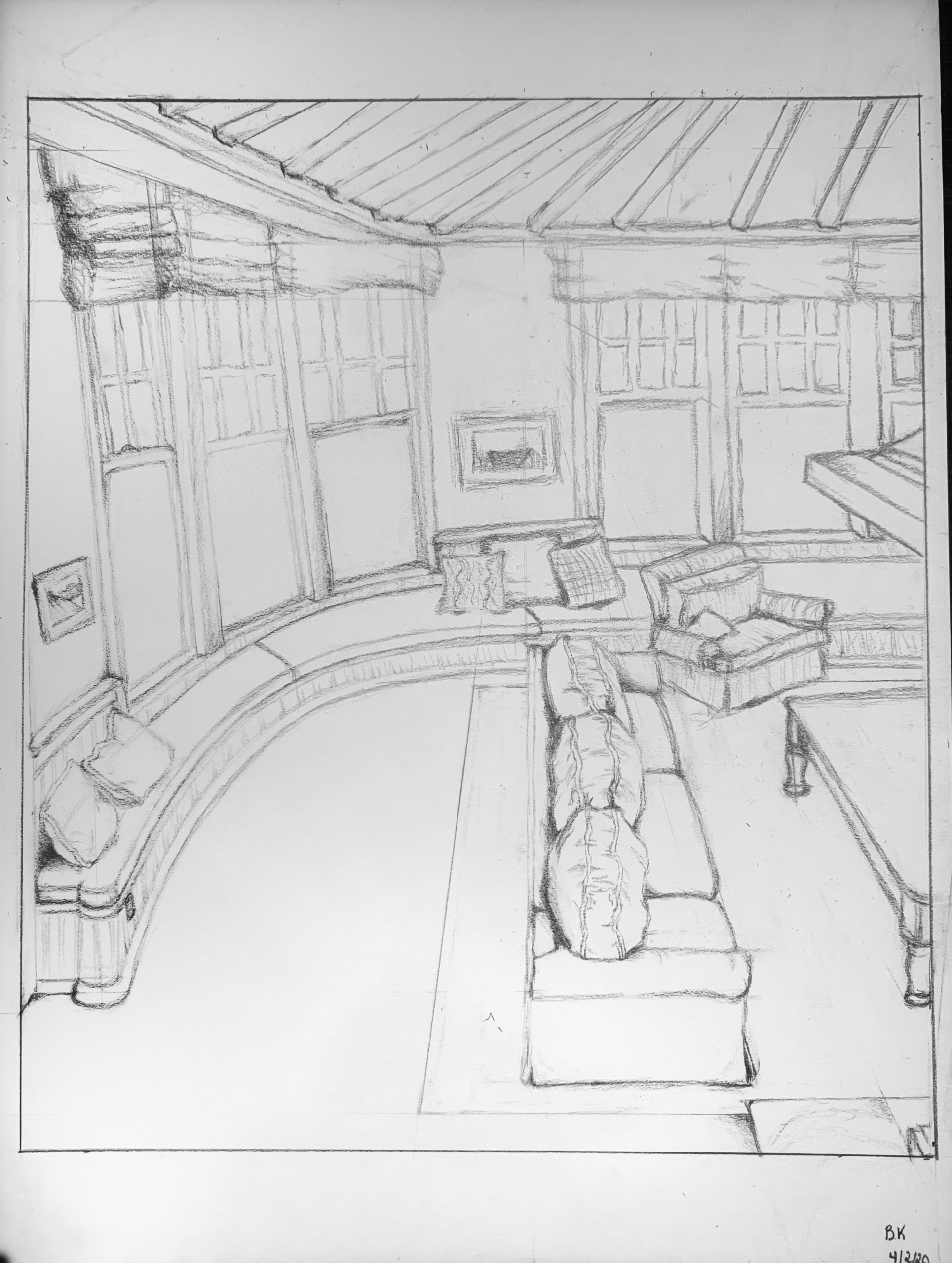
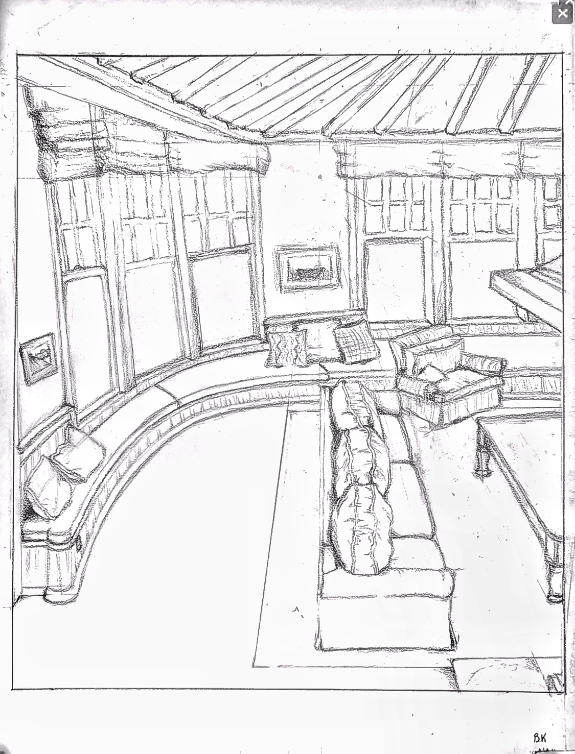
Ben Time Capsule