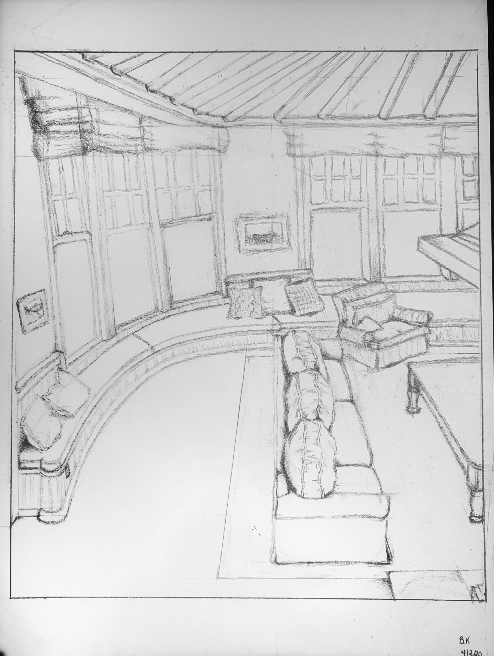
I enjoyed this project because I liked trying to replicate an area of my home that I spend a lot of time in and that brings me a lot of joy. I definitely tried to challenge myself by picking a curved room, and I am proud of the end result, although I think it could be better with more practice. I also left out a few details because I was not sure if I could have incorporated them well enough, and I am contemplating whether that was the right decision. Personally, I feel like the picture of the drawing doesn’t do the original justice. I am curious if other people in the class feel the same way, or maybe I just need to work on my photo editing skills?
Hi Ben,
1) First, I wanted to say that I like the composition of this drawing. The couch divides the composition into two halves. I’d especially like to commend you on the couches and the table. It would be easy for the couches to look off when they are foreshortened and seen from a high horizon line. Yet, I can tell exactly what they are. The pillows look right to me, and the armchair looks right to me. The table uses perspective very subtlely, where the part facing toward us is slightly thicker than the part facing away. It really helps create space. I think that this piece is sufficiently detailed, except maybe the floor on the right side of the living room, which seems a little empty to me. Overall, good job!
2) While I don’t know what the living room actually looks like, I feel like there should be more foreshortening in the left half of the drawing. I agree with Max that something doesn’t quite feel right about the windows and the bench. The bench is noticeably thicker on the right part of the drawing, and it’s difficult to tell if this was intentional or not. I’m having trouble locating the horizon line. It seems like you’re looking down upon the couch, but at a certain point we can look up at the ceiling. I think this means the horizon line is really high, but I’m not sure.
This drawing turned out really well, great work Ben. I really liked the level of detail you maintained while also maintaining a very good sense of depth. I think that the perception of depth in this drawing is aided by your use of value on the edges of objects, like the pillows, couches, and table. I think that that really anchors those items into their space. The most important suggestion I would offer would be on the area where the left windows that sit along the curve are located, which I would imagine was very tricky. The bench feels thin there and the windows don’t feel like they are curving as hard as the bench which makes them feel more like tangents.
On your own comment, I also felt as though there was a sense of texture missing from the drawing in the photograph — the structure feature helped me a bit there.
Great job, Ben. This was a tricky view and you handled it well. Good self-assessment and good comments from Anibal and Max as well.
I agree with a number of their points–it feels like the bench seat should be wider as it comes closer to us, and the reason the windows feel off is the tipping verticals. Their sills follow the curve of the bench just fine but what we accept in a wide-angle photo doesn’t always translate into pencil.
I suspect that line where the two curved cushions meet is also too steep, tipping that plane forward into the room instead of laying it down.
Anibal’s right–great job on the couch cushions and line quality in general–although your architectural lines could be drawn more firmly and straight to contrast the two. You seem more confident drawing cushions than window frames. Even the mullions are a bit too schematic–they need finer lines to express their dimensions and details.
His concerns about the vanishing point and horizon line aren’t a problem though. The camera was being held by a standing adult (i.e., you), so it makes sense that the ceiling is visible overhead even as we look down on the couch, etc.
You’re right–your photo editing skills could be better. There are always losses in reproduction, but see my notes above (next to the images) for a couple of suggestions.
Good work–