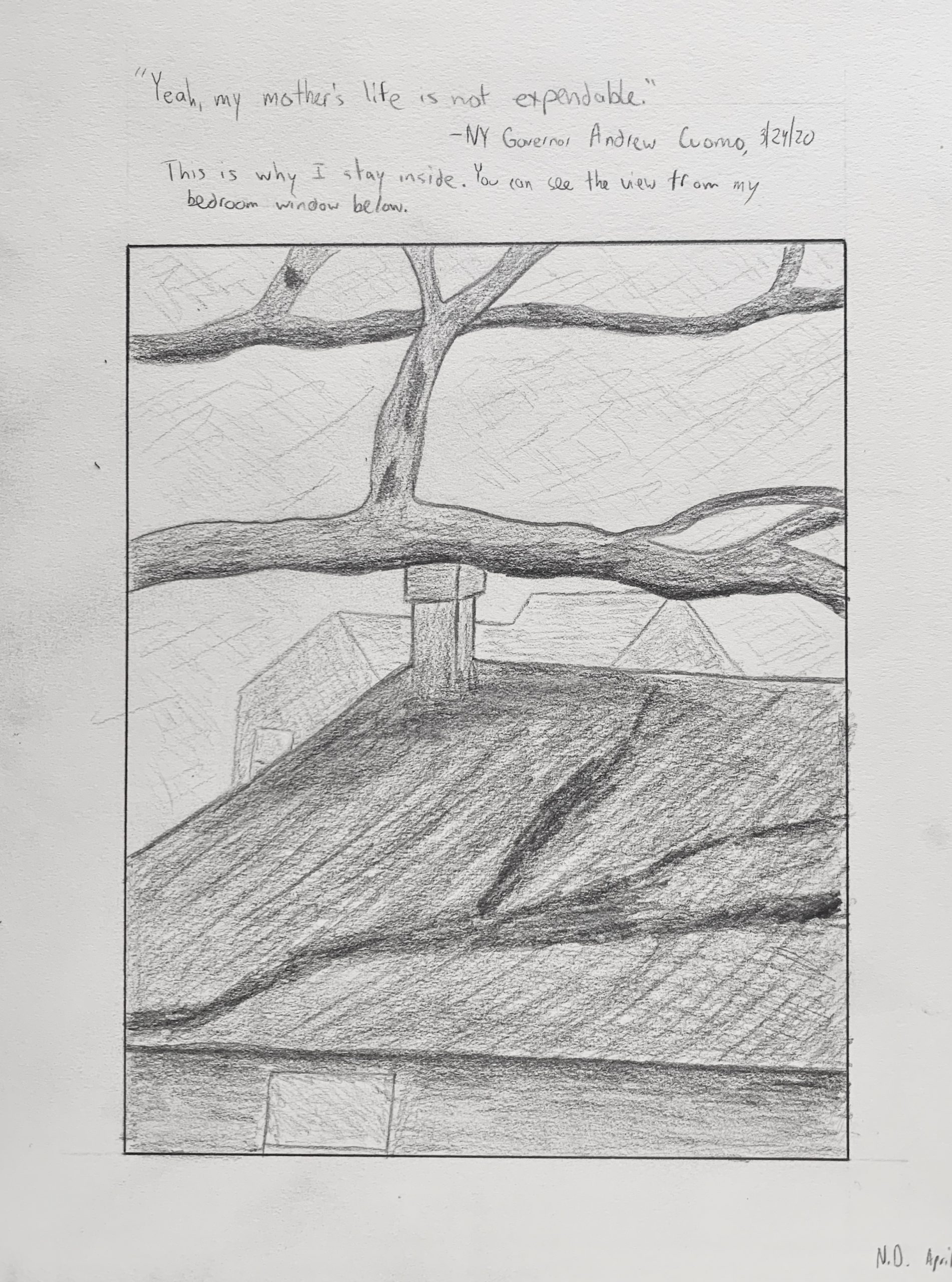
This was a tough one. I drew the view from my bedroom window. As a photographer, I usually find windows really interesting because they act as a frame in the natural world. Photographs of windows, however, are hardly ever compelling as the actual view from a window (the frame tends to get in the way), so I tried my hand at drawing one. I think there’s a strong composition, and I think I captured the composition well. I particularly like the little house in the background. I think the shading is a mixed bag. Right now, I still look at this and think I could’ve taken a better photo, but I think I need to overcome my deficiencies as a drawer before I blame the medium.
I love the idea of drawing the view from your window. That perspective is very true to the experience we are having right now. However, if you look at the drawing absent of your accompanying statement, it is not clear that it is very out your window. If you were to do another draft, I would encourage you to keep the window frame within the drawing so your perspective is clear and viewers have the same experience of feeling stuck inside while looking out into the world.
Additionally, I think you have done a wonderful job with shading, especially with the branches. The only thing I would encourage (which is the same Devon gave to me) is to make your shading slightly stronger i.e. make the darks darker and the lights lighter.
You took a wonderful risk in jumping outside of your comfort zone and experience as a photographer to consider the view out of a window in a different way. I think the shading curving around the bottom of the center tree branch is quite compelling, as is the disappearing nature of the small house into the background. I think you have portrayed a lovely distinction between manmade and natural forms, but I feel as if my eye has a difficult time distinguishing each branch’s location, in terms of foreground and background, and whether the dark shape overlapping with the roof is a branch, a shadow, or a stain in the roofing. The border you drew is very strong and defines the space of the drawing, and I would love to see the lines that contour each form to be attacked a with the same graphic strength. I like the addition of the quote and your own personal read on the situation.
The comments from Sara and Devon are very good. I second Sara’s suggestion to include the window frame as a point of reference but also to deepen the perception of space. Devon talks about upping the line quality—I agree—but also what the line is describing. Like our work with pure contour, the artichoke, and the flowers, more deliberate attention to the specifics of the tree (in particular) would add a lot.
As is, your cursory description undermines the intensity of the drawing and by extension the intensity of what you’re expressing. I’m big fan of the inscription, by the way, and how it helps shape our perception of the scene without dominating it.
Back to line quality, a quote from noted poet (and deeply flawed human being) Ezra Pound: “Technique is the test of sincerity.” We’re only going to follow you as far as you’re willing to go.
Not that the window gave you a lot of choice, but I love this composition (overall). The spatial layers and movement are disrupted, however, by that rectangle at the bottom (a window?) that’s essentially tangent to your border, and the connection of the chimney to the branch. The branch is just tangent enough that the two stick together—it almost looks like the chimney is propping it up.
The way to untie these knots is to raise or lower your eye level until they resolve more decisively.
Nice atmospheric perspective on the far house but beyond that….(like the maps used to say “Beyond here lay dragons.”) That flurry of faint marks doesn’t cut it. A few signals of the receding planes of other buildings and/or foliage are what’s in order. You’re abdicating responsibility for that part of the drawing too easily.
I do take that to be a shadow of the limb on the near roof. The lack of any other sign of light (other than on the limbs) is odd—and again, a bit half-assed—but also lends it a symbolic feeling, like nature casting a shadow on our homes and our lives. It’s quietly ominous in an appealing way, vaguely reminiscent of this painting by Di Chirico (note the cast shadow in the piazza), but also Lois Dodd, who you should have a look at.
Giving it a more convincing mise-en-scene would underscore this feeling still better.
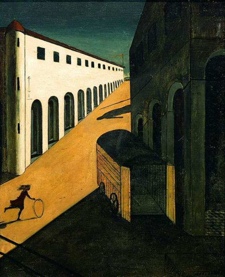 Giorgio de Chirico
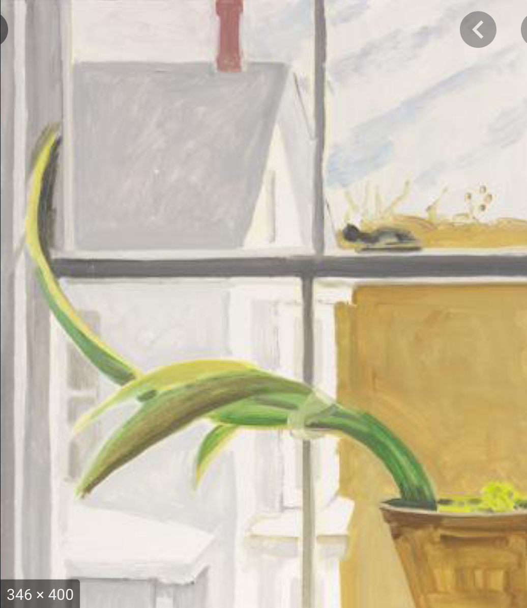 Lois Dodd
This was a tough one. I drew the view from my bedroom window. As a photographer, I usually find windows really interesting because they act as a frame in the natural world. Photographs of windows, however, are hardly ever compelling as the actual view from a window (the frame tends to get in the way), so I tried my hand at drawing one. I think there’s a strong composition, and I think I captured the composition well. I particularly like the little house in the background. I think the shading is a mixed bag. Right now, I still look at this and think I could’ve taken a better photo, but I think I need to overcome my deficiencies as a drawer before I blame the medium.
Hi Nate!
I love the idea of drawing the view from your window. That perspective is very true to the experience we are having right now. However, if you look at the drawing absent of your accompanying statement, it is not clear that it is very out your window. If you were to do another draft, I would encourage you to keep the window frame within the drawing so your perspective is clear and viewers have the same experience of feeling stuck inside while looking out into the world.
Additionally, I think you have done a wonderful job with shading, especially with the branches. The only thing I would encourage (which is the same Devon gave to me) is to make your shading slightly stronger i.e. make the darks darker and the lights lighter.
You took a wonderful risk in jumping outside of your comfort zone and experience as a photographer to consider the view out of a window in a different way. I think the shading curving around the bottom of the center tree branch is quite compelling, as is the disappearing nature of the small house into the background. I think you have portrayed a lovely distinction between manmade and natural forms, but I feel as if my eye has a difficult time distinguishing each branch’s location, in terms of foreground and background, and whether the dark shape overlapping with the roof is a branch, a shadow, or a stain in the roofing. The border you drew is very strong and defines the space of the drawing, and I would love to see the lines that contour each form to be attacked a with the same graphic strength. I like the addition of the quote and your own personal read on the situation.
The comments from Sara and Devon are very good. I second Sara’s suggestion to include the window frame as a point of reference but also to deepen the perception of space. Devon talks about upping the line quality—I agree—but also what the line is describing. Like our work with pure contour, the artichoke, and the flowers, more deliberate attention to the specifics of the tree (in particular) would add a lot.
As is, your cursory description undermines the intensity of the drawing and by extension the intensity of what you’re expressing. I’m big fan of the inscription, by the way, and how it helps shape our perception of the scene without dominating it.
Back to line quality, a quote from noted poet (and deeply flawed human being) Ezra Pound: “Technique is the test of sincerity.” We’re only going to follow you as far as you’re willing to go.
Not that the window gave you a lot of choice, but I love this composition (overall). The spatial layers and movement are disrupted, however, by that rectangle at the bottom (a window?) that’s essentially tangent to your border, and the connection of the chimney to the branch. The branch is just tangent enough that the two stick together—it almost looks like the chimney is propping it up.
The way to untie these knots is to raise or lower your eye level until they resolve more decisively.
Nice atmospheric perspective on the far house but beyond that….(like the maps used to say “Beyond here lay dragons.”) That flurry of faint marks doesn’t cut it. A few signals of the receding planes of other buildings and/or foliage are what’s in order. You’re abdicating responsibility for that part of the drawing too easily.
I do take that to be a shadow of the limb on the near roof. The lack of any other sign of light (other than on the limbs) is odd—and again, a bit half-assed—but also lends it a symbolic feeling, like nature casting a shadow on our homes and our lives. It’s quietly ominous in an appealing way, vaguely reminiscent of this painting by Di Chirico (note the cast shadow in the piazza), but also Lois Dodd, who you should have a look at.
Giving it a more convincing mise-en-scene would underscore this feeling still better.