Project 4

Good effort, Bryant, as far as it goes, but you need to slow down and look still more closely. Happily you have not substituted preconceived symbols for her features (like almond eyes or peanut shaped nostrils)–these are very much coming from the Degas–but you need to examine and push them further, from being more specific and particular about the shapes of the negative spaces around her head, to centering the features on her face, to the shapes of the eyebrows, and more.

Her eyes are also larger and more widely set. The one on the left especially is too close to the bridge of the nose. Notice that on the Degas (and as a rule) that the tear duct is directly above the outside edge of the nostril. You did better at this on our left side.

In the final stage, Degas applies his hatching more softly and deliberately. There are smudged tones here that don’t appear in the original, like the one between and just above her eyes.

You’re applying the fundamental lessons of the semester but not consistently and thoroughly enough, but all the same she’s looking back at us with a tender and tentative expression not so different than the original.

Anibal Husted

In answer to your very last question, I think the second one is the better exposure (without being able to see the original, of course). In terms of your other questions (and thanks for those),

1. The tilt of the head is indeed off–a sign that you need to slow down and linger at the schematic stage awhile longer.

2. This is also a good observation. Being aware of that (on your own) is half the battle. The value variations on her forehead, for example, are not as significant as the greater overall unity of the shadow relative to that patch of light to its left. Her hairline on the left side is also quite different–another signal that your schematic (which is 60-70% of the drawing) needed to be more observant and scrupulous.

3. You’re also right about gentler, finer strokes in the face; another signal to slow down. She has a distinctively methodical hatching style that you could learn more from. But yours is not at all dissatisfying in its own right.

4. Your version doesn’t look younger so much as slightly fuller. The proportions in your face are good in and of themselves, but the original is narrower. Once again–something to iron out in the schematic.

5. In terms of smiling, maybe ever so much. But even if this artist copied her own drawing there would be differences of this kind. It takes very little to turn a pensive look into an irritated one (and any number of other mood shifts). You did great.

As you did on the whole drawing. I especially like the way you stuck with her attention to planes–our most important goal. Nicely done!


Portraiture Prep

Good work overall, Ben,  notably the lovely texture and subtle value gradations you’ve achieved with the side of your pencil (I assume). Just a few notes:

Your features are all too large, something that needed to be ironed out in the schematic. Because you’ve done this uniformly you still have an almost physiologically plausible portrait, but the eyes are impossibly oversized (if very expressively so) for those eye sockets.

Nevertheless, the eyes are very well drawn, including the less defined and slightly obscure eye on our left. The eye on our right is missing a tear duct, and the distinctive shape it imparts to that part of the eye.

The edge of the shadow on the bridge of the nose is too firm—that’s a softer gradation—and that shadow is a bit too dark.

The mouth is beautifully and very sensitively drawn—including that delicate reflected light on the upper lip—gorgeous—but it’s overall much too large, as mentioned earlier.

The modeling on the chin and her profile on our left are too dark and absolute-they should be subtler.

The contour of the ear on our right is lighter and thinner, to help it go back.

The strands of hair and whatever that is on her shoulder, as well as the contour of her shoulder on our right, need to be lighter and more delicate.

Great job on the hair, but the shadows on the hair are the same or darker than the shadows on the face.

Despite the above, many important achievement here. Just stay with the schematic longer until all is in order.

Portrait Practice

Good work, Ryan, especially in your composition, overall proportions (good schematic), attention to planes, and mark-making (hatching).

This model has close set eyes, which you’ve located correctly, but made more apparent by enlarging the eyes slightly and turning the irises inward a bit, making him look cross-eyed. When you draw irises, pay even more attention to the white of the eyes.

You’ve also widened his face just a bit–still anatomically plausible but perhaps his stockier cousin. The space between the eye socket on our right and his sideburn is noticeably too wide.

The tip of the nose needs more attention. You’ve shifted into a pre-conceptual symbol for the nostrils–a great lesson you could learn from this drawing.

Great job emulating his hatching, which underscore the planes almost like the chisel marks on a sculpture, but your values wander a bit. Your center forehead is too dark while the upper lip and underside of nose are too light.

Glad you picked up on the darker values on the hair at the temples–a classic move to draw attention to the eyes.

Amanda- Portrait and Practice

Simply tremendous job, Amanda. Beautifully composed and organized and a very fine response to Hanna’s modeling technique. The only room for improvement is subtler gradation (more gradual fading to white) on the shadow on the forehead, and a bit richer value range and modeling in the eye socket and eye on our left. The whites of her eye there are a shade darker.

Excellent work–and very fine studies as well. Nice to see–

Aadhya Portrait Prep

Processed with VSCO with b1 preset

Excellent work, Aadhya. A very sensitive, confident, and subtle rendition of the original. Just a few notes:

The whites of her eyes on the  left (our left) are not that light. They’re noticeably shaded in the original, along with every value in the eye socket, making that eye more mysterious.

Her upper lid on that eye is also a bit wider, lowered, and more relaxed–yours looks a bit startled.

The base of the nose should be a bit wider (look for it to be the width between the tear ducts, as it is in the original), and the modeling a bit softer.

The upper lip is fuller and more softly drawn (less sharply defined edges).

Great job–


These studies are very good.  Nice to see–

Processed with VSCO with b5 preset

Portrait copy

Fine work, Grace, from locating the image and its proportions during the schematic to your very fine touch, emulating Degas’—very much what I was hoping this exercise could offer.

A few notes:

You’ll note that Degas’ model has a more inward expression, like she’s lost in thought, while yours feels very attentive to us and engaged. It’s because his upper lids are lowered just a scintilla more, eclipsing more of the irises, which are also slightly larger in his.

Her eyebrows are not the continuous arched curves that you show, but rise from the center outward on a straight axis (the darker portion) before bending downward more abruptly, and at a slight angle as they also become lighter in value (they’re turning back onto the side of the head).

The shadow on the bridge of the nose isn’t quite as dark, and curves slightly. The upper bridge of her nose, just below the brow, is also narrower.

Good work on the hair, but still a tendency to add a lot of hair-like lines. Note there are very few in the original—mainly diagonal hatching to establish a value, and then a few select hairs.

The shadow on her hair band is too dark and defined. It wants to frame her face and add volume (as a cross-contour line) but not draw too much attention to itself.

Great job keeping all of your edges soft and your touch light. Wonderful to see.

Well done, Grace—I commend your patient attention and sensitive interpretation.


Ian Strudwick – Portrait Drawing 1

Beautiful drawing, Ian, and a very thorough exploration of the Degas. Curiously, like Ben’s treatment of the same image, your features are oversized. Also like his they’re nevertheless almost physiologically possible, but just a bit too large—those eyes could never fit in those sockets, but it’s a distortion that makes them very expressive. Also very well modeled.

One consequence is that that they take up more than their share of the face, so that the space between the nose and the ear, on our right, should be wider. This is also true because you made the head somewhat too narrow to begin with (the negative space on the left is too wide).

Great exploration of value and of Degas’ touch, including that reflected light on her upper lip. That tells me you were really looking. I commend you for not trying to show us more of the eye on the left than he did—it’s hidden in shadow. Allowing the “whites” of the eye to get the dark is a good example of overcoming a major preconception.

The light on her cheek on our left is a little too light; the shadow on the nostril on our right a little too dark; and the highlight on her lower lip a little too dark, but small matters—nicely done.

Good job on the hair as well, although you’ll notice the lines representing hair disappear in the highlight on his. Don’t be so dogged in reporting all the strands. Note how few of those lines he actually includes.


Good work–

Drawing from another artist and practice

Good work, Hannah, with some very nuanced and subtle expression in the features.

Some notes:

The first thing I noticed when I saw this is that the features are off center. Degas was looking directly at her, and she’s looking directly at us, so she should be symmetrical (and is). The distance from the tip of her nose to either side of her face is equal on his; too wide on the left side (our left) and too narrow on the right side on yours.

This was something that should have been ironed out in the schematic. Inverting the image and the drawing would have turned this up right away.

The nose and mouth are beautifully drawn but a bit too dark. Note in his that there are moments when the value of the face and the value on the lips is the same; that is, the edge disappears. It gives a more tangible sense of light and connects (rather than separates) these planes. Still—beautifully drawn.

The shadow on the chin is likewise too dark and also too defined. It has much softer edges. As it is it looks like it might be a chin strap. Your soft edged hatching on the nose is much better.

The eyes are a bit too small and she seems to be looking over our right shoulder rather than directly toward us (and through us to some extent, but one thing at a time). This has do with the visible portions of the white of the eye. When we turn to look at something one side narrows and the other side widens as the iris moves right to left. Yours have the irises looking left and slightly up.

Also her lids are wider and heavier.

Good job on the hair, following his example and keeping it simple, but the accents around the head band are too dark and draw a bit of attention away from the portrait.

The sides of the neck in the Degas angle in ever so slightly as they descend. Yours do the opposite, giving a false sense of her build.

Despite this list, something  of the original—a strong woman at peace with herself but still vulnerable–shines through in your version as well. More attention to the basic alignments and measures would take it that much farther.

Portrait Prep – Grace Bilodeau

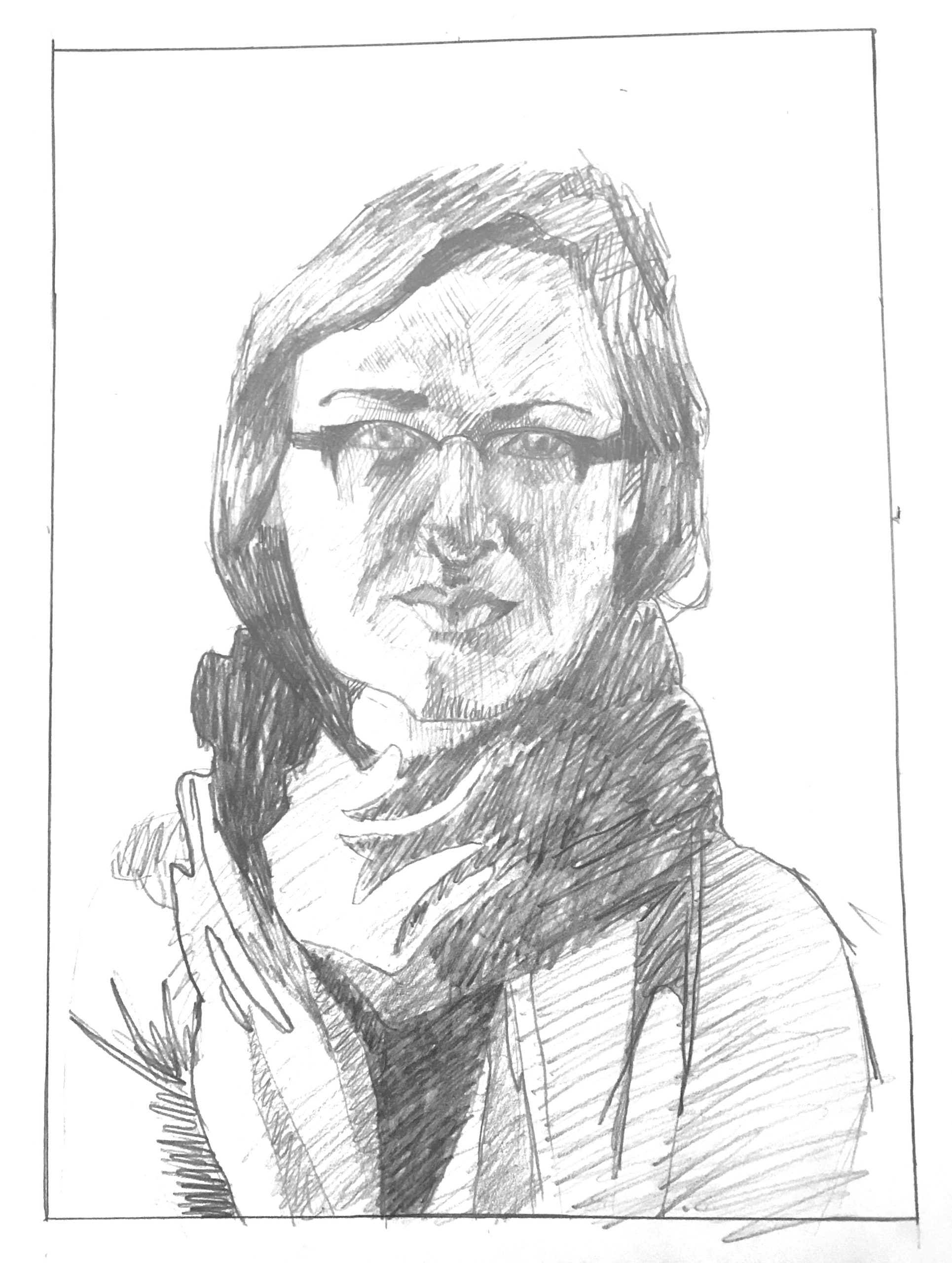
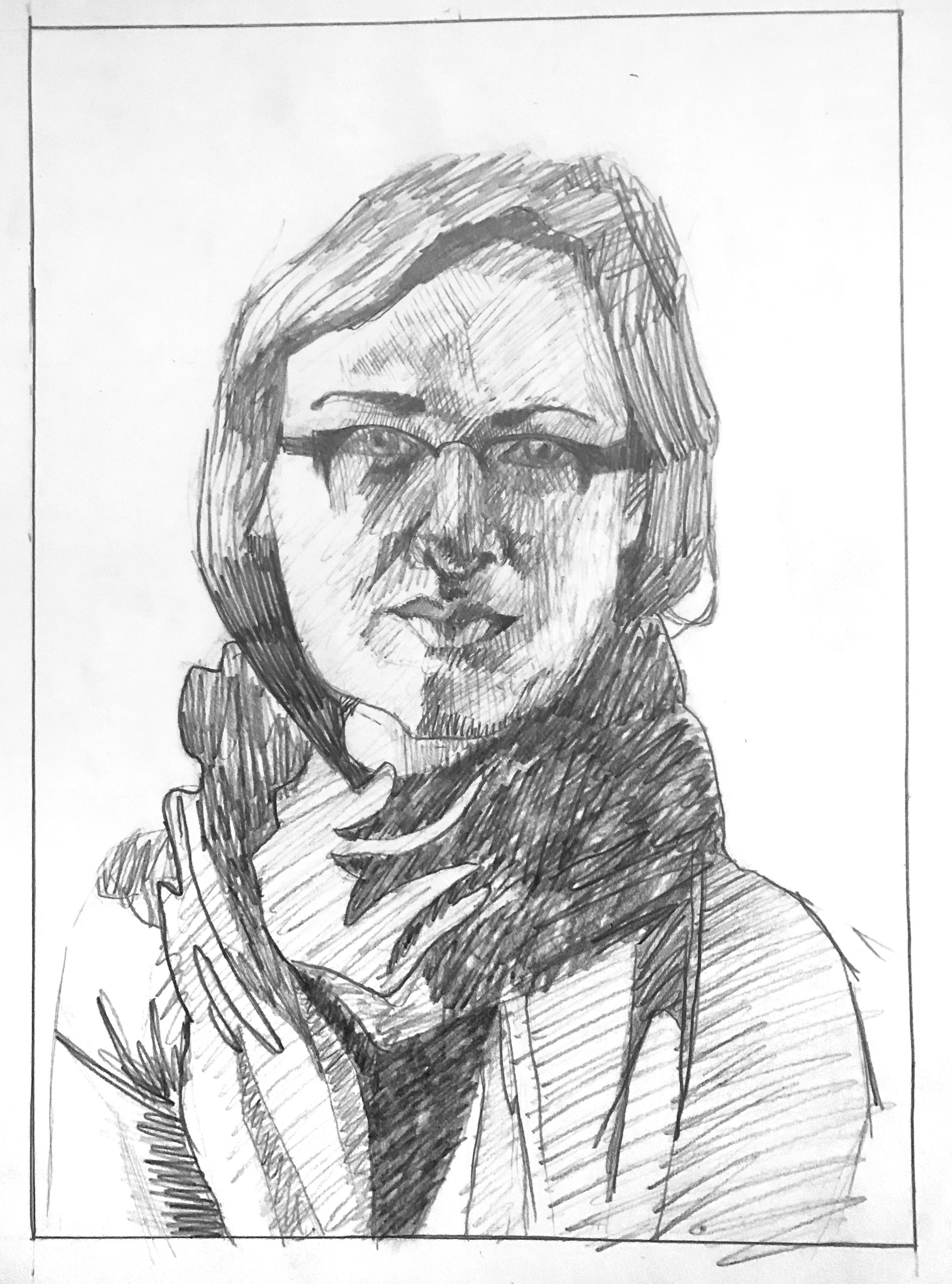
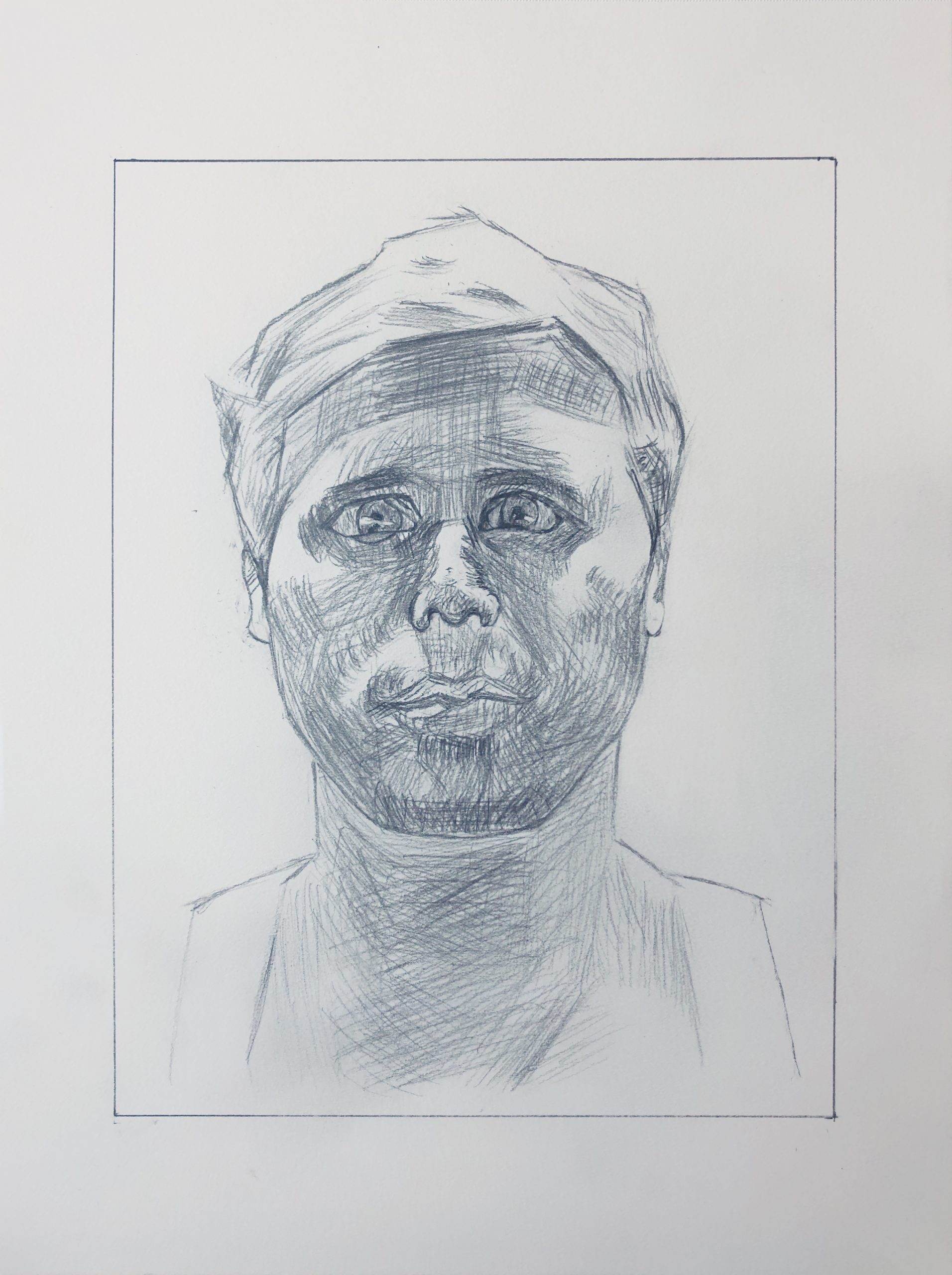
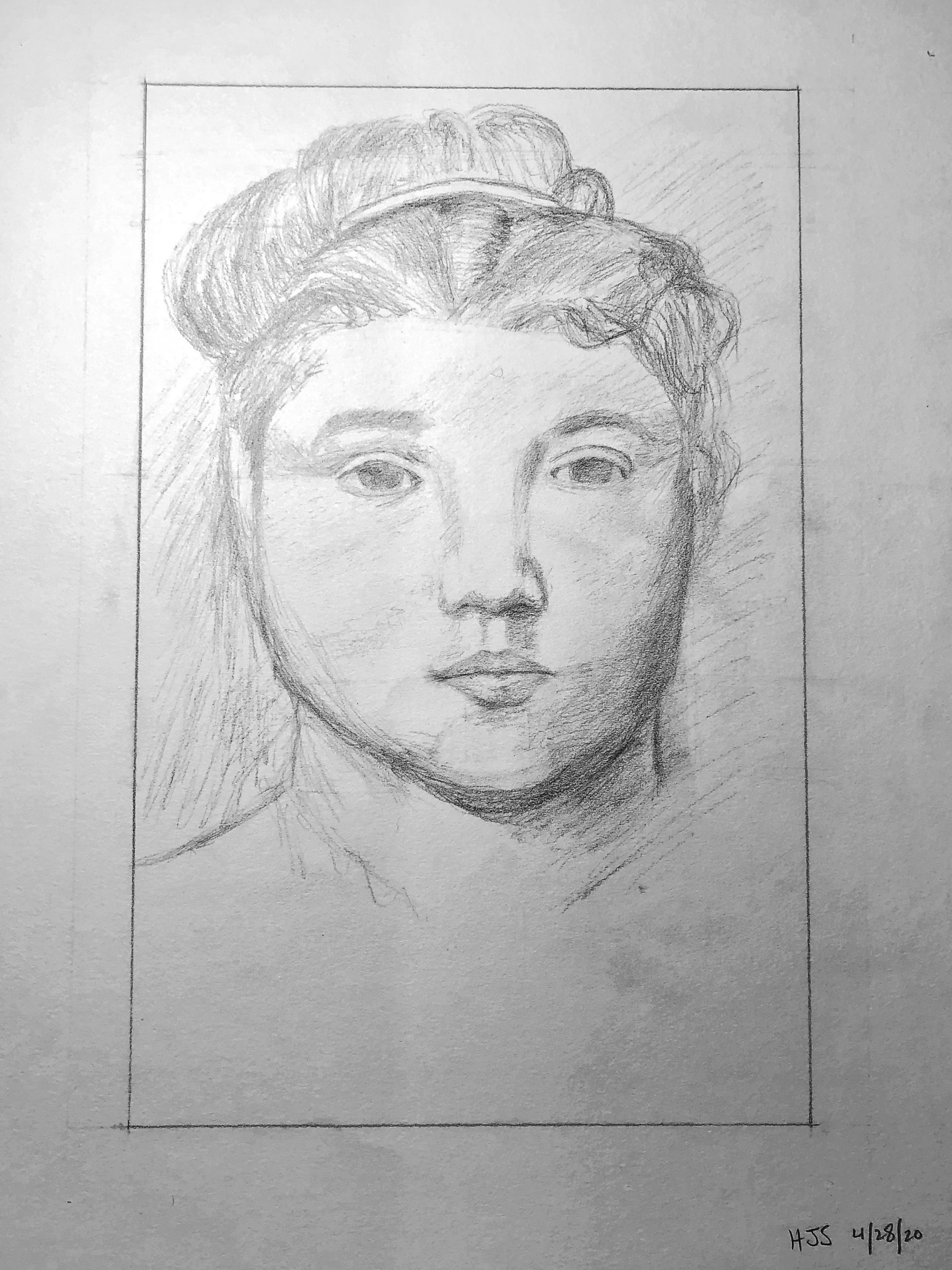
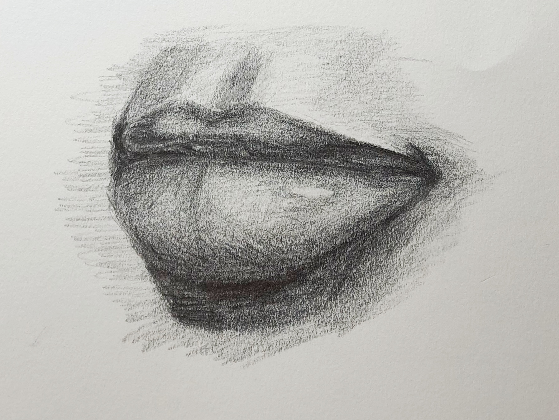
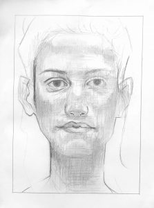
(MW): Beautifully done, Grace, from finding the image on the page to drawing the contours and line qualities with great sensitivity, to your subtle and consistent modeling of values. I’m struck that you think it’s too dark. Some of your mid-tones are maybe on the verge of being too dark but they aren’t, and there are much darker values yet to go in the eye socket on the left, which is such a focal point, under the tip of the nose and at the corners of the mouth.

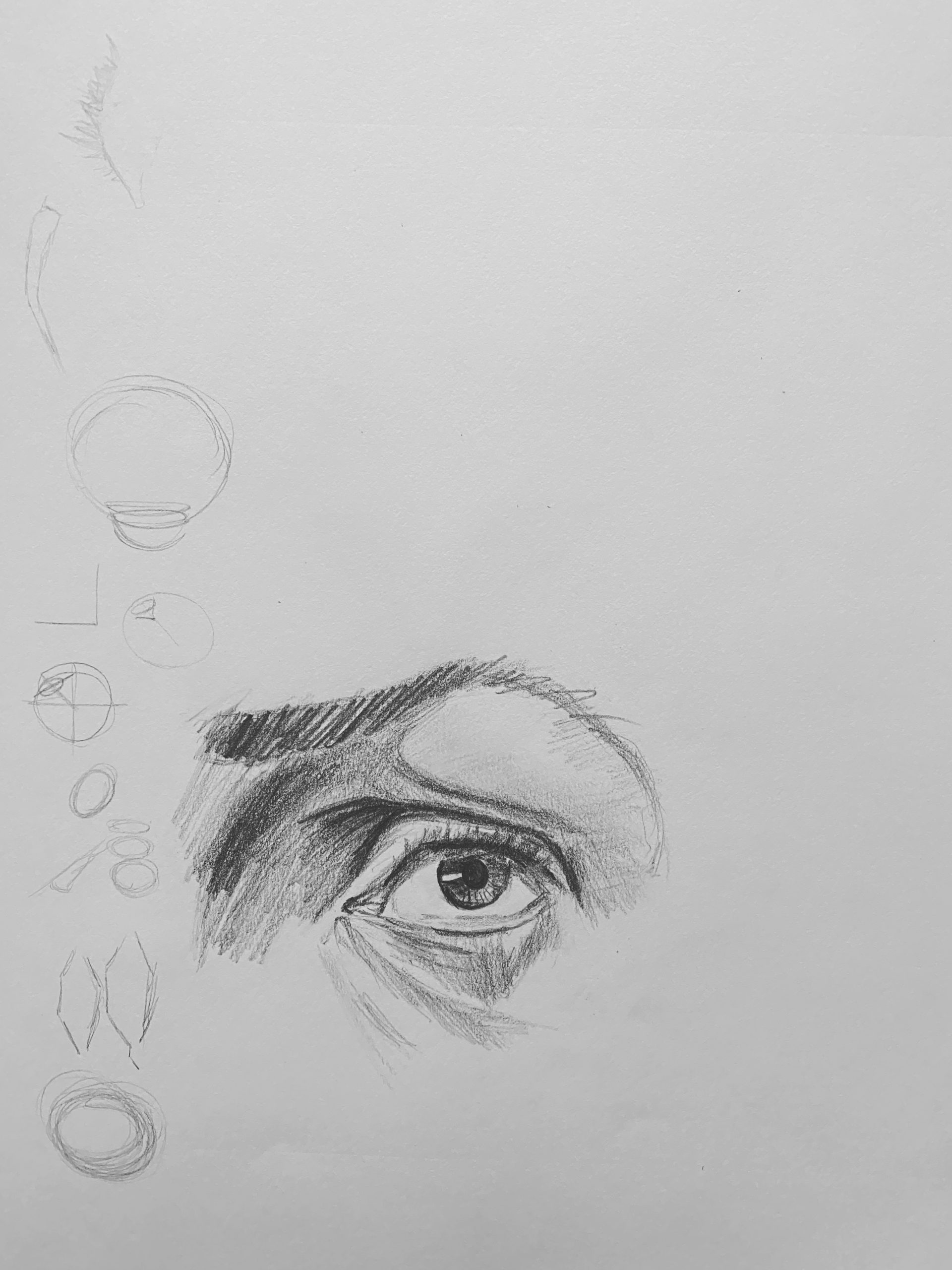
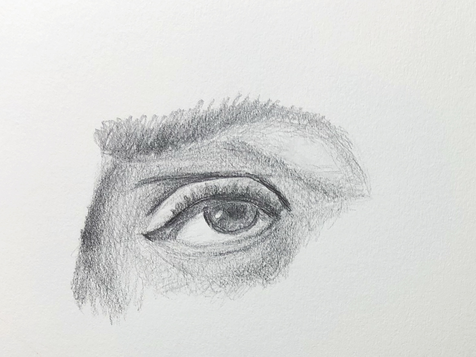
The eye on our right is just a bit too dark, I’ll grant you that. It appears he went over that area with vertical swipes of his kneaded eraser (judging by their width).

This was a topic in your O’Keeffe as well. You might be overly concerned about going too far and messing up, but you haven’t yet–and until you do you’ll never learn when you’ve crossed the line. But this is much closer to the original than the O’Keeffe–good progress.

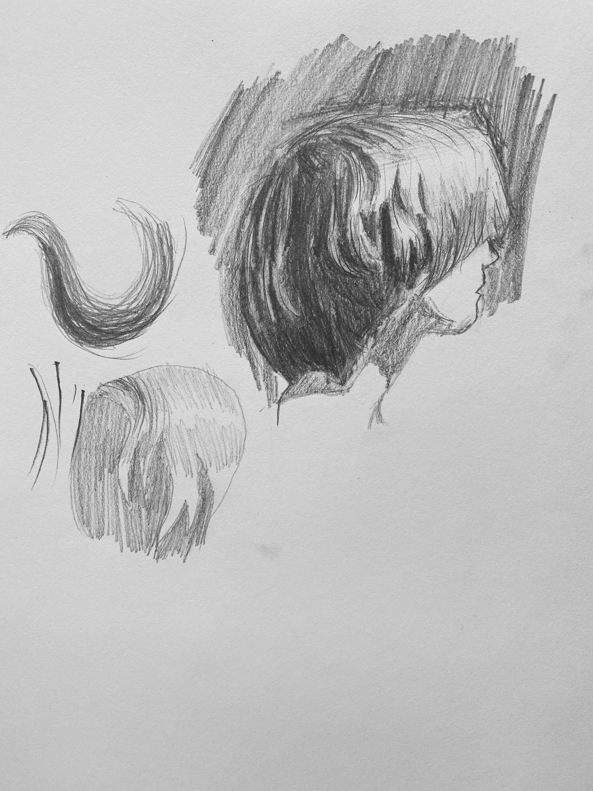
Two notable differences about your shading from his—the shadows have much subtler and softer gradations into the adjoining highlights—especially on the cheekbones (there’s a modulation between your lights and the next darker value–a very light grey–that you could still use more effectively)—and you’ve introduced an overall horizontal hatching, as well as his vertical hatching, that I don’t see in the original.

The fact is you do it so well that you’ve made it all your own—a strong unifying texture.

Can’t say enough about the line quality of your contours, however—truly exquisite, and your finest work yet. Every bit as subtle, nuanced, and confident as the original.

Fine work–


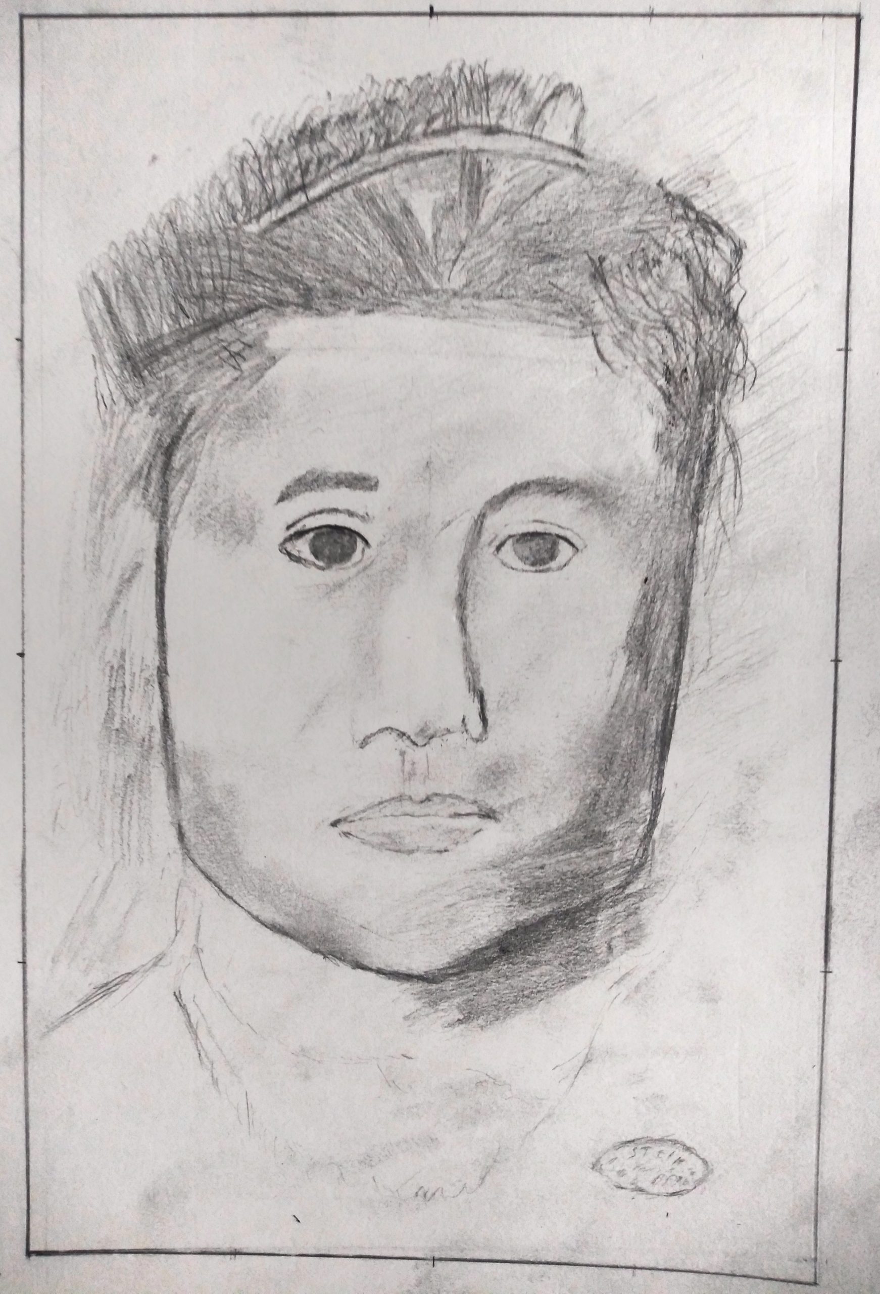
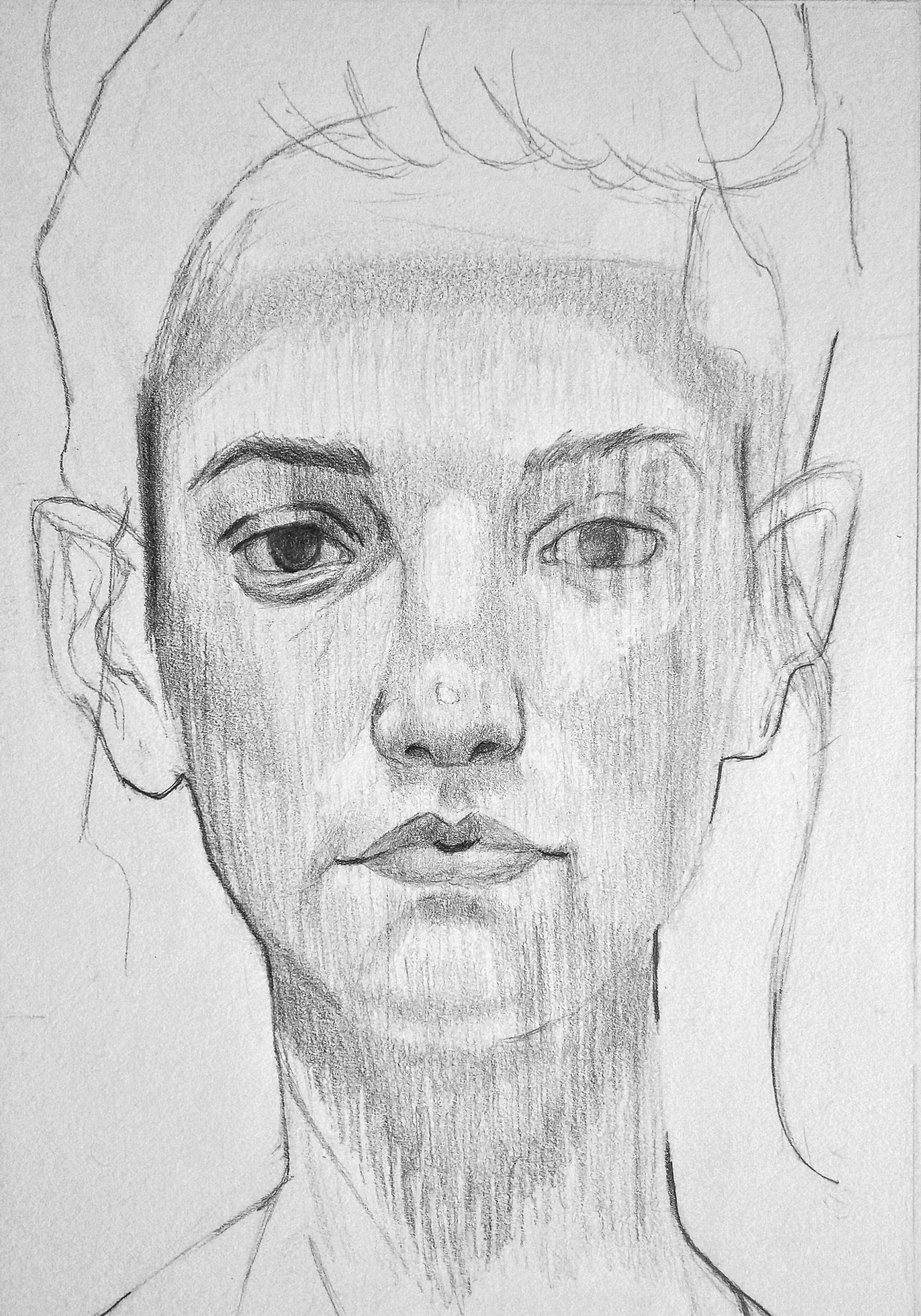
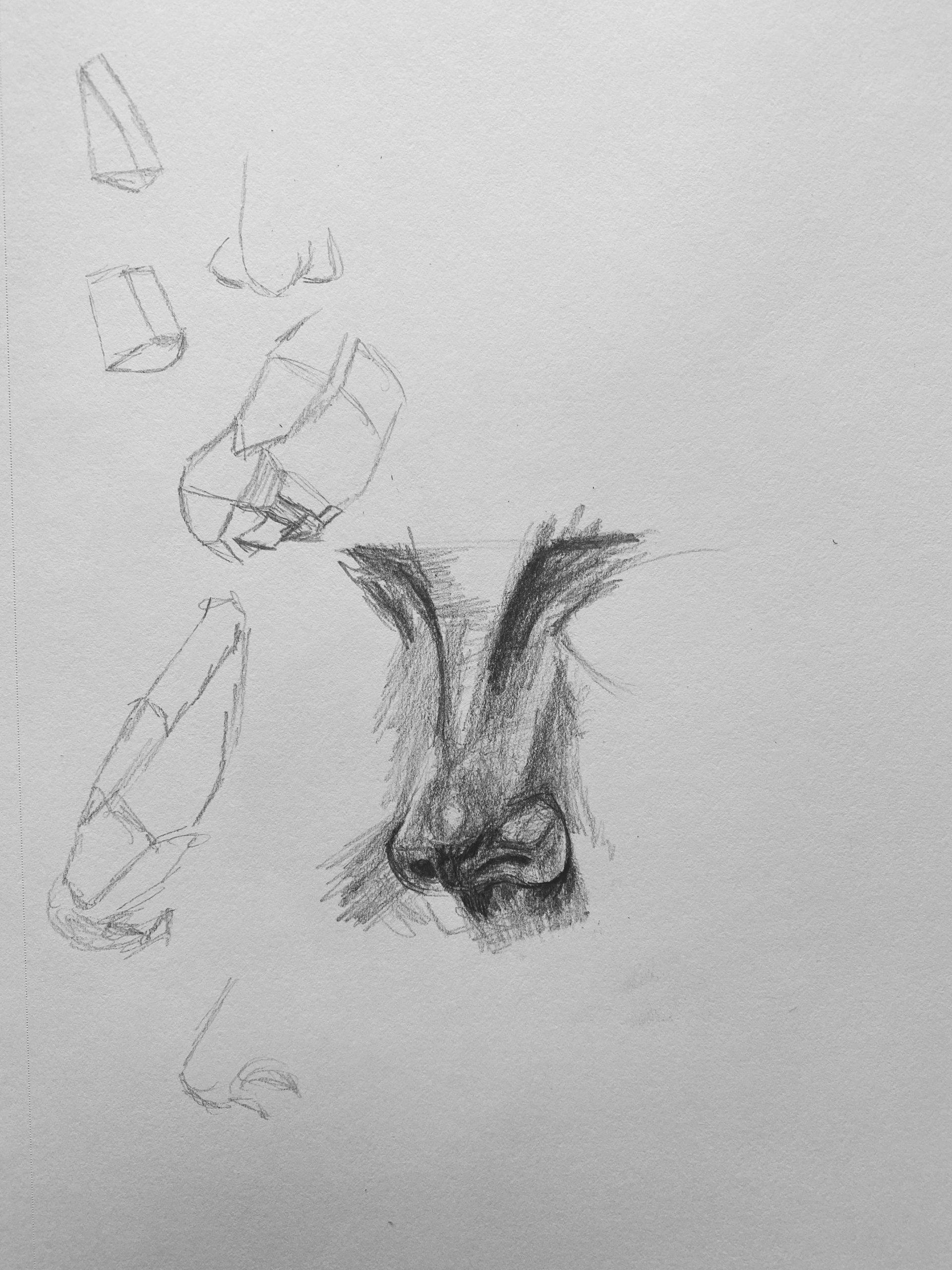
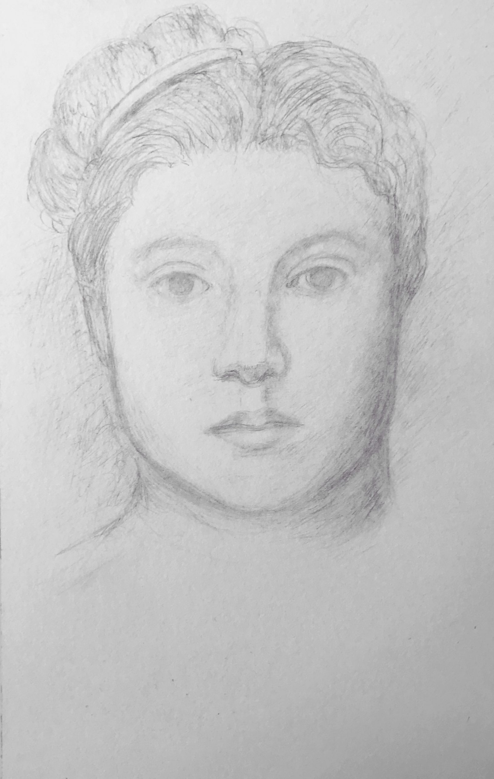
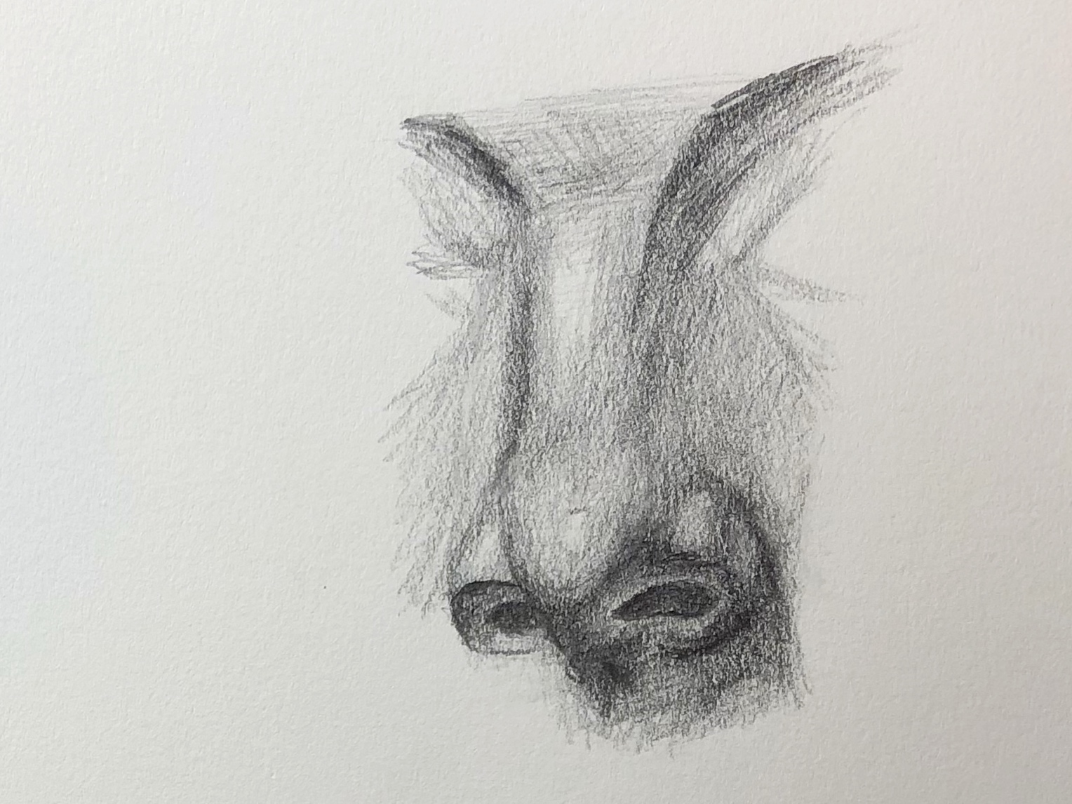
One thing that I was worried about going into this project was my ability to find and distinguish the various planes of the face. For example, in my past attempts at drawing faces I have always been unreasonably frustrated with cheekbones. I was never able to reflect the actual angles and appearance that those shadows create. One tip that really helped me from Proko (and actually surprised me with how well I was able to do this) was the simple idea that you should shade the the dark areas first and leave the highlights of the image as what remains. I think the instructional video about the plains of the nose also really helped me, especially when talking about the “Wings” of the nose and how the shadows vary there. I am proud of this drawing, but I do think I over did the shading, as the original that I was copying is overall much lighter in value. I did try the technique of smudging pretty tentatively, but I think in the areas that I did apply it, it turned out alright.