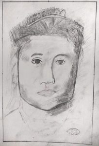
Good effort, Bryant, as far as it goes, but you need to slow down and look still more closely. Happily you have not substituted preconceived symbols for her features (like almond eyes or peanut shaped nostrils)–these are very much coming from the Degas–but you need to examine and push them further, from being more specific and particular about the shapes of the negative spaces around her head, to centering the features on her face, to the shapes of the eyebrows, and more.
Her eyes are also larger and more widely set. The one on the left especially is too close to the bridge of the nose. Notice that on the Degas (and as a rule) that the tear duct is directly above the outside edge of the nostril. You did better at this on our left side.
In the final stage, Degas applies his hatching more softly and deliberately. There are smudged tones here that don’t appear in the original, like the one between and just above her eyes.
You’re applying the fundamental lessons of the semester but not consistently and thoroughly enough, but all the same she’s looking back at us with a tender and tentative expression not so different than the original.

I wanted to imitate this piece because I really liked the eyes and thought that the hair was manageable. The lack of obvious lines in this piece made it tough to to get started and find a point to build the drawing from. I think my lines were softer than what the image presents but they were definitely darker than I wanted them to be. I really tried to follow each stroke with the hair and it gave it a very straw-like feel that I really don’t like. The shadow on the right side of the face and her neck I paid less attention to and I feel that they came out a lot lot better. The nose was what I put the most time into and I still don’t like it. I think the headband came out ok which I thought was kind of random. Overall it was fun being able to revise this drawing.