Author: bblackbu
Project 4
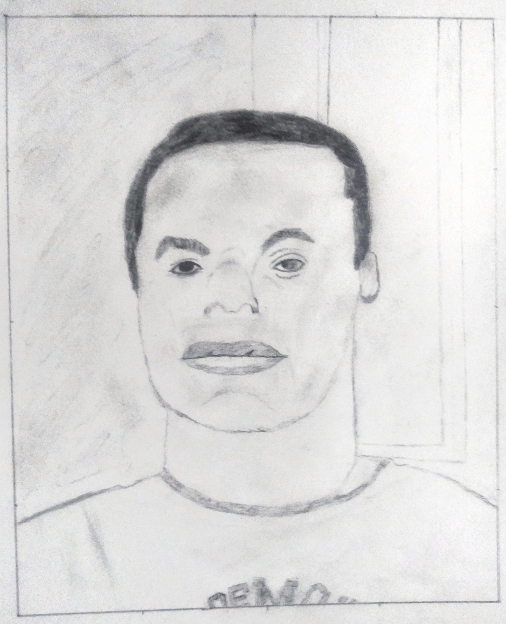
Good effort, Bryant, as far as it goes, but you need to slow down and look still more closely. Happily you have not substituted preconceived symbols for her features (like almond eyes or peanut shaped nostrils)–these are very much coming from the Degas–but you need to examine and push them further, from being more specific and particular about the shapes of the negative spaces around her head, to centering the features on her face, to the shapes of the eyebrows, and more.
Her eyes are also larger and more widely set. The one on the left especially is too close to the bridge of the nose. Notice that on the Degas (and as a rule) that the tear duct is directly above the outside edge of the nostril. You did better at this on our left side.
In the final stage, Degas applies his hatching more softly and deliberately. There are smudged tones here that don’t appear in the original, like the one between and just above her eyes.
You’re applying the fundamental lessons of the semester but not consistently and thoroughly enough, but all the same she’s looking back at us with a tender and tentative expression not so different than the original.
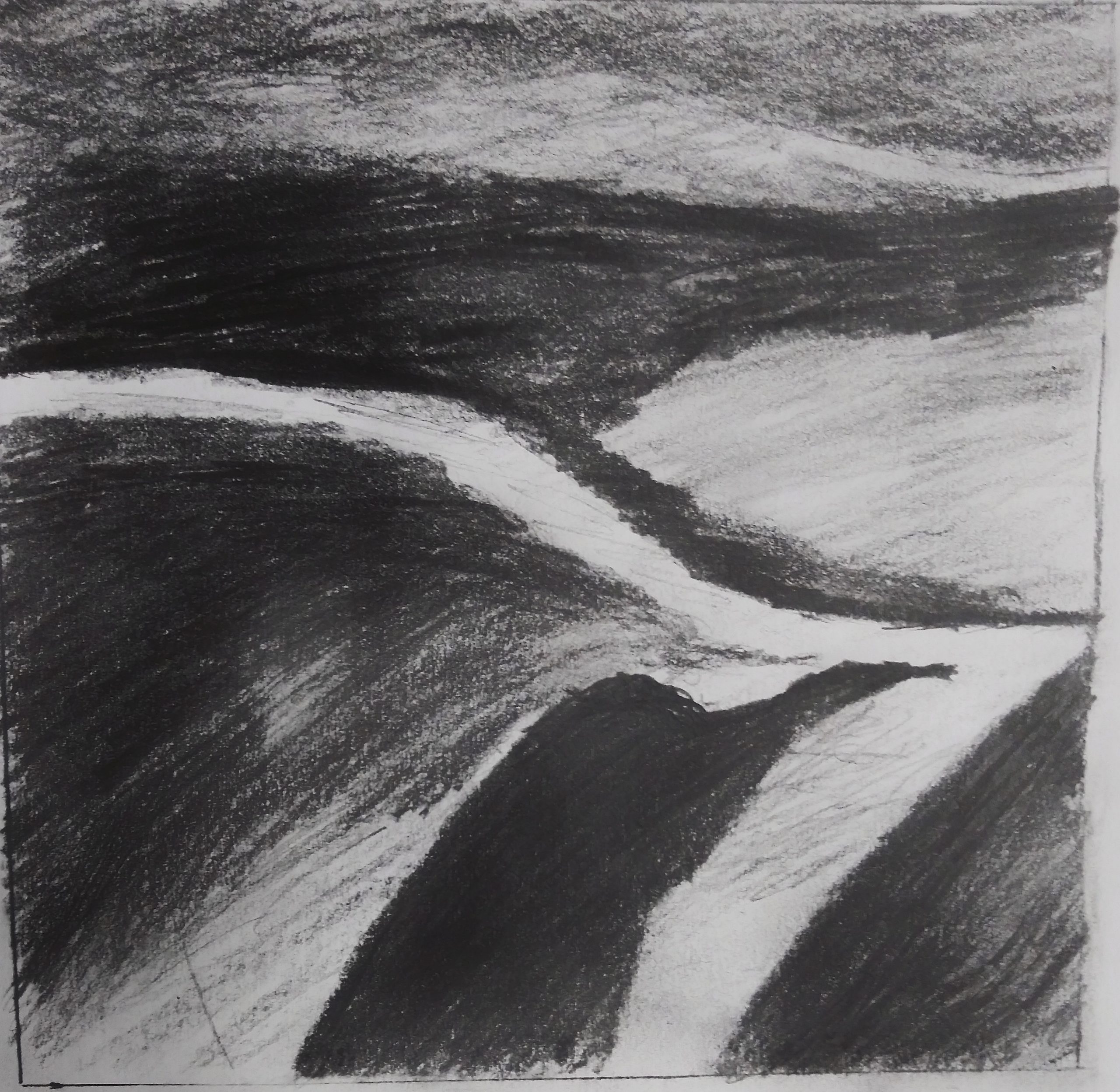
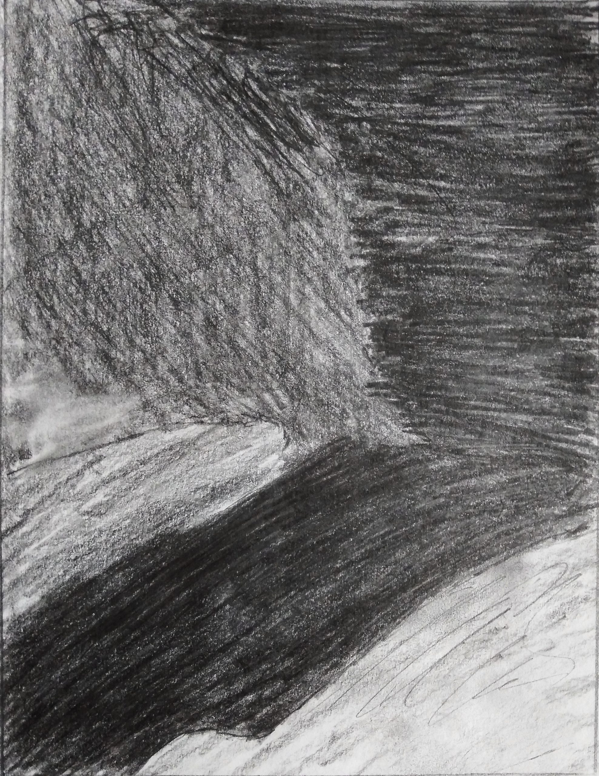
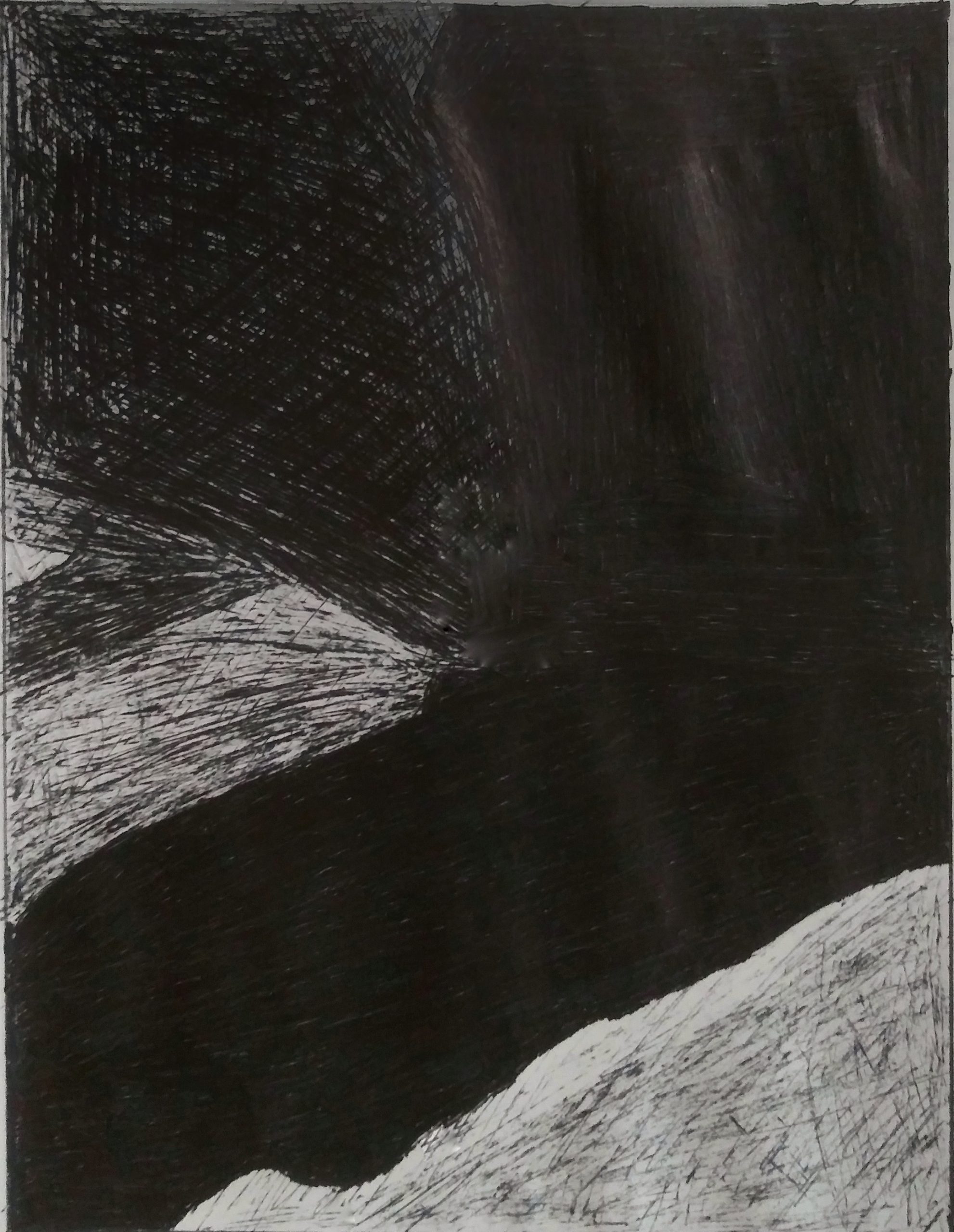
Team Value
Project 2
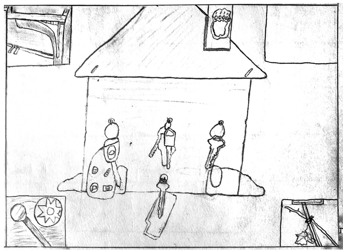
I’m guessing this is closer to the cropping and exposure of the original. We can’t begin to talk about your work until it’s presented more clearly. Please take the time and effort to make a good exposure and edit it more effectively. If you’re having difficulty with this just let me know.
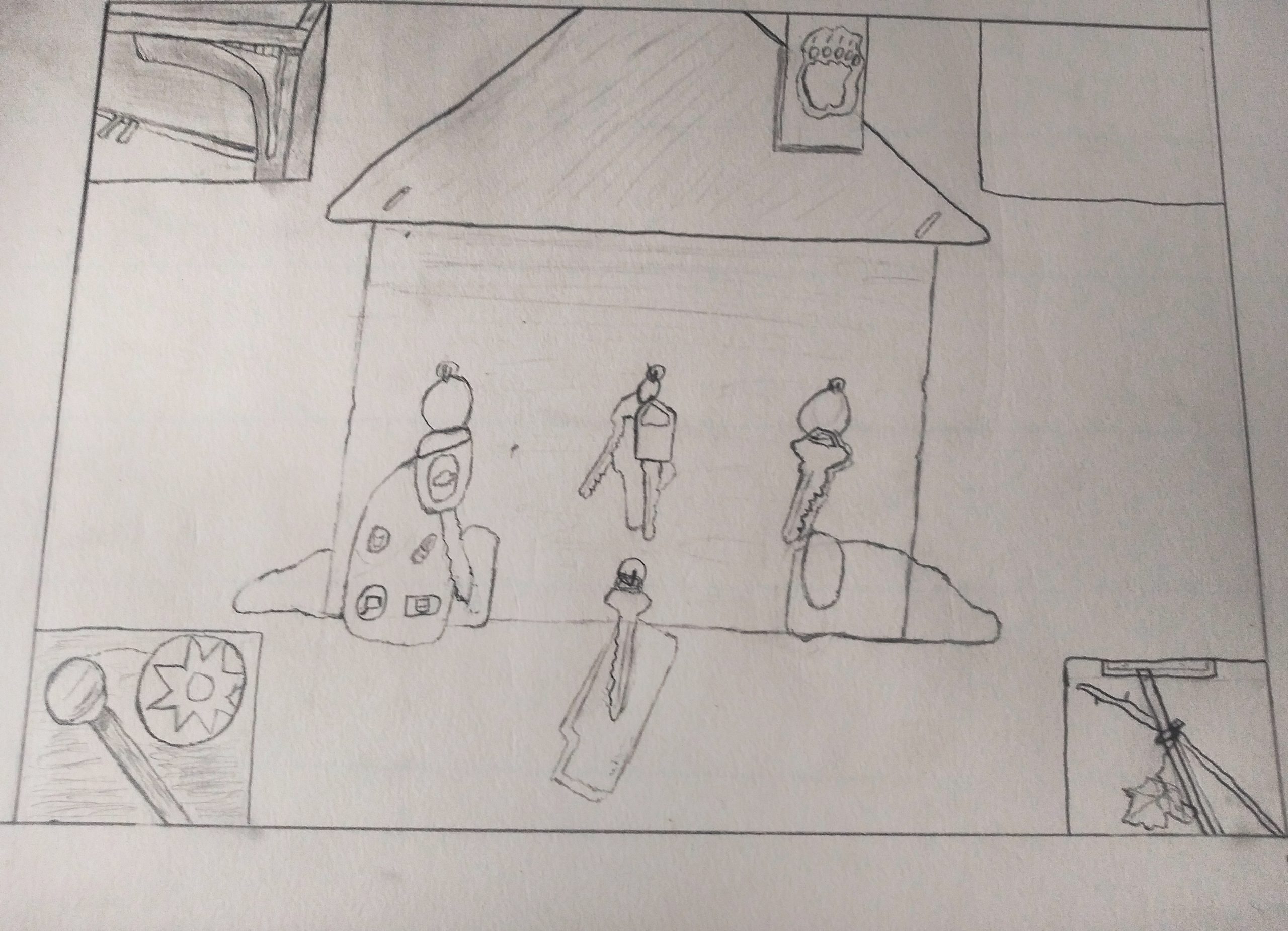
Drawing Project 1
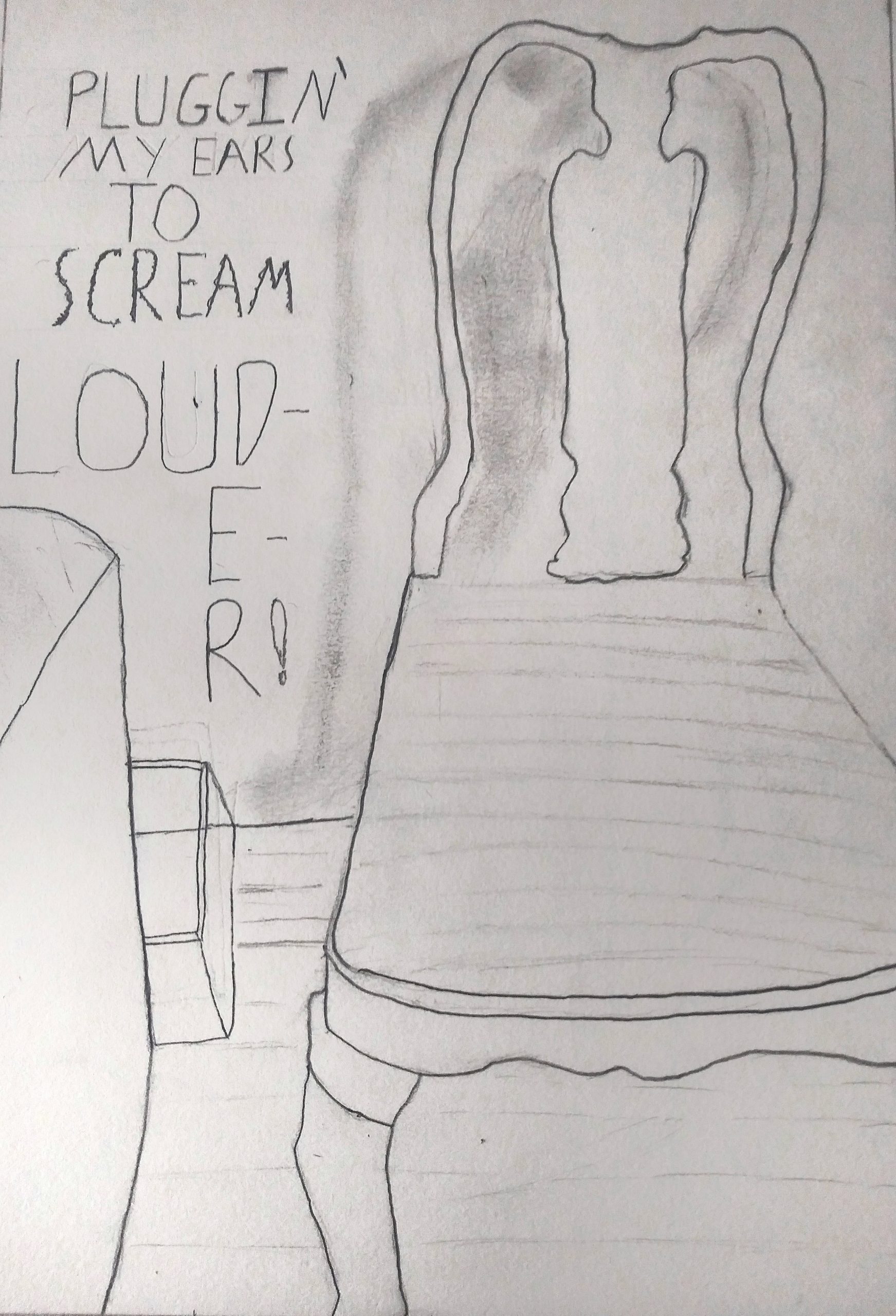
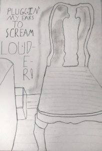
I reloaded this so that it could be opened larger with a click. Love that you included the text, which is like concrete poetry–poems whose graphic design contribute to their meaning, such as the word “louder” too big to fit in its space, spilling over twice to a new line. The contrast between this sentiment and the apparent calm and domesticity of the chair is very powerful. Great drawing.
Raymond Pettipon, another artist who uses text and image very effectively:
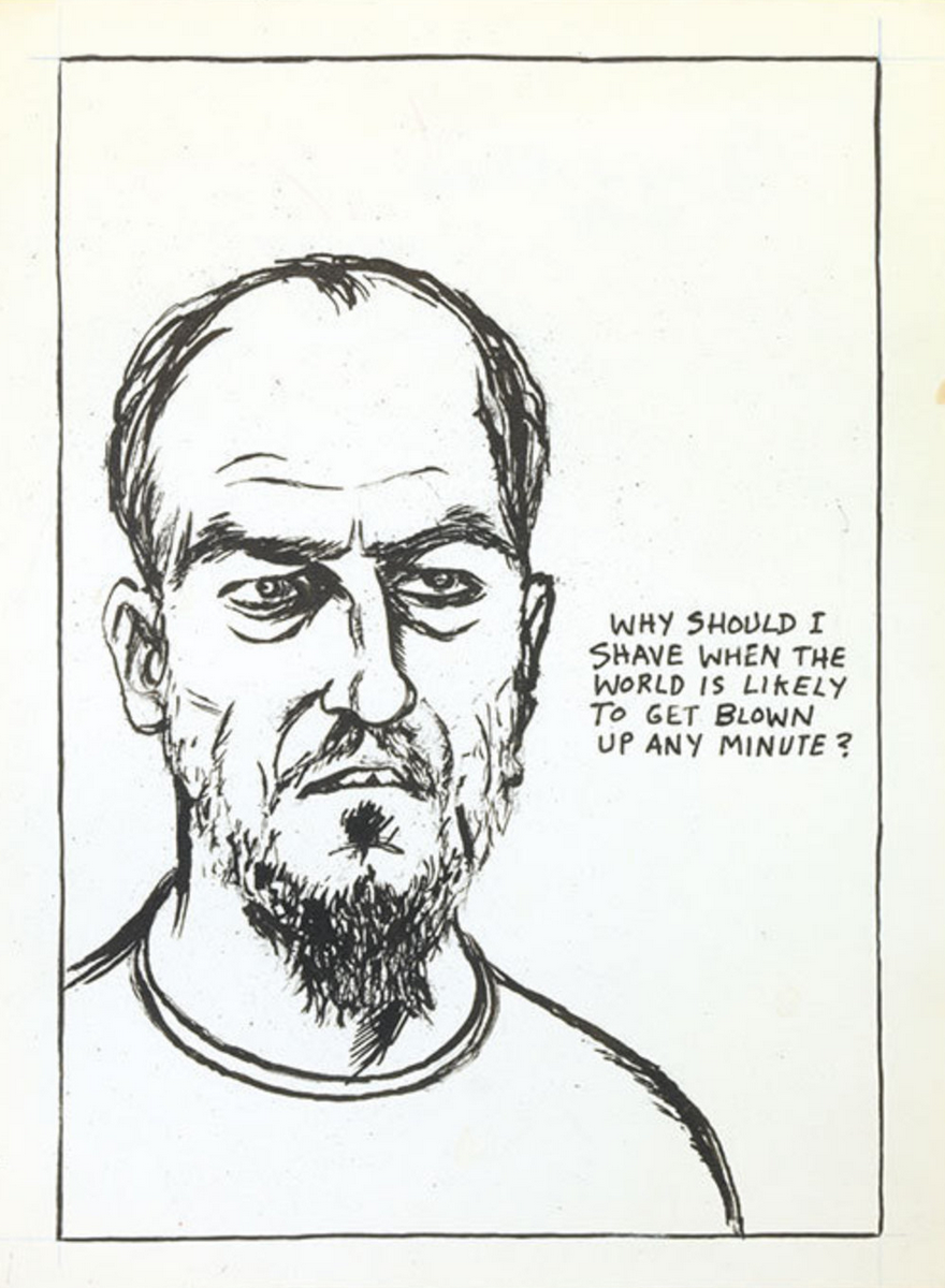
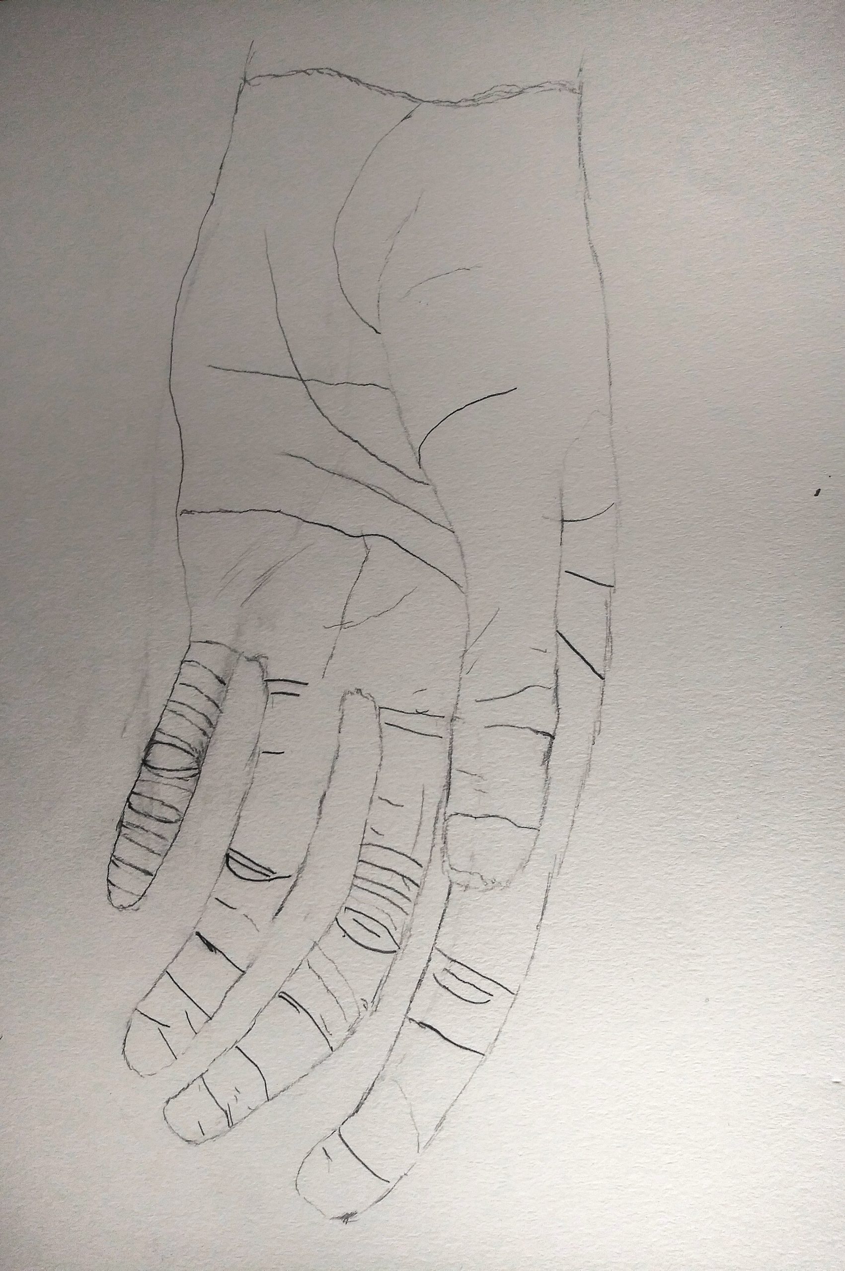
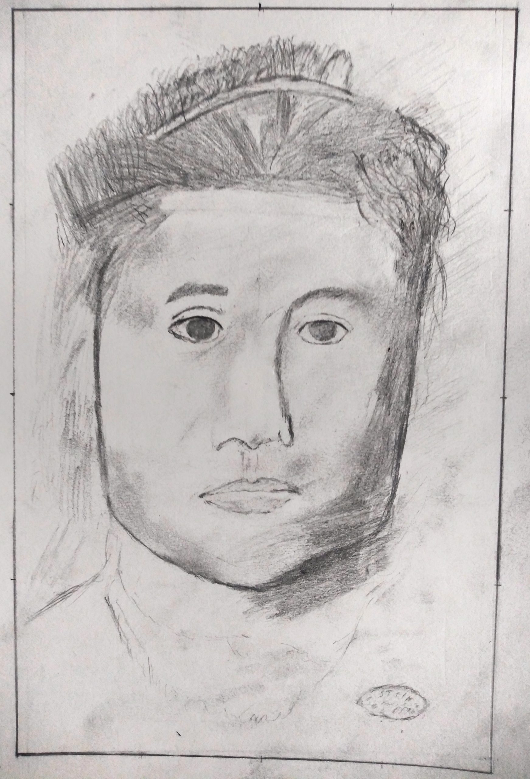
Very good drawing, but could be better still with a more forceful line quality. You’re being too circumspect, and your theory about the small finger doesn’t hold up. Better the thumb, to bring it closer. Some other examples:
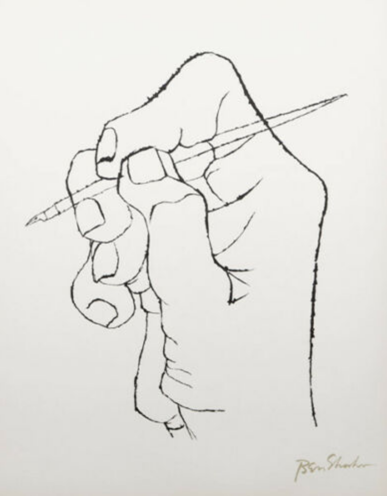 Ben Shahn
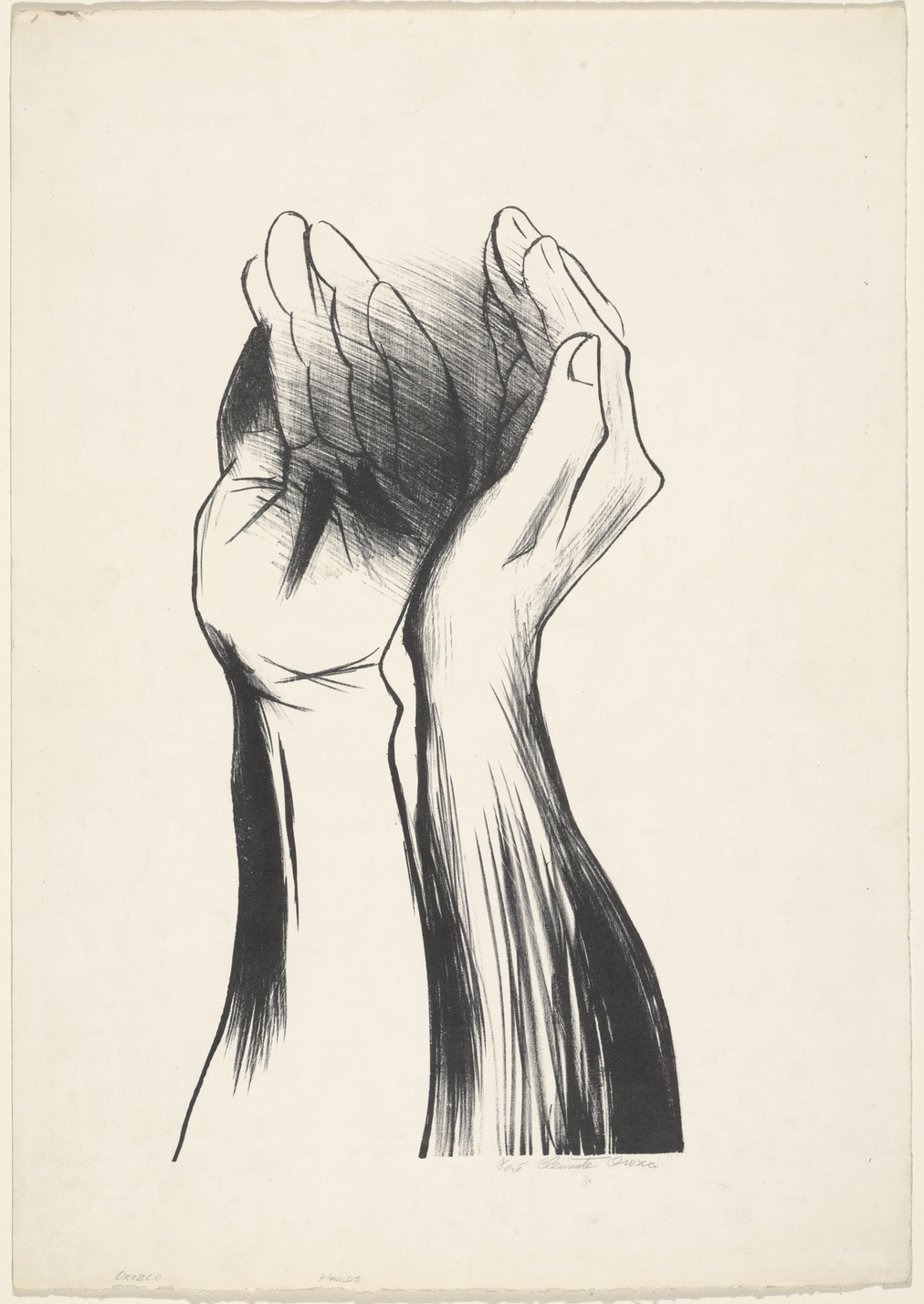
José Clemente Orozco
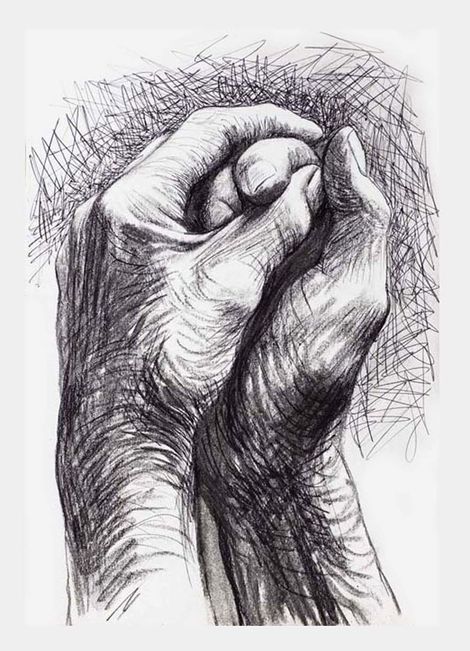
Henry Moore