I’m guessing this is closer to the cropping and exposure of the original. We can’t begin to talk about your work until it’s presented more clearly. Please take the time and effort to make a good exposure and edit it more effectively. If you’re having difficulty with this just let me know.
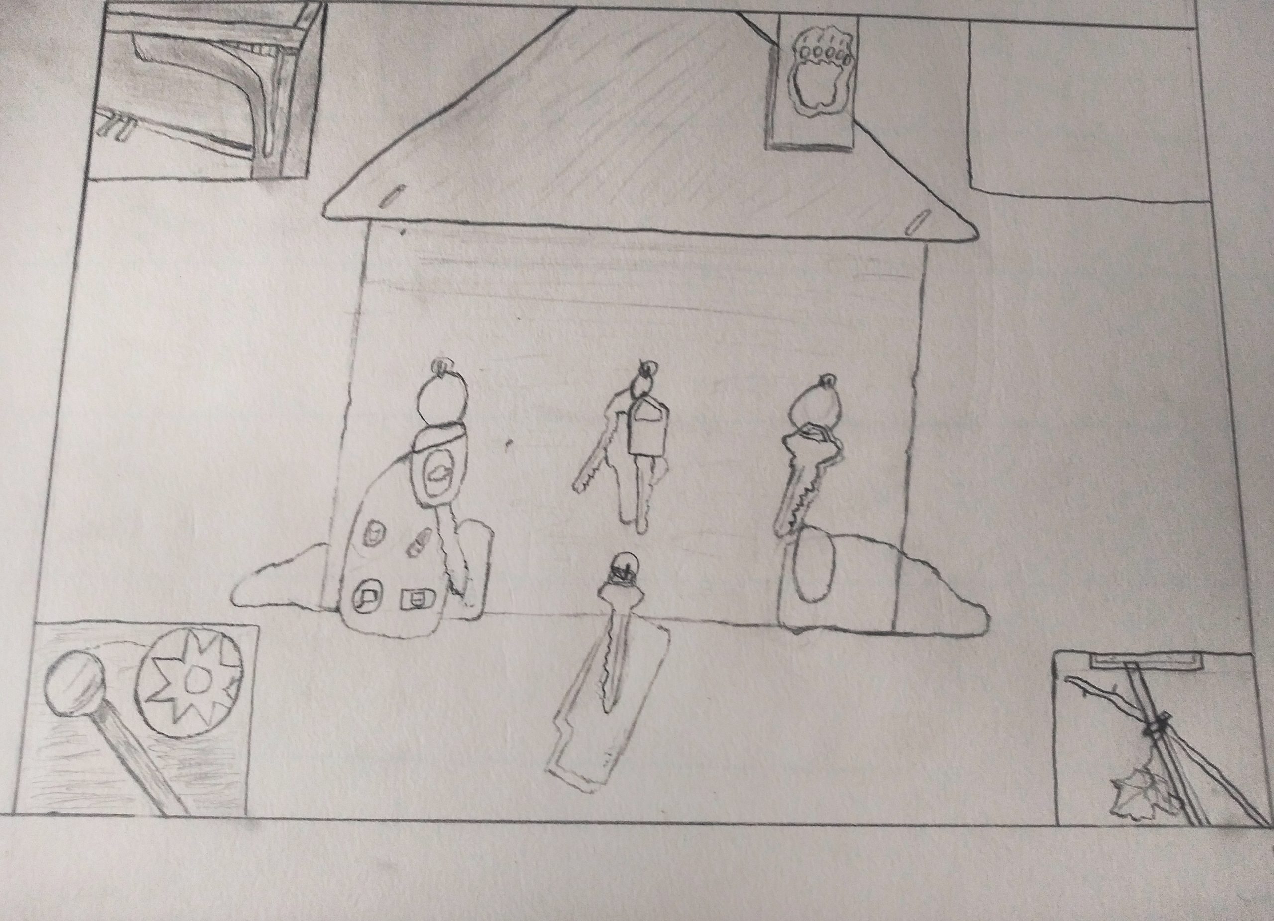
For this one I drew a key holder thing that hangs by the door in my house. I think my brother made it when he was little that’s why it’s mounted all crooked and is cracked and stuff. The key holder thing is full of keys because everyone is home for the pandemic. The little boxes show different activities that are filling this time at home. I drew them so that they tell a couple different stories. 1) if look piano, rattle, dead flower, then empty box then you have a story of enthusiasm descending into nothingness. 2) if you look piano, empty box, rattles, then dead flower. You have the breaking down of enthusiasm into a sadness. But the box is empty so fill with what you want.
I really like the thought you put into this and I think you perfectly captured the bittersweet nature of the pandemic. There are sadness and disappointment that comes with moving back home but the feeling of unity and togetherness from a full home again. I also really love the four boxes and the different ways to interpret them. One suggestion I have is making sure you take the picture of your work from directly above it and then editing and brightening it up a bit. You could also strengthen some of your lines to make your piece more confident and unified.
I agree with Olivia. I think taking a more direct photo and editing it a bit would improve our experience viewing your drawing. I also think you need more confidence! Your lines are very light, and they waver often. I get the sense that you’re afraid to draw or something. I might recommend doing some sketches before you work on the final draft and giving yourself some room to make mistakes. Generally, I think you need more conviction when you draw because I like your composition. I think you have a great concept, and the format of the drawing clearly demonstrates your creativity. I like the activity in the corners, though I’m not convinced by the empty box. I like the story you’re trying to tell. I think the smaller boxes employ depth and perspective to a stronger degree than the center drawing, but that could be improved with more shadows to kind of place the keyholder somewhere rather than it exist in empty space.
Hi Bryant,
My apologies for the delayed reply, but Olivia and Nate have done a great job talking about your work. I agree with them entirely–good advice.
Olivia’s summary of what we’re seeing here is very eloquent. Love how the keys actually look like figures in the house–a symbol and a representation at the same time.
As you can see, I agreed with the comments about better photography and editing as well. You do both us and yourself a disservice by submitting such a poorly composed and edited image. Let me know if I can help with this skill. I needed to spruce it up before I could begin to think about it.
The comments also mention your creativity and I agree. What a wonderful idea about changing the meaning based on the sequence, but I wish the symbols were more legible. I didn’t know what they were until I read your text, and I still don’t know what that small one is with the ring (?) in it, But I’m intrigued–especially by the empty box. Nice touch.