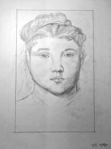
Good work, Hannah, with some very nuanced and subtle expression in the features.
Some notes:
The first thing I noticed when I saw this is that the features are off center. Degas was looking directly at her, and she’s looking directly at us, so she should be symmetrical (and is). The distance from the tip of her nose to either side of her face is equal on his; too wide on the left side (our left) and too narrow on the right side on yours.
This was something that should have been ironed out in the schematic. Inverting the image and the drawing would have turned this up right away.
The nose and mouth are beautifully drawn but a bit too dark. Note in his that there are moments when the value of the face and the value on the lips is the same; that is, the edge disappears. It gives a more tangible sense of light and connects (rather than separates) these planes. Still—beautifully drawn.
The shadow on the chin is likewise too dark and also too defined. It has much softer edges. As it is it looks like it might be a chin strap. Your soft edged hatching on the nose is much better.
The eyes are a bit too small and she seems to be looking over our right shoulder rather than directly toward us (and through us to some extent, but one thing at a time). This has do with the visible portions of the white of the eye. When we turn to look at something one side narrows and the other side widens as the iris moves right to left. Yours have the irises looking left and slightly up.
Also her lids are wider and heavier.
Good job on the hair, following his example and keeping it simple, but the accents around the head band are too dark and draw a bit of attention away from the portrait.
The sides of the neck in the Degas angle in ever so slightly as they descend. Yours do the opposite, giving a false sense of her build.
Despite this list, something of the original—a strong woman at peace with herself but still vulnerable–shines through in your version as well. More attention to the basic alignments and measures would take it that much farther.
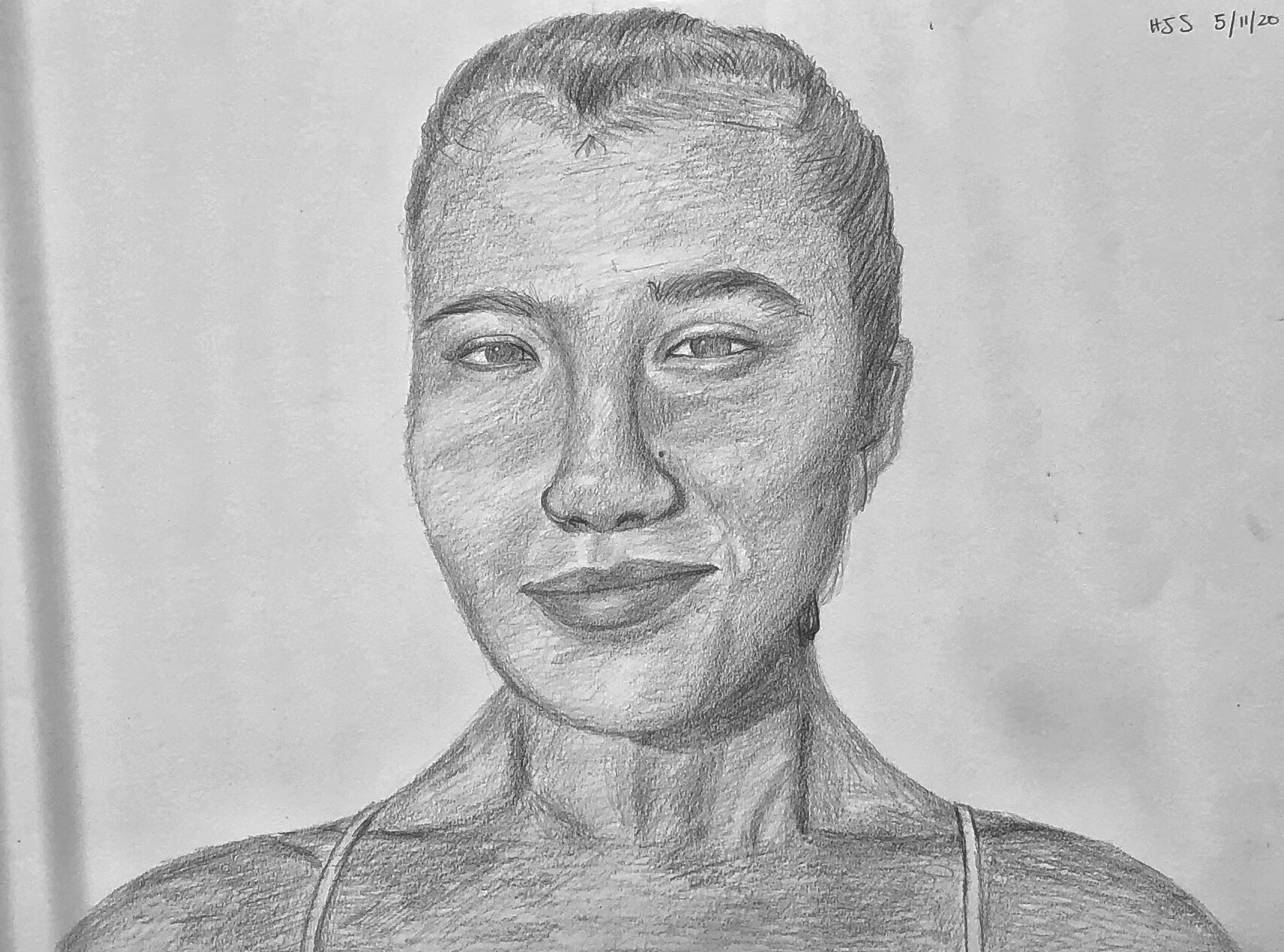
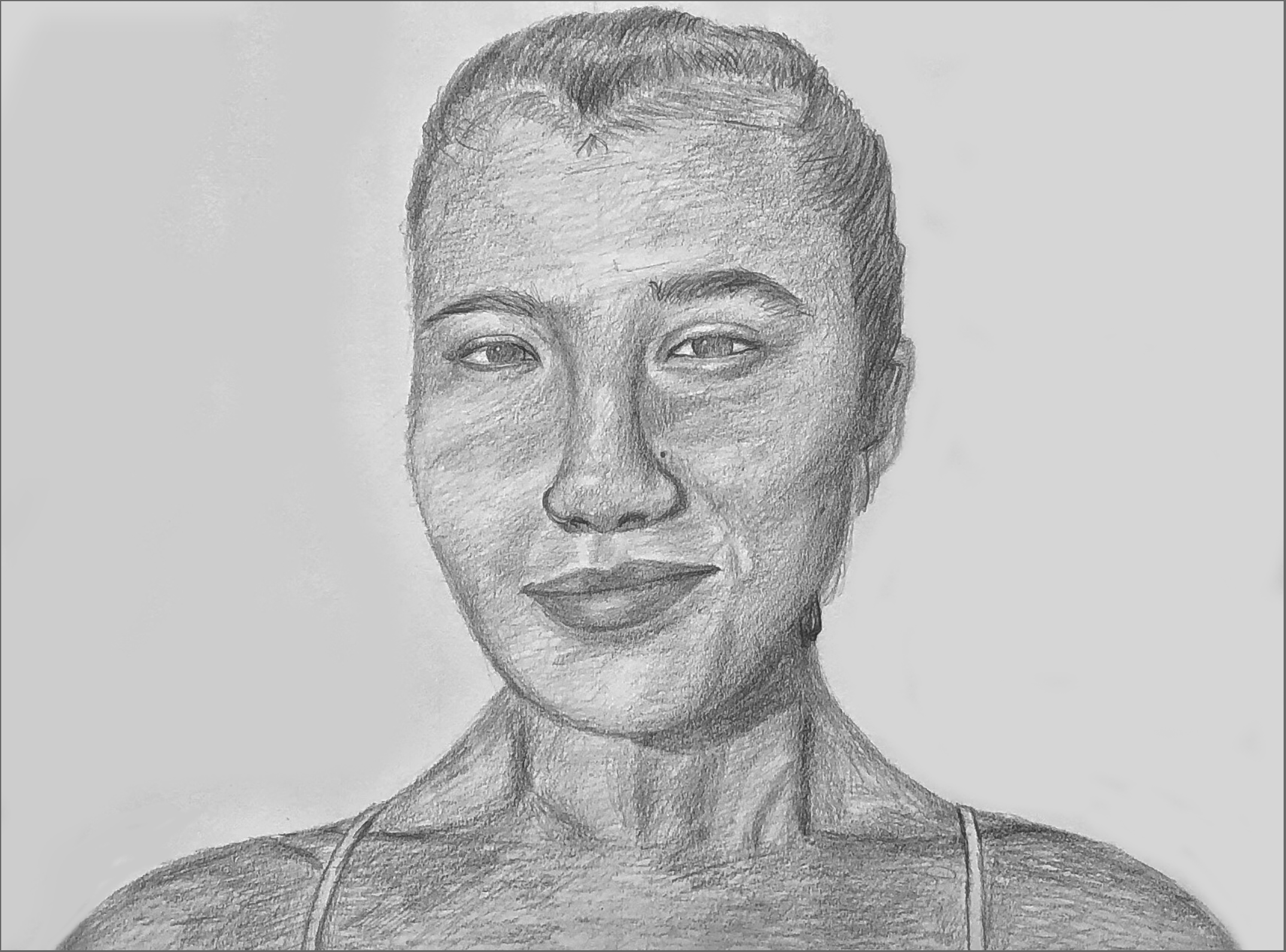

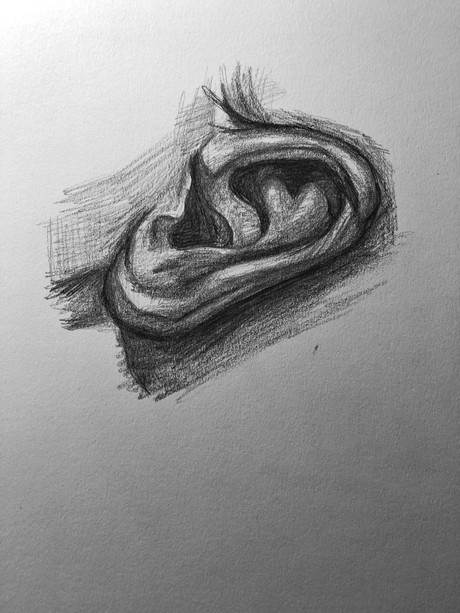
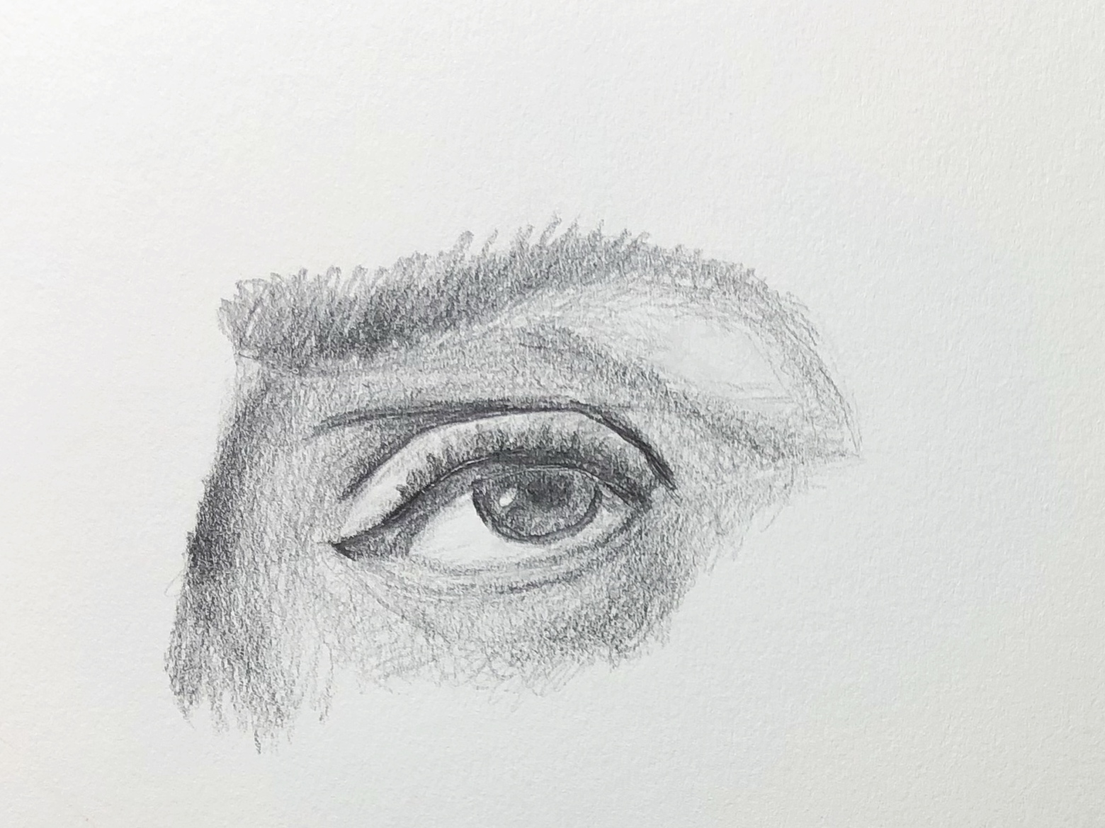
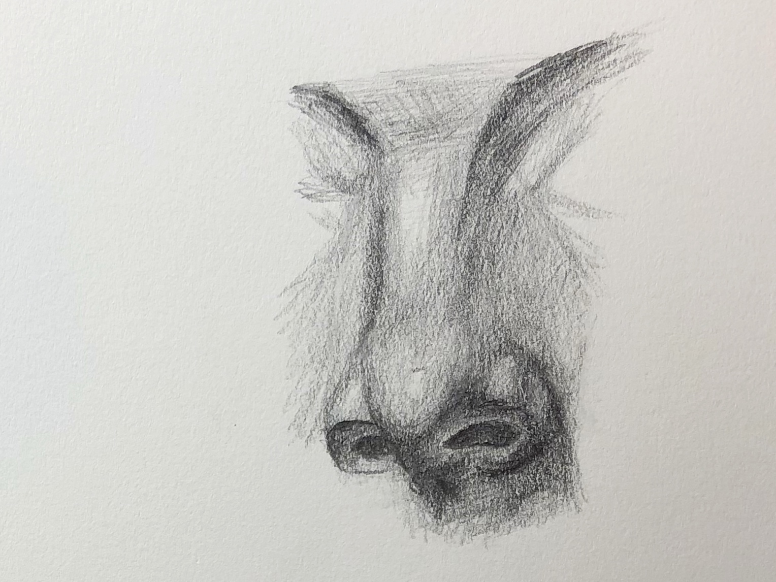
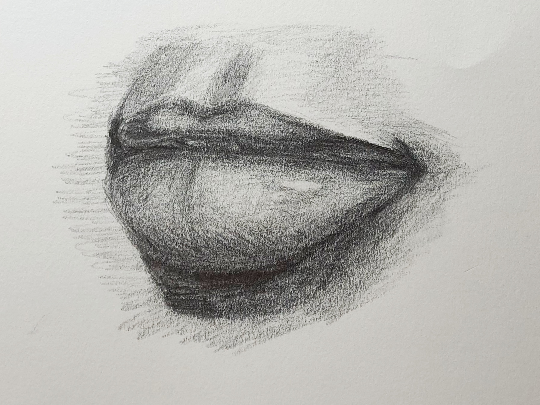
 image 27