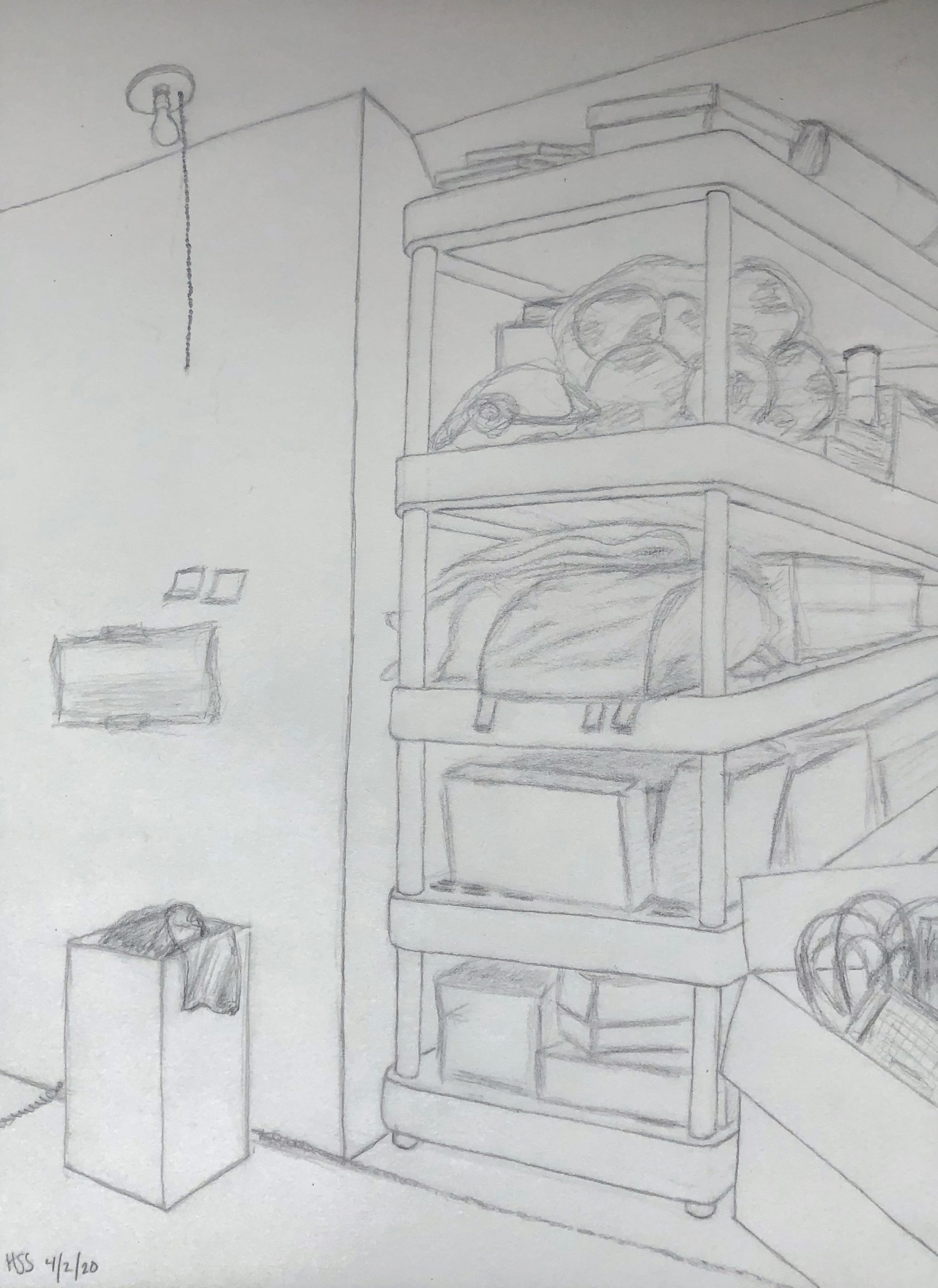
After increasing contrast (the best I could with a poor exposure), straightening the verticals, cropping the top slightly, and the right to “decelerate” the pull to the right and draw more attention front and center:
Professor Mark Wethli – Spring 2020
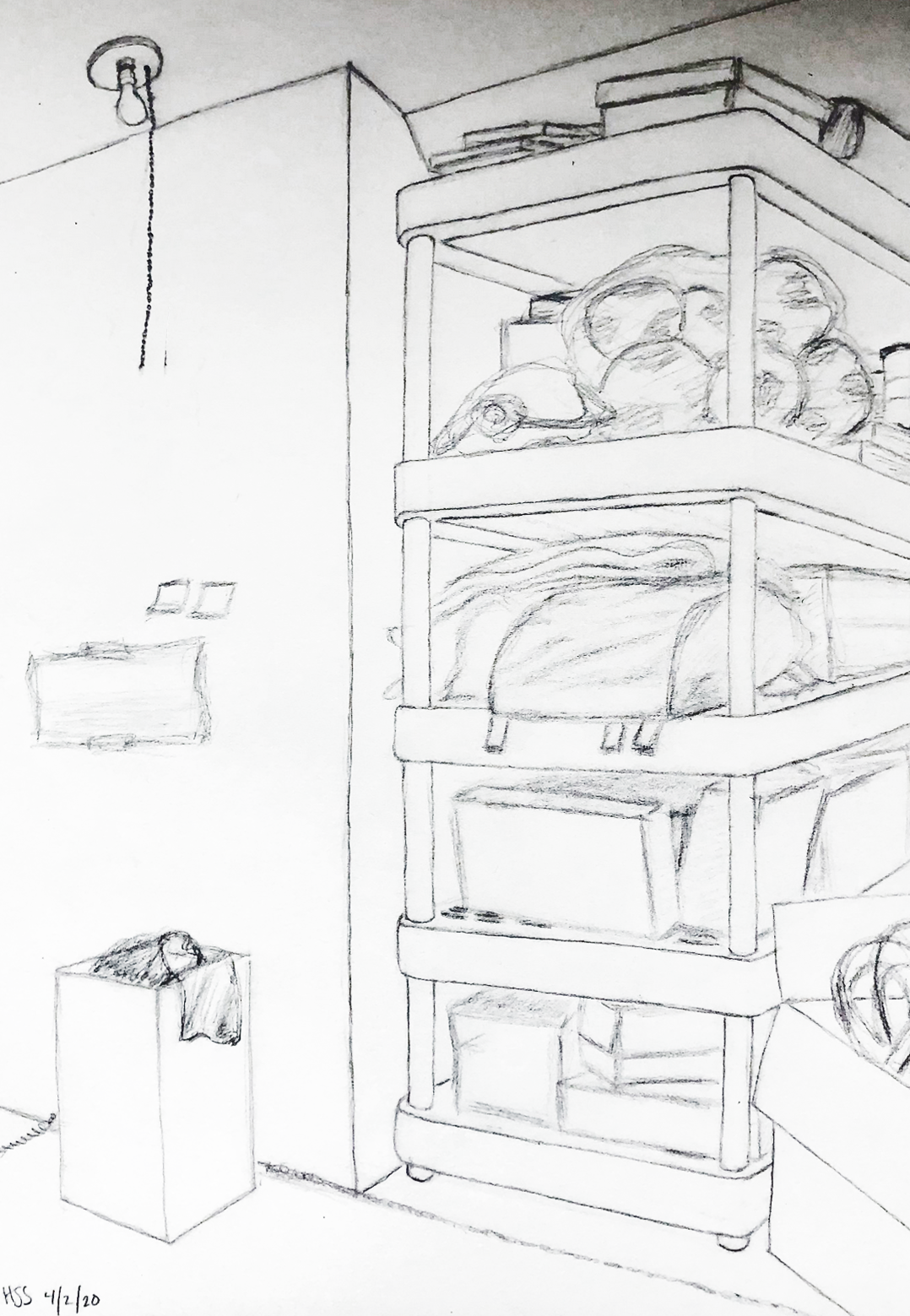
After increasing contrast (the best I could with a poor exposure), straightening the verticals, cropping the top slightly, and the right to “decelerate” the pull to the right and draw more attention front and center:
You must be logged in to post a comment.
This drawing was hard for me to make. I made a bunch of different versions of the drawing, but I was not very happy with them for various reasons. This one I submitted I drew in my attic, which is the only place I can get some stretches of time without interruption. I felt I was most able to do my best work on this version. I also liked the mundane nature of the scene, a familiar storage shelf and laundry basket. It was comforting to focus on something so regular to me in a time of extreme tumult. I liked the idea of using a more clear, decisive line for the furniture and permanent fixtures and a looser line for the junk, almost representing its impermanence. I do think my perspective is slightly off, especially on the shelf. I also think I could have made the furniture lines darker.
Your perspective for the shelf seems great, but since you have done so many drafts of this scene it makes sense that you are much more critical than I am. I think your hard work has payed off to create a beautiful perspective drawing. The piece is compositionally well balanced with the intriguing potential energy of the thin light bulb string moving the viewers eyes away from the dominating shelves on the right side of the drawing. I enjoy the presence of the whispering line quality of the soccer balls, and I appreciate the concept of temporality playing into your line quality. As you mentioned, I think darkening the furniture and perhaps other objects on the left middle would make this piece even better. Have you considered adding a few more details regarding texture or labels? I know working in a busy place and perspective line drawings don’t go well together, but you’ve managed to do a great job with this assignment!
Hannah, I think you did a wonderful job in capturing the detail of this attic scene. I can tell that you put a lot of time and effort into really seeing what was in front of you in order to show each and every detail. In terms of your perspective, I actually think the angles in the drawing are very accurate and know that achieving this consistency is not easy. The main suggestion I have is the line weight throughout the work. I would say that there isn’t much variety in terms of your line weight which could allow a better sense of depth of different objects and areas. Overall, I think you did a great job and am very impressed with how your were able to capture the many details in the space.
Hi Hannah,
My apologies for the slow turnaround on this comment. Getting this week’s assignment out eclipsed my time for comments–just catching up.
I love your thinking for this drawing–why you chose that spot, and the fleeting presence of objects–but the drawing doesn’t capture that as well as it could. My first take is that it looks like storage areas I’ve seen in homes many times over, and thus felt kind of anonymous. There’s no debating that this is the place YOU chose to mark “where you are”–seeking a place of respite–but my feedback about the drawing itself is as follows–
A big impediment here is your photography, which appears to be out of focus, and your editing, which needs higher contrast to bring out the lines and lighten the paper. My comments are limited a bit by not having a better view of the piece. Please work on this skill for this coming week (haven’t seen your Time Capsule yet).
Great job with the 2-point perspective, but your lines lack the consistency and character of the one you drew just before we left, which was great. I agree with Ian–they could use a little more conviction and development. The problem with this particular point of view is the 2 sets of receding lines “drain” the viewer’s attention off to the left and right. Aadhya’s correct–the string on the light (as well as the waste can) slow down this recession a bit on the left side, but the right side ushers the eye out too quickly (thank goodness for the box in the lower right).
This phenomenon is exacerbated by the tipping verticals, which happen to be tipping to the right. See my notes above (after the drawing).
Love your attention to the specifics of the things on the shelves–labels and patterns and such–but I agree with Aadhya–still more of this kind of information would make this more fascinating and a stronger document of a place and time.
A solid image overall, but the above suggestions could put the viewer still more in your place, both physically and emotionally.