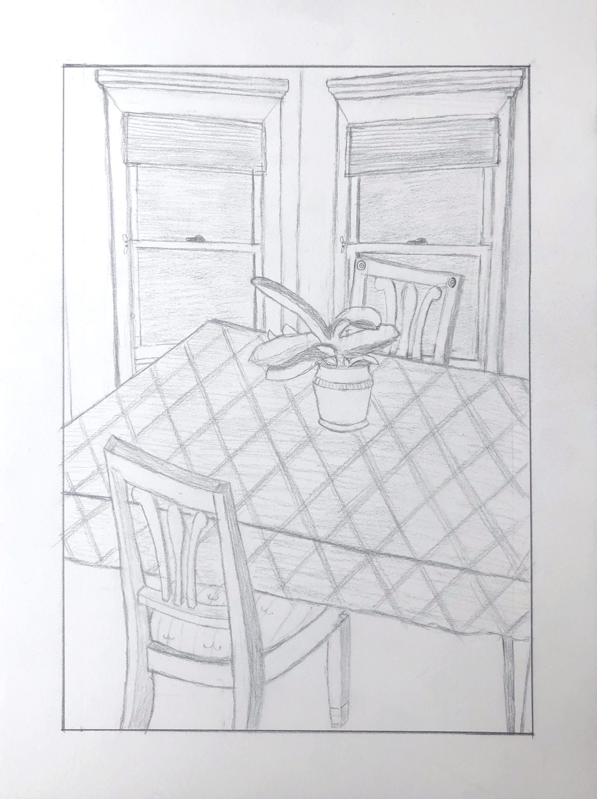
This is an almost great composition, save for the dreaded TANGENCIES along the top edge (i.e. space killers, because they glue the drawing to its frame). In a composition in which everything else but the potted plant is cropped or overlapped, I’d probably opt for cropping the top of the windows (on the left), which also throws more attention to the plant at the center.
But you could also open up the space a little (on the right side as well) for another good solution.
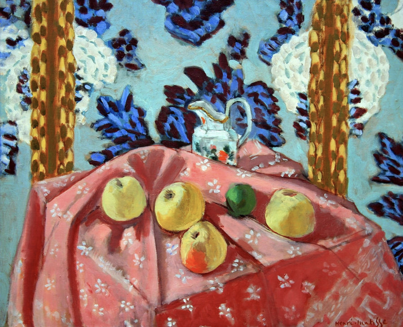 Matisse
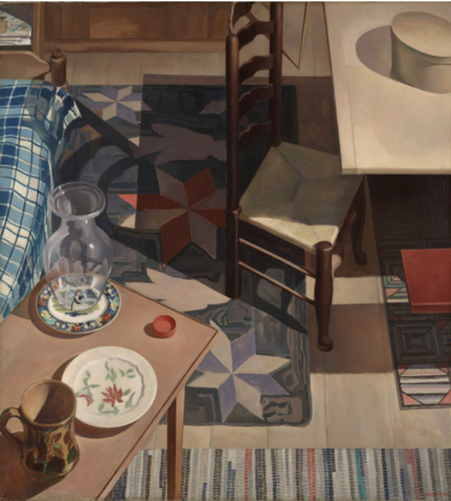 Charles Sheeler, American Interior, 1934
I really enjoyed crafting this drawing. I believe partially due to the stress relief during these difficult times, but I think I would have enjoyed it otherwise as well. I found it particularly rewarding to draw a place that you know so well and have grown up with every single day. I think this drawing went fairly well. I like my composition a lot and I really paid a great deal of attention to the chairs in order to make it appear 3D which I think enhanced my piece. A few things I know I could have improved upon is my line weight and quality in certain locations. I also struggled a lot to make the windows appear as if they were at different angles (which they are) but I am unsure if that came across to my viewers. Overall, very interesting drawing and I appreciated all of the detailed virtual instructions from Professor Wethli.
I find the composition of this piece very pleasing to look at. I think your efforts to show the windows at different angles came across and there’s something nice about having that symmetry broken up by the table and chairs at the forefront. The chair in the front is especially well done.
I could be wrong, but the perspective of the table seems a little off to me. My brain is telling me that the table shouldn’t taper as much as it exits the drawing on the right. Again, you know this location better than I do, but something about the perspective seems a little wonky and worth re-examining.
I really enjoy the style of this drawing, it kind of reminds me of a Matisse still life. I think the composition works really well here, as it’s symmetrical but not blandly straight-forward, like how the windows reflect each other, as the chairs do too. While I like the more sketchy style of your lines, I think your drawing would be improved if there was some variation in line weight, for example if the plant or the table were darker it would give more of an idea of where the focal point is because the composition is so carefully balanced. Good job on this, I’m glad you found it so enjoyable.
Great job, Ryan.
What I find so engaging and charming about this drawing is what Lily noticed—its similarity to still lives by Matisse (great comparison, Lily!).
Amanda is right about the perspective being off, according to the rules of linear perspective, but Matisse—like so many artists after Cezanne started painting this way—preferred to combine different viewpoints to give us a better look at things. It also represents how we actually see—with a changing viewpoint or combination of viewpoints rather than just one—by looking down at the table top and a moment later looking up at the windows.
By tipping up the table top as you both do (into what’s called an orthogonal perspective, with receding parallel lines actually drawn parallel, rather than converging, as in Chinese art), it fills the picture more dramatically than it would in a “photo” view. Like Matisse, this effect is fortified by the grid pattern that doesn’t change direction (foreshorten) as it goes over the edge of the table. Some texture or pattern on the floor would be a nice addition, for visual interest and to identify that plane as well.
The big question is whether you intended this or not. Either way, you;’ve come up a winner as long as you like the results.
As for the angle of the windows to one another this does come across, but whether they’re at right angles, or some other angle (like in a bay window) is unclear. It would depend on your eye level as to whether the middle sashes are meant to angle upward or downward. I honestly don’t care because the drawing has more important uses for them, to fill that space in such a good way.
The only rub for me is in my notes above, about the tangency of the top of the windows with the top of the drawing. All of your other entrances and exits are decisive—almost a theme in the drawing—so this is out of place. Note my suggested solutions.
I’ve added a Matisse, to illustrate Lily’s point, and one by Charles Sheeler that does something similar.
Good work–