Professor Mark Wethli – Spring 2020
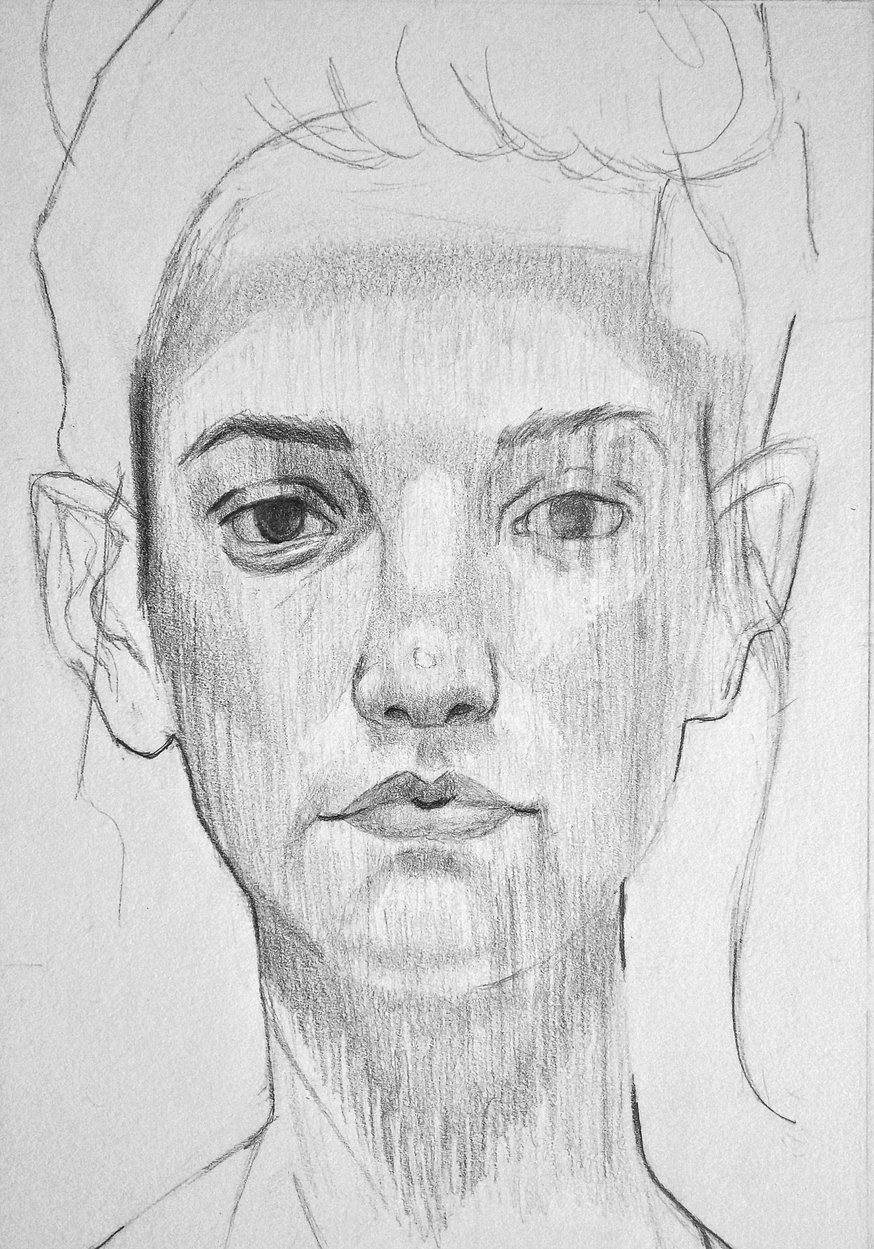
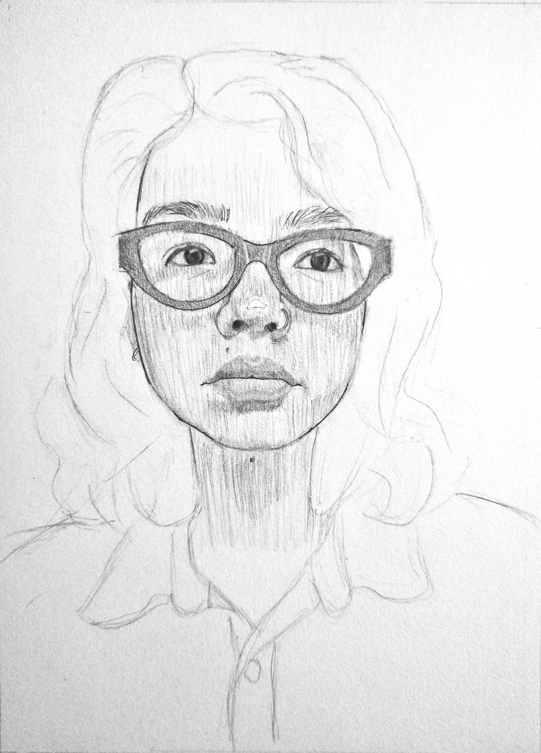
Simply tremendous job, Amanda. Beautifully composed and organized and a very fine response to Hanna’s modeling technique. The only room for improvement is subtler gradation (more gradual fading to white) on the shadow on the forehead, and a bit richer value range and modeling in the eye socket and eye on our left. The whites of her eye there are a shade darker.
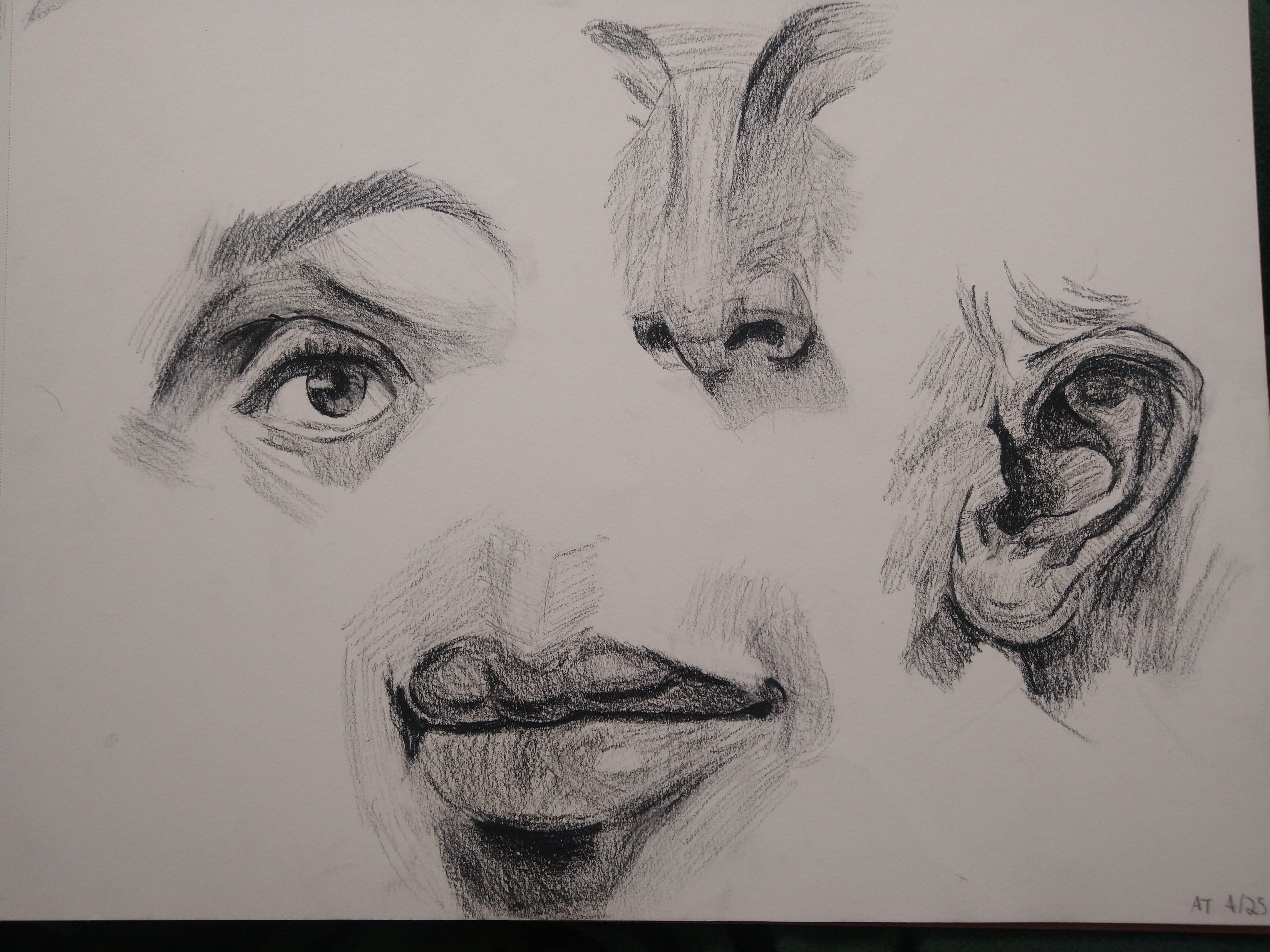
Excellent work–and very fine studies as well. Nice to see–
 Good, but darkest areas should be darker.
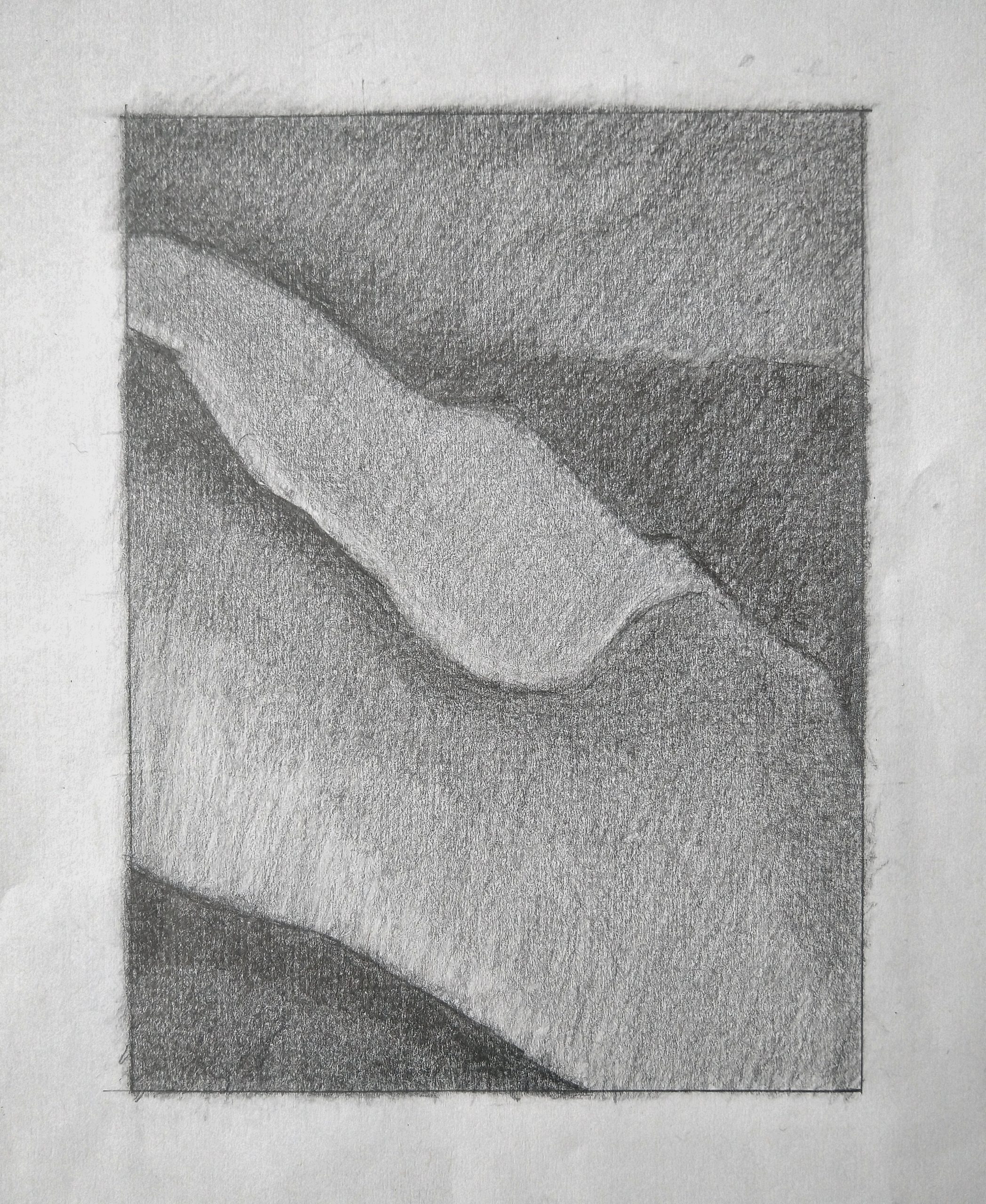
Good, but needs to be categorically darker. The lightest values in yours are comparable to the white of the paper but should be much darker. Even the very lightest value here doesn’t rival the white of the paper.
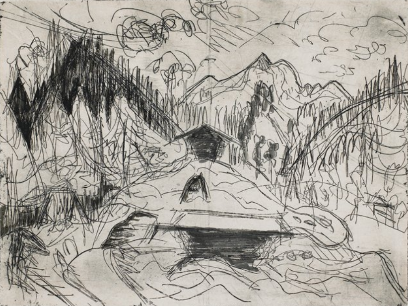
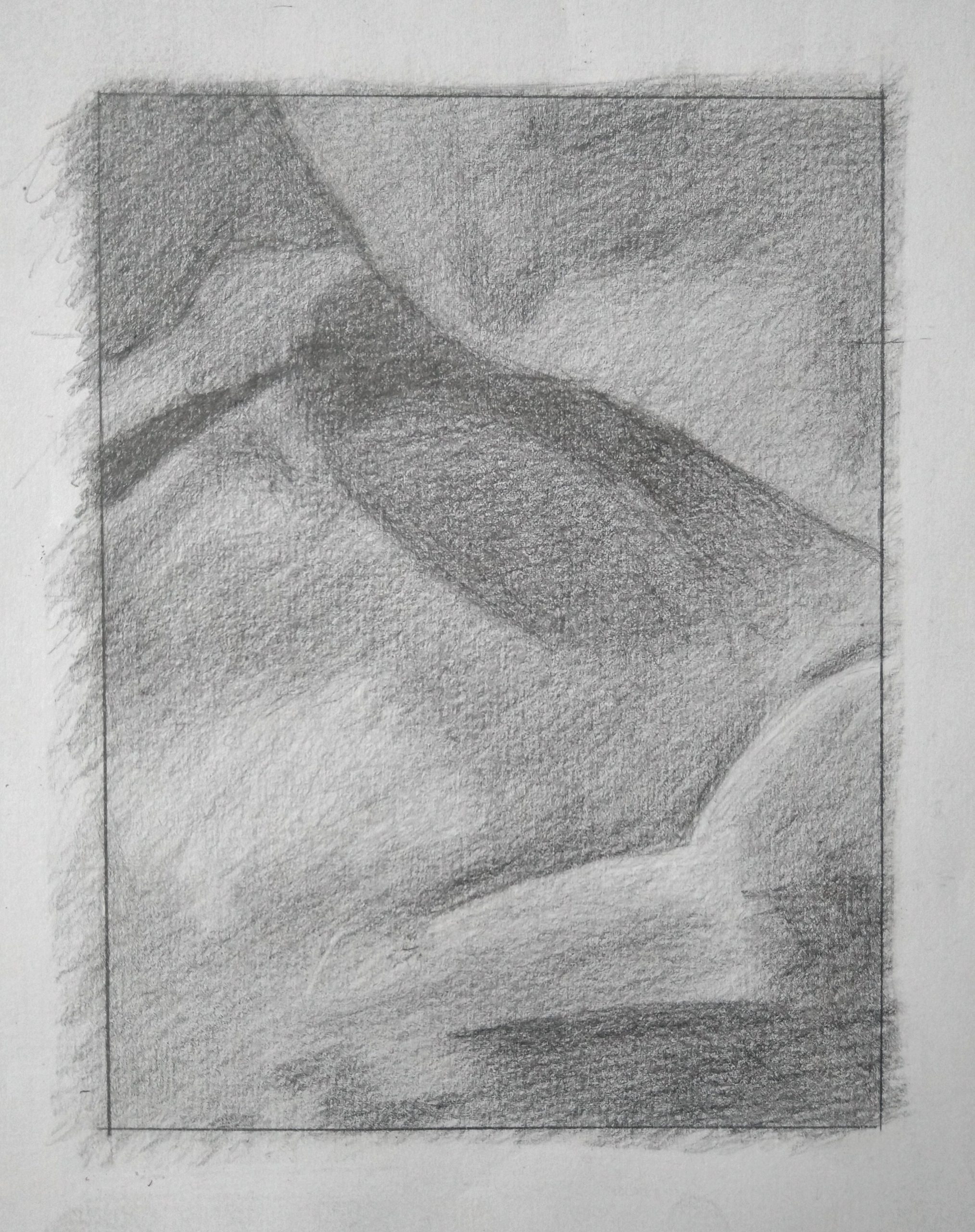
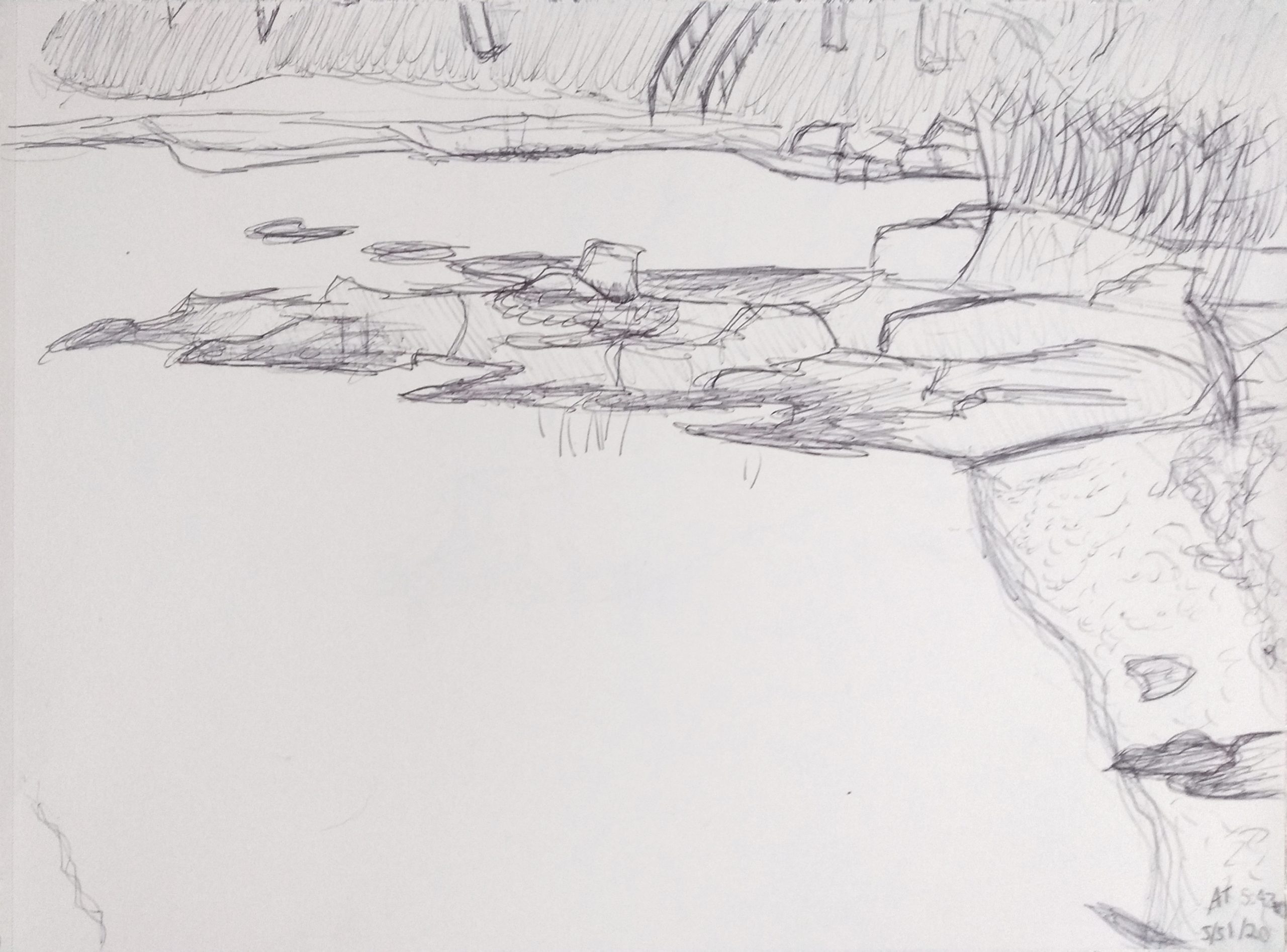
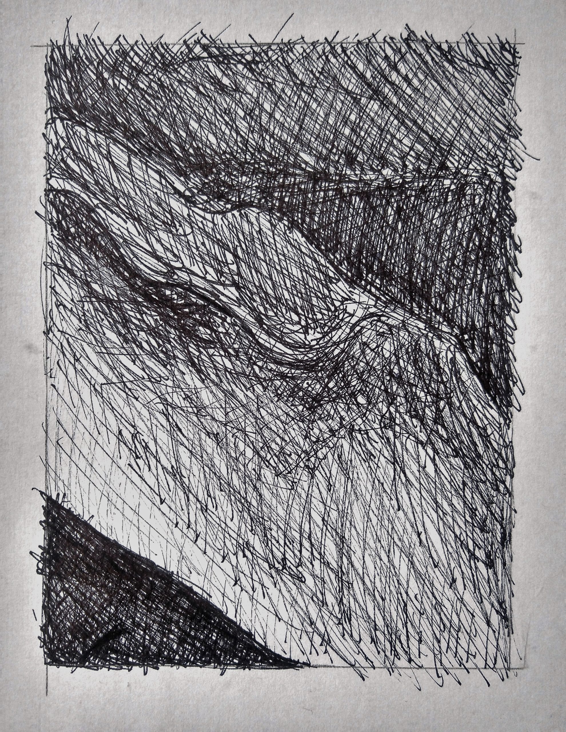 Good job on the lower left. The triangular shape on the right upper half should be the same darkness or very close to that. You need more contrast along that “breaking wave” shape by sharpening the edge and darkening the value that borders it there. Very top shape is too light and needs more hatching in multiple directions.
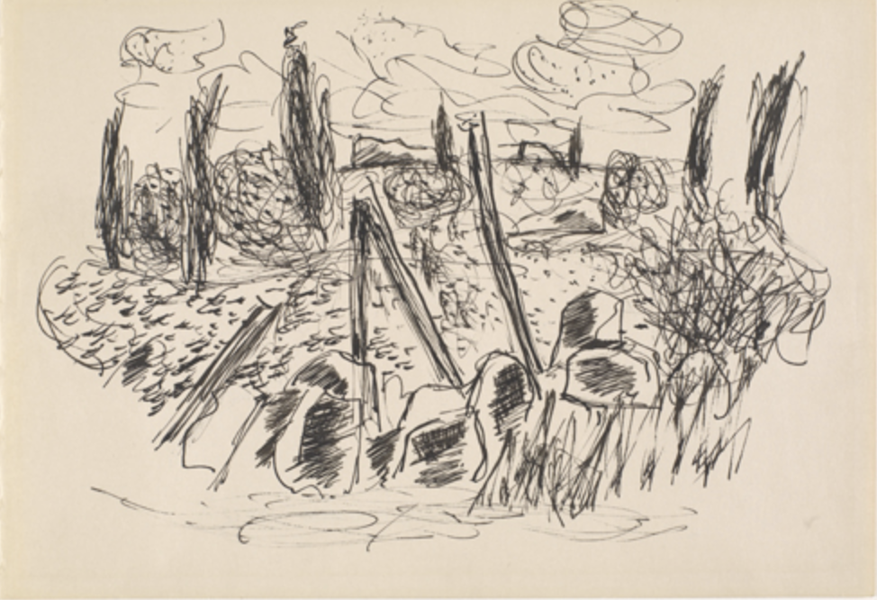
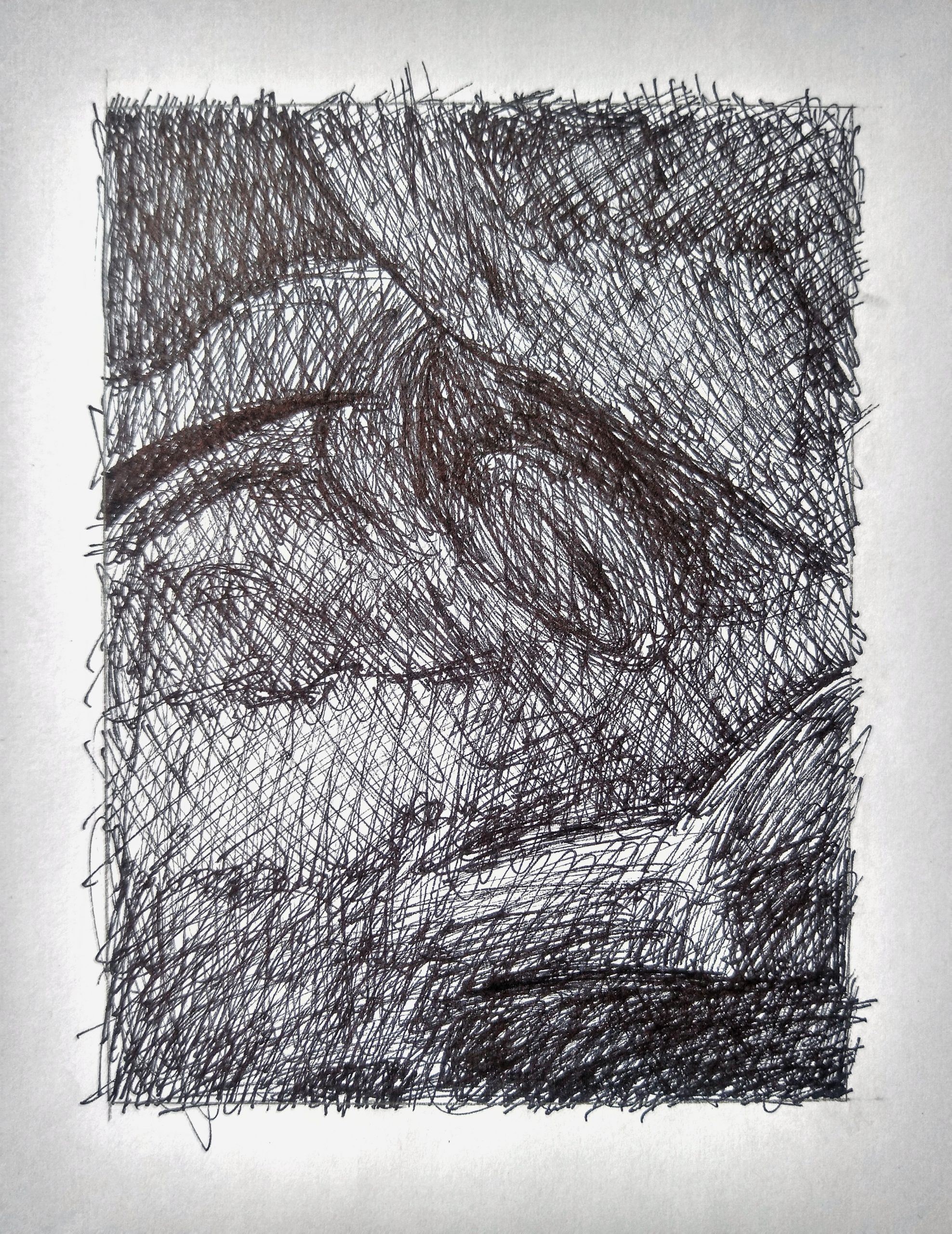 Upper left corner is darker. There’s a dark shape like a leaf and a stem in the upper half that needs to be more unified. You’re breaking it up into too many sub-values and sub-shapes, when in the reference it’s more unified. There are differences in it but they never overtake it’s unity and simplicity as a shape.
Better editing:
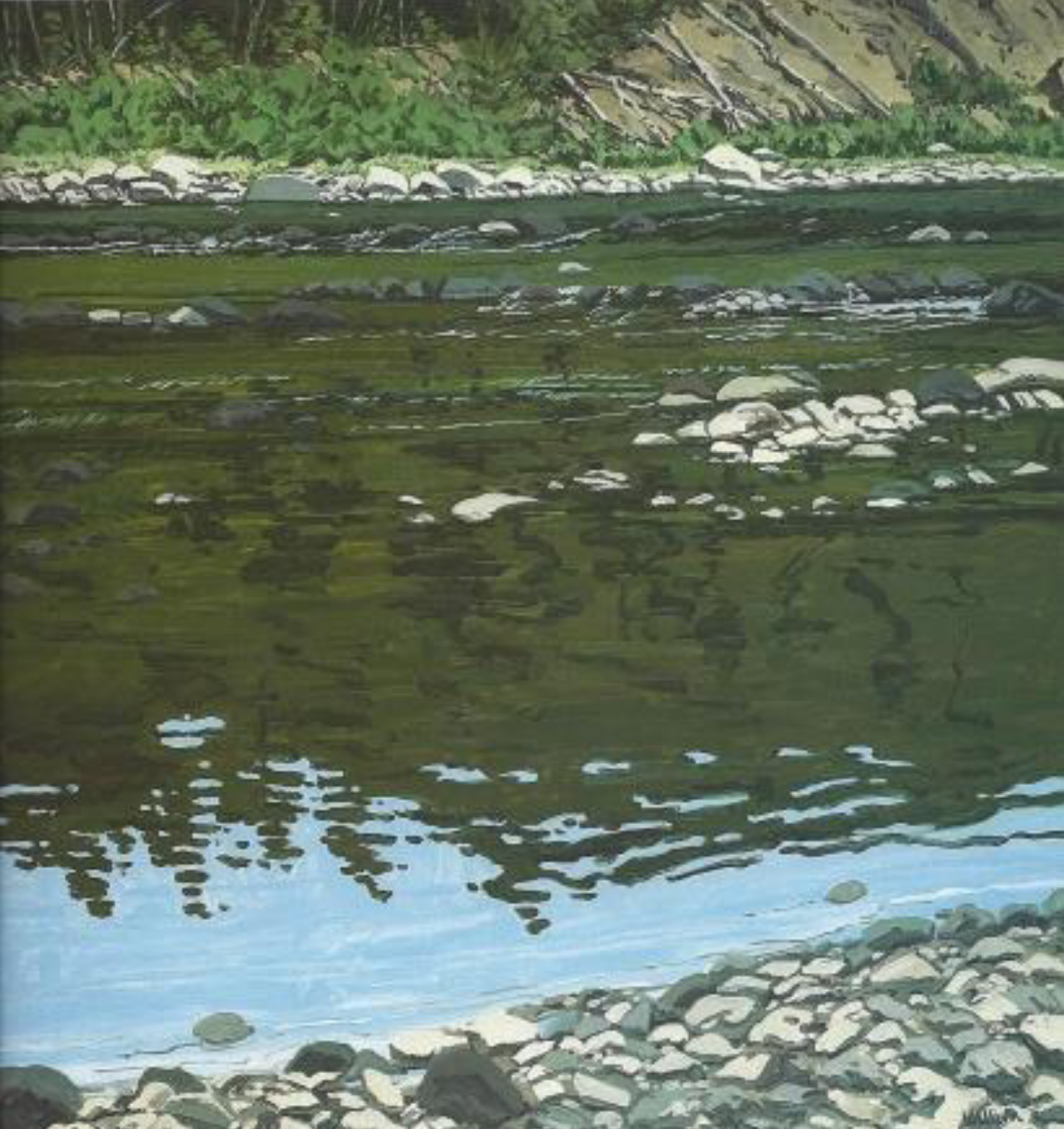
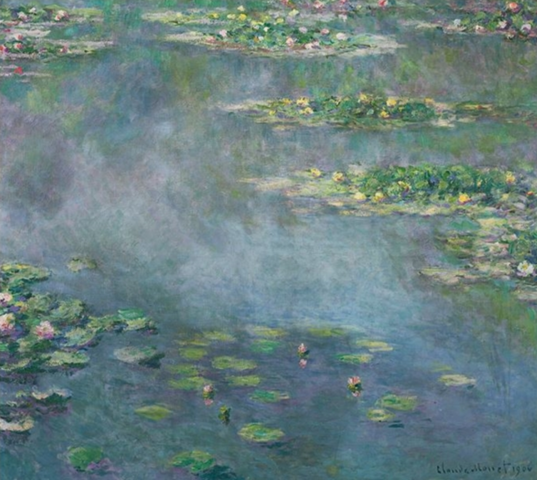 Claude Monet