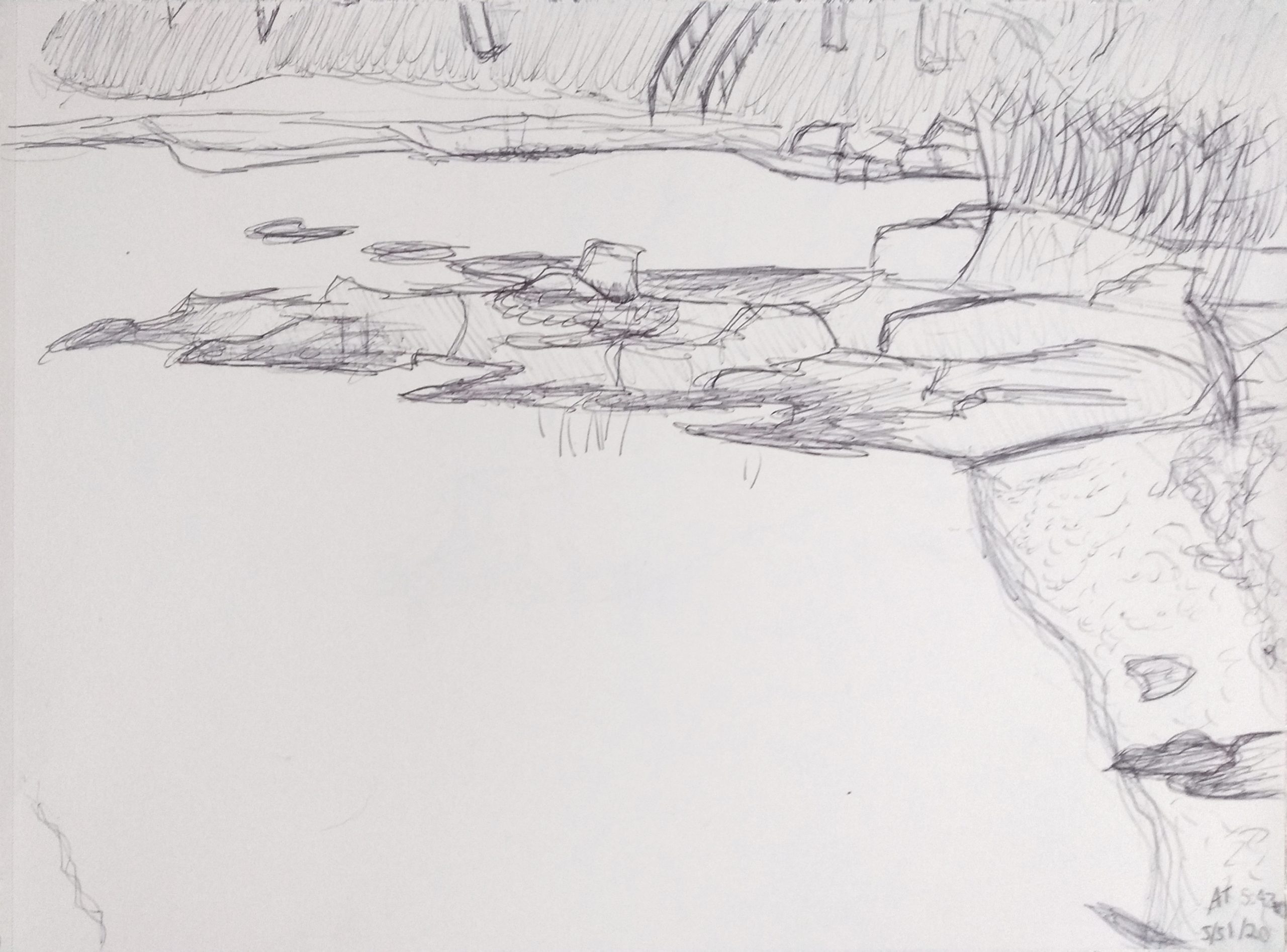
I experimented with a different type of drawing I hadn’t previously tried and had a lot of fun doing so. I’ve taken to long bike rides a few times a week and have been frequenting Simpson’s Point as of late. I felt like the landscape suited this type of free-flowing, energetic drawing and I was unsatisfied with the process of trying to make cleaner lines for the landscape in previous attempts. I have mixed feelings about the result; it’s difficult for me to see this as a “good drawing” when it’s so messy and simple and I feel like I obscured detail with value and messy lines. I also feel that there isn’t enough contrast which I didn’t really notice until photographing. However, the drawings themselves were a lot of fun to create and I think I’m going to keep messing with this style.
This drawing is particularly engaging. I enjoyed the risk you took in constructing an outdoor setting. It’s very easy for me to tell that this is a body of water meeting up against land, creating a shoreline, but in some places it’s a bit difficult to determine exactly what I am seeing. I appreciate the line weights which you experimented with in different locations to really bring this drawing to life and I love the detail on the rocks. I’m thinking maybe you could have shifted your composition a bit to the left, so that only a bit of the shore was visible and the emptiness of the water left more to be desired/unknown. Just a thought, but your focal point appears to be a bit off and in violation of the rule of thirds.
This is great Amanda, I actually love the composition as a whole but I think your drawing could be improved if you gave more information on what we’re seeing at the very top of the page. It feels a bit cut off at the top. I’m not quite sure how you’d do this while staying true to the original composition, maybe just moving the whole thing slightly down or giving more detail to the stuff in the background. The most outstanding part of this drawing to me, though, is your line quality and style. I think it does a great job of portraying the feeling of the landscape, and the way you use lines overlapping with each other in some places to create depth is just brilliant. Great job!
Good self-assessment and great comments from Ryan and Lily.
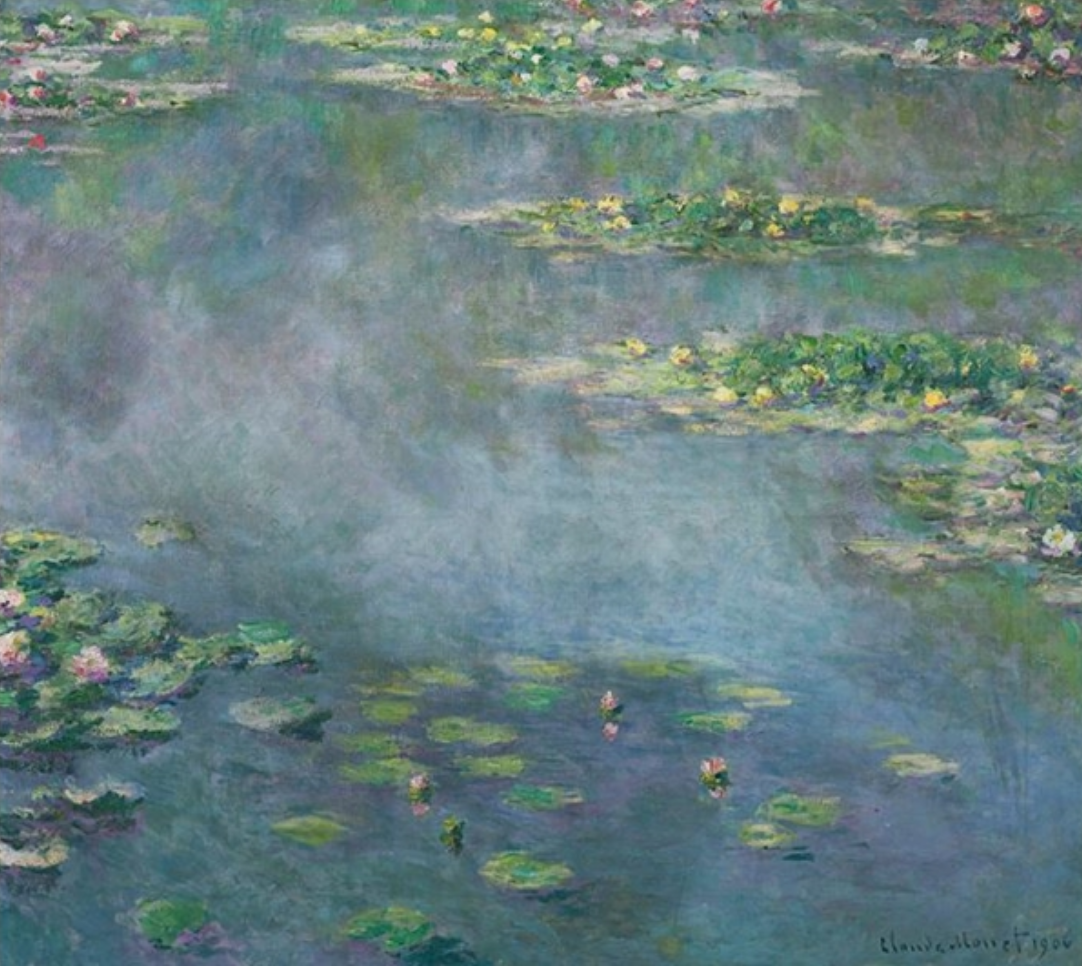
Your approach to this is first-rate, and remininscent of work by Monet (see above) and many artists since–looking downward to eliminate the horizon line and focus attention on the abstract shapes of the landscape. I agree with Ryan, though–there’s probably a better composition to be found by panning to the left or the right, and possibly up or down a bit–and not by much–to fill and activate the rectangle more effectively; the rule of thirds will never let you down.
I agree with Lily as well about that top edge–just enough information to whet our appetite but not enough to satisfy it. It’s those tree trunks especially that pull our attention up and out the top of the page.
Your own comment about the darkness of the lines was the first thing I noticed. When the subject shifts from a pretty view to the interlocking patterns found in nature, mark-making and graphic elements become more critical. You could have had more fun with this with a bolder attack. You’re being too tentative. Note the examples above by Kirchner and Hartley (who was from Lewiston, Maine)–both artists working in the expressionist tradition.
Note that Maine artist Neil Welliver (but internationally renowned) takes a similar viewpoint, activating the image with color and brushwork.
You’re in great company–I’d love to see you take up your own suggestion and try a few more of these.
 Claude Monet
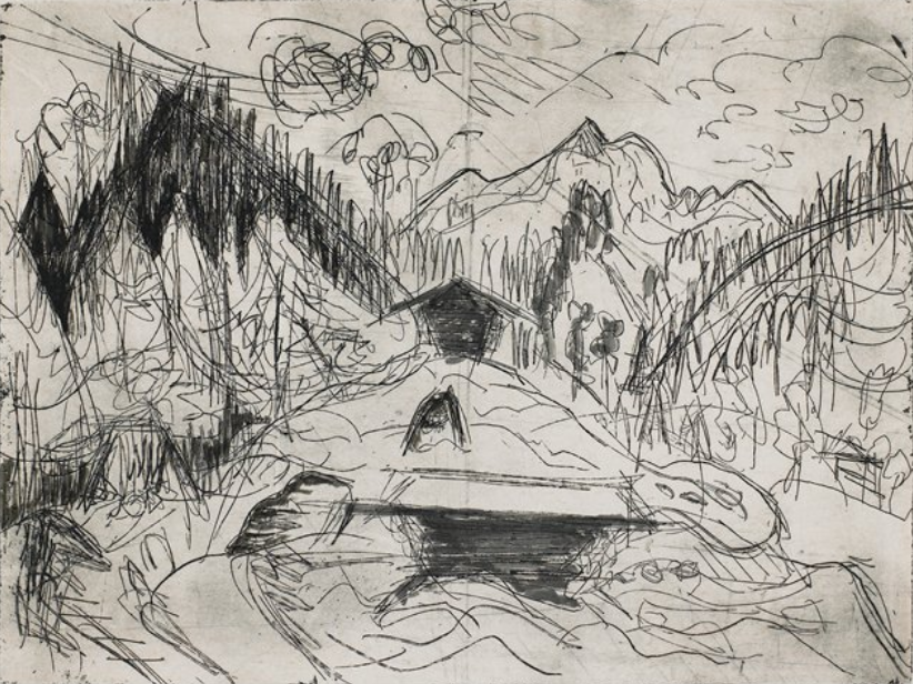 Ernst Kirchner
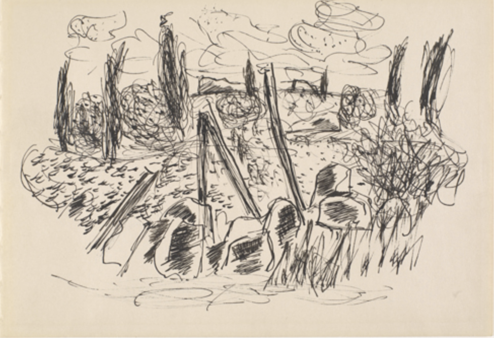 Marsden Hartley
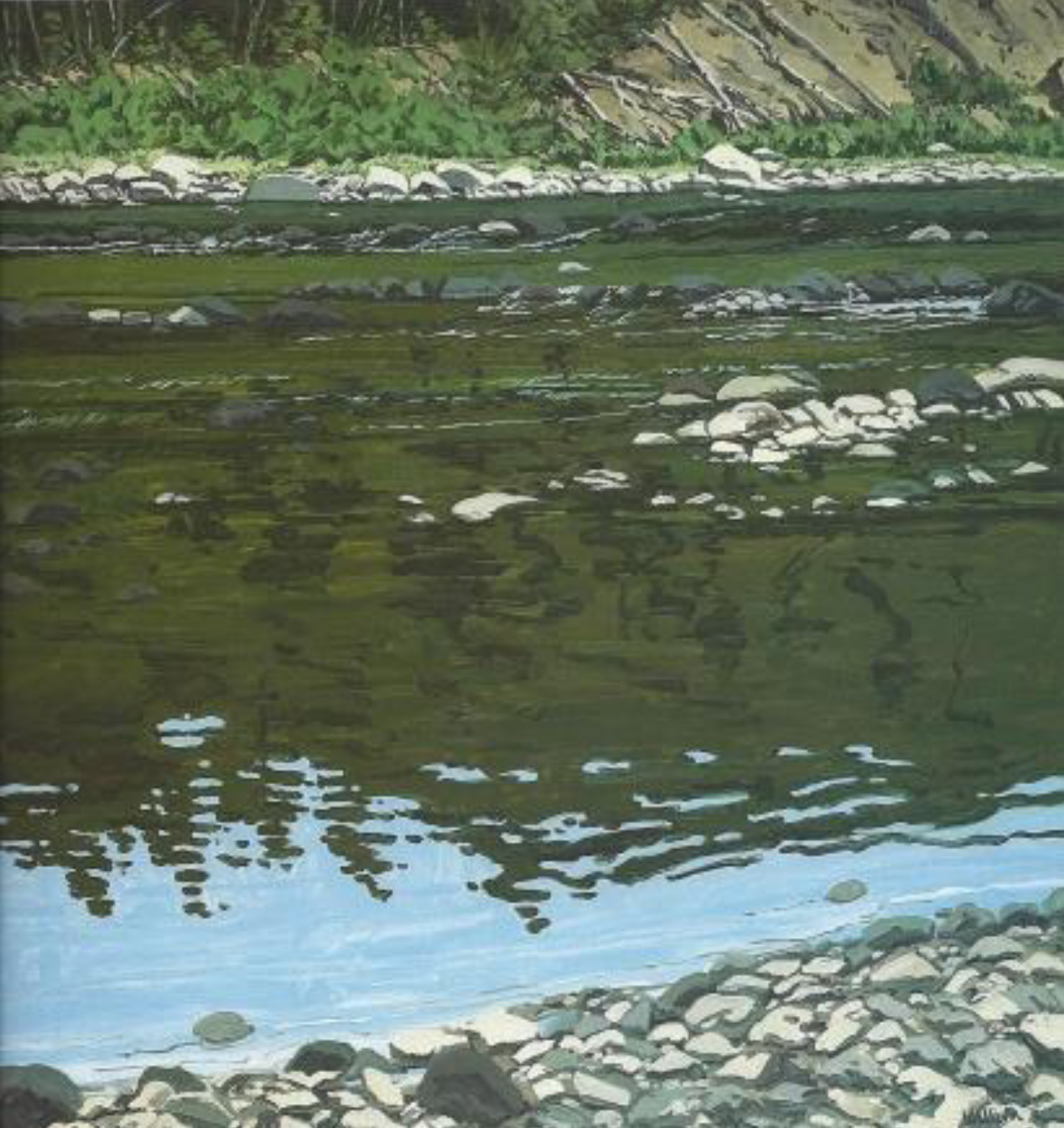 Neil Welliver
I experimented with a different type of drawing I hadn’t previously tried and had a lot of fun doing so. I’ve taken to long bike rides a few times a week and have been frequenting Simpson’s Point as of late. I felt like the landscape suited this type of free-flowing, energetic drawing and I was unsatisfied with the process of trying to make cleaner lines for the landscape in previous attempts. I have mixed feelings about the result; it’s difficult for me to see this as a “good drawing” when it’s so messy and simple and I feel like I obscured detail with value and messy lines. I also feel that there isn’t enough contrast which I didn’t really notice until photographing. However, the drawings themselves were a lot of fun to create and I think I’m going to keep messing with this style.
This drawing is particularly engaging. I enjoyed the risk you took in constructing an outdoor setting. It’s very easy for me to tell that this is a body of water meeting up against land, creating a shoreline, but in some places it’s a bit difficult to determine exactly what I am seeing. I appreciate the line weights which you experimented with in different locations to really bring this drawing to life and I love the detail on the rocks. I’m thinking maybe you could have shifted your composition a bit to the left, so that only a bit of the shore was visible and the emptiness of the water left more to be desired/unknown. Just a thought, but your focal point appears to be a bit off and in violation of the rule of thirds.
This is great Amanda, I actually love the composition as a whole but I think your drawing could be improved if you gave more information on what we’re seeing at the very top of the page. It feels a bit cut off at the top. I’m not quite sure how you’d do this while staying true to the original composition, maybe just moving the whole thing slightly down or giving more detail to the stuff in the background. The most outstanding part of this drawing to me, though, is your line quality and style. I think it does a great job of portraying the feeling of the landscape, and the way you use lines overlapping with each other in some places to create depth is just brilliant. Great job!
Hi Amanda,
Good self-assessment and great comments from Ryan and Lily.
Your approach to this is first-rate, and remininscent of work by Monet (see above) and many artists since–looking downward to eliminate the horizon line and focus attention on the abstract shapes of the landscape. I agree with Ryan, though–there’s probably a better composition to be found by panning to the left or the right, and possibly up or down a bit–and not by much–to fill and activate the rectangle more effectively; the rule of thirds will never let you down.
I agree with Lily as well about that top edge–just enough information to whet our appetite but not enough to satisfy it. It’s those tree trunks especially that pull our attention up and out the top of the page.
Your own comment about the darkness of the lines was the first thing I noticed. When the subject shifts from a pretty view to the interlocking patterns found in nature, mark-making and graphic elements become more critical. You could have had more fun with this with a bolder attack. You’re being too tentative. Note the examples above by Kirchner and Hartley (who was from Lewiston, Maine)–both artists working in the expressionist tradition.
Note that Maine artist Neil Welliver (but internationally renowned) takes a similar viewpoint, activating the image with color and brushwork.
You’re in great company–I’d love to see you take up your own suggestion and try a few more of these.