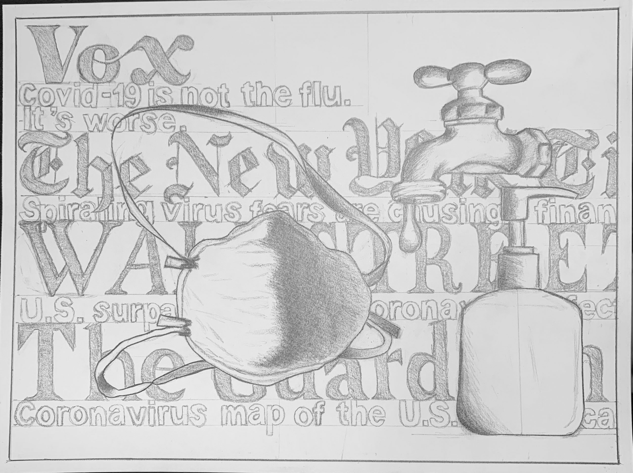
Category: 2) Time Capsule Drawing
Hannah Schleifer Time Capsule
I took the liberty of editing this further, using the tools I’ve shared before, to give us a better look (and to do it justice):
And my suggestion to raise your viewpoint (see comment).
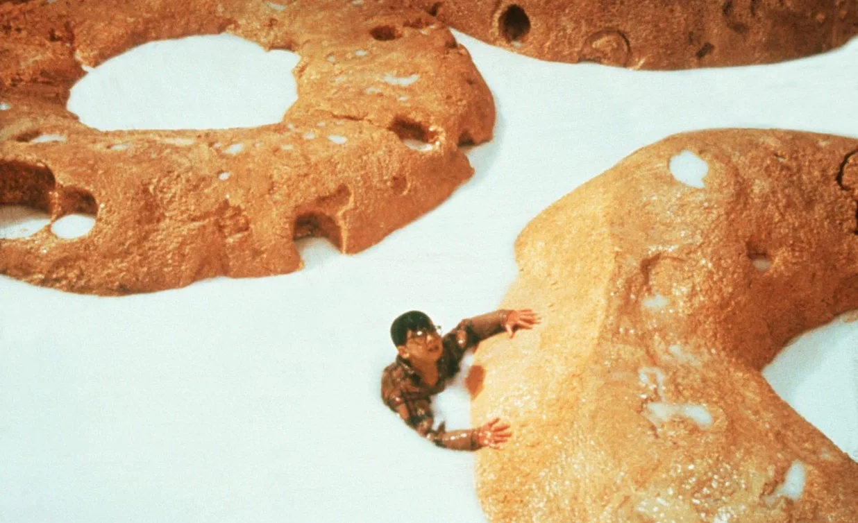
This also brings to mind this scene from “Honey, I Shrunk the Kids” (from when your parents were your age). That’s a kid in a bowl of Cherrios.
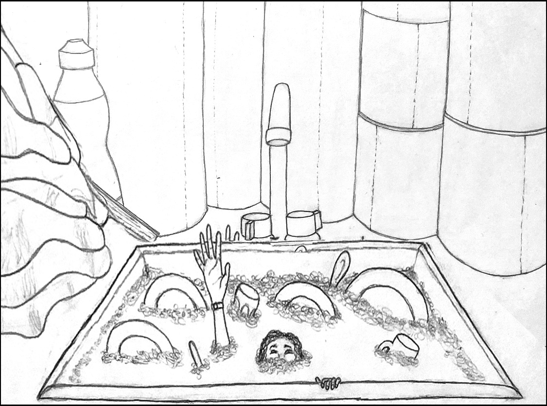
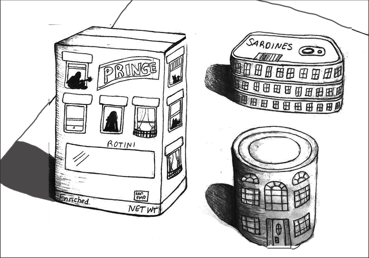
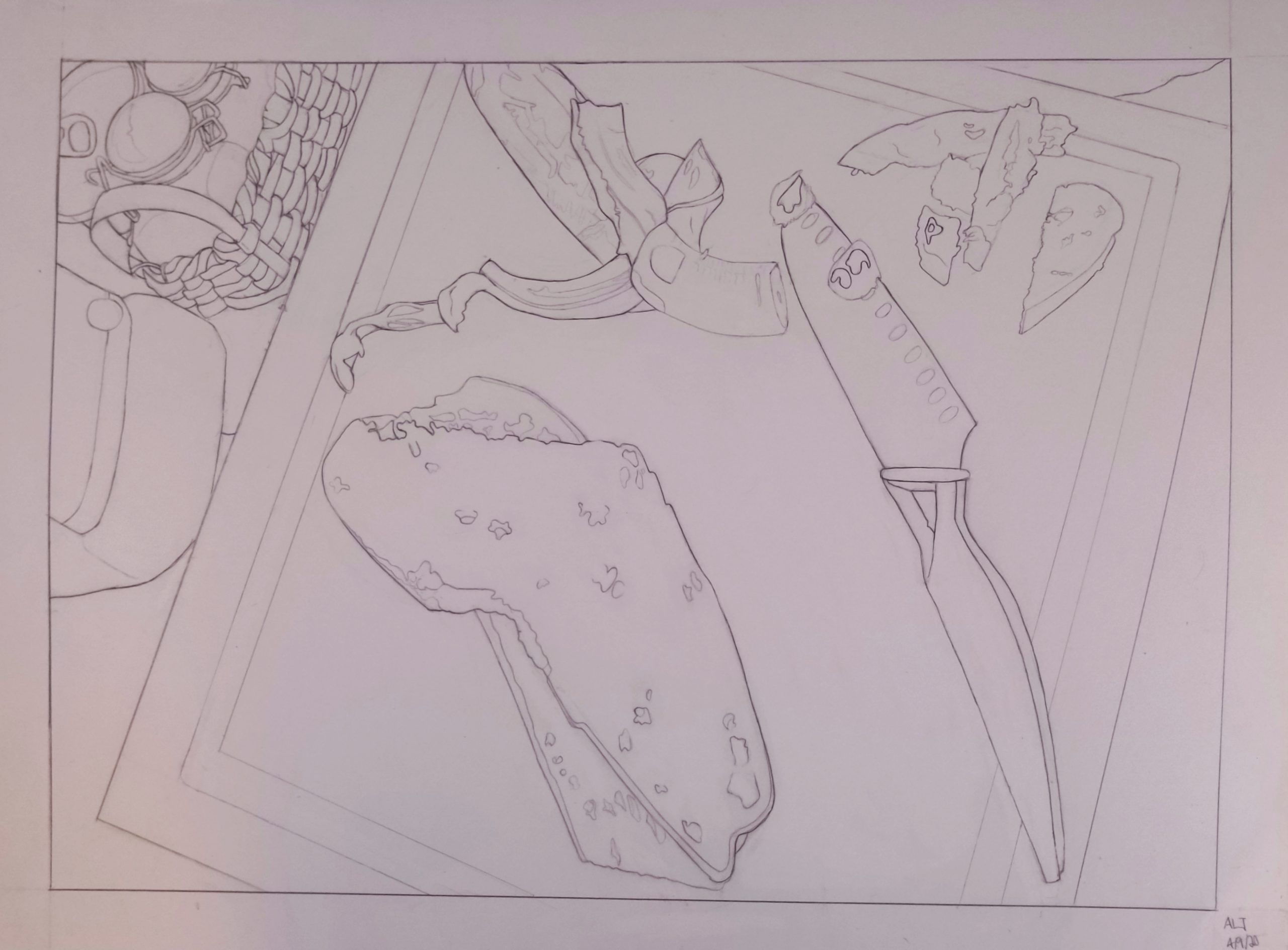
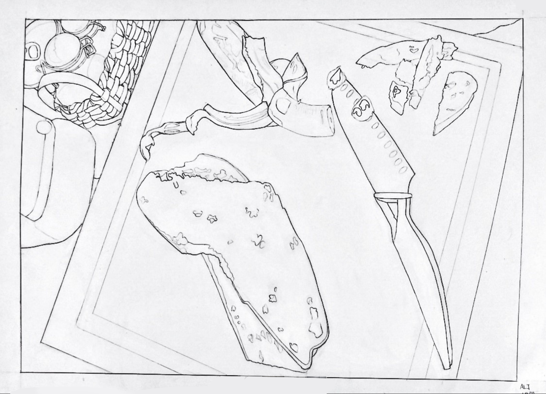
Grace BT Time Capsule Drawing
The cast shadows darkened a bit in the process, but here’s a lighter, higher contrast version to make it easier to see (I added the outline):
And here’s a version (below) with a little more space around the objects and straightening them up, so they’re not sliding off the table. There’s a certain charm in that, but it does make for an unstable composition. I think the added space around them gives them a stronger sense of what you’re after–objects isolated not only from one another but from the border (space around them) as well.
This reminds me of the famous Saul Steinberg drawing (a New Yorker cover from 1976), of a New Yorker’s view of America. Your objects have a similar child-like charm, and even your style and lettering (as well as the eye level, looking down) are reminiscent of his–great company to be in:
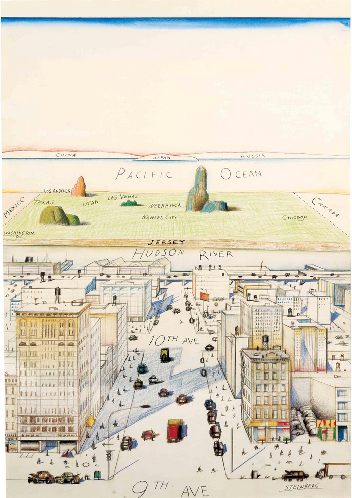 (that empty space at the top is for the name of the magazine).
Yours also reminds me of the work of Roger Brown, especially the silhouettes in the windows, but also that view from above:
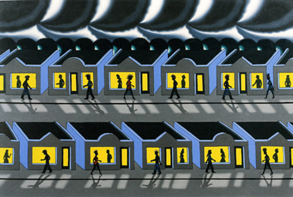
His was done years ago (1991), but has a prescient sense of social isolation.
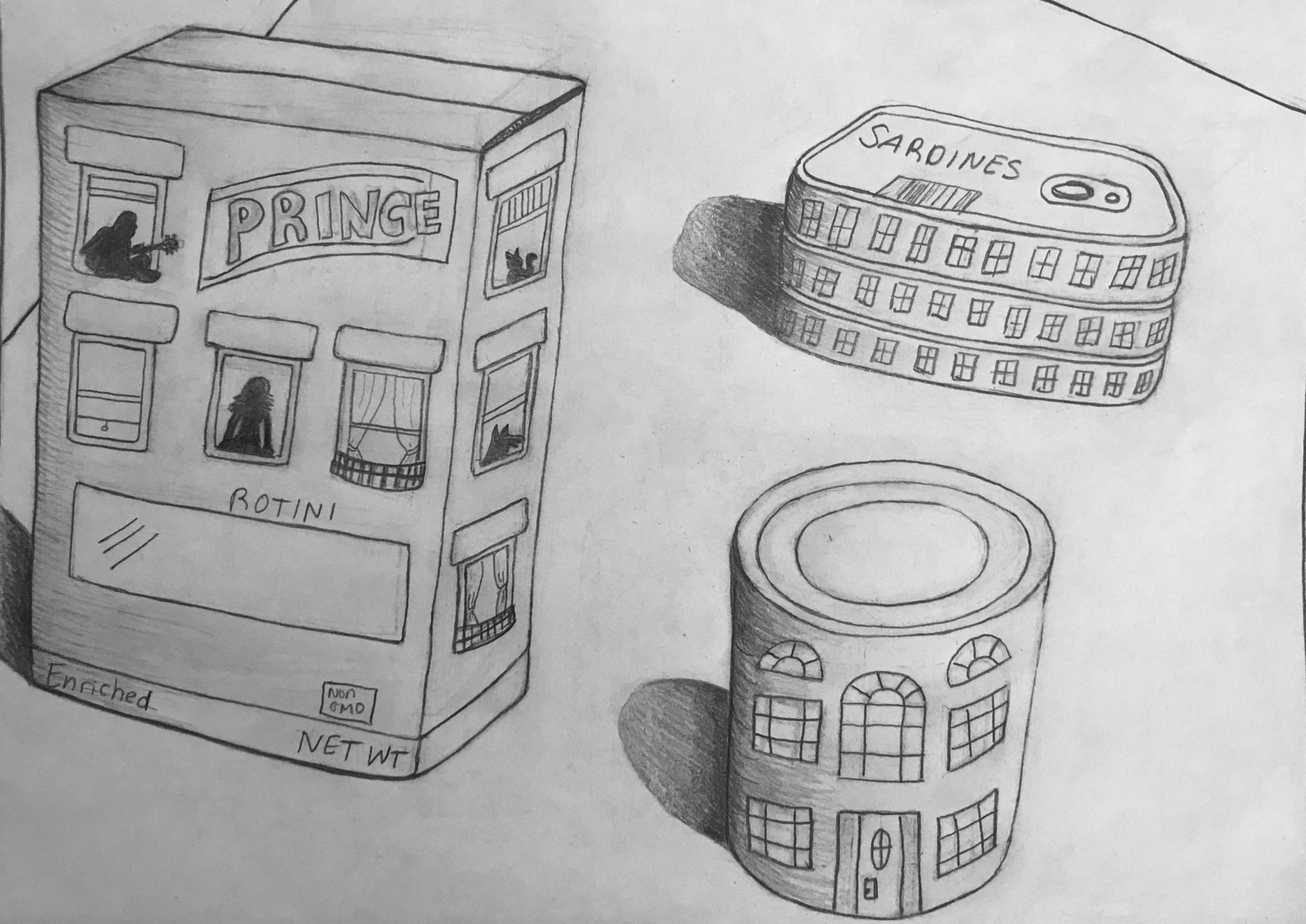
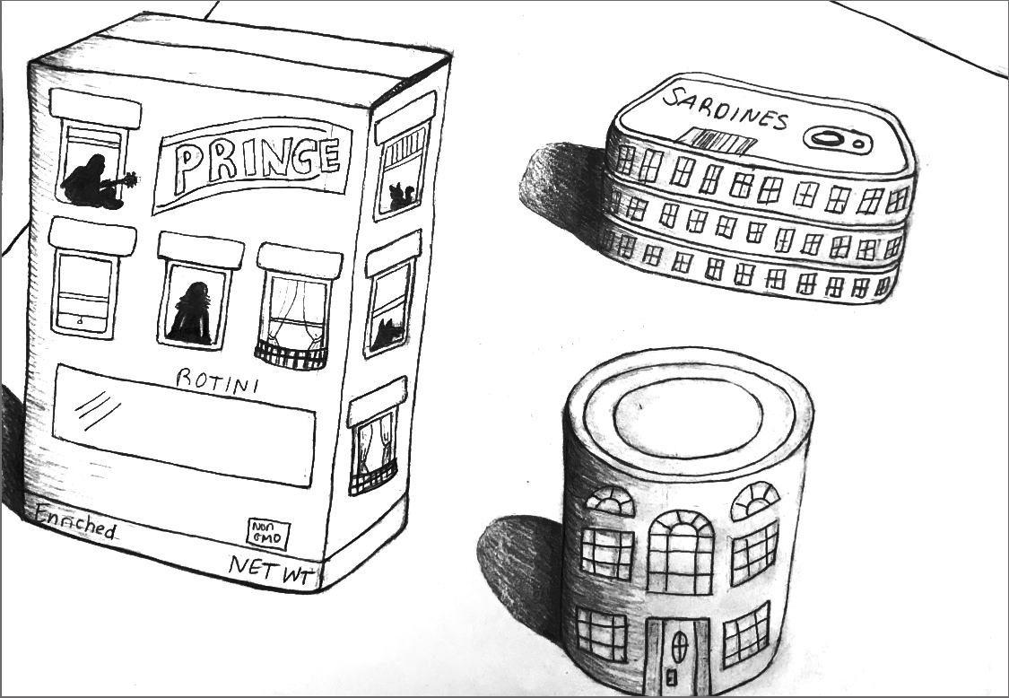
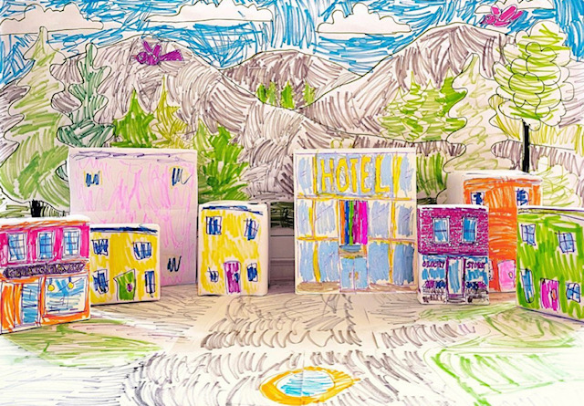
Finally, yours reminds me of a tableau that our daughter made a couple of weeks ago, using paper-covered cereal boxes and such, suggested by Mo Willems on his Lunch Doodles telecast:
Amanda Trent- Time Capsule
Better editing:
Project 2
I’m guessing this is closer to the cropping and exposure of the original. We can’t begin to talk about your work until it’s presented more clearly. Please take the time and effort to make a good exposure and edit it more effectively. If you’re having difficulty with this just let me know.
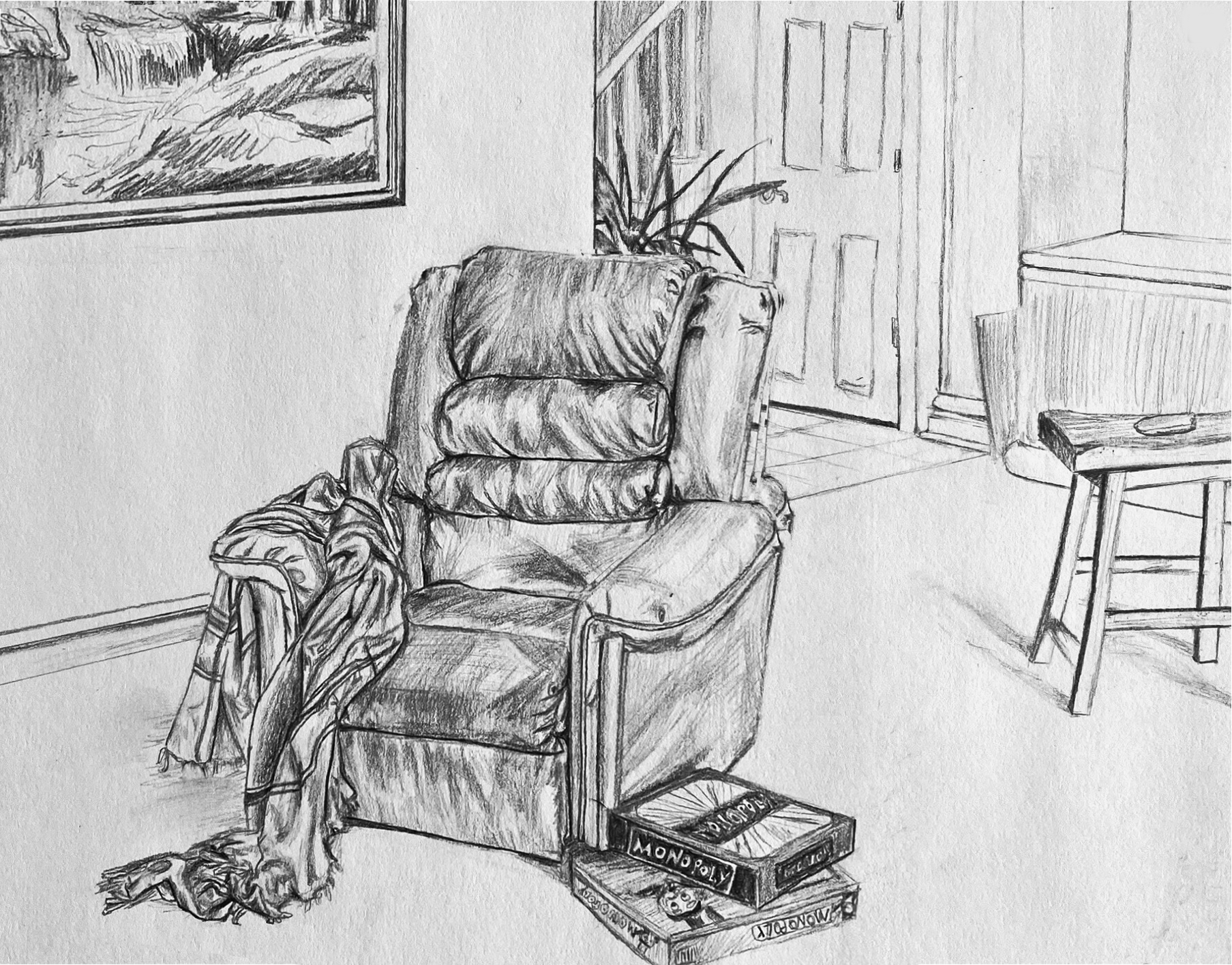
Aadhya- Time Capsule
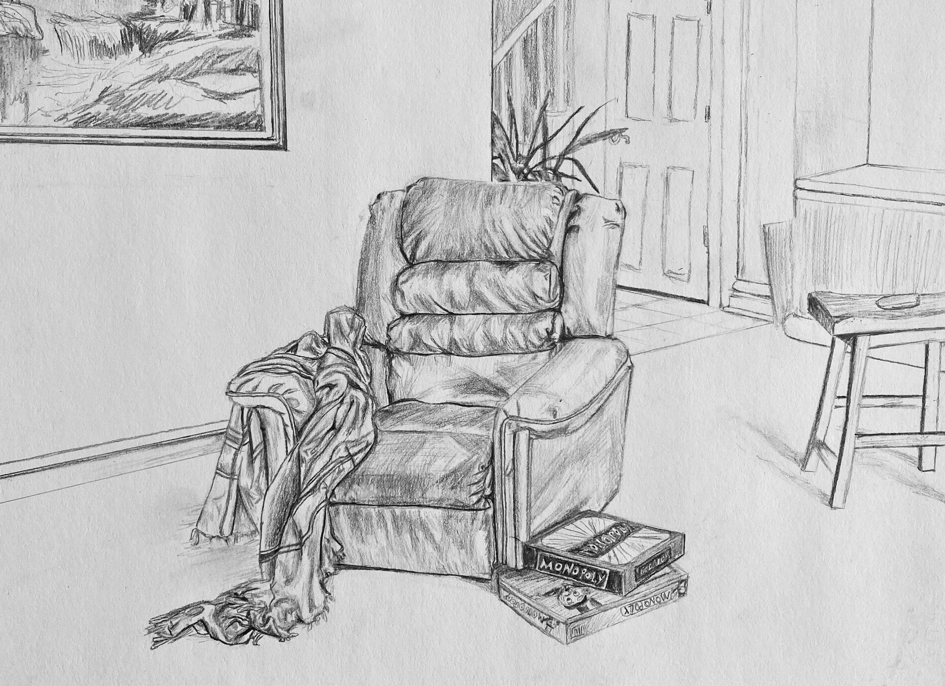
Excellent work (see my comments) but your perspectives are off. Most noticeable is the painting on the wall, the bottom edge of which should be converging on a common vanishing point with the baseboard and the short end of the countertop. But the recliner is also slightly askew. It would look more like this:
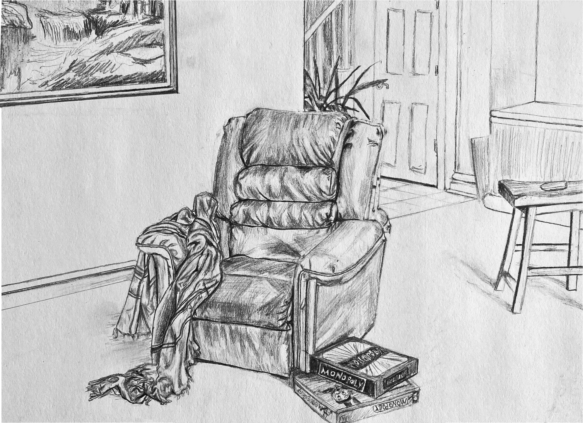
Note how that also has the games touching the edge of the frame, just like the stool, the painting, and all the background material. Not only does this complete the visual “theme” but makes stronger (better defined) negative spaces and ties the image to the rectangle. Your objects float a bit.
Finally, I’d also recommend cropping the left a bit. It goes on a bit without adding anything to the drawing (much like the space between the plant and the bed last week). Your sketch of the painting is just terrific. I didn’t want to lose any of it so I moved it down the wall–and in the process made a tighter connection (and better negative spaces) with the chair. Note how the cropping plus the more correct (and more dramatic) perspective anchors and opens the space to the viewer more.
Max Muradian — Time Capsule
Here’s one way (below) to depict faces if you don’t want to deal with them–at the very least show us the planes of the head. To exclude them entirely in a drawing in which all other planes are at least minimally indicated actually draws more attention to them; conspicuous in their absence. A face (at this distance) can be broken into 4 main shadow planes–the two eye sockets, under the nose and the shadow on the upper lip, as I’ve done here:
 You’ll notice the one I didn’t add to is your brother, who’s actually your best figure in my estimation. The way he’s cropped and the half light he seems to be in is all you need.
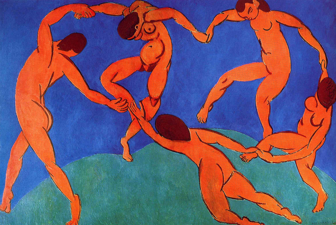
A painting that came to mind, oddly enough, is Matisse‘s The Dance. Here the figures aren’t distant from one another at all, but Matisse goes out of his way to hide their faces. He wouldn’t have been daunted about painting them, so he had another reason–my guess is to make them more universal, and focus attention on their bodies and movement over their identity. But you’ll notice, when he’s forced to deal with that one toward the upper right, that he hits the planes I just mentioned, quickly and simply–also volumetrically, wrapping the planes around the head rather than painting a 2D mask.
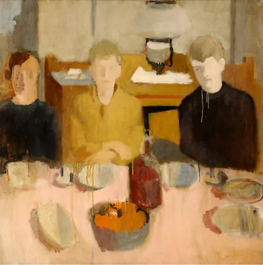
I also thought of Fairfield Porter, who often downplayed the features into shadow planes. Note in his and the Matisse how much description you can get out of the shape of the hair alone–
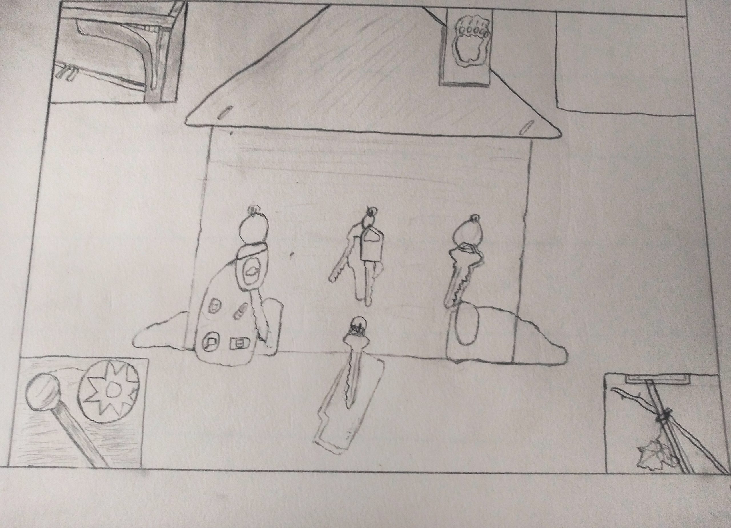
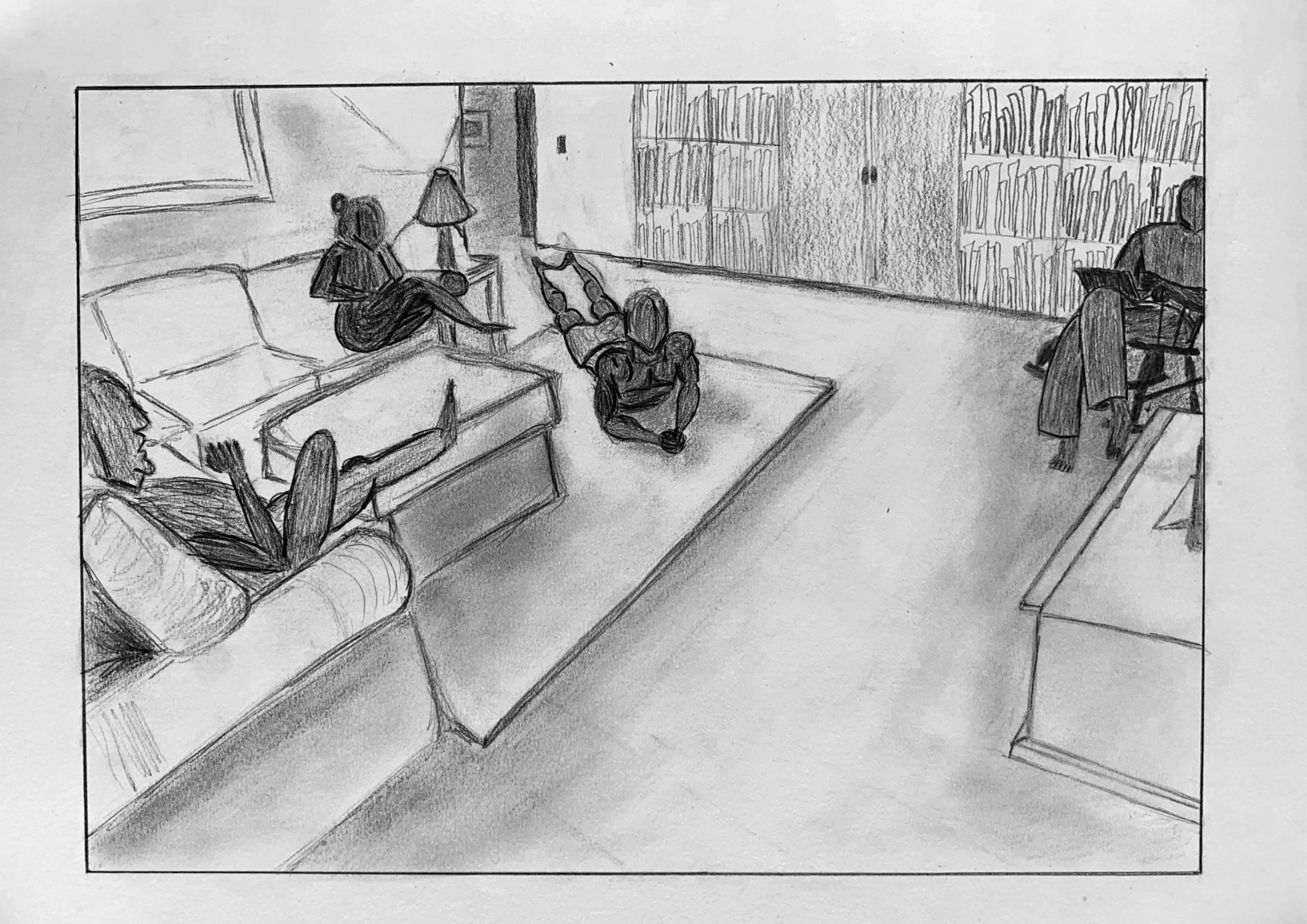
Nate – Time Capsule
See my comments about each of the following–
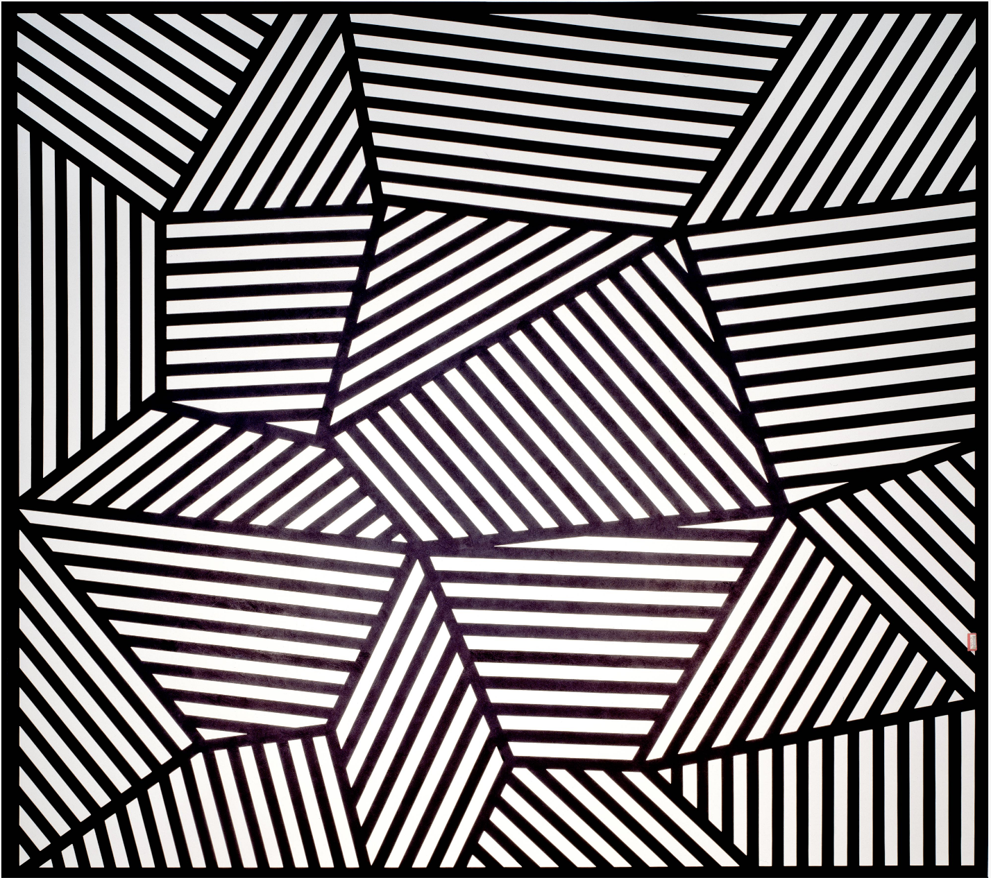
Sol Lewitt, Wall Drawing 565
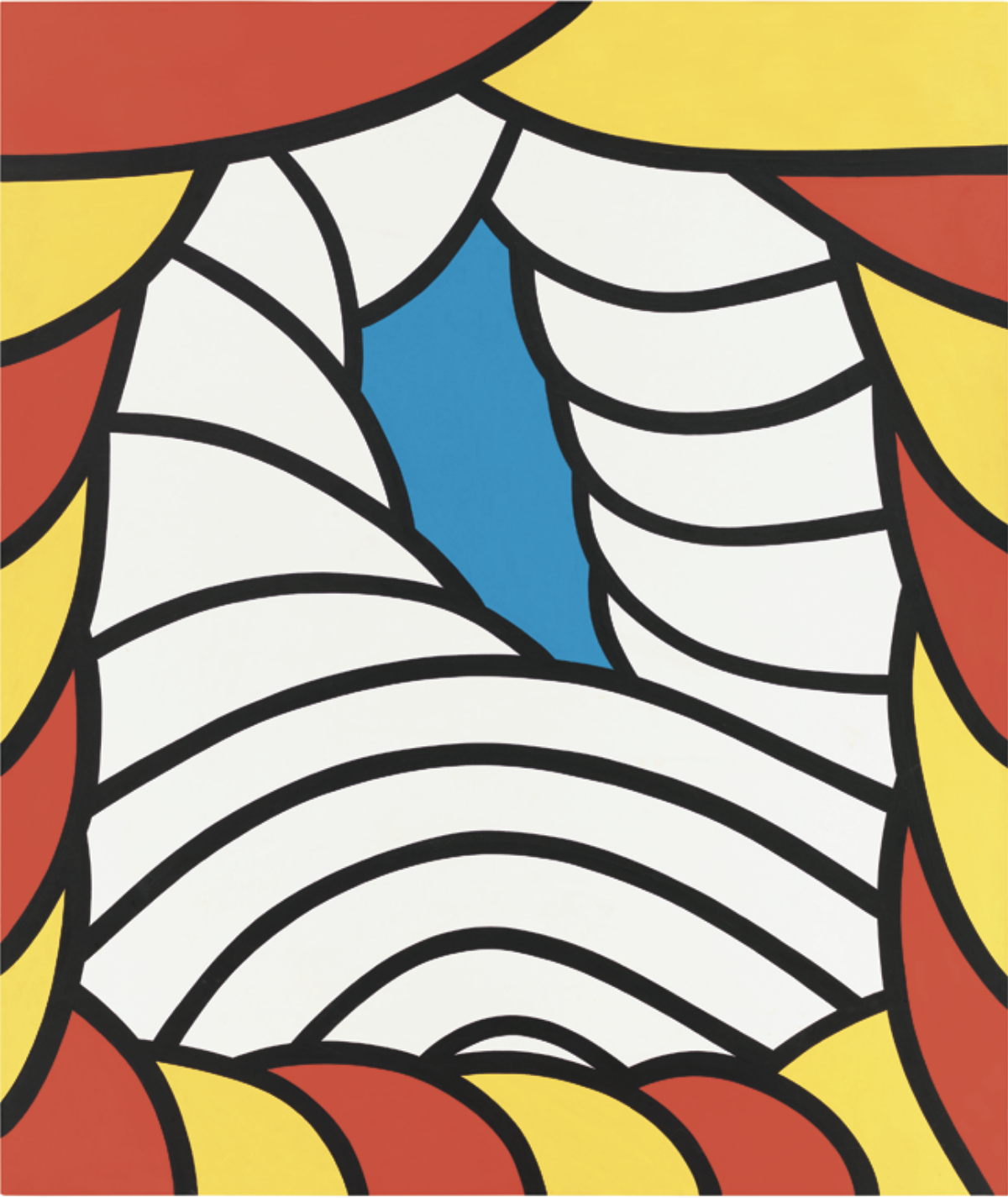
Nicholas Krushenick
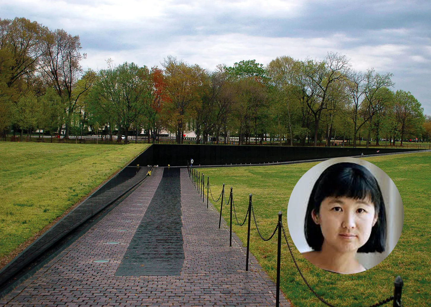
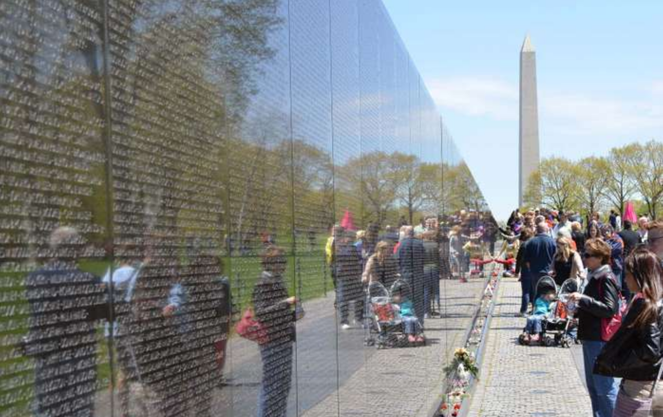
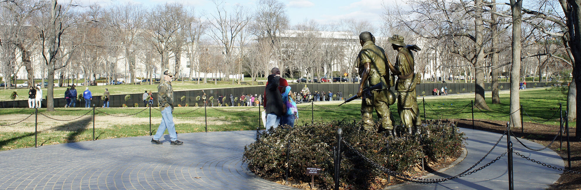
Maya Lin, Vietnam Veterans Memorial
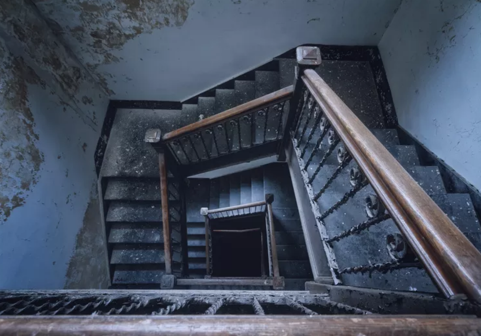 Bathmophobia
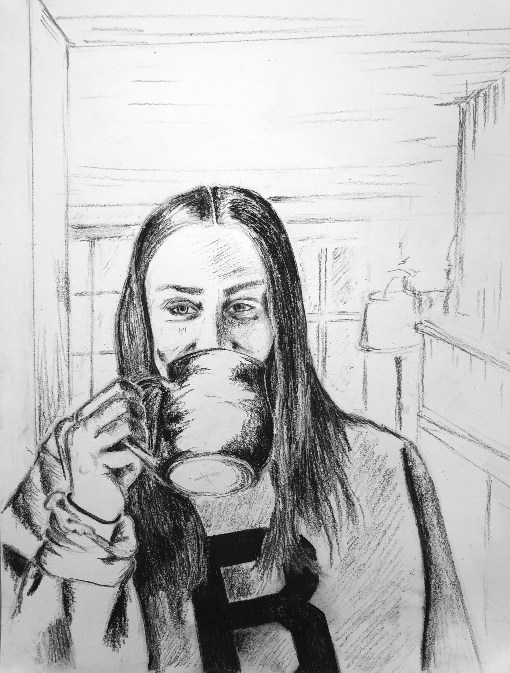
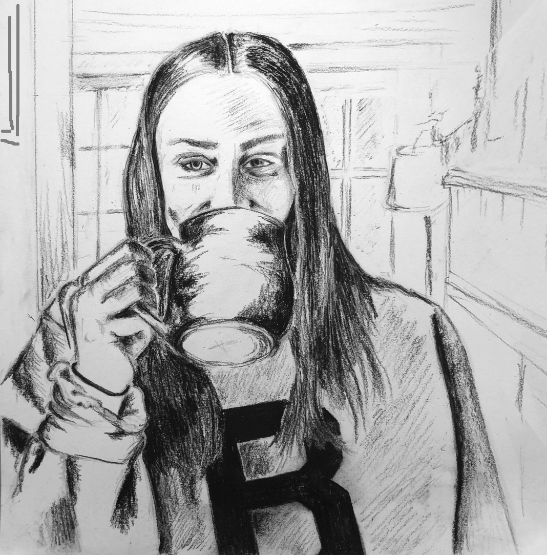
Given what you wrote, and what I see in the drawing, I suggest a composition more like this (see below). I don’t see anything happening in that top third (or slightly more), so I say lose it. There’s also a conventional wisdom in portraiture to place the eyes in the upper half of the composition–yours are on the 50-yard line, and the composition is teetering top to bottom.
Meanwhile I’ve adjusted the perspective on the mantle to gently direct our attention to your eyes, which are the focal point. I’ve also added a framed picture on the left wall to do the same.
I like the way she’s closed in by the space, and I’ve added the perspective elements to ramp up that feeling of feeling safe and cozy but unable to ignore the larger forces looming around us.
Ben Time Capsule