Category: 2) Time Capsule Drawing
Ian Strudwick – Time Capsule
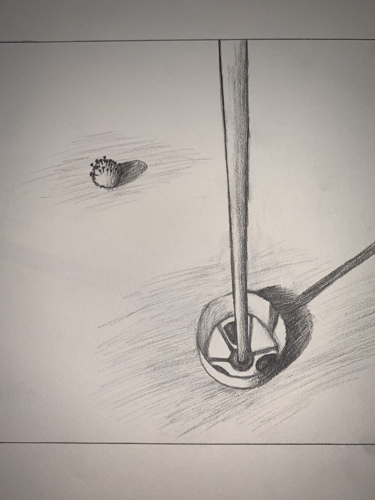
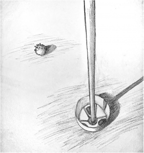
You need to up your game when it comes to photo editing. I don’t know the original, of course, but my guess is that it’s closer to the following (I made all these adjustments in Snapseed using the tools I’ve outlined in my notes here on Blackboard):
I’m also guessing the spaces above and below the image are borders. If so, they don’t work as borders if there are none to the left and right, but start to look like they might be part of the drawing. My guess is that they’re not (so I trimmed them off) but correct me if I’m wrong.
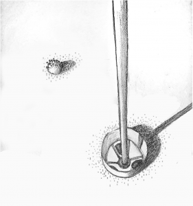
Next suggestion: replace that mindless, all-purpose shading around the ball and the cup with something that says more. I’m suggesting a stipple of dots and dashes that suggest the texture of a putting green. I only did enough to give you the idea, but there could be more (like in yours). You could also replace the hatched shadows (which are fine) with the same texture but darker and denser. The same way you can still see the grass in the shadow this would give a stronger sense of the light falling on the green.
But as an added dividend, the tiny dots look a bit like clouds of germs.
Sara Caplan – Time Capsule
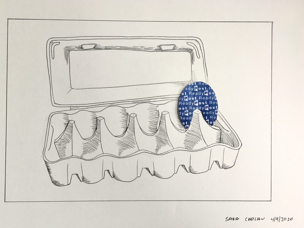
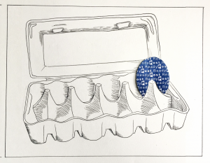
I agree with Isaac–the top of the egg carton is wonky. This wouldn’t be an issue except that it twists the space just behind the egg. In addition, the carton wants to be the “straight man” (as in a comedy act) and a foil to the star–the egg. In other words it needs to be normal. I’ve taken a pass at correcting it below:
I also tweaked the embossed rectangle inside the lid, and let the egg eclipse it a little more; again, foregrounding the egg a bit. I suspect you drew this directly with your pen, rather than using a pencil under-drawing, so the distorted lid has a certain honesty–but in this case there are other virtues in the drawing to protect.
I also brought in the left and right side of the drawing. This image isn’t so much a still-life as something more iconic. The spaces to the left and right begged the question of what space it was in–bringing in the borders and neutralizing the implied environment (or the lack of one) makes that a moot point and again, foregrounds the carton and its sad egg.
Time Capsule drawing
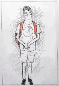
Grace Bilodeau, Pencil, 9×6.5
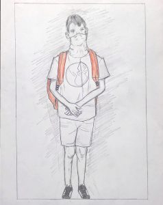
Instead of meaningless background hatching (see my comment to Ian Strudwick about this as well), better to leave it blank…
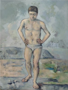
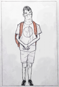
…or, with just a hint of space around the figure (below). I’ve chosen a line that might represent the bottom of a wall, “trapping” him between a wall behind him and the picture plane that you’ve so effectively placed him up against. Remember how Juan Gris used a nameless shape behind the Max Jacob portrait in a similar way.
I’ve set the line at a slight angle to make the space less stable and also since it’s about 90 degrees to the angle of his head, as well as that crease down the center of his shirt; a quiet way to connect the top to the bottom.
I’ve also darkened the exposure, by the way, which I suspect is closer to the original (but I might be wrong). If not, the drawing should be (agreeing with Isaac).
Or, if you prefer an energized field of marks, at least make them “autographic” and not neutral. In this example I tried to pick up on the kind of marks (good ones) I see in the folds of the clothes. Note how they also bristle with a barely contained energy.
Abandoned Courts
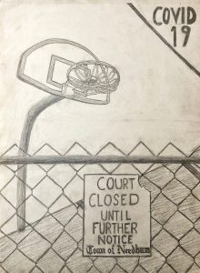
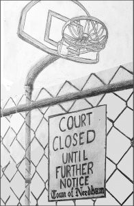
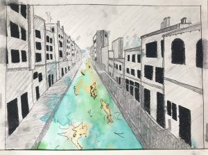
The odd thing in your perspective is that we’re looking up at the hoop but down on the court (and straight at the fence) simultaneously, which makes the experience of approaching the sign and feeling shut out less tangible. I’ve tried to recast the same elements in a perspective that might be closer to actual experience, all looking up and looming over the viewer, making things more out of reach (see below).
This also fills the space, eliminating the need for that “band-aid” solution with the COVID tag. There’s such a thing as telling your audience too much, and not leaving room for them to reach their own conclusion.
I cropped the top of the backboard to create two stronger negative spaces and to put some pressure on the image. Note too how it makes the fence feel much more insurmountable. It also brings more attention to the tied up net, which I agree is fantastic–so well done.
I also cropped it to create a stronger vertical, and adjusted the white balance so the drawing doesn’t look so old (on old paper).
Of course all of this can’t be worked out once the drawing is on the page, but that’s what thumbnails are for (as you’ll recall we did with the flower)–to sharpen the composition and refine your “message” by testing different alternatives before you dive in.
Olivia Greuel Time Capsule
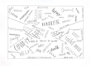
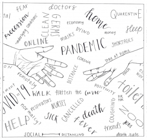
I was going to suggest the following cropping for the sake of the hands alone–I think your drawing includes too much of the forearms at the expense of the more expressive hands (wonderfully drawn, BTW), and the blank areas inside the forearms don’t go with the overall style of filling space uniformly (i.e., no resting places). But then I noticed that the words look interesting going out of the frame, as if they go on indefinitely–more of a sea of words and associations rather than just a “pond.”
But this wasn’t meant to exclude any of the words in the cropped sections–my main idea is to keep all the words just as they are but enlarge the hands in proportion to the rectangle and/or change the proportions of the rectangle itself.
In the process, however, I also happened on a square format, which might also have its advantages. Squares are equilateral–that is, they move in all four directions, rather than left/right only–making the sea of ideas more infinite. Horizontal compositions connote landscape space (and vertical compositions connote figurative space) but square compositions are equivocal, and more inclusive.
But whether you like these ancillary suggestions or not, my core suggestion is to have made the hands more prominent by cropping the forearms (a purely academic speculation, by the way–this version of the drawing is fine as is).
Lily Weafer Time Capsule
Isaac Gelb– Time Capsule Drawing
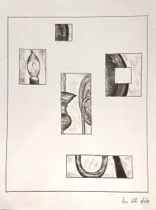
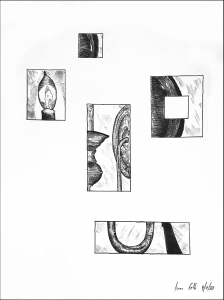
Love the way you broke this into parts. They’re perfectly arranged and aligned to both hold the space and maintain their independence while also converging on the same image–wonderful job. I’d go one step farther and let go of the outer border, which feels redundant and less daring. The black outline on mine is the edge of the paper (I also tweaked the contrast and the white balance to remove that pink haze and make the lines black).
David Hockney
