I was going to suggest the following cropping for the sake of the hands alone–I think your drawing includes too much of the forearms at the expense of the more expressive hands (wonderfully drawn, BTW), and the blank areas inside the forearms don’t go with the overall style of filling space uniformly (i.e., no resting places). But then I noticed that the words look interesting going out of the frame, as if they go on indefinitely–more of a sea of words and associations rather than just a “pond.”
But this wasn’t meant to exclude any of the words in the cropped sections–my main idea is to keep all the words just as they are but enlarge the hands in proportion to the rectangle and/or change the proportions of the rectangle itself.
In the process, however, I also happened on a square format, which might also have its advantages. Squares are equilateral–that is, they move in all four directions, rather than left/right only–making the sea of ideas more infinite. Horizontal compositions connote landscape space (and vertical compositions connote figurative space) but square compositions are equivocal, and more inclusive.
But whether you like these ancillary suggestions or not, my core suggestion is to have made the hands more prominent by cropping the forearms (a purely academic speculation, by the way–this version of the drawing is fine as is).
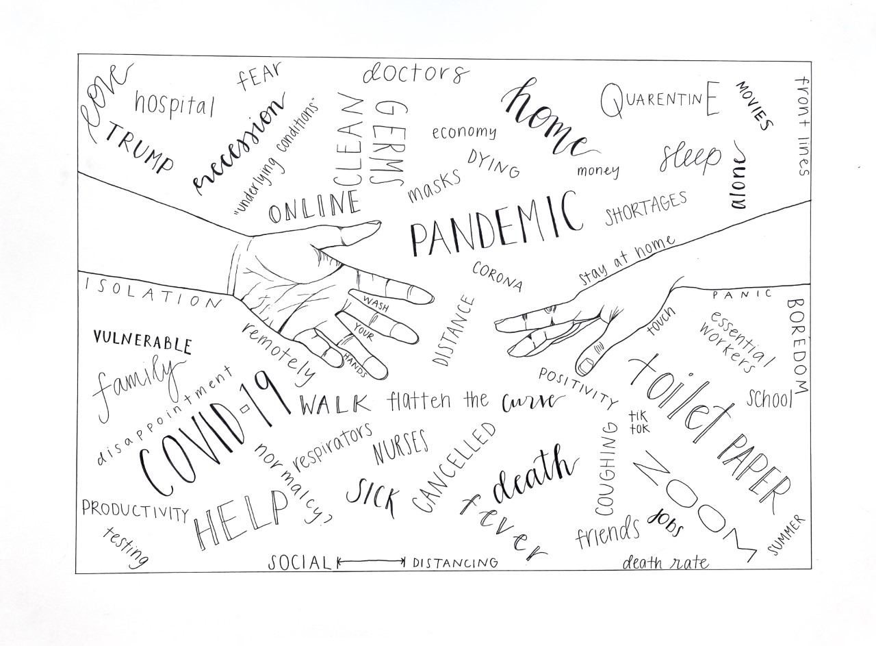
I think COVID-19 has taught us about the importance of our hands and the things that we touch. We come in contact with so many germs and people on a daily basis that we previously did not think about. Not to mention, physical touch is so important to our lives and yet this pandemic has forced us to keep our distance. I chose to draw hands for these reasons and many more. The hands are reaching for each other but not touching, perhaps to symbolize the virtual and sometimes invisible ways we are all supporting each other during this pandemic. I decided after the fact to add the words in the background to help capture all of the feelings and ideas floating in my head. I think it turned out really cool, and I like the bold look that the pen provides.
I also like the bold look that the pen provides, as well as the lettering throughout. Each line in each word does work to provide a complete story for meaning of each word. My favorite example of this is “boredom.” Where you positioned it on the page, isolated and vertical, opposed to the majority and the way you choose to draw your letters even in size but hardly ornamented captures a boredom that results not from lack of activities but the removal of them. This boredom is lonely and hurt not rude and indifferent. Also Germs and Clean facing off, the “wash your hands” between the fingers, the capital E in quarantine, and your drawing of the word “curve” were areas that stood out to me. The lone question, “Normalcy?” seemed hauntingly hidden in all the affirmations, like we’re taking in more than we can question. Oh, and the hands were cool.
Olivia, I think your line work here is beautiful. The hands are simple but incredibly elegant contour drawing. I appreciate how just the smallest details create very convincing wrinkles or knuckles. You draw hands very well!
The hands also remind of that famous painting, The Creation of Adam, and the composition you chose clearly communicates to me this idea of separation. The hands are almost touching, and one is contorted so that to create a sense of motion. They could be reaching out for one another just as easily as they are pulling away from one another. The tension displayed is very effective.
I’m on the fence about the text. Your handwriting is beautiful, and you use line weight well to highlight some words more than others. I think the more subtle ones work best here. I really like the phrase “wash your hands” put right between the left hand’s fingers. That feels applicable and appropriate where the bold “COVID-19” I find a bit distracting. The text also dates this piece very explicitly in Spring 2020 in a way that challenges the quality of timelessness, for me personally. I think the text is also so abundant that it conflicts with the minimalist nature of the drawing, but that said, it also communicates a certain element of surprise. It looks like you had fun adding the text, and the varying sizes and forms show that to me. Maybe not in the next assignment, but I’m looking forward to how you bring this fun, energetic yet minimalist style to the self portrait because this is a great piece!
Hi Olivia,
My apologies for the delayed reply. An odd place to start but commendations on your photography and editing–a textbook example of what we’re after.
The comments from Bryant and Nate are very observant, insightful, and articulate. I love how both of them noticed how your placement of words, choice of fonts, and design choices animate and dramatize their meaning. I completely agree.
Great line drawing in the hands, and great typographical drawing as well. A very effective piece.
Nicely done–