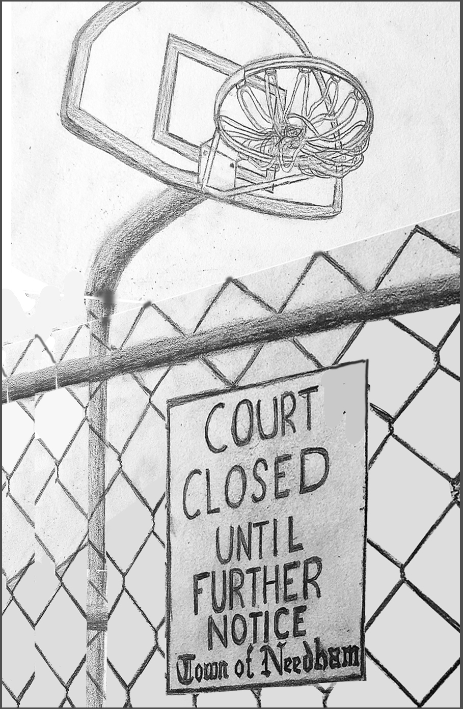
The odd thing in your perspective is that we’re looking up at the hoop but down on the court (and straight at the fence) simultaneously, which makes the experience of approaching the sign and feeling shut out less tangible. I’ve tried to recast the same elements in a perspective that might be closer to actual experience, all looking up and looming over the viewer, making things more out of reach (see below).
This also fills the space, eliminating the need for that “band-aid” solution with the COVID tag. There’s such a thing as telling your audience too much, and not leaving room for them to reach their own conclusion.
I cropped the top of the backboard to create two stronger negative spaces and to put some pressure on the image. Note too how it makes the fence feel much more insurmountable. It also brings more attention to the tied up net, which I agree is fantastic–so well done.
I also cropped it to create a stronger vertical, and adjusted the white balance so the drawing doesn’t look so old (on old paper).
Of course all of this can’t be worked out once the drawing is on the page, but that’s what thumbnails are for (as you’ll recall we did with the flower)–to sharpen the composition and refine your “message” by testing different alternatives before you dive in.
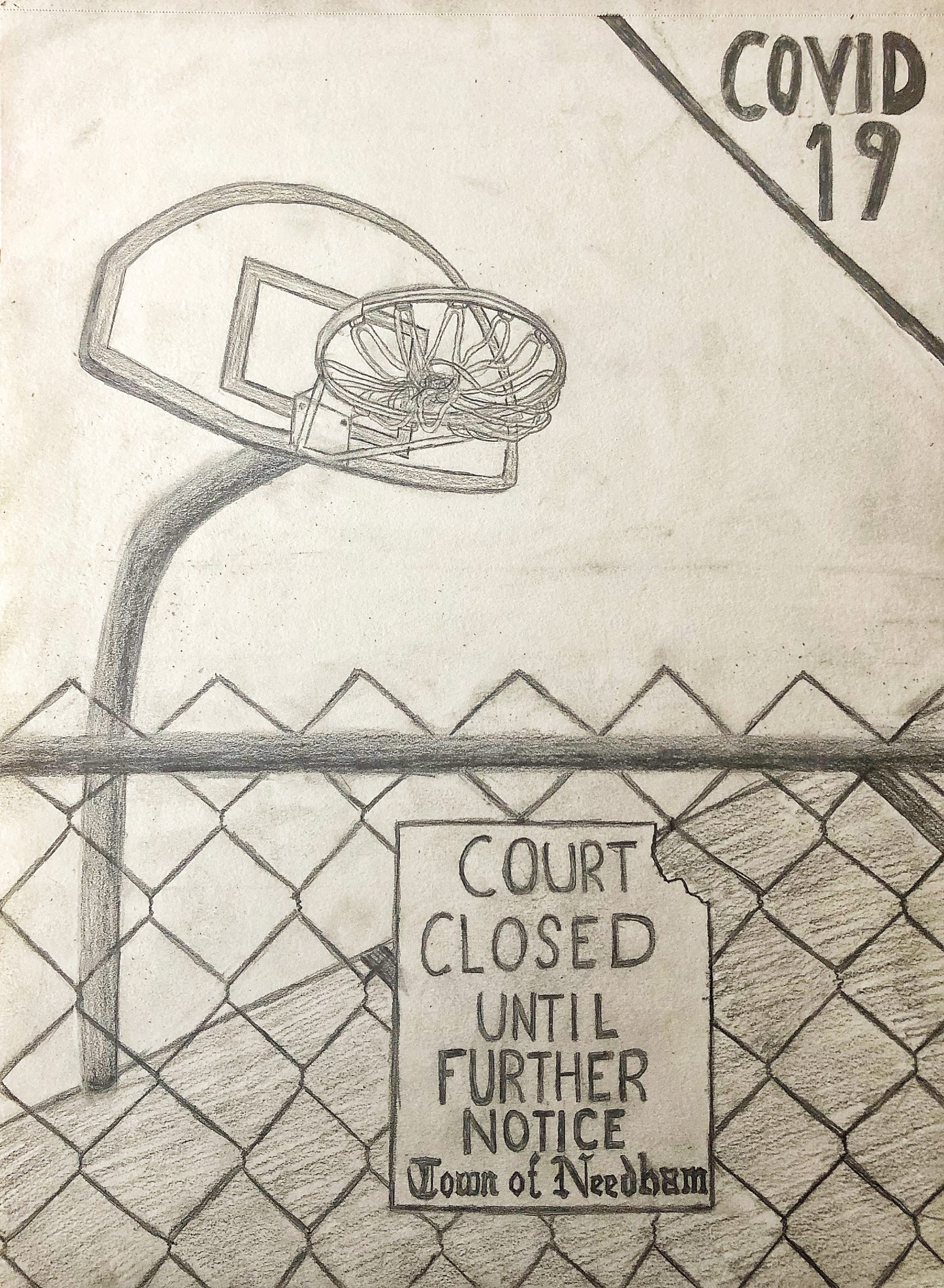
My drawing is portraying a basketball court in a park with its net zip tied and a sign telling residents to keep off. I thought this was something that could fully illustrate the scope of this virus because the shut down of parks is something that I never thought I would witness, parks have always been a safe and communal location throughout my lifetime. In this drawing I tried to really represent a foreground and background with my line weight to make the scene look as empty and depressing as possible. I worry that I spent too much time on my basketball hoop and not enough time on other details, especially the top right. It was a bit barren so I included COVID 19 to make the scene appear as if it belongs in a magazine or something along those lines.
1. There’s a lot of subtle details in this drawing that I appreciate. First I noticed that fence was not simply diagonal lines: you took the time to have the wires weave around each other. Two, the letters on the sign saying the town of Needham looks accurate, like the original font. Three, the netting is really well done. I know this must have been especially difficult since the rope and the ellipse is in perspective. Nice job!
2. There’s an overall flatness to the drawing. The fence in the foreground helps to create some space, but the ground is one value, which takes away the illusion of space. While there’s some value change in the pole, I think it suffers from the same problems as ground.
I think you did a great job establishing a foreground and background with a subtle variation in line weight. Also I like how you darkened the text to make it pop. I think the darkest shade is well established, but the highlights on the metal and elsewhere are a bit lost. I think the scene conveys not simply “empty and depressing” but also the foreboding feelings everyone is feeling right now. It establishes this in two ways the sheer weight of the words “until further notice,” and perhaps unintentional smudges across the page. The slightly sooty paper makes the paper look old, and for some reason this makes me feel like what if there is no after Corona virus… or maybe day to day life will be totally different? Also, I’m not sure what your perspective is on this because of the shaded (ground?) area, but this makes it look more like a historic magazine cover that was edited. Great job with this assignment, I hadn’t thought about the perspective of parks being closed, so thank you for sharing. Lastly, the details on the basketball hoop are gorgeous upon zooming in-well worth the time!
Great approach, Ryan, and my apologies for the slow reply.
I agree with Aadhya–you did a killer job on the tied up netting, but also on the lettering for the town of Needham–that took some work. And good job on the drawing in general, including the painstaking chain link fence. I would only suggest making the wires in the chain link a bit thicker.
I’ve left most of my remarks with the drawing, above. I would only underscore that when you create a drawing to communicate something it’s a good idea to work through some thumbnails first, so that you don’t end up drawing yourself into a corner (quite literally) forcing band-aid solutions (like the Covid lettering).
Good work–