Grace Bilodeau, Pencil, 9×6.5
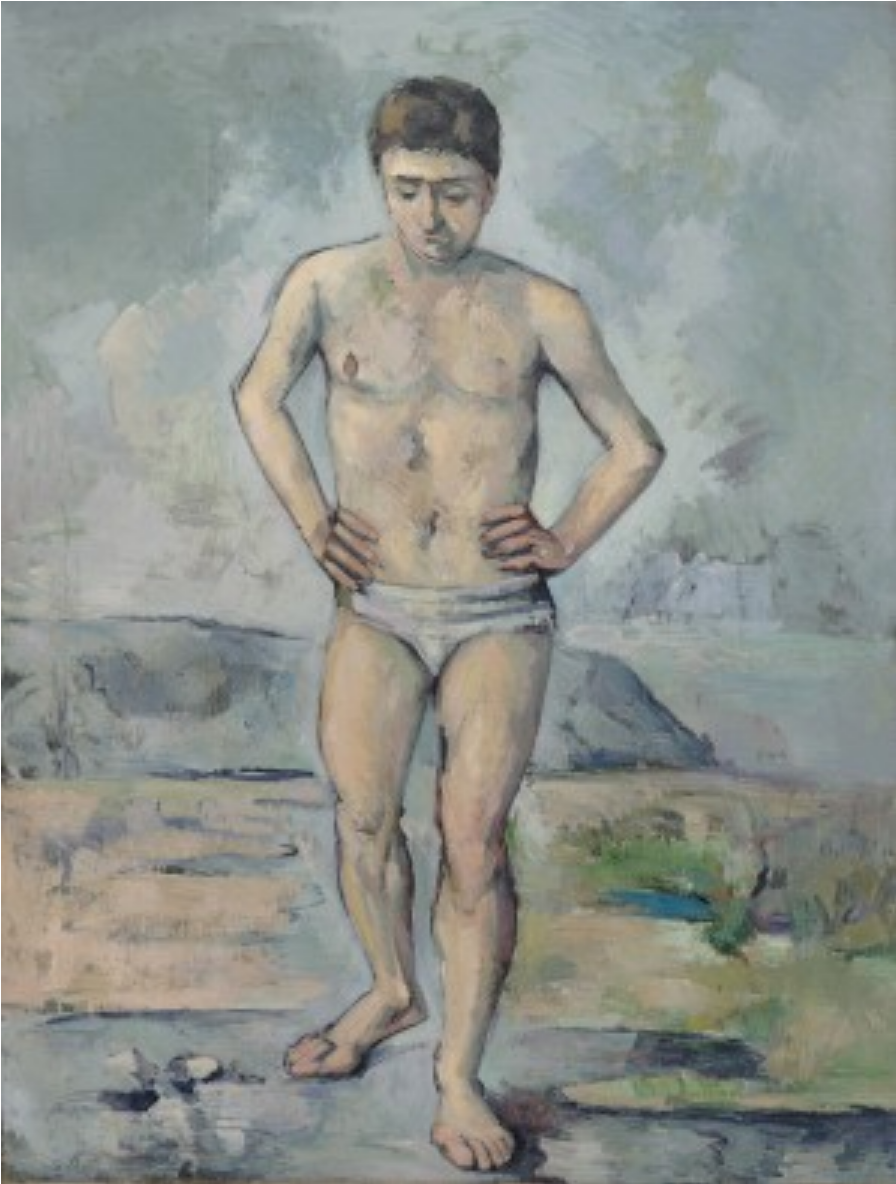 Cezanne, The Bather, 1885
Instead of meaningless background hatching (see my comment to Ian Strudwick about this as well), better to leave it blank…
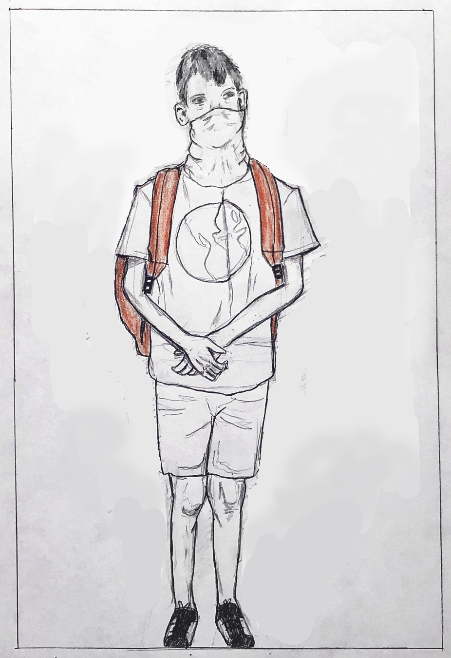
…or, with just a hint of space around the figure (below). I’ve chosen a line that might represent the bottom of a wall, “trapping” him between a wall behind him and the picture plane that you’ve so effectively placed him up against. Remember how Juan Gris used a nameless shape behind the Max Jacob portrait in a similar way.
I’ve set the line at a slight angle to make the space less stable and also since it’s about 90 degrees to the angle of his head, as well as that crease down the center of his shirt; a quiet way to connect the top to the bottom.
I’ve also darkened the exposure, by the way, which I suspect is closer to the original (but I might be wrong). If not, the drawing should be (agreeing with Isaac).

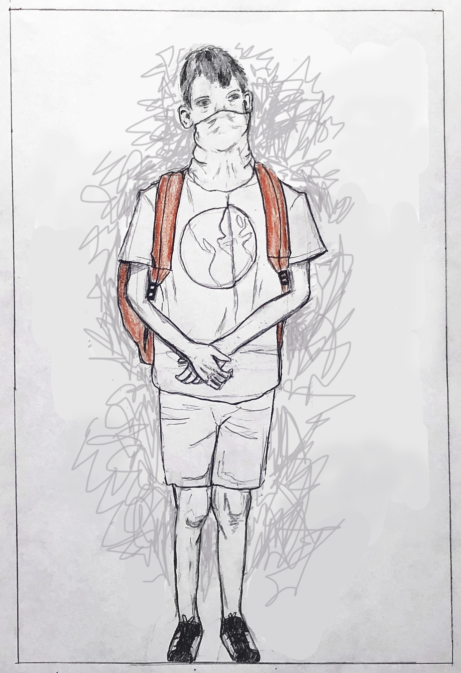
Or, if you prefer an energized field of marks, at least make them “autographic” and not neutral. In this example I tried to pick up on the kind of marks (good ones) I see in the folds of the clothes. Note how they also bristle with a barely contained energy.
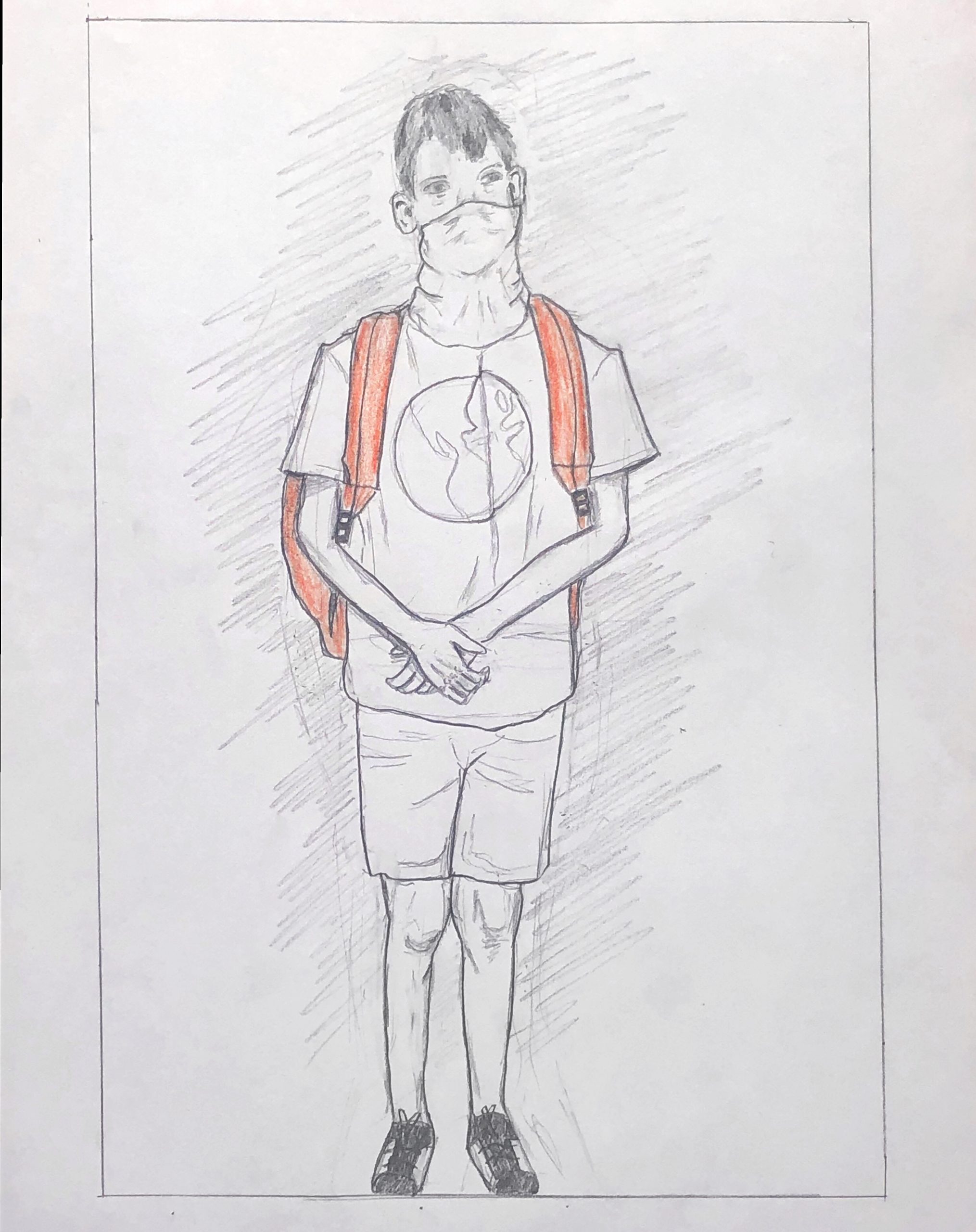
The most thing that has grabbed my attention most amid the Corona-virus pandemic is the displacement of schools and academic institutions. While I myself am home from school because Bowdoin has closed, the local schools in my area including elementary and high schools have also closed indefinitely. I have been thinking a lot about parents who are now working from home including my sister with three children, as well as teachers who are home with their children and are meant to be teaching at the time as taking care of their children. This is drawing of my nephew with his backpack and ski mask on ( a pseudo-medical mask).
This is a really powerful drawing, I think you capture the uncertainty of the child perfectly. Your decision to only color in the backpack was ambitious, but it works well. I also think the shading in the background adds some depth and draws the composition together well, but maybe you could’ve gone even further and darkened the shading there and a lot of the lines in general. I also notice that your border cuts off the shoes at the bottom, which doesn’t necessarily take away from the drawing but it’s a bit awkward in the context of the composition as whole.
Hi Grace. I really love your drawing subject. I love the idea behind it. I also really love the body positioning. I think the way you have captured his body says a lot about the potential fear and helplessness he feels. I might even take it an additional step and exaggerate his body position further. Maybe with more shrugged shoulders or a different eye and chin position.
I agree with what has been said about his shoes. He goes right up to the bottom of the drawing and is cut off in an abrupt way. However, as I was writing the comment “give his body some space to breath”, I realized that the other direction you could go on, could be making him feel much more claustrophobic in the space. Albeit, you would probably still want to include the rest of his shoes, but you could find ways to either bring in the boarders or fill in the white space that would even further articulate the emotions coming portrayed in your drawing. (I really like the idea of having a very narrow image, where you bring in the left and right boarders substantially.)
I also agree with Mark in his comments on the lines in the background. If you want to draw the viewer’s attention to the background, what is there should serve a purpose! You can use that opportunity to create more energy or have him sink into his fear/hopelessness even further.
With all of that being said, I think you have done a wonderful, direct job of depicting the crazy times we are in now.
Hi Grace,
My apologies for not getting back to you about this sooner. This is a very winning drawing that drew my attention the moment it came on screen. Assuming this is drawn from a photo, you chose one (or took one) that does a great job of capturing a feeling of being uprooted and aimless.
While a juvenile male might look this way at any time (like waiting for a bus), the makeshift mask tips us off that this isn’t business as usual. The main thing that puzzles me (and that you don’t mention, curiously) is highlighting the backpack in what looks like safety orange. While it adds a sense of emergency to the drawing it also singles out the backpack in a curious way.
Why not also color the mask, which I would venture is the more topical garment? That would draw out and equalize the two components of your narrative–a student on the one hand, but one with no place to go and a mask to protect him.
I respectfully disagree with Isaac’s comment about the feet. We read the bottom edge of any picture as a threshold that we’re about to cross, and placing him there–literally between the space of the drawing and our own–is one of the best things about the drawing; that tentative “should I stay or should I go?” quality.
The artwork it brings to mind is the Cezanne bather that I’ve attached above. Note how his left foot is teasing that same boundary,and the bather’s gaze on that spot suggests his own indecision or hesitation. This painting has another important lesson–better to articulate something about the background than an all purpose scrawl. After all the careful and very successful drawing you’ve done on the figure (great portrait, by the way, and other details–the knees are great) it sells the drawing short, like you ran out of time or patience.