I just threw a border on this in order to assess the composition better.
Professor Mark Wethli – Spring 2020
I just threw a border on this in order to assess the composition better.
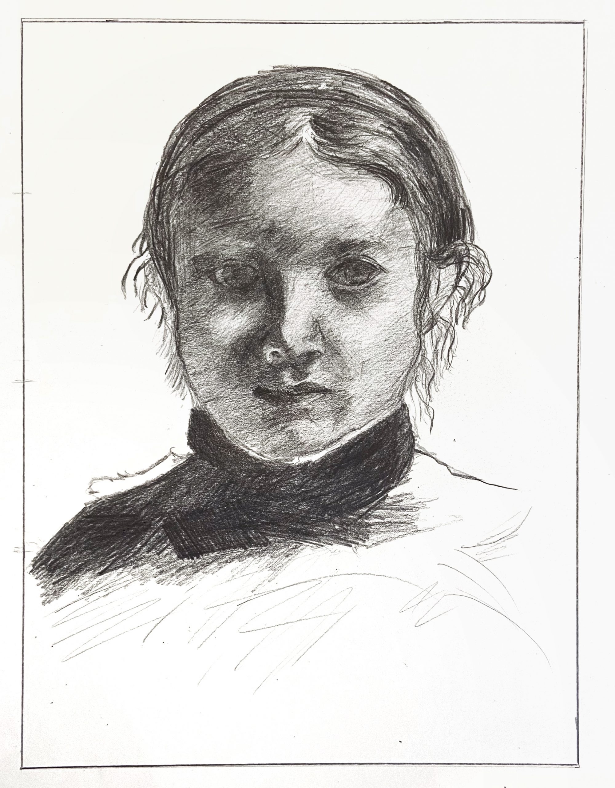
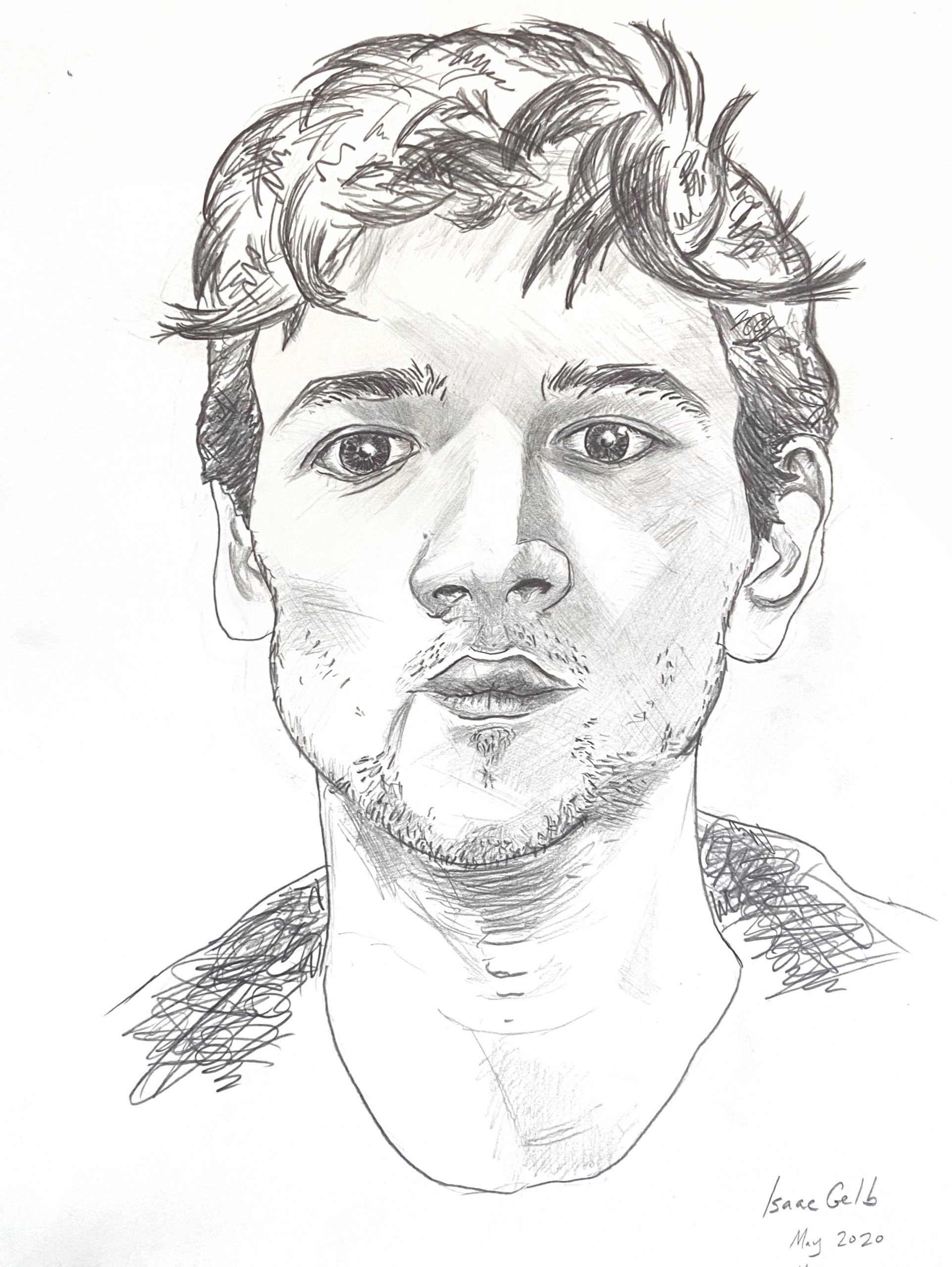
Good work, Isaac, and your scrupulous attention to proportions, values, and details is apparent. So glad this set you up for this week’s drawing, which was my main intention. And so glad you can also see and appreciate Degas’ seemingly infinite subtlety.
The two things that jump out at me are the texture of your hatching, which is coarser and grainier than the original, and a slight misalignment of the features with the silhouette of the head.
To solve the first issue you need a sharper point on your pencil and a much lighter, softer touch, holding the pencil loosely and far back and allowing the values to build up gradually. This can be followed by even finer marks to fill the white spaces between your strokes. To be clear, there’s nothing wrong with this kind of hatching the way it is—it’s just not as fine grain and high res as the original.
As for the misalignment, the space between the left contour and the features is just a bit too wide (just a bit) and the space between the features and the right profile is just a bit too narrow (again, just a bit, but taken together they pull the features to the right). Also, that contour between the face and the ear on our right is simpler and smoother–not so undulating.
You’ll notice we can see her left ear (on our right) but not her right, which tells us her head is slightly turned to her right. This has the effect of foreshortening that side of her face just a bit and making that side slightly narrower. It looks like you’re trying to center her features a little.
This is exacerbated by the eye on our right being a little too far to the right even in relation to the other features. Her tear duct should be directly above the outside edge of her nostril, but is slightly more to the right.
Great job accepting Degas’ lighting on the eye on our left—it all but disappears and you didn’t try to impose what you know or expect, but followed suit—great work.
Other small notes:
The reflected light on the nostril to our left is much too light, as is the reflected light on the cheek to our left, but to a lesser degree.
The modeling of the edge between shadow and light on the tip of her nose needs to be softer.
The white of her collar is jumping out in yours—it’s more of a light grey.
The values in her collar and shoulder are too dark.
Very good effort and noteworthy achievements here but still room for some refinement as outlined above.
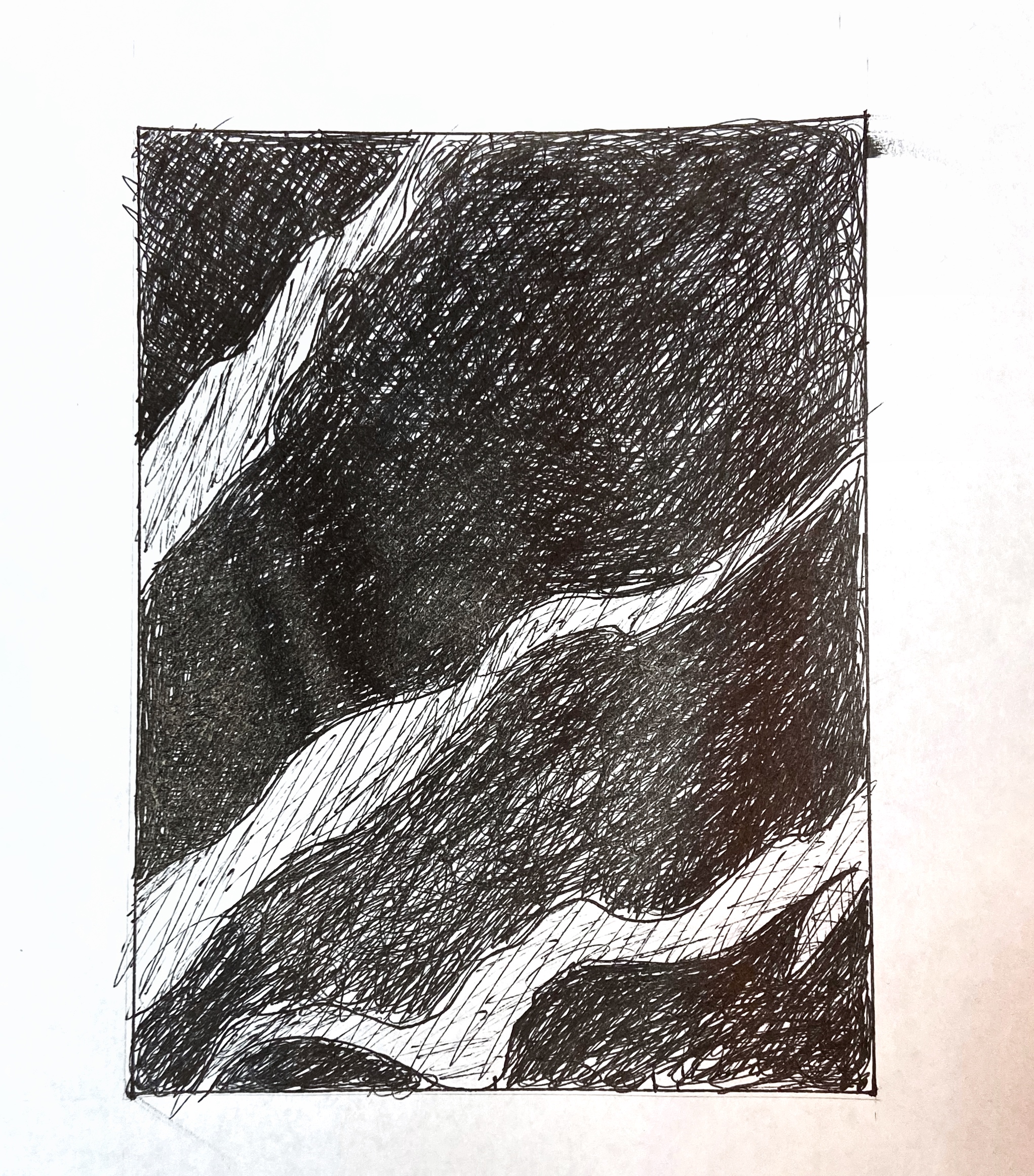
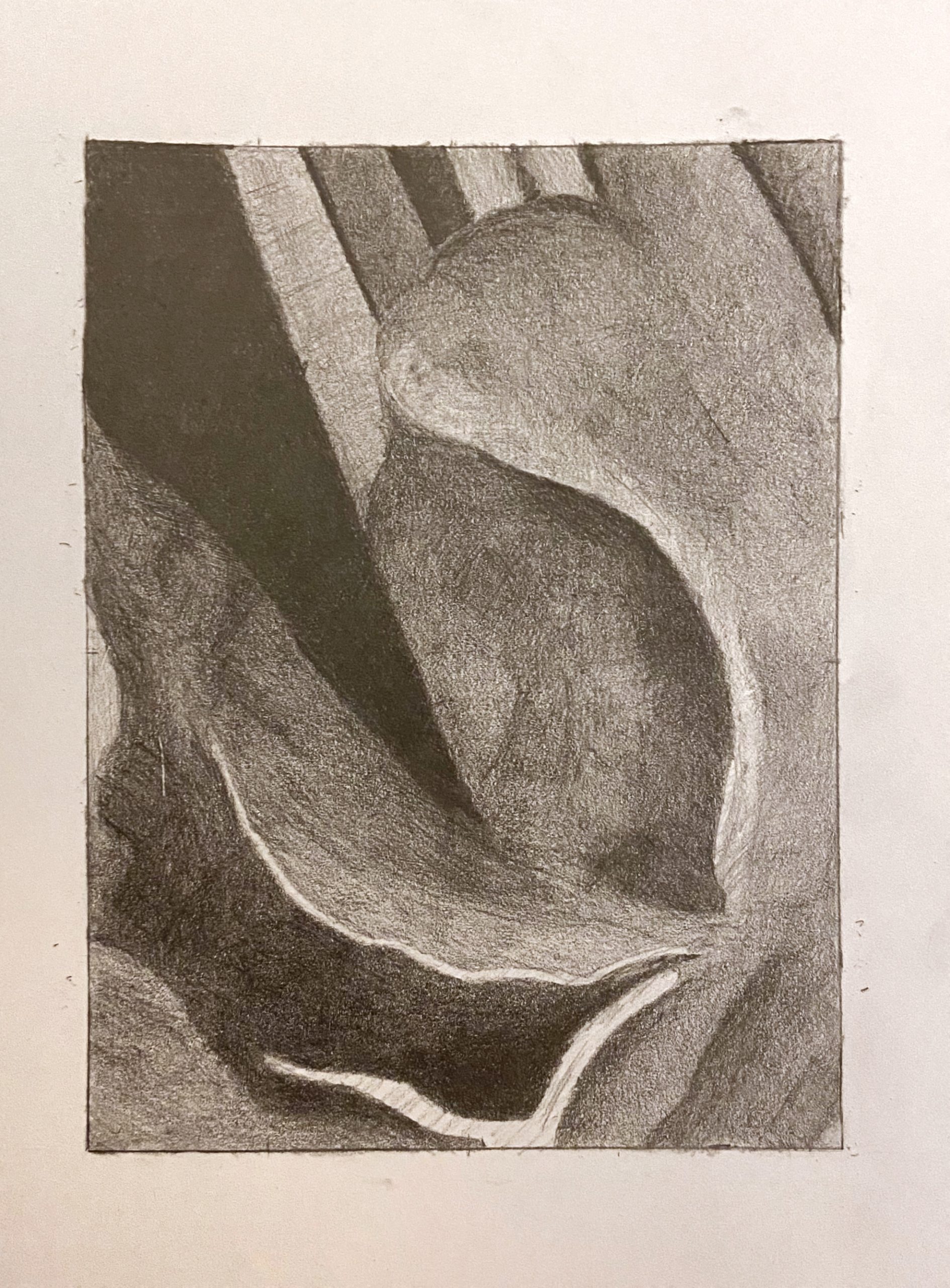 That dark V-shape on the upper left and the vaguely leaf-shape at the bottom left and center (your darks, that is) are great, but all other values should be a shade or two darker than they are here. That light shape at the bottom edge (like a bird in flight) is much darker (and so are the values around it)–not the same value as the paper as it is here.
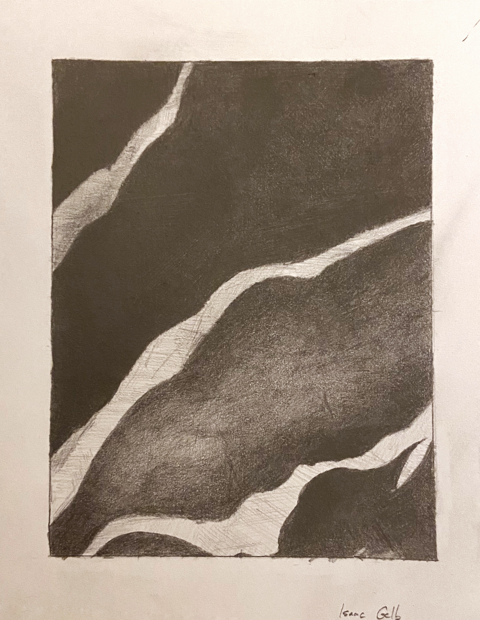 Very good, but light stripes aren’t this light–especially the one in the upper left. The third dark shape down from the top has a slightly lighter value running through it, but not this much lighter–it’s subtler than that. By the time it reaches the right edge it’s as dark as the other dark parts of the drawing.
 Much better than the pencil version, in terms of value, but that white shape near the bottom is still not that light. A light grey, but not that light. Make sure the lighter values at the top edge go all the way to the edge–you’re leaving a gap there on the two to the left. All of the lighter values near at the top could be a shade darker.
 Very good, but lower portion of upper left stripe, where it meets the edge, is darker–still lighter than what’s around it, of course, but not as light as this.
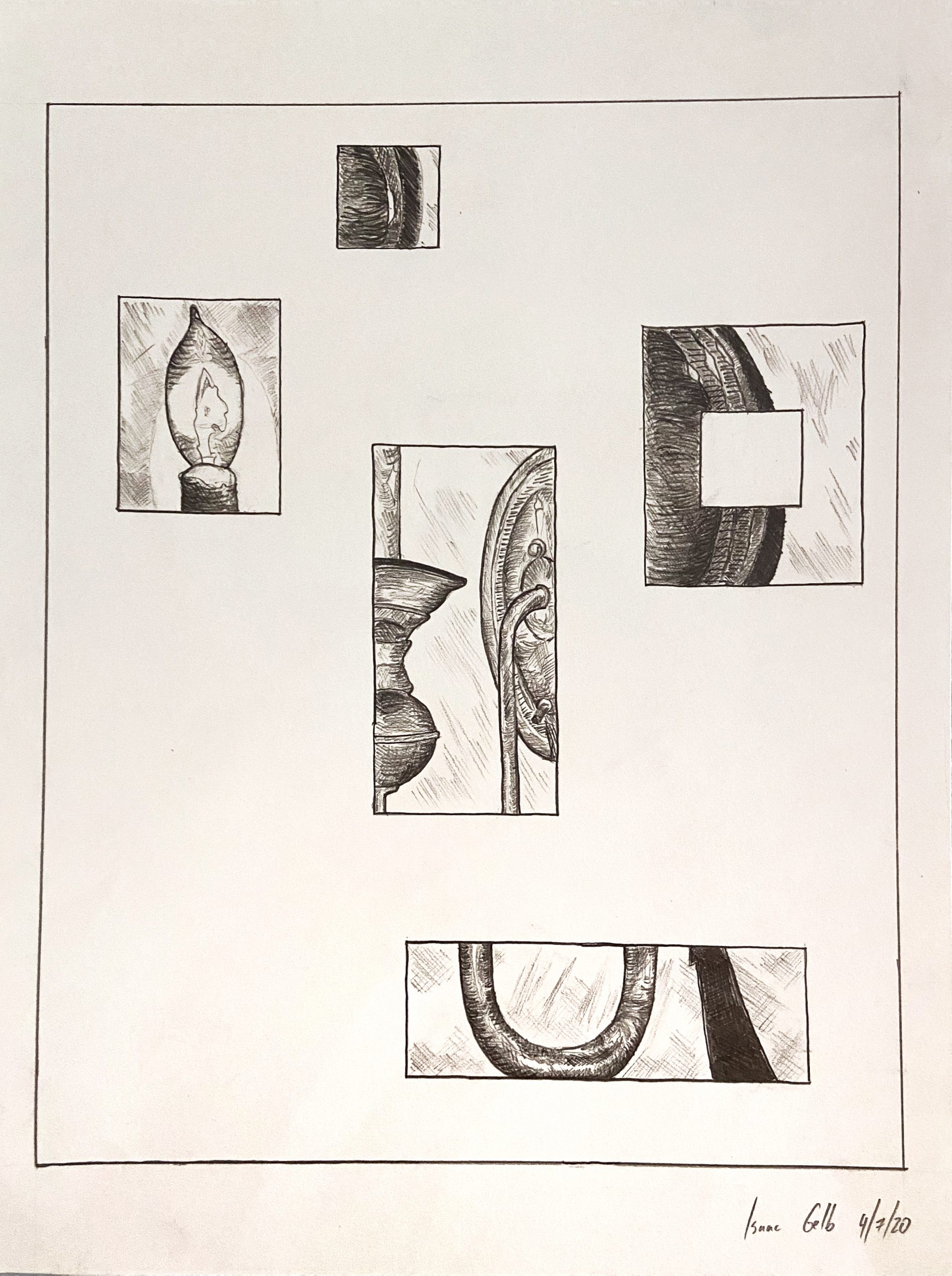
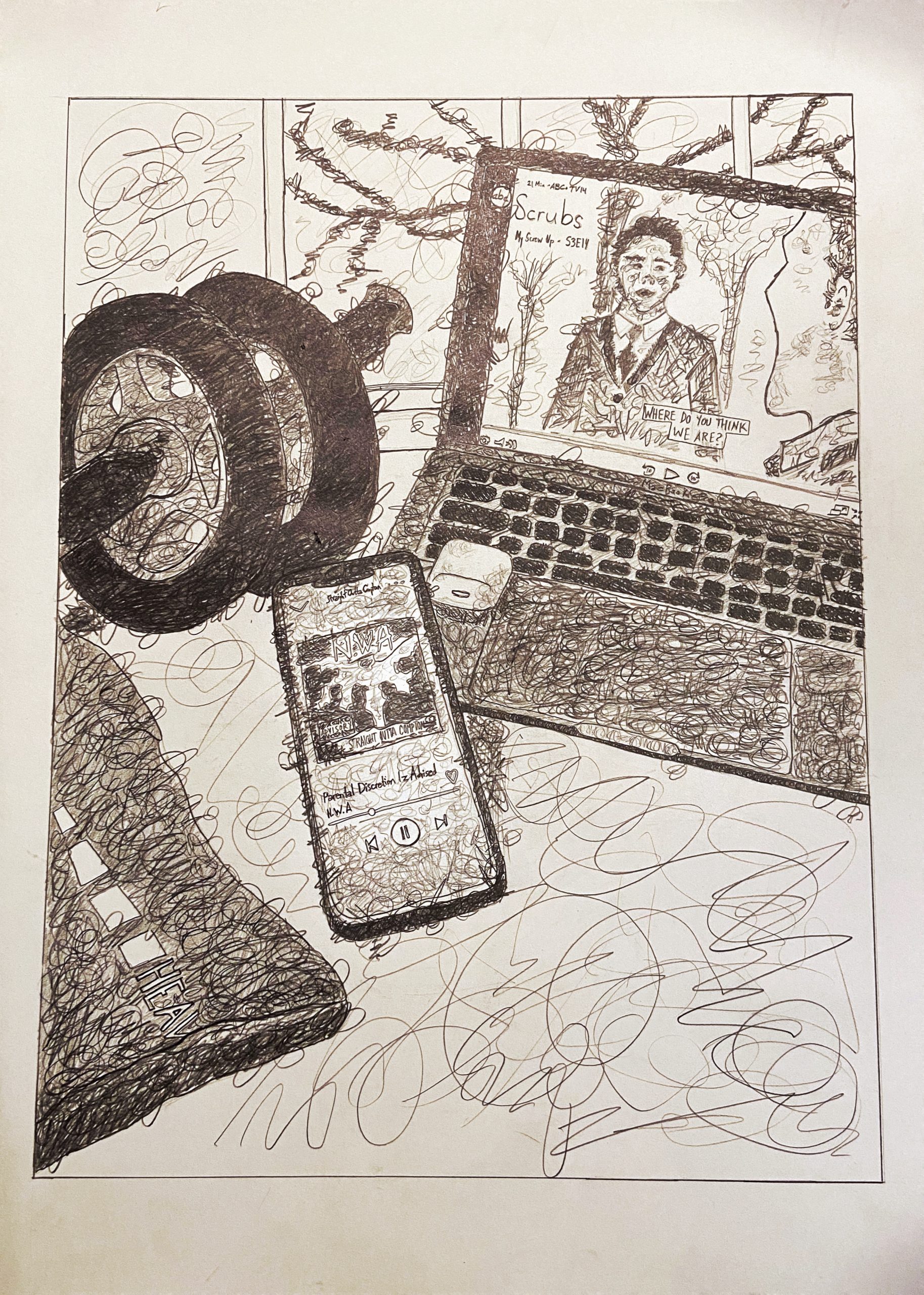
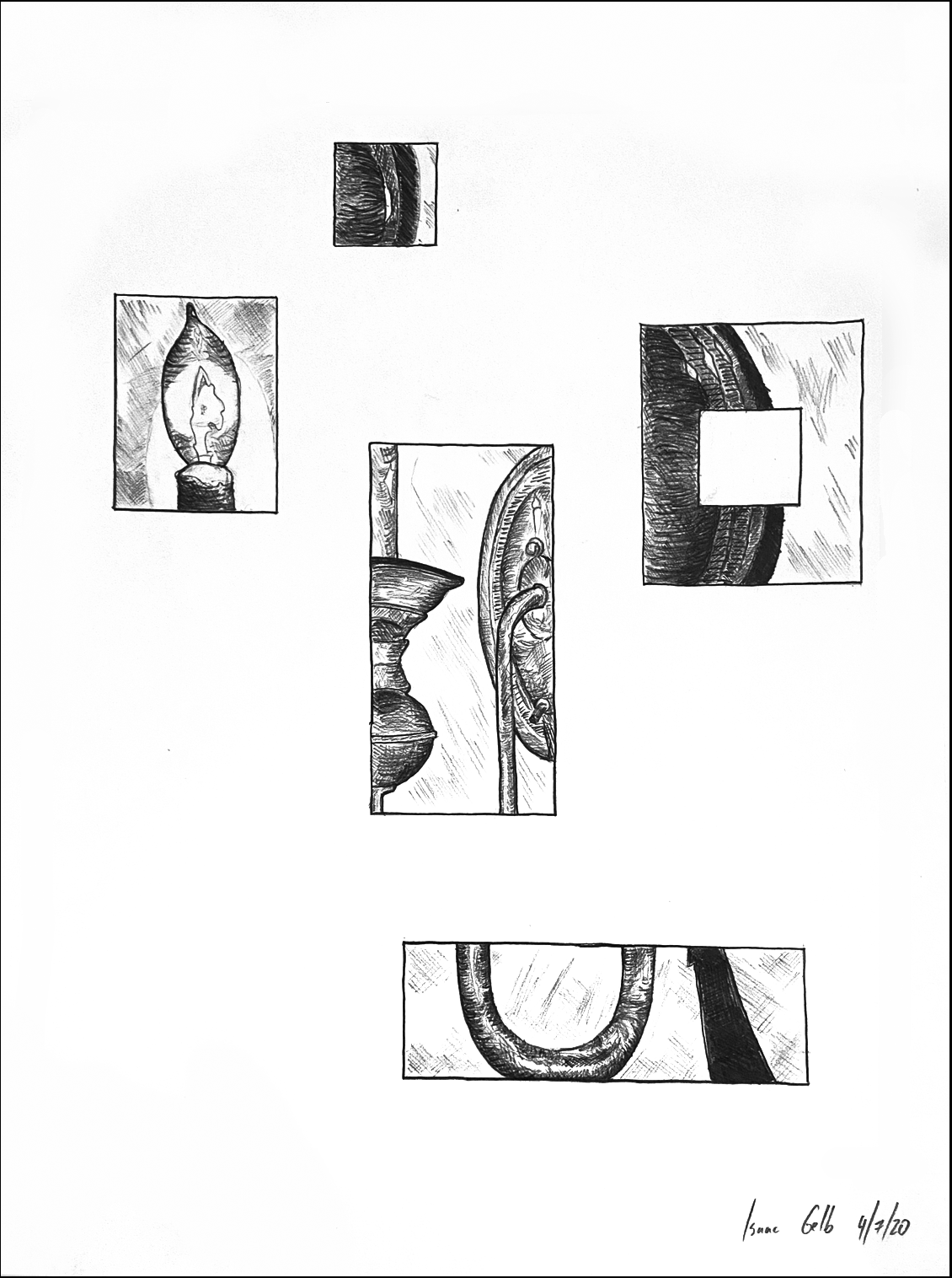
Love the way you broke this into parts. They’re perfectly arranged and aligned to both hold the space and maintain their independence while also converging on the same image–wonderful job. I’d go one step farther and let go of the outer border, which feels redundant and less daring. The black outline on mine is the edge of the paper (I also tweaked the contrast and the white balance to remove that pink haze and make the lines black).
David Hockney