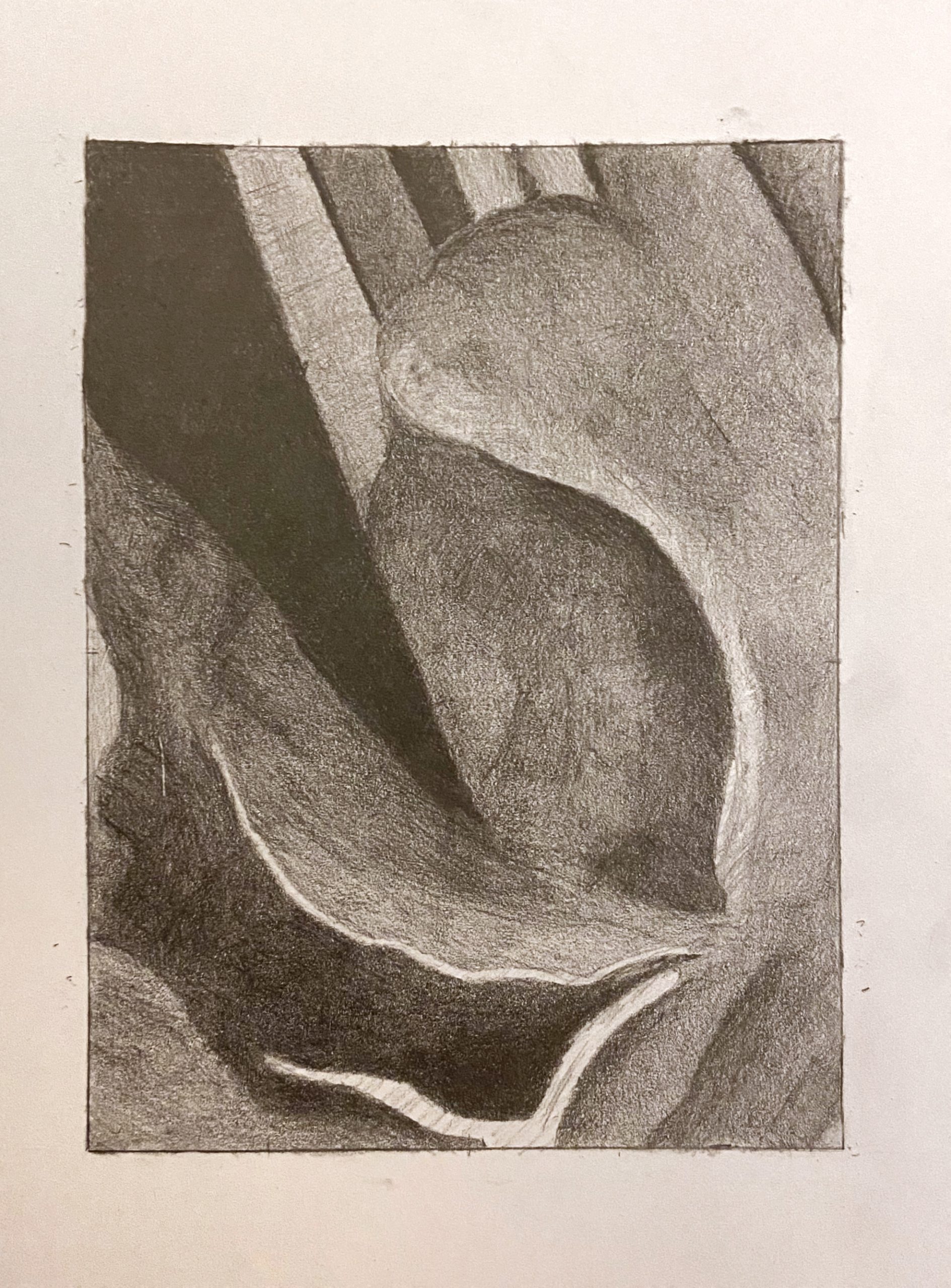
 That dark V-shape on the upper left and the vaguely leaf-shape at the bottom left and center (your darks, that is) are great, but all other values should be a shade or two darker than they are here. That light shape at the bottom edge (like a bird in flight) is much darker (and so are the values around it)–not the same value as the paper as it is here.
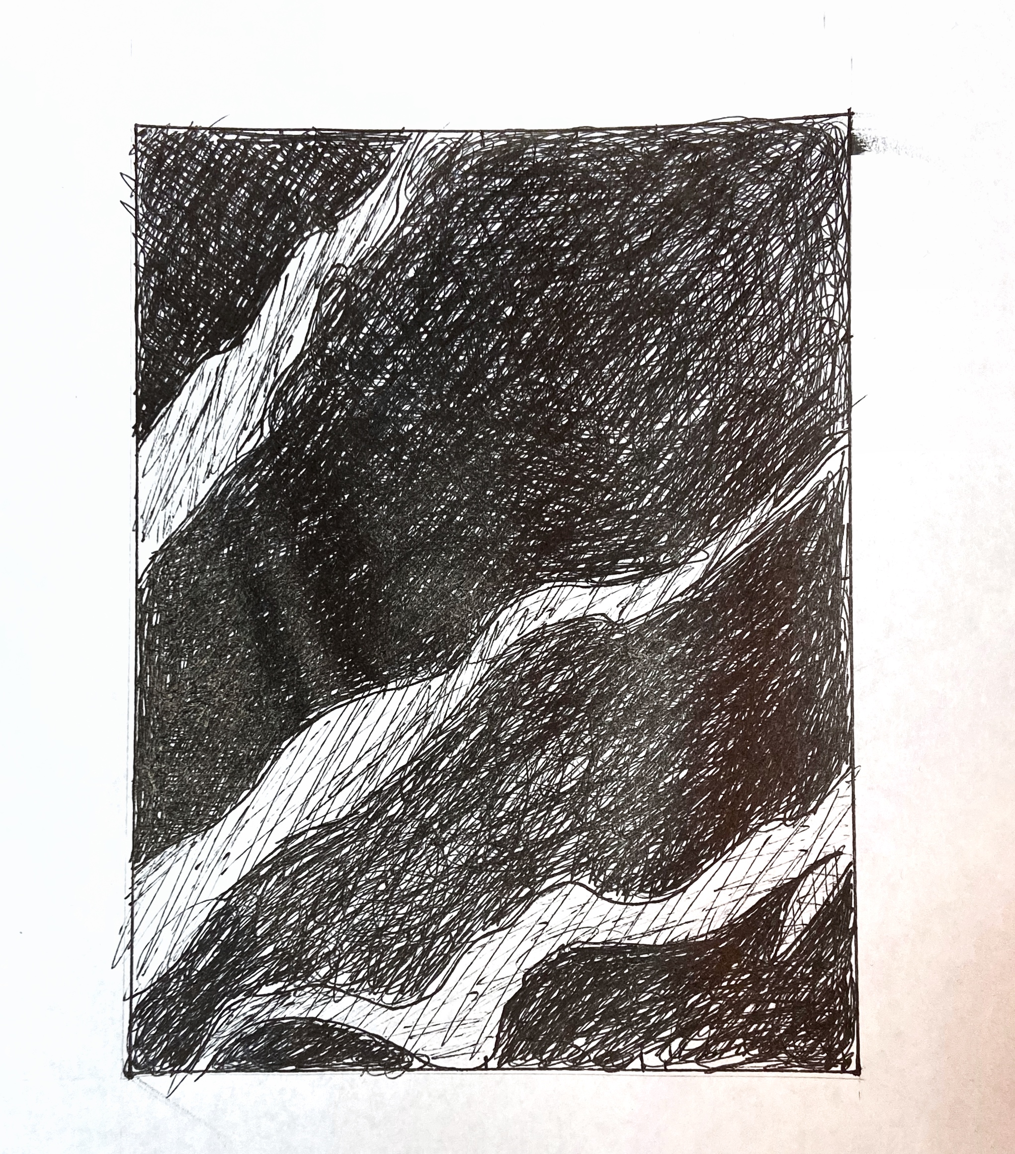
 Very good, but light stripes aren’t this light–especially the one in the upper left. The third dark shape down from the top has a slightly lighter value running through it, but not this much lighter–it’s subtler than that. By the time it reaches the right edge it’s as dark as the other dark parts of the drawing.
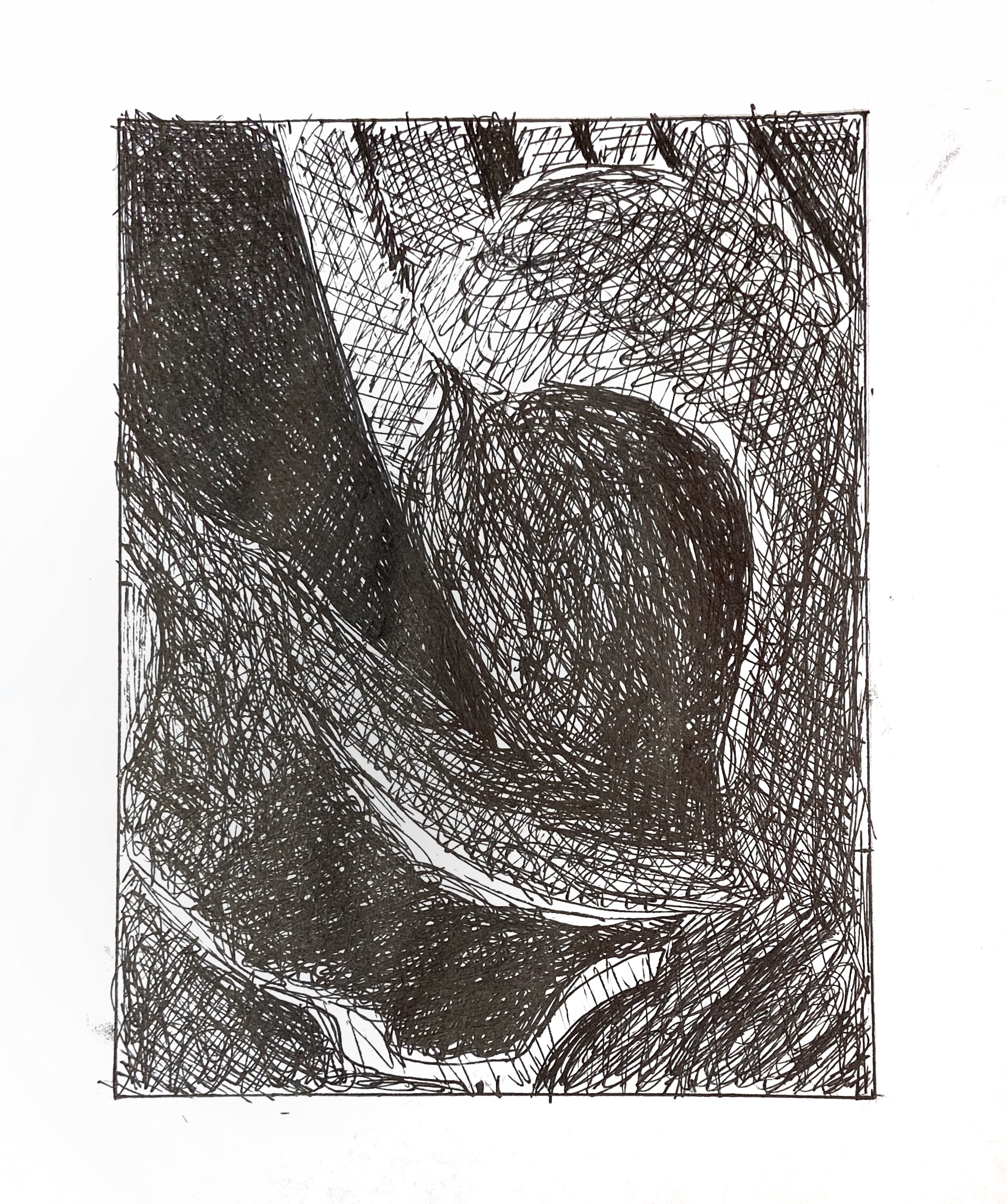 Much better than the pencil version, in terms of value, but that white shape near the bottom is still not that light. A light grey, but not that light. Make sure the lighter values at the top edge go all the way to the edge–you’re leaving a gap there on the two to the left. All of the lighter values near at the top could be a shade darker.
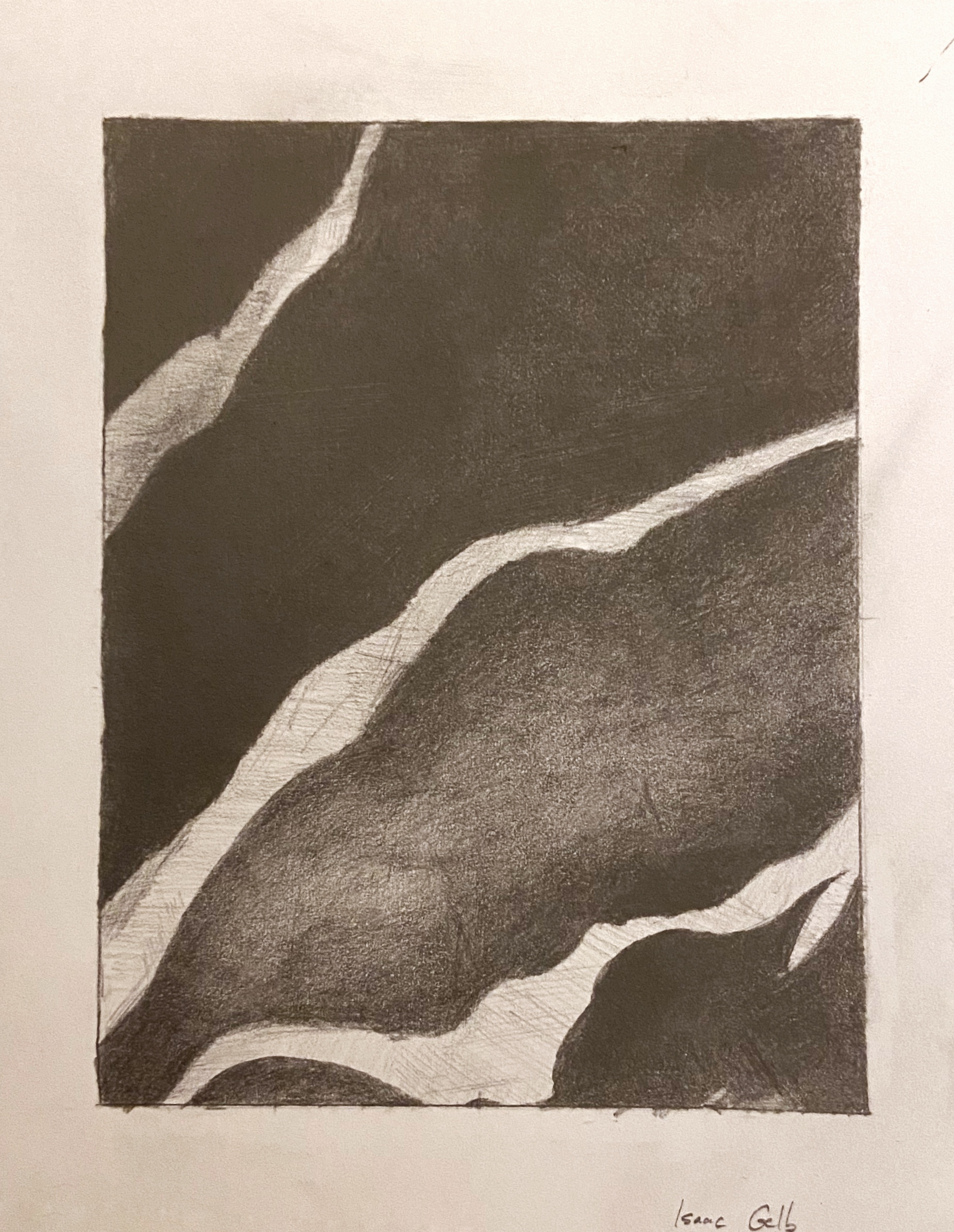
 Very good, but lower portion of upper left stripe, where it meets the edge, is darker–still lighter than what’s around it, of course, but not as light as this.
When I got the instructions for this assignment, I honestly did not expect to enjoy it. I thought four drawings with very little room for creativity would be completely boring and tedious. Despite these low expectations, I actually ended up enjoying this project immensely. I thought it was therapeutic to spend a few hours refining an image little by little, just turning the page and shading a little more in different directions until I got to a value I was satisfied with. It was also rewarding– I felt myself improving as I spent more time and really ended up happy with the results. The pen versions were very different, but still fun in their own way. It was liberating to scribble away and still feel like I was gradually refining something. Overall, I think the pen drawings ended up much uglier than the pencil ones, but I still like how I managed to convey a pretty broad spectrum of values in both versions.