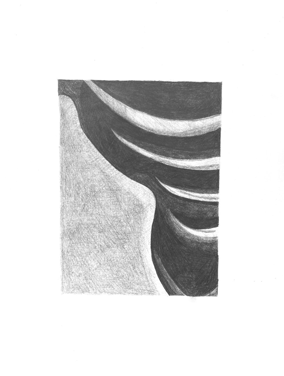
 Like the other pencil drawing, the middle-grey shape to the lower left needs to be much darker–also a chance to hide those horizontal rows of overlapping shading. Just change up the direction of the pencil. As noted in my demo, multiple layers of hatching, each at a slightly different angle to the last, will even our the texture and the pencil strokes. Also, the four very light shapes in the upper right are much darker. Compare them to the white of the paper.
One thought on “Olivia Pencil 1 (edited)”
Leave a Reply
You must be logged in to post a comment.
I had quite a bit of fun drawing these. In my opinion, Pencil 1 and Pen 1 were definitely harder to draw than the 2 drawings. I found that the 2s were much more forgiving as far as shading and lining up the edges correctly. I also found the pencil to be much easier and more forgiving than the pen (obviously). Mistakes could be easily erased and I could add and subtract value as I pleased. With the pen, it was difficult making lighter gray values that looked ‘clean’ and accurate. Overall, I’m happy with how these came out and I’m happy we did this assignment as it definitely gave me practice in value and shading.