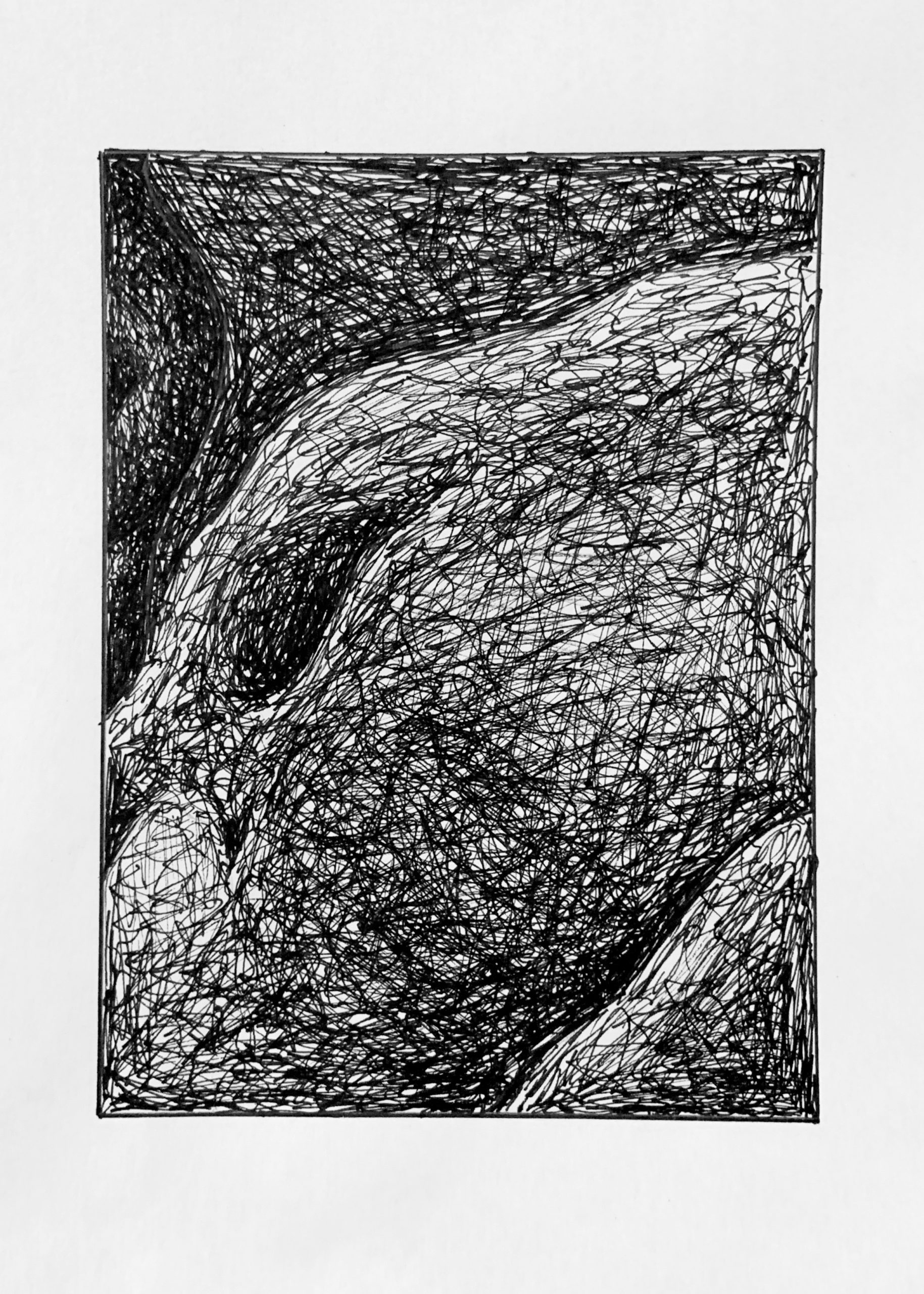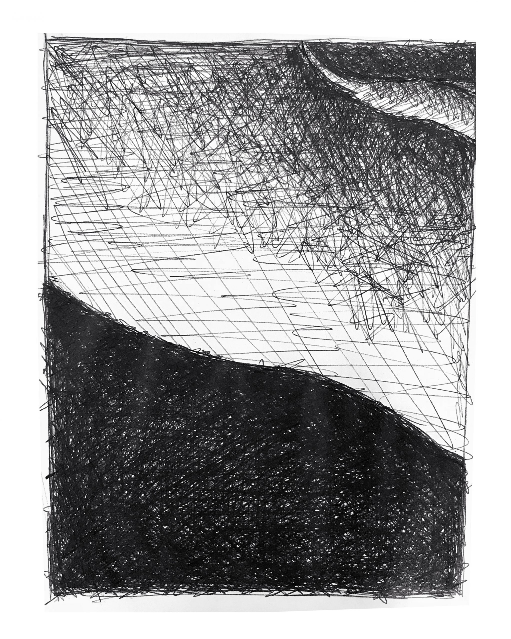
All 36 drawings together. Above is the high-resolution pencil version, and the one below is the pen rapid hatching version. Click them open and zoom in to see your pieces in context with their neighbors. The value and resolution differences between them is inevitable but makes the image interesting in a different way.
Note also the overall difference between the “complexion” of the pencil version and the ink version.
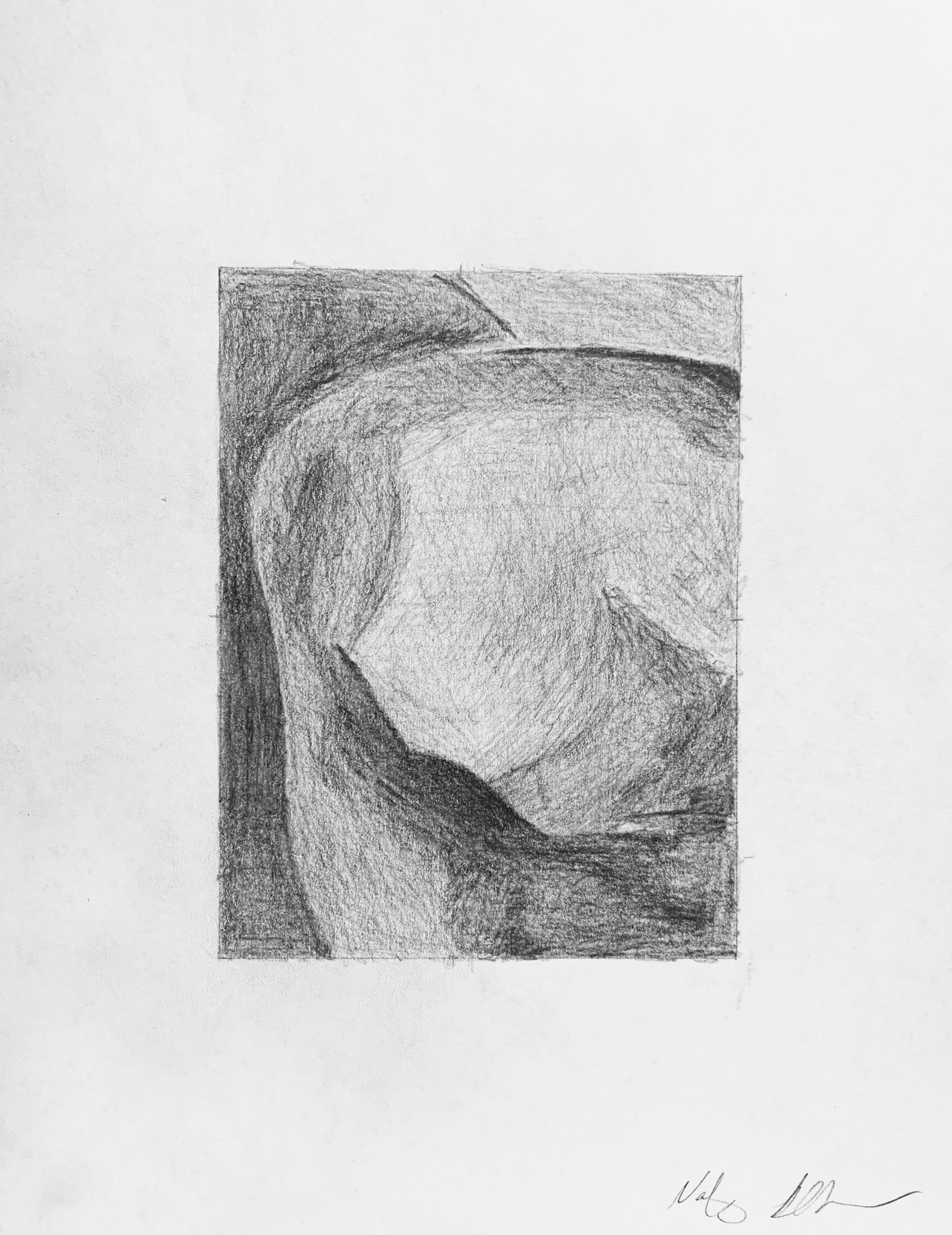
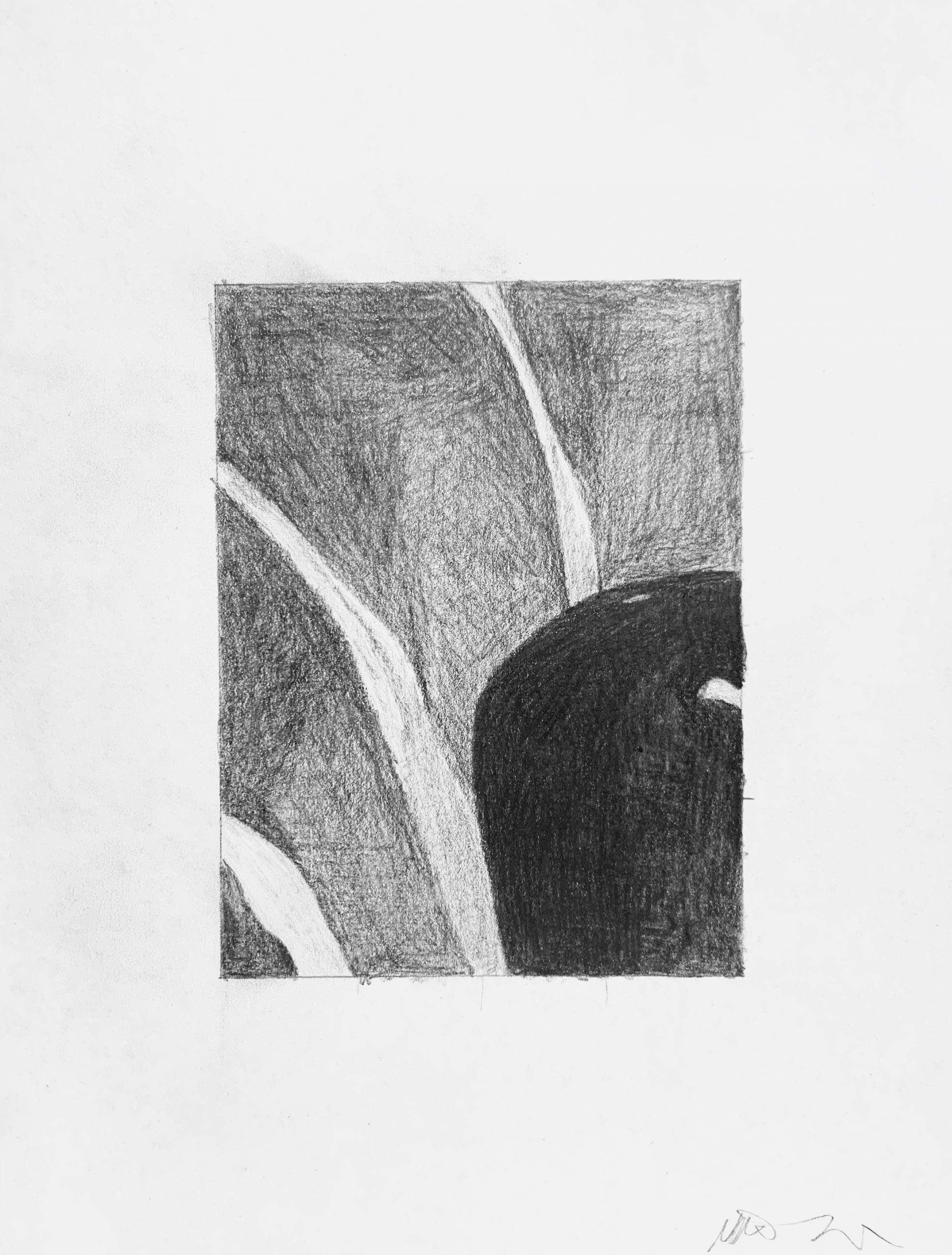
The image is a painting by Georgia O’Keeffe, called Jack-in-Pulpit, No.2, 1930, Oil on canvas, 40 x 30 inches
Here it is in black and white, which you worked from:
And the original, in color:
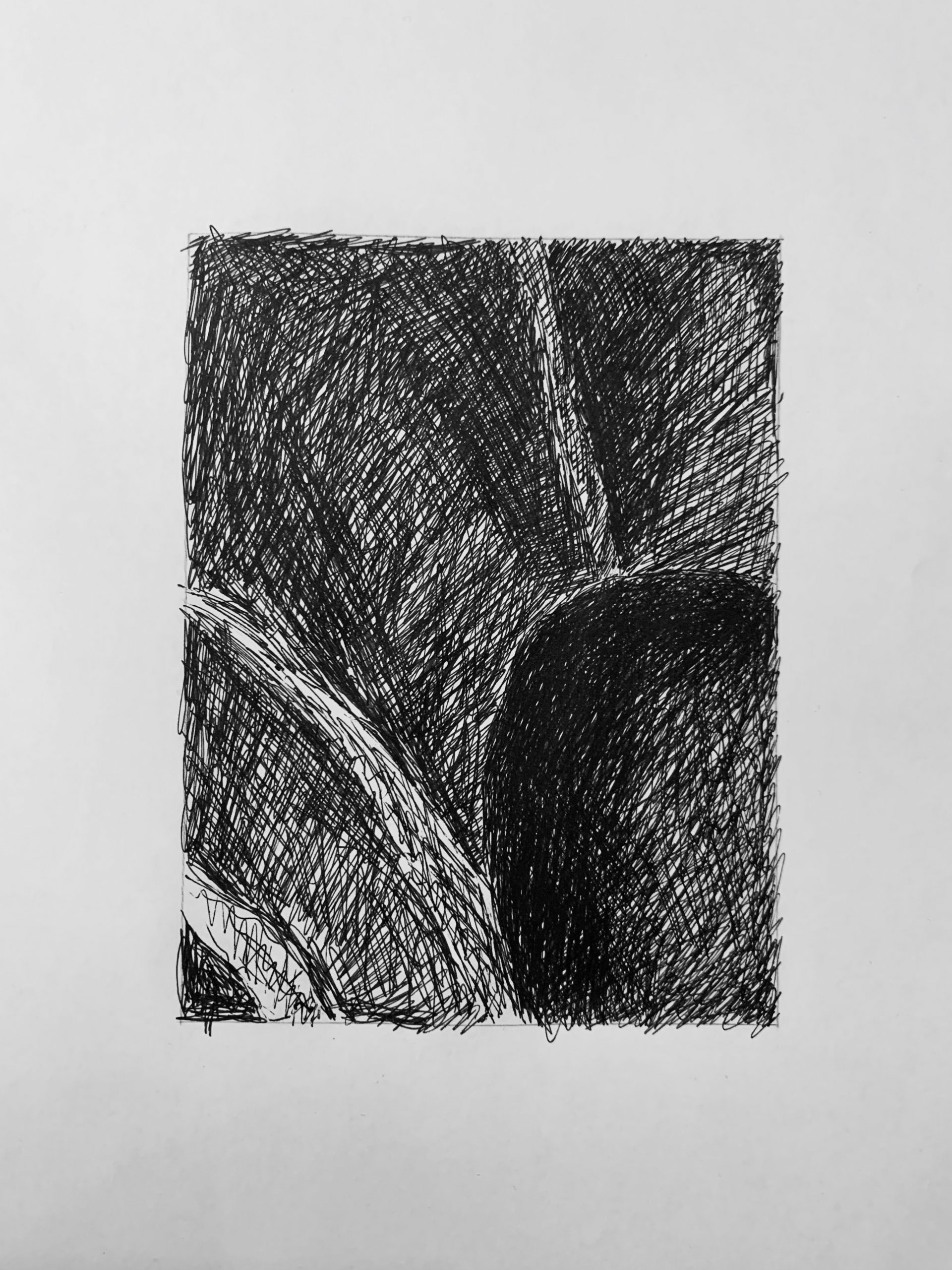
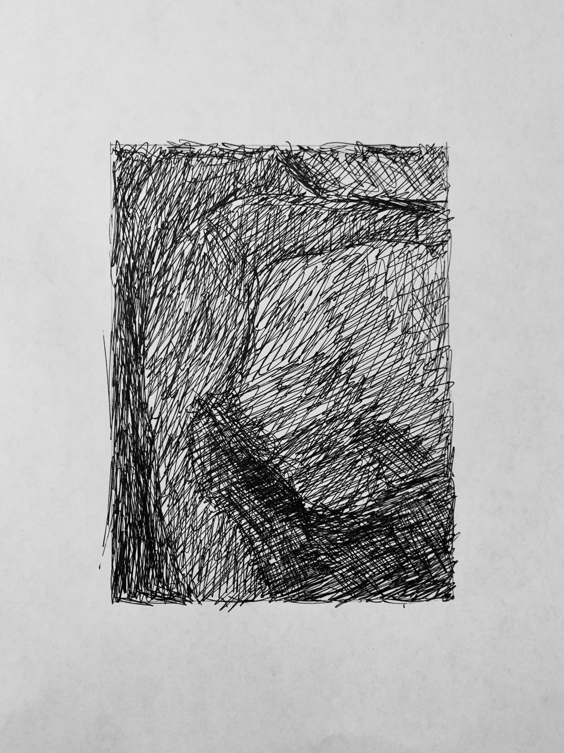
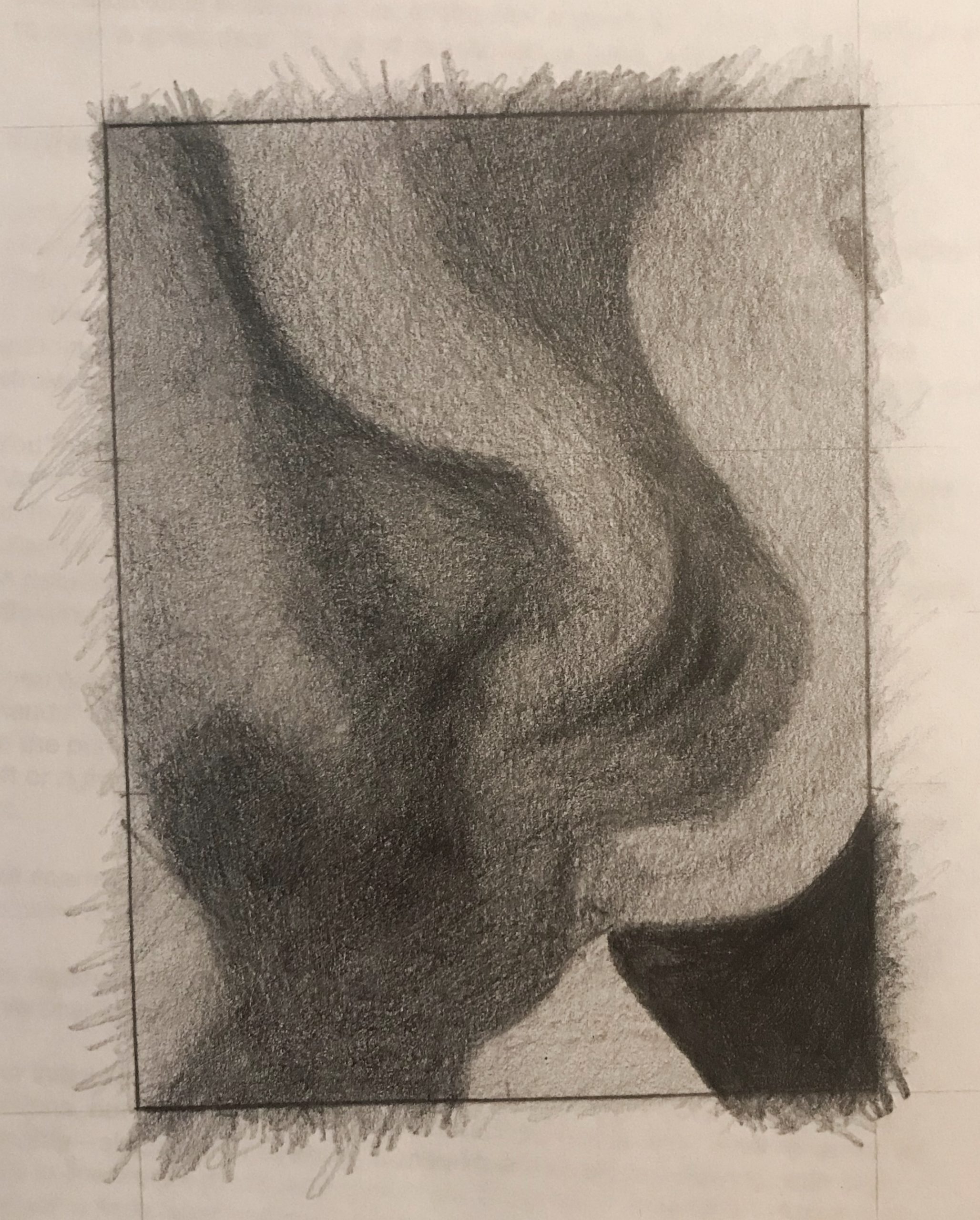
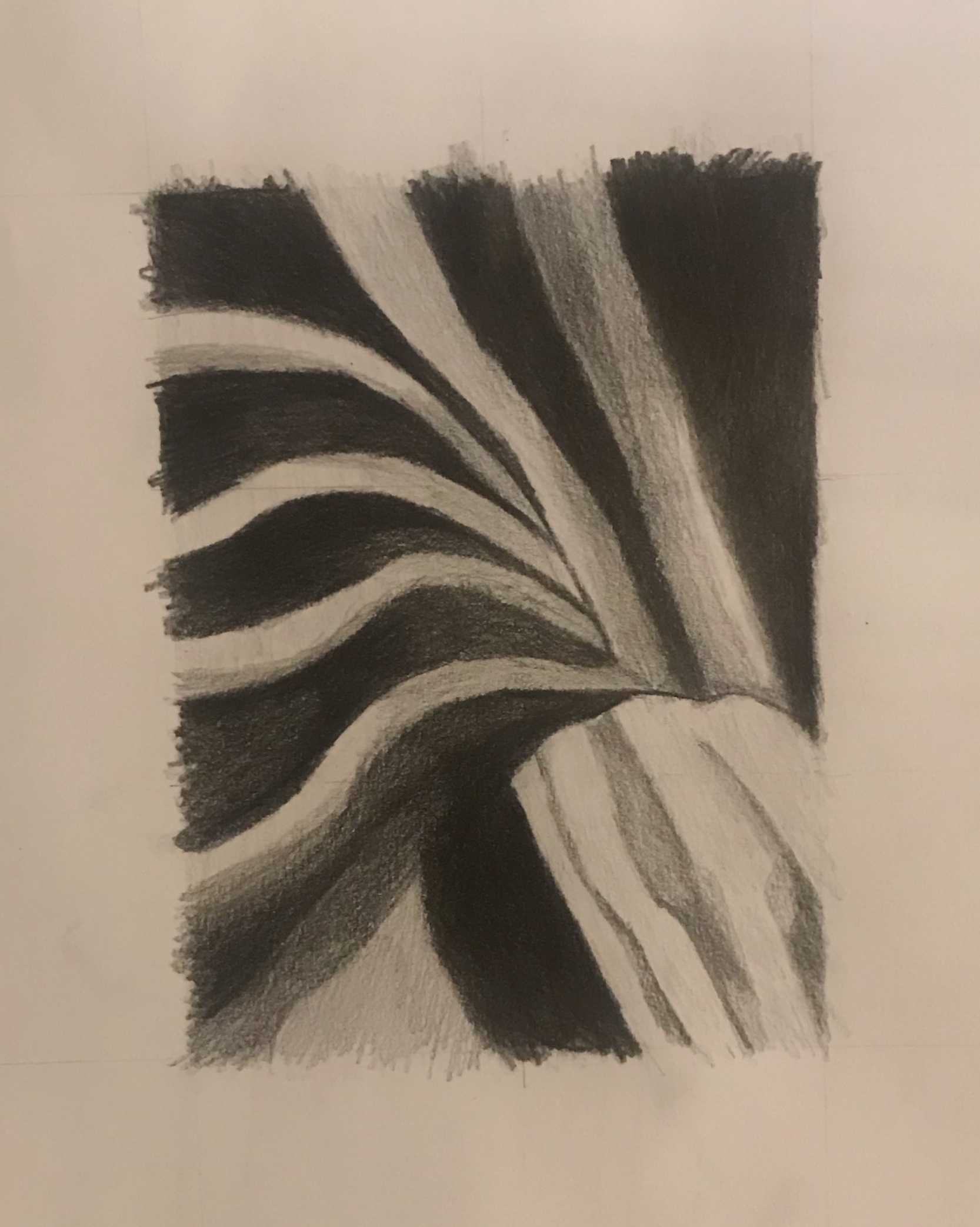
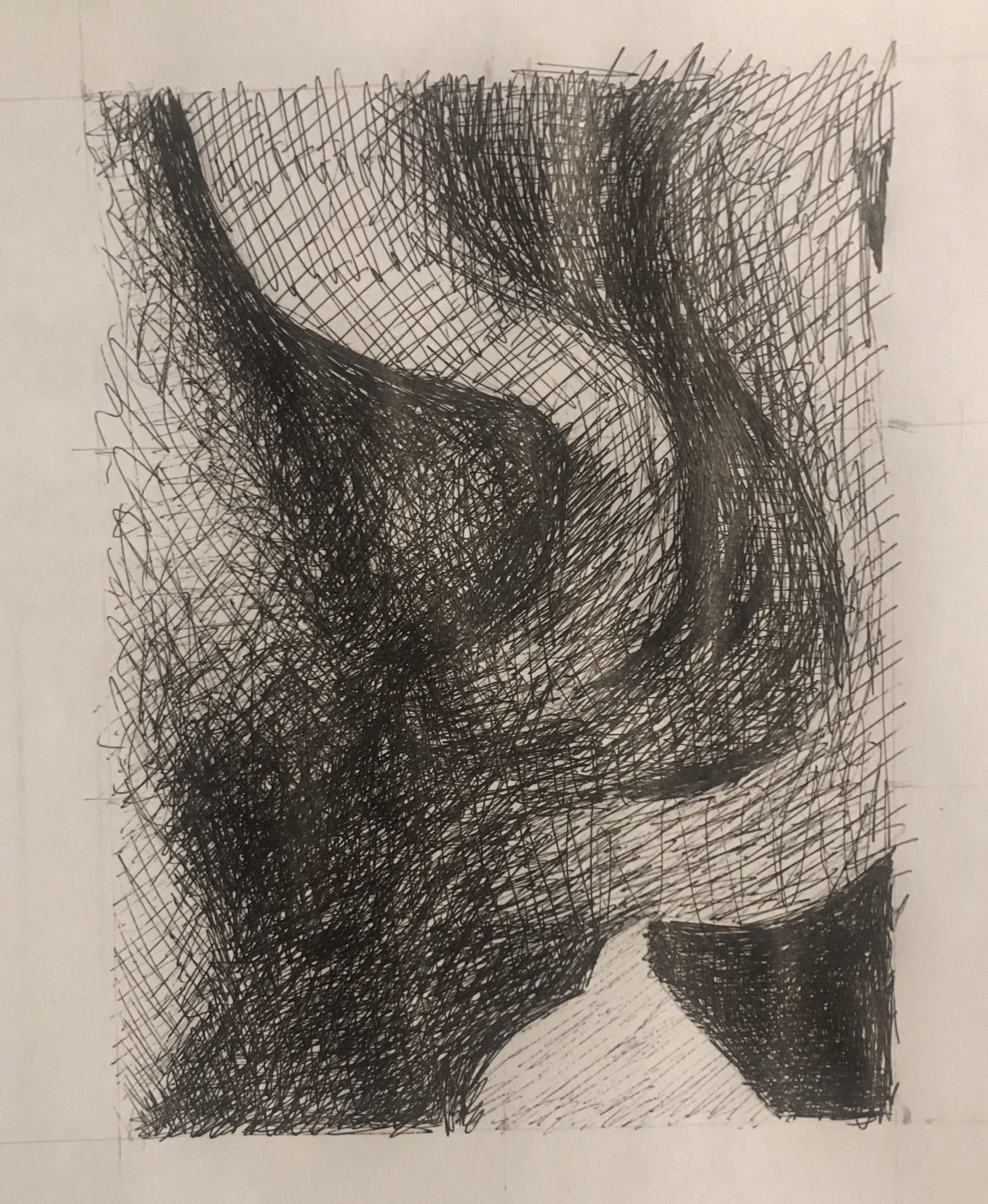
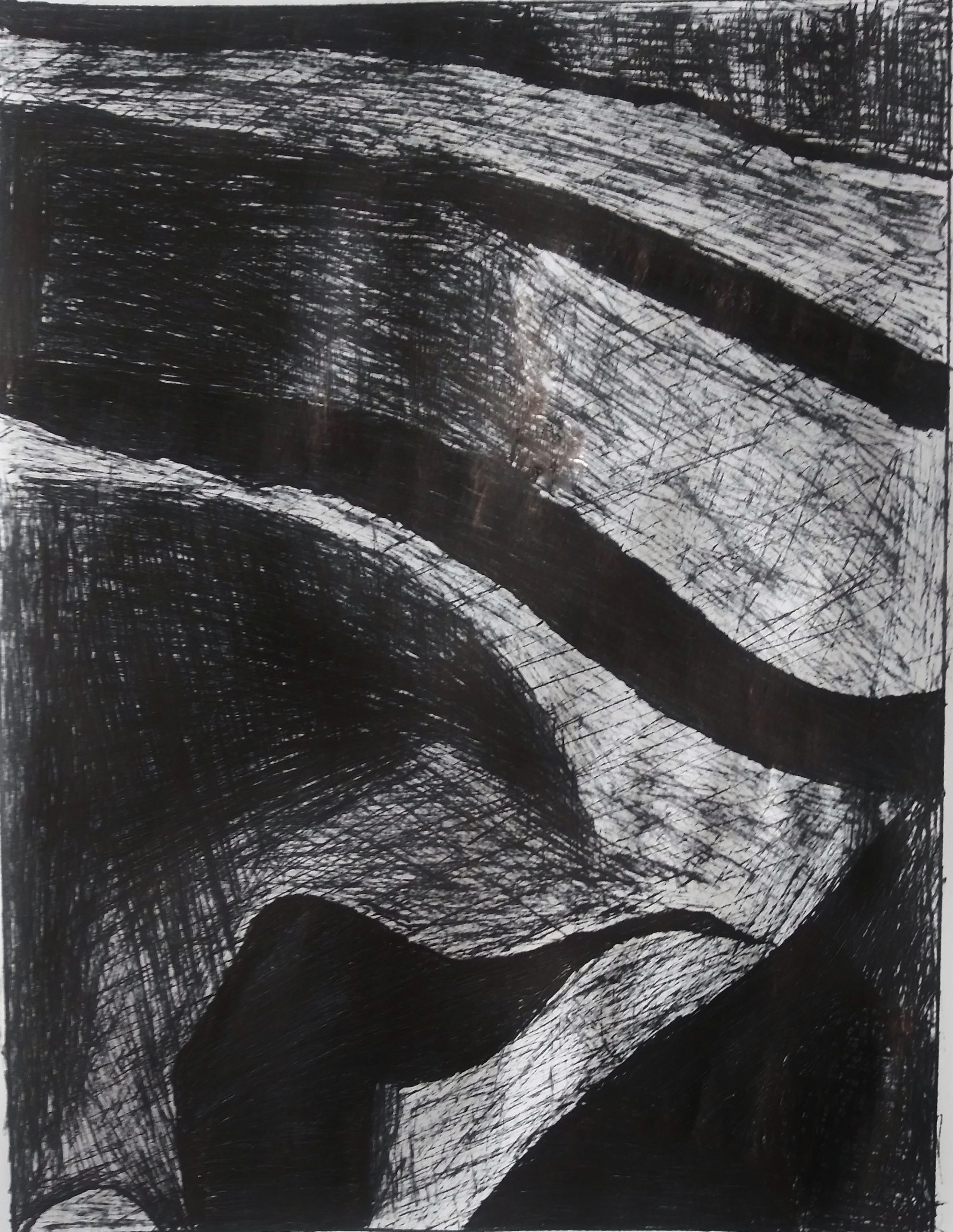
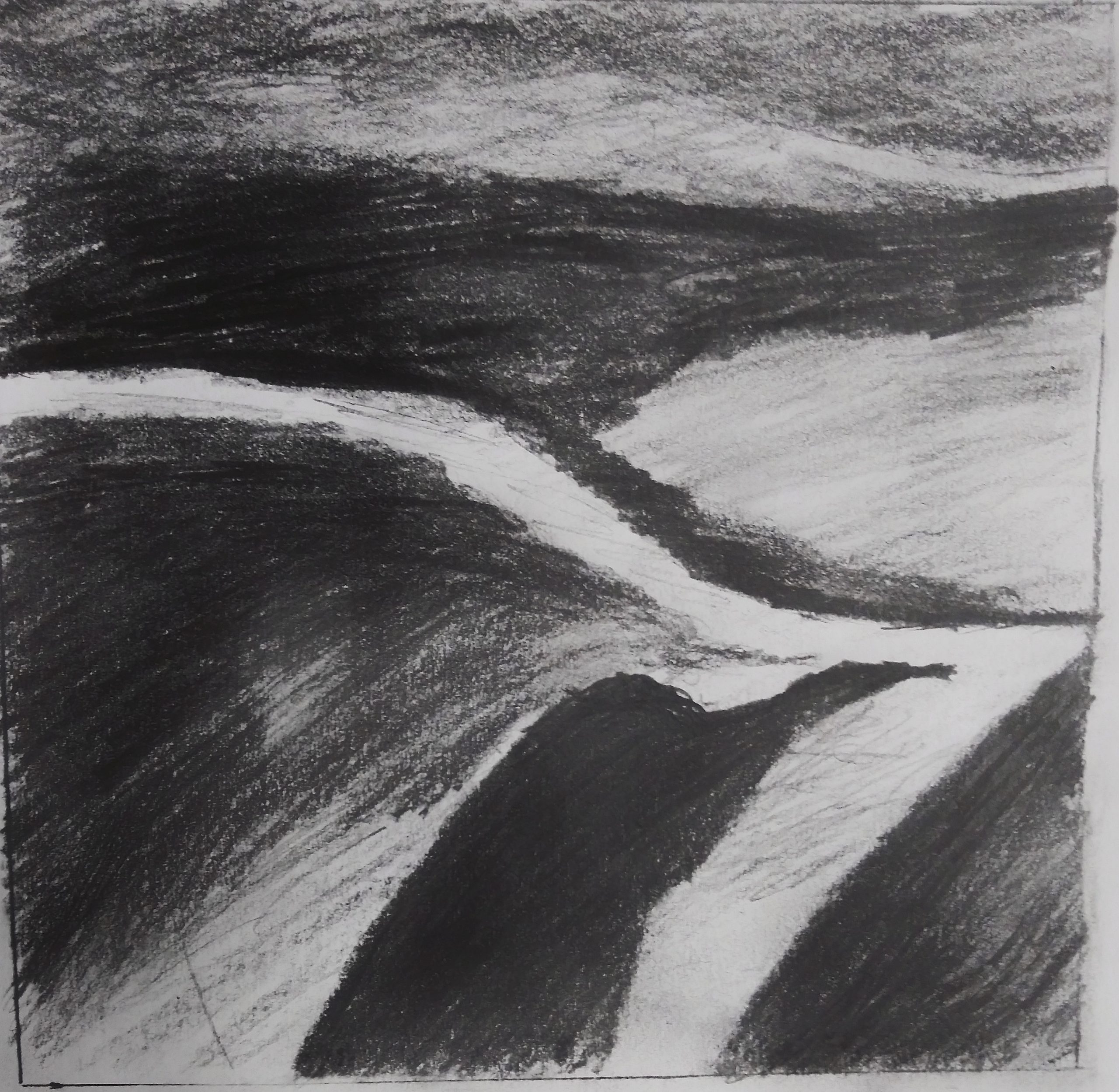
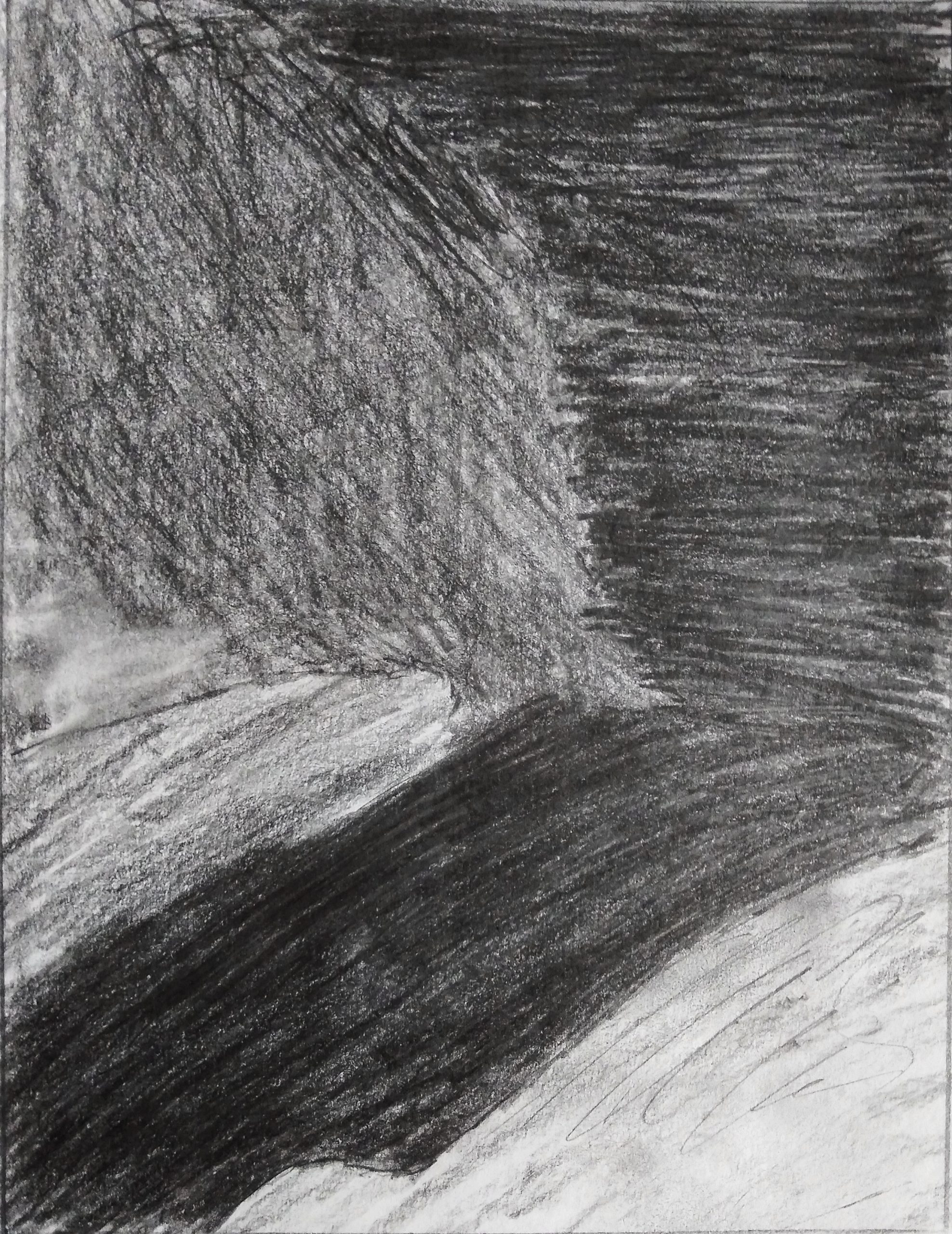
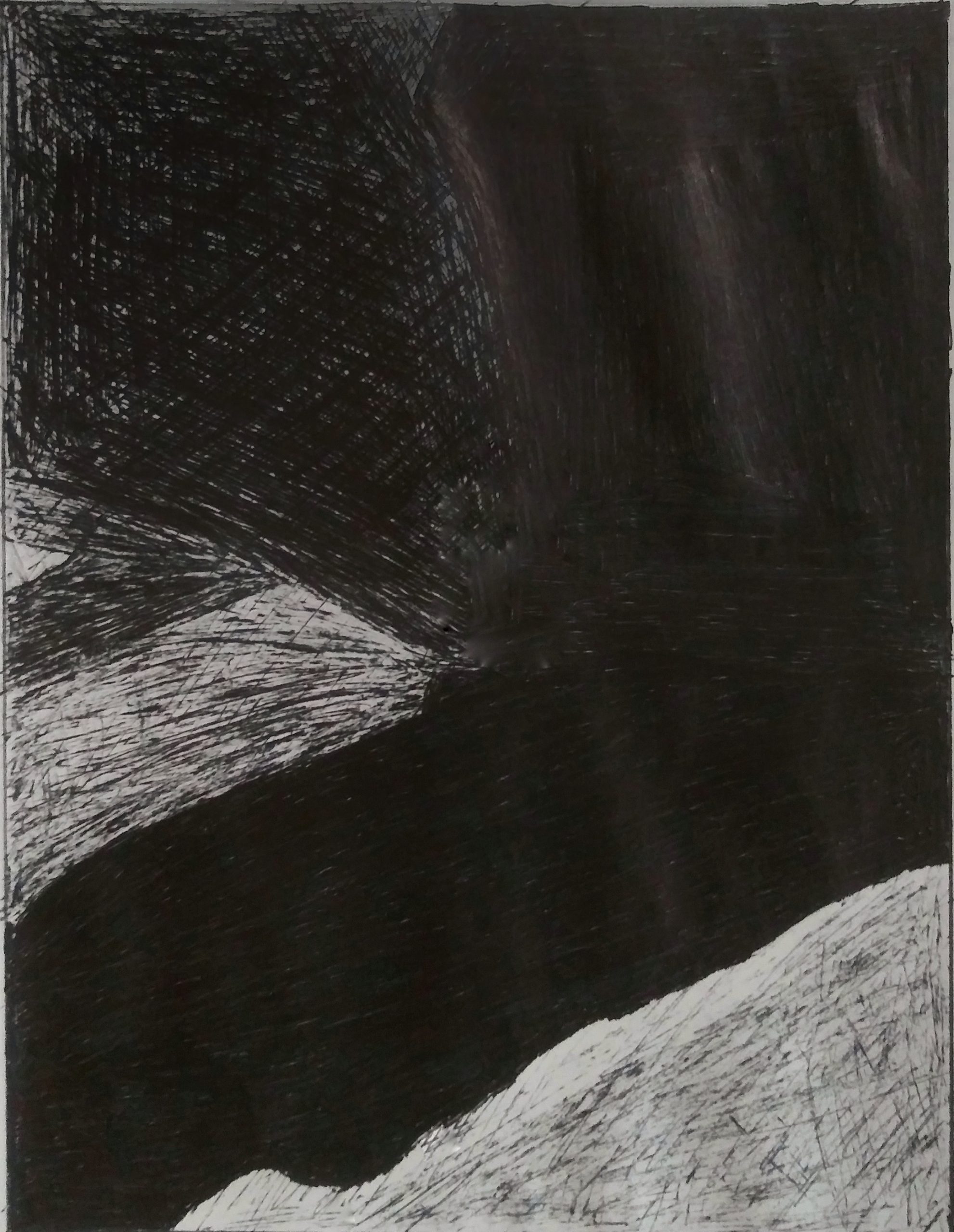
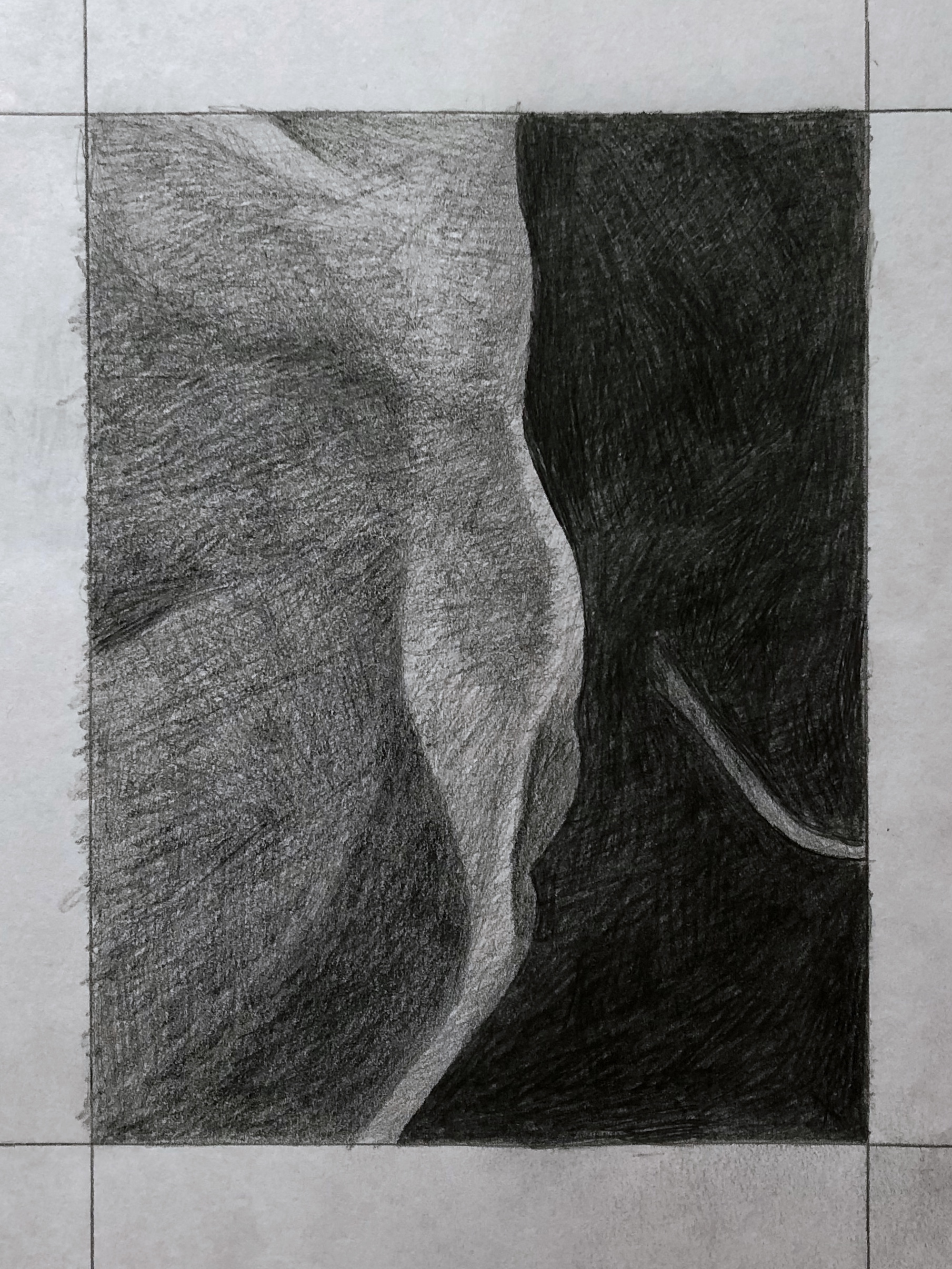
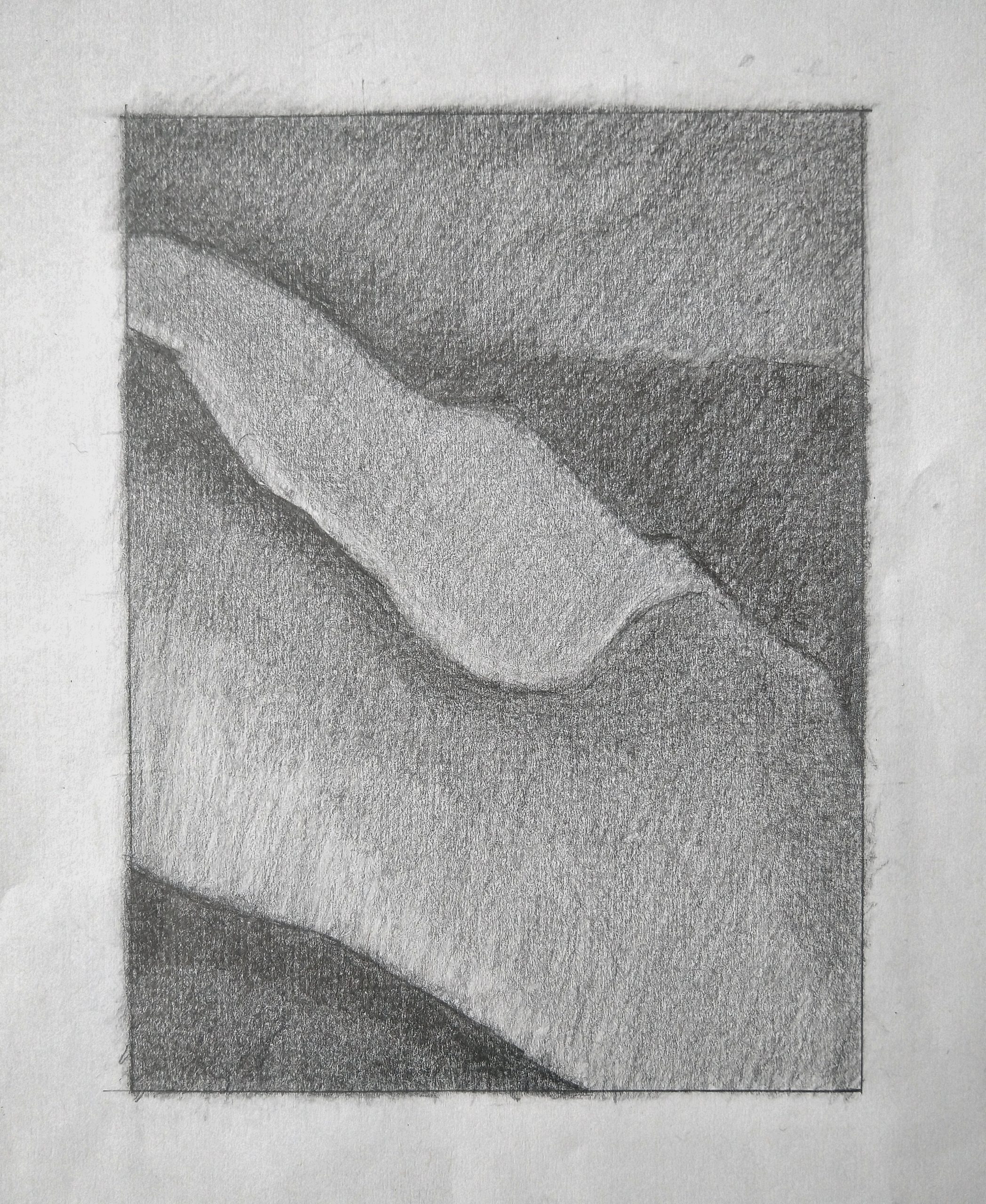
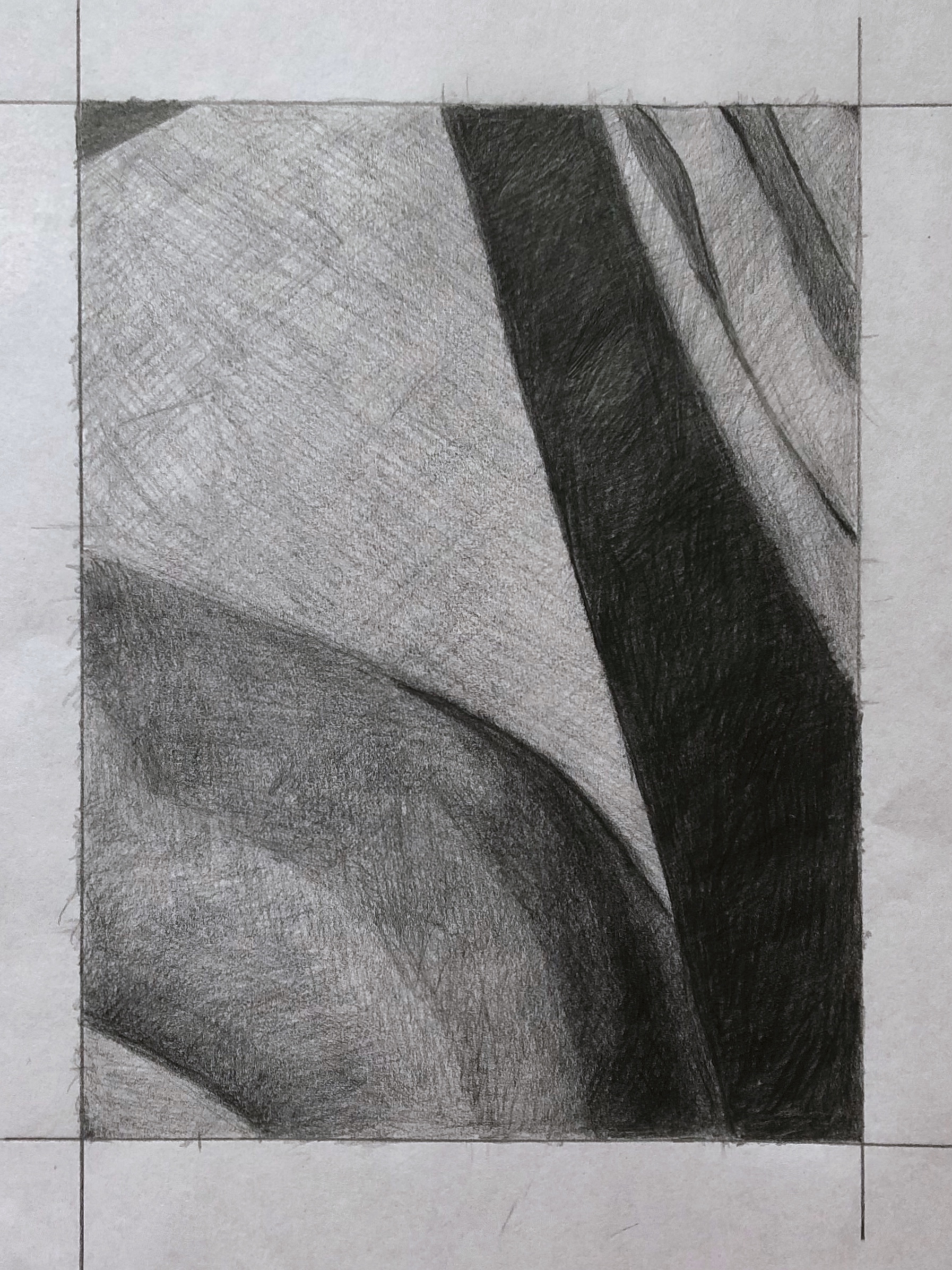 image 27
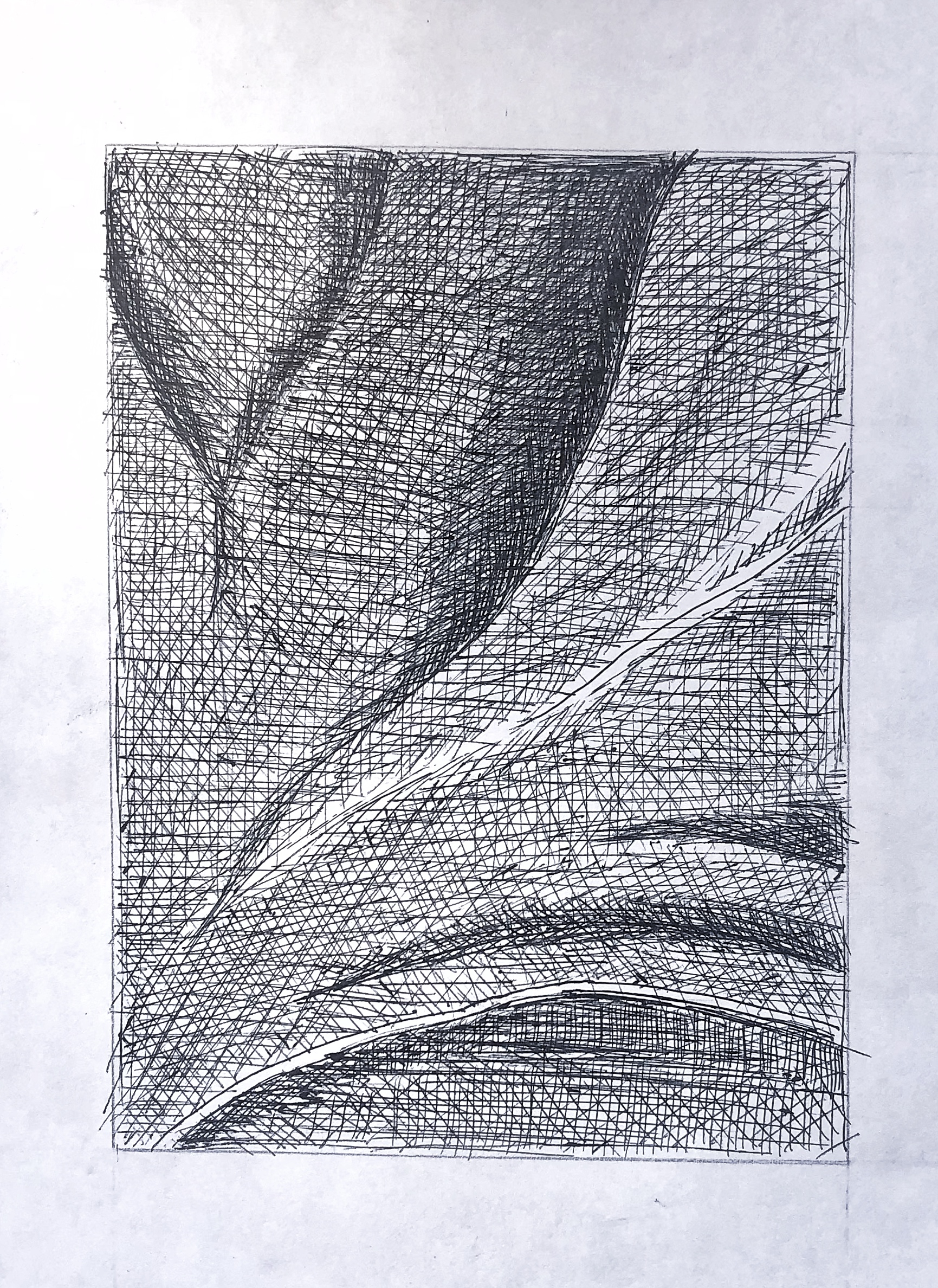
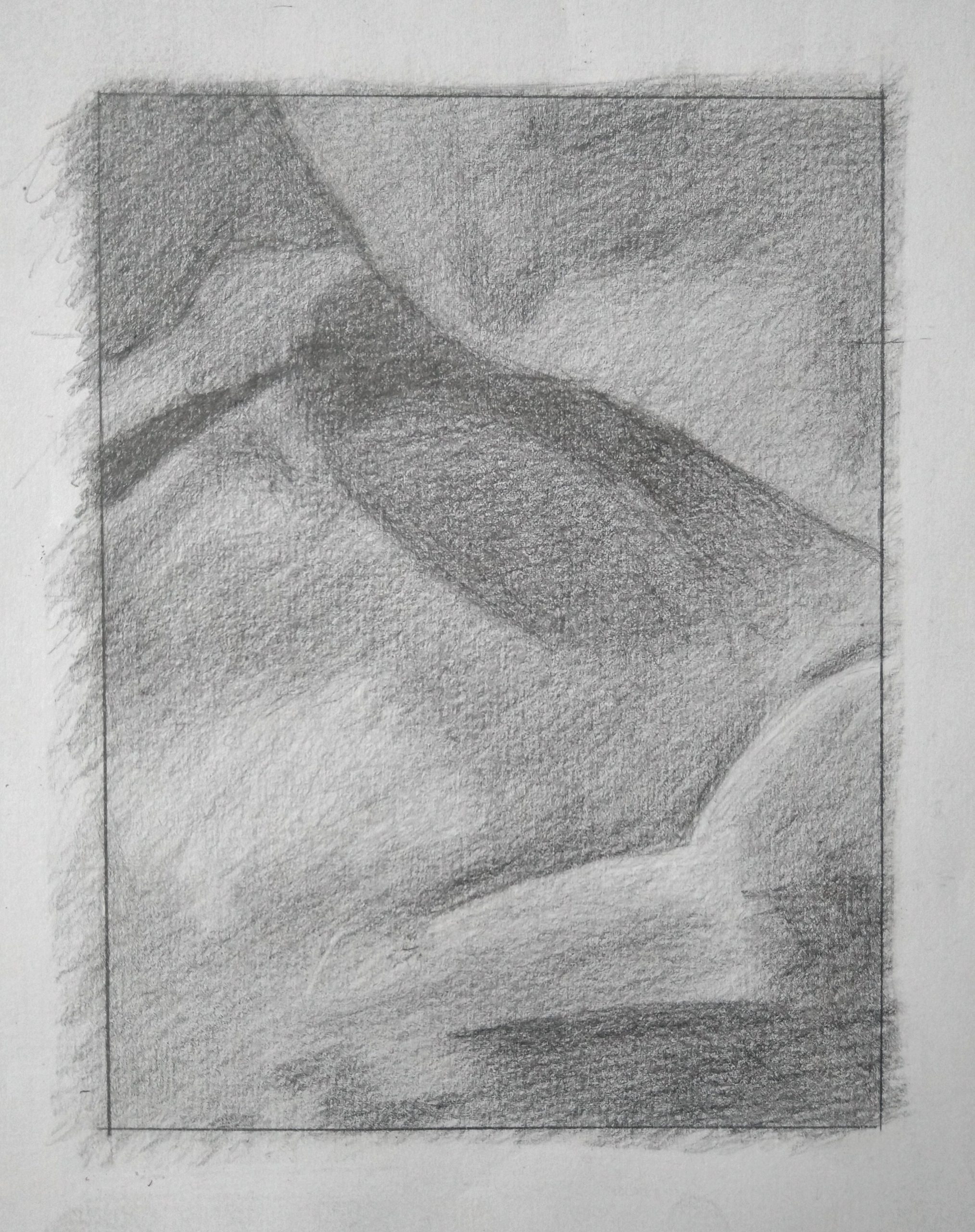