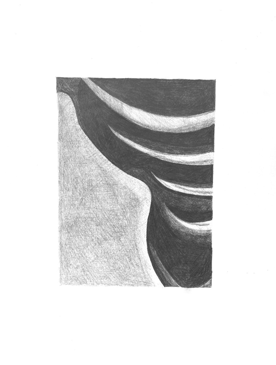
 Like the other pencil drawing, the middle-grey shape to the lower left needs to be much darker–also a chance to hide those horizontal rows of overlapping shading. Just change up the direction of the pencil. As noted in my demo, multiple layers of hatching, each at a slightly different angle to the last, will even our the texture and the pencil strokes. Also, the four very light shapes in the upper right are much darker. Compare them to the white of the paper.
Category: 3) Team Value Drawing
Isaac Gelb– Team Value Drawings
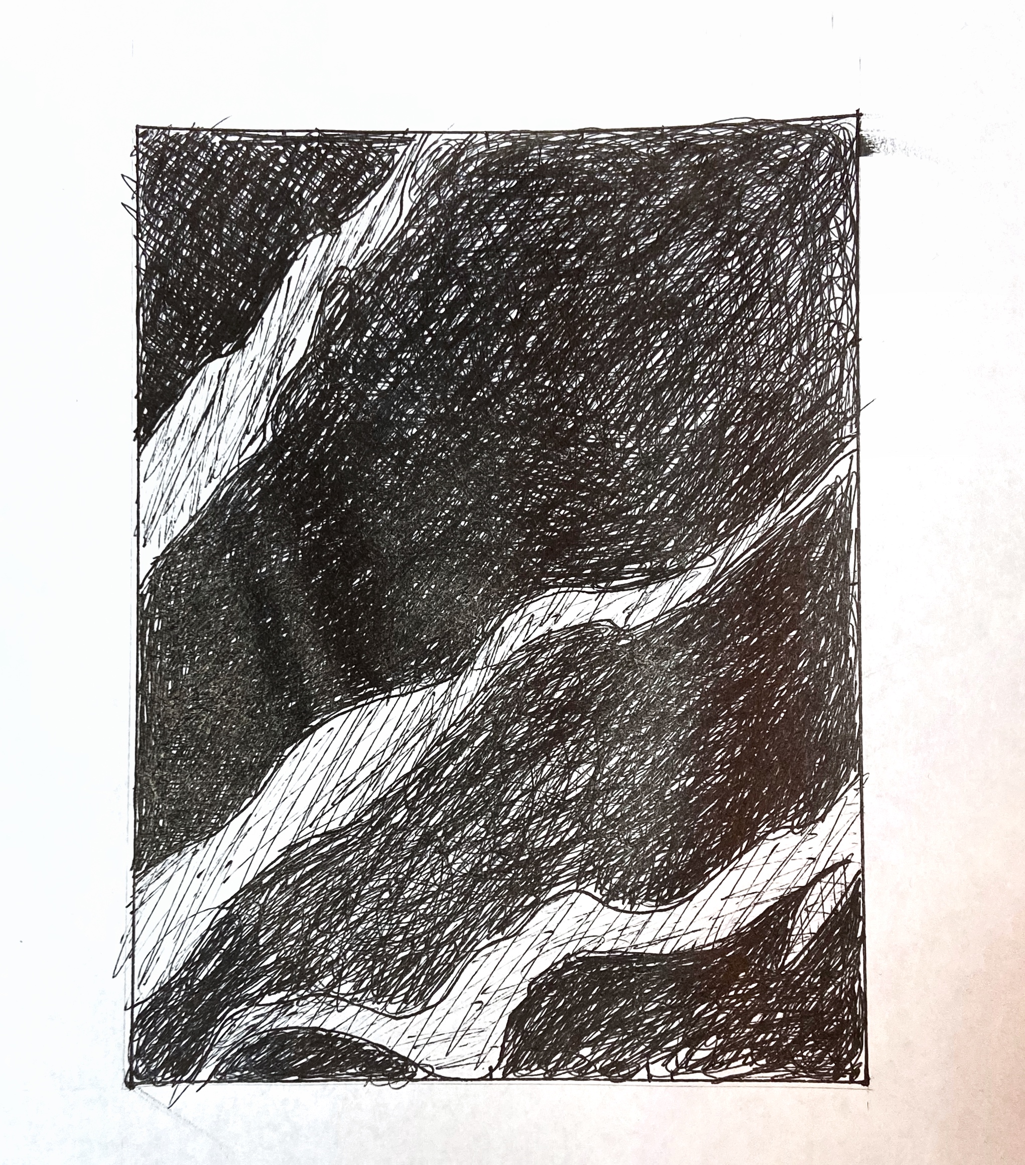
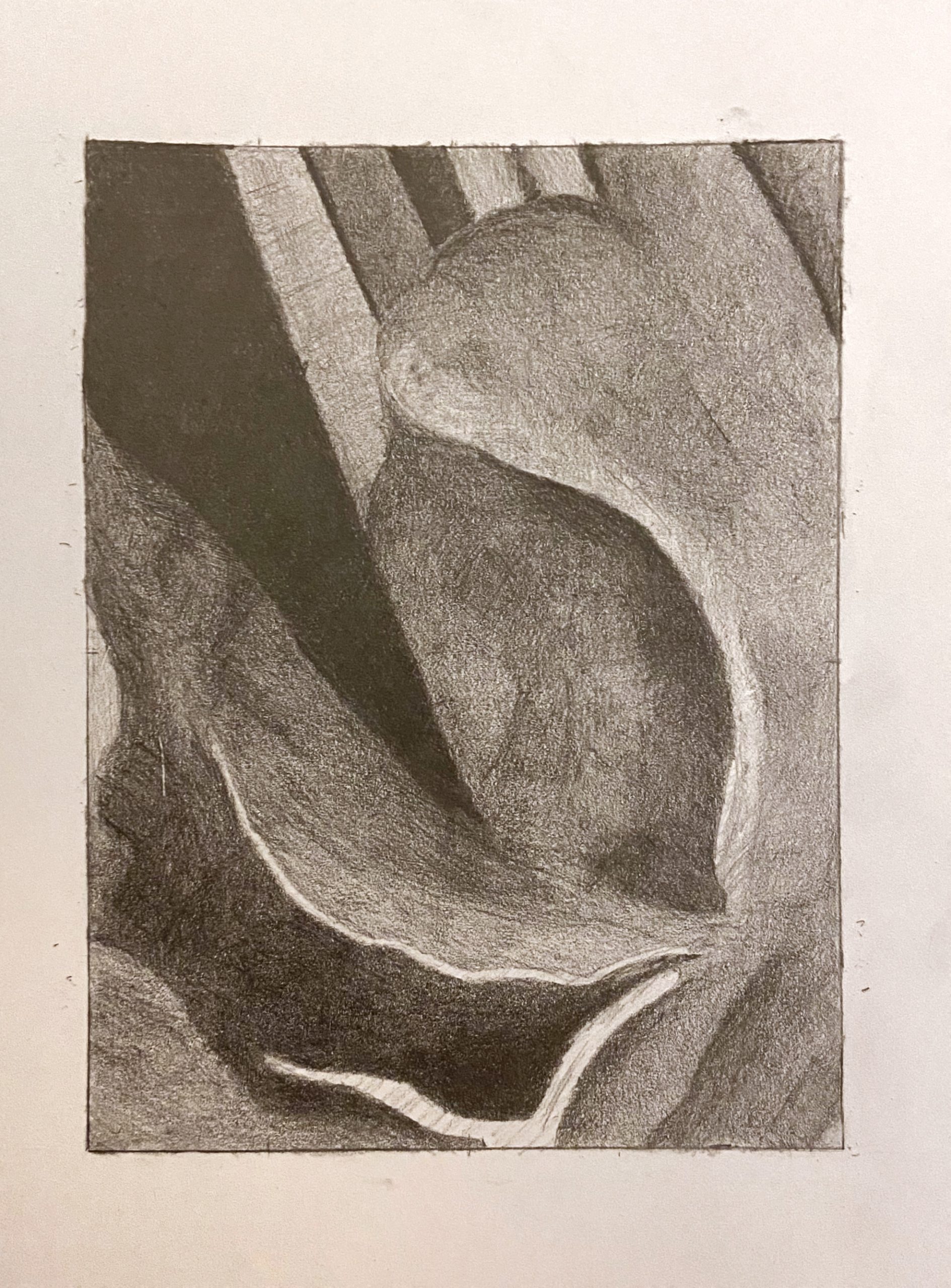 That dark V-shape on the upper left and the vaguely leaf-shape at the bottom left and center (your darks, that is) are great, but all other values should be a shade or two darker than they are here. That light shape at the bottom edge (like a bird in flight) is much darker (and so are the values around it)–not the same value as the paper as it is here.
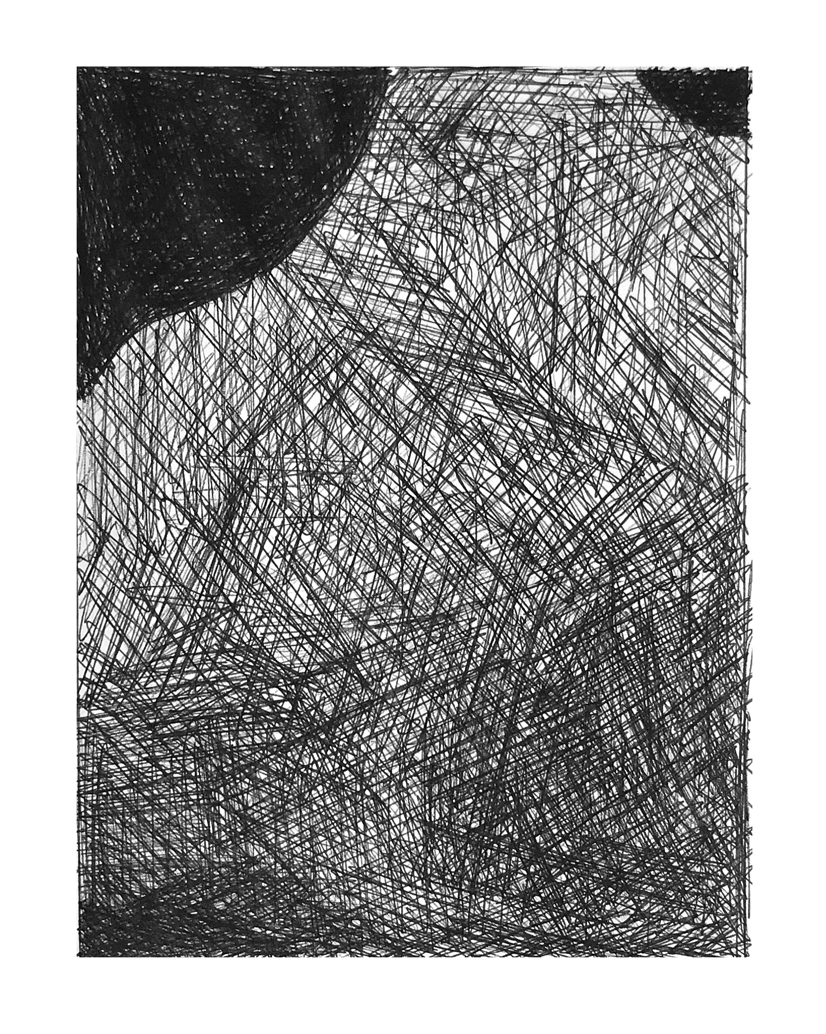
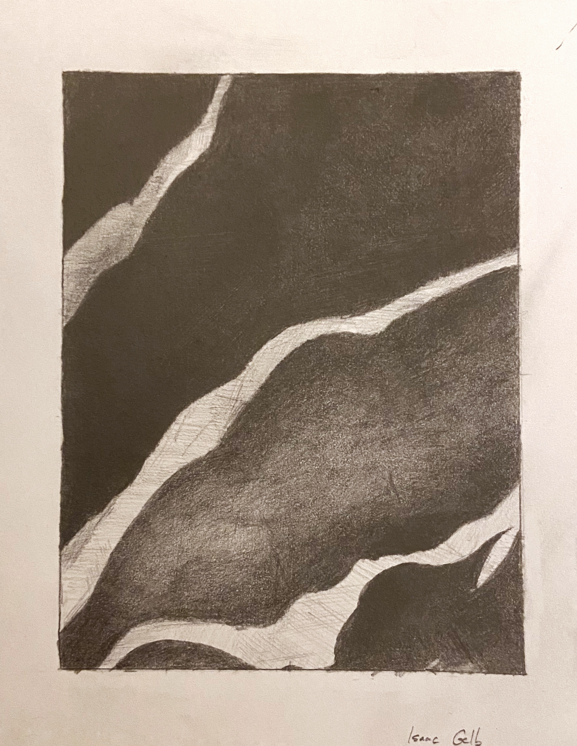 Very good, but light stripes aren’t this light–especially the one in the upper left. The third dark shape down from the top has a slightly lighter value running through it, but not this much lighter–it’s subtler than that. By the time it reaches the right edge it’s as dark as the other dark parts of the drawing.
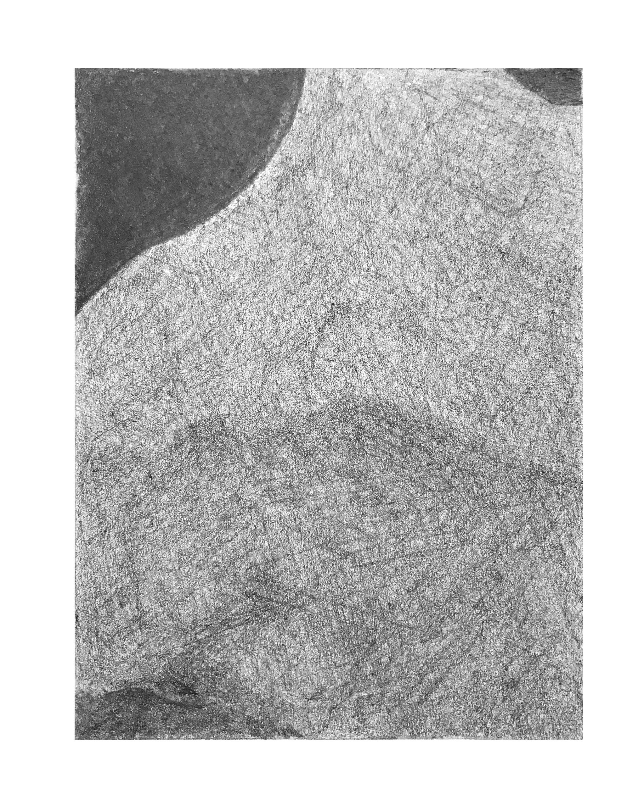
 Much better than the pencil version, in terms of value, but that white shape near the bottom is still not that light. A light grey, but not that light. Make sure the lighter values at the top edge go all the way to the edge–you’re leaving a gap there on the two to the left. All of the lighter values near at the top could be a shade darker.
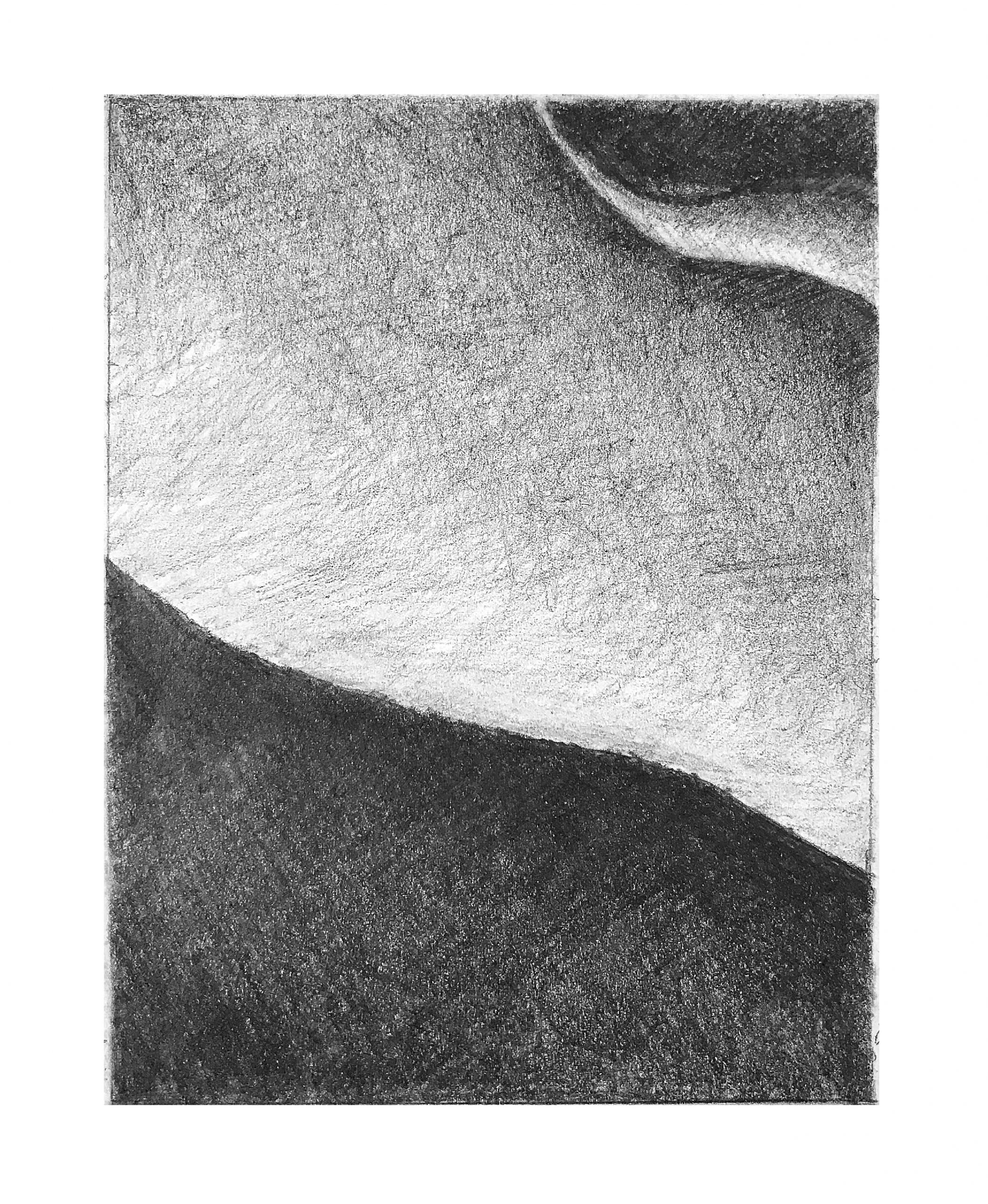
 Very good, but lower portion of upper left stripe, where it meets the edge, is darker–still lighter than what’s around it, of course, but not as light as this.
Lily Value Pen 2
 Fine work.
Lily Value Pencil 2
 Good values, but you’re over-defining value changes in the large mid-value shape that dominates this composition. There is a shift there (around the mid-line between top and bottom) but it’s subtler and more gradual. Likewise the gradation from that dark area and along the bottom edge–a more seamless transition.
Lily Value Pencil 1
 Excellent work.