Professor Mark Wethli – Spring 2020
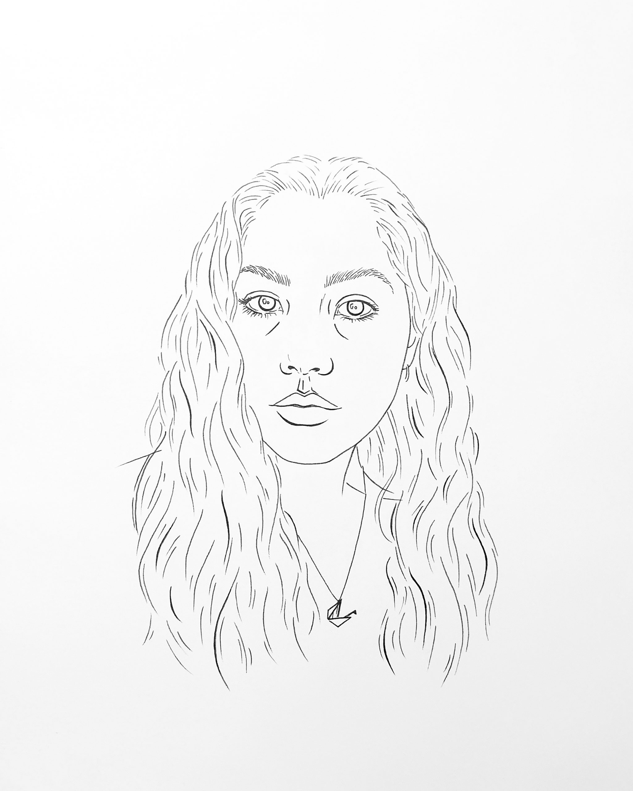
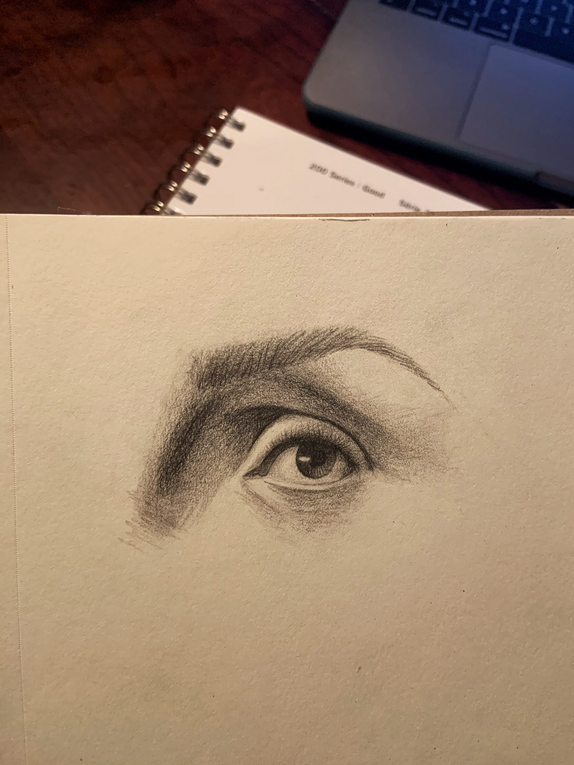
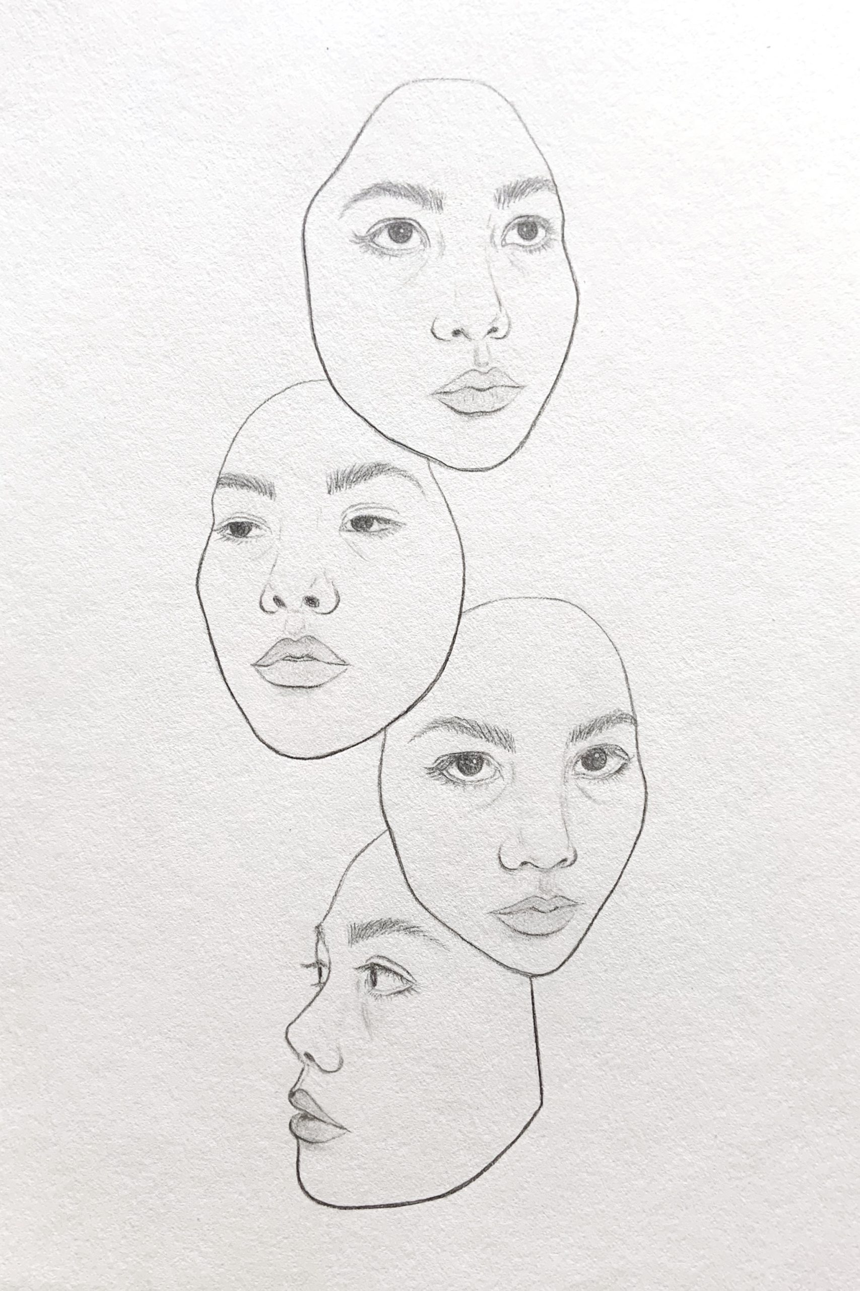
(MW): What can I say? This is an extraordinary rendition of the Schiele.
The only thing that might be noted, and is neither here nor there, is that the eyelid on our left slopes down a bit more (his is more arched), making her look a bit more tired or sad, and also eclipses the iris a bit lower, making her look less alert than the original. But that’s not a criticism or a suggestion–simply an observation.
Great use of the side of the graphite (in a wooden pencil) to achieve these effects.
Exceptional work–
__________
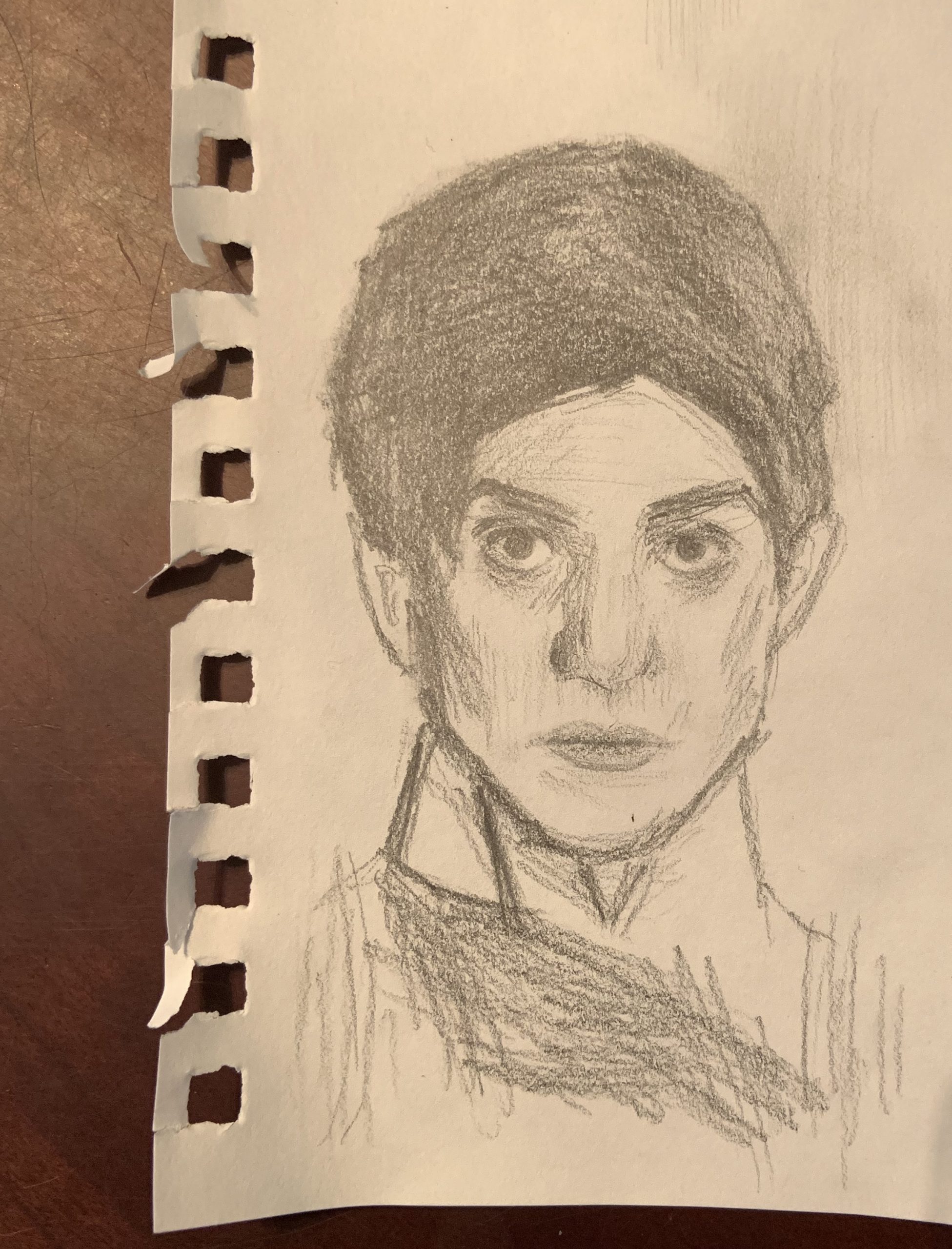
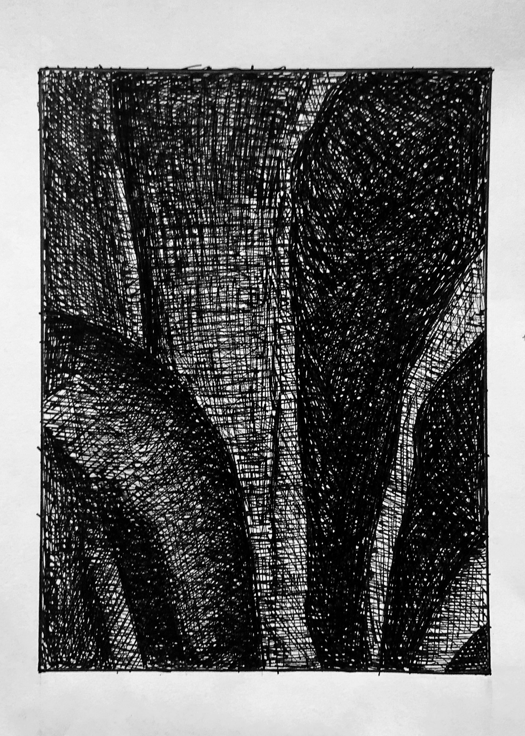
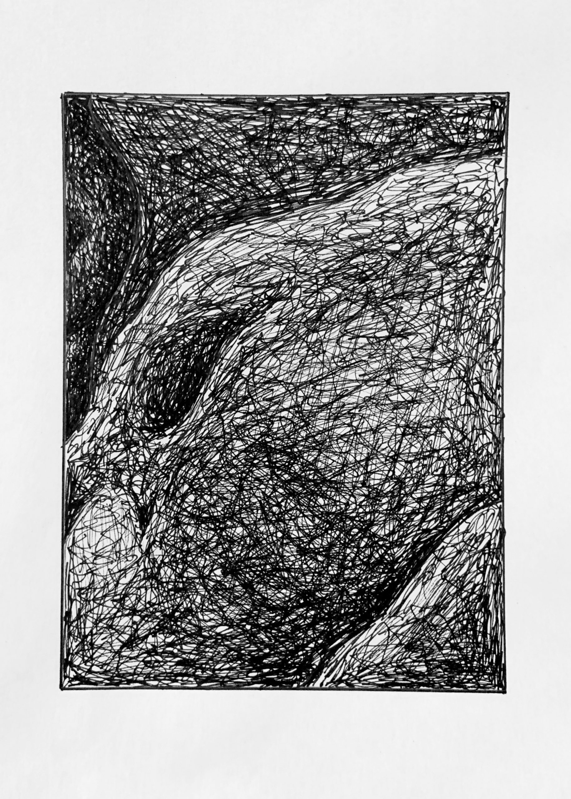
I admire Schiele’s work and this portrait interested me because of its focus on contours and lines that don’t feel quite smooth and rhythmic, but rather expressive in their weight variance and jagged edges. I had a lot of fun with the face. The eyes have an expressiveness in their semi-geometric imperfect shapes and shadowing – I feel my results were mixed and definitely could have improved upon the shadowing and openness. I used a wooden pencil and feel that it was definitely the better tool for this style. The hair was very difficult, with many interlocking forms that seem to blend into one another but simultaneously stand out. I used the flat side of the graphite for wider strokes, but some forms feel glaring while I also struggled to reach a depth of darkness. I am unsure if I rendered small bits of shadow (?) on the face correctly and would love thoughts on what to try.
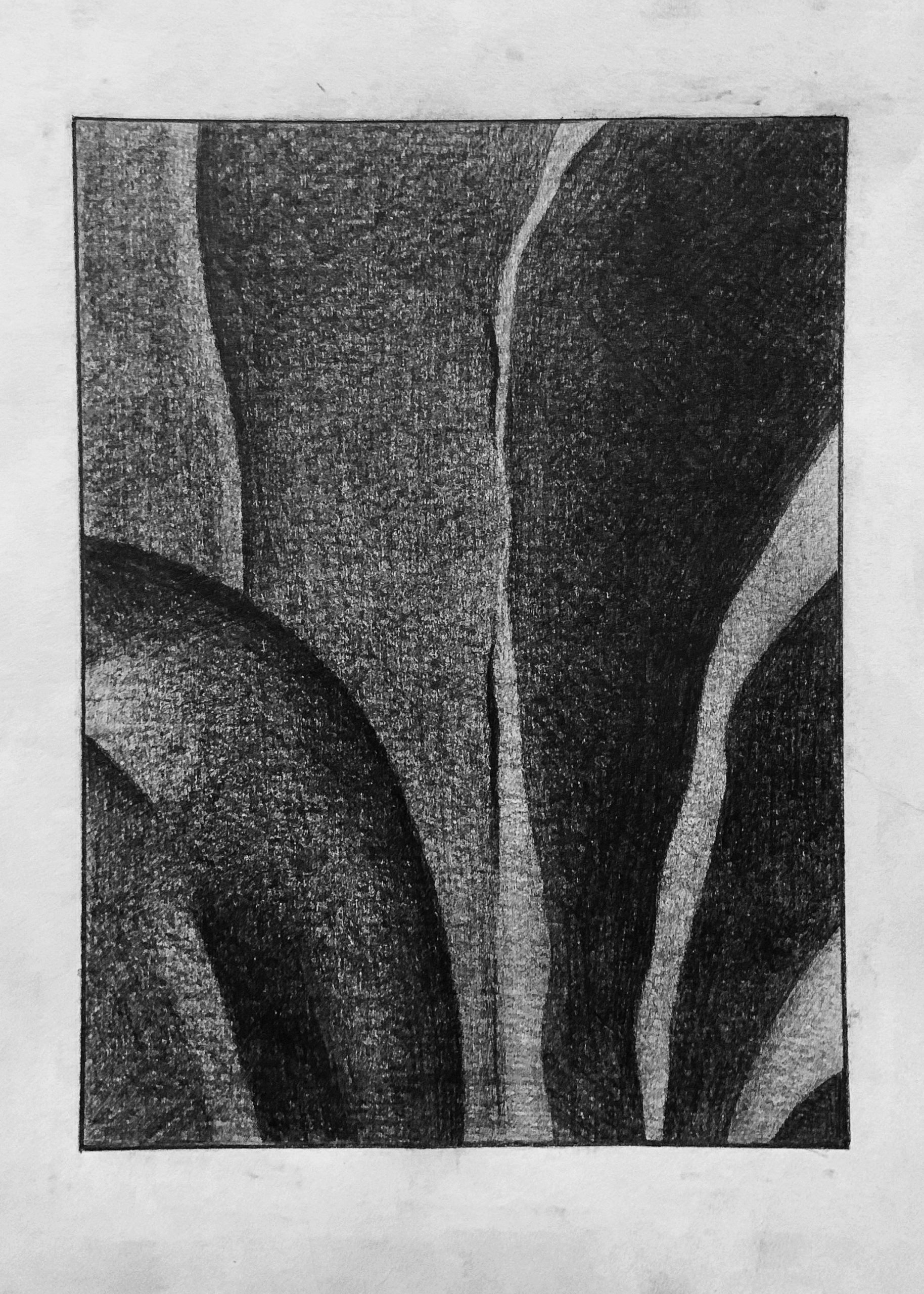
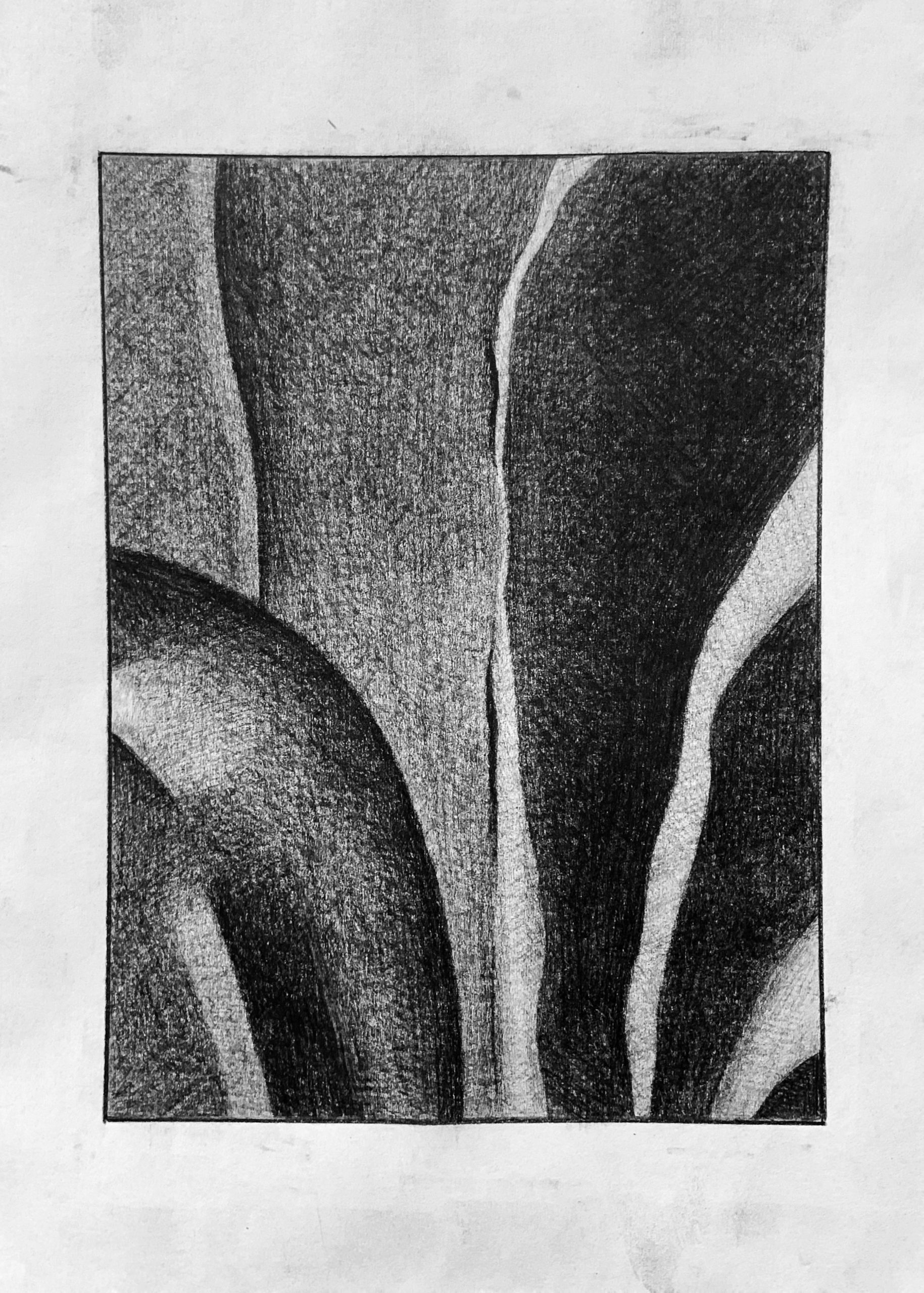
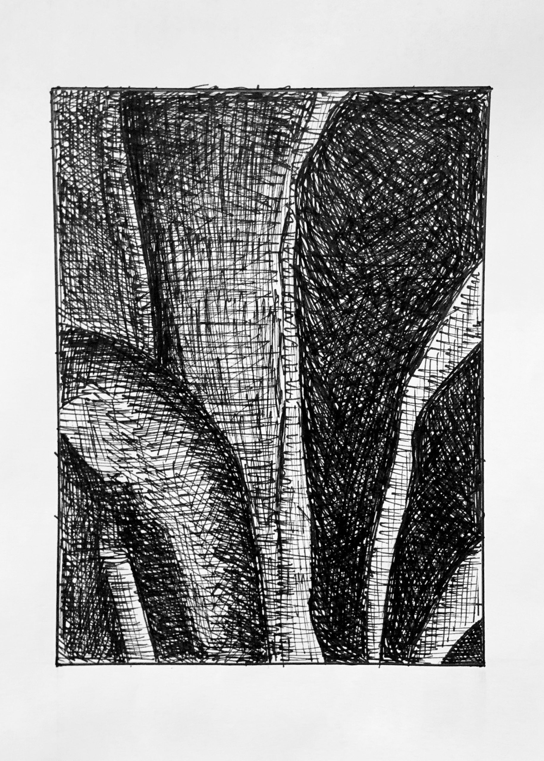
Right half is great, but the lighter stripes aren’t nearly that light. Yours approach the lightness of the paper when they should be mid-dark greys, not light greys. Left half is categorically too light; good value relationships but the whole passage is in a darker key. Only a shade lighter than the right half; not to this degree.
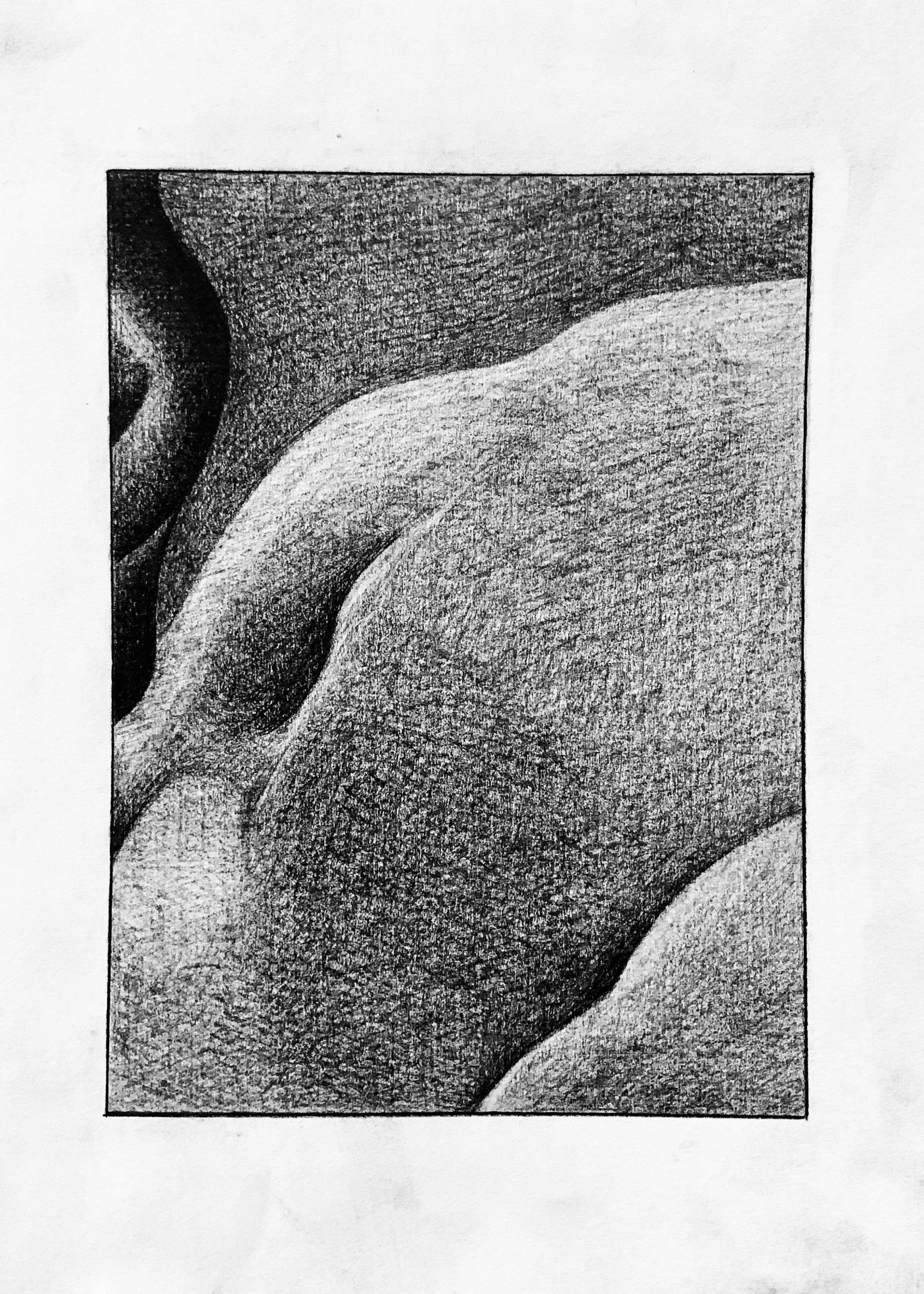
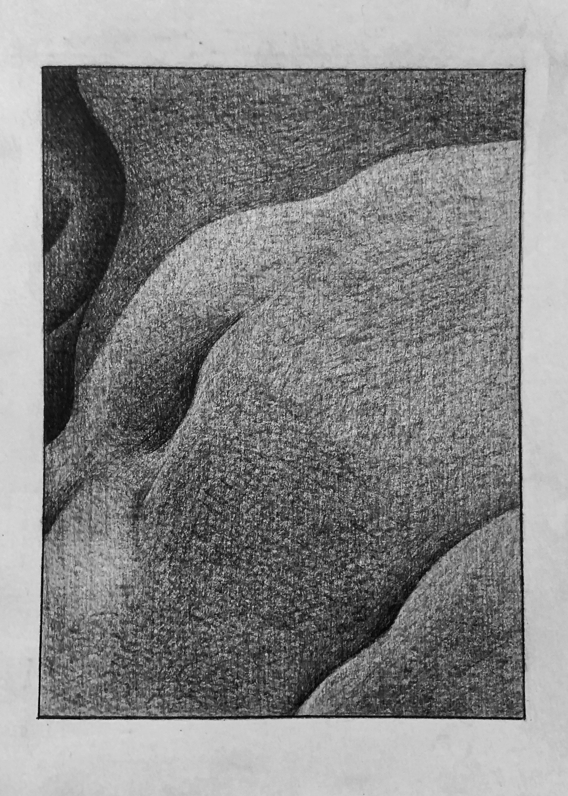
Good. Your lightest values could be a shade or two darker, and that sideways V-shaped highlight on the upper left isn’t nearly that light. It’s a barely perceptible difference from the dark shape it’s part of.
Very good drawing, but same notes as the pencil one.
Very good. Terrific abstract drawing.
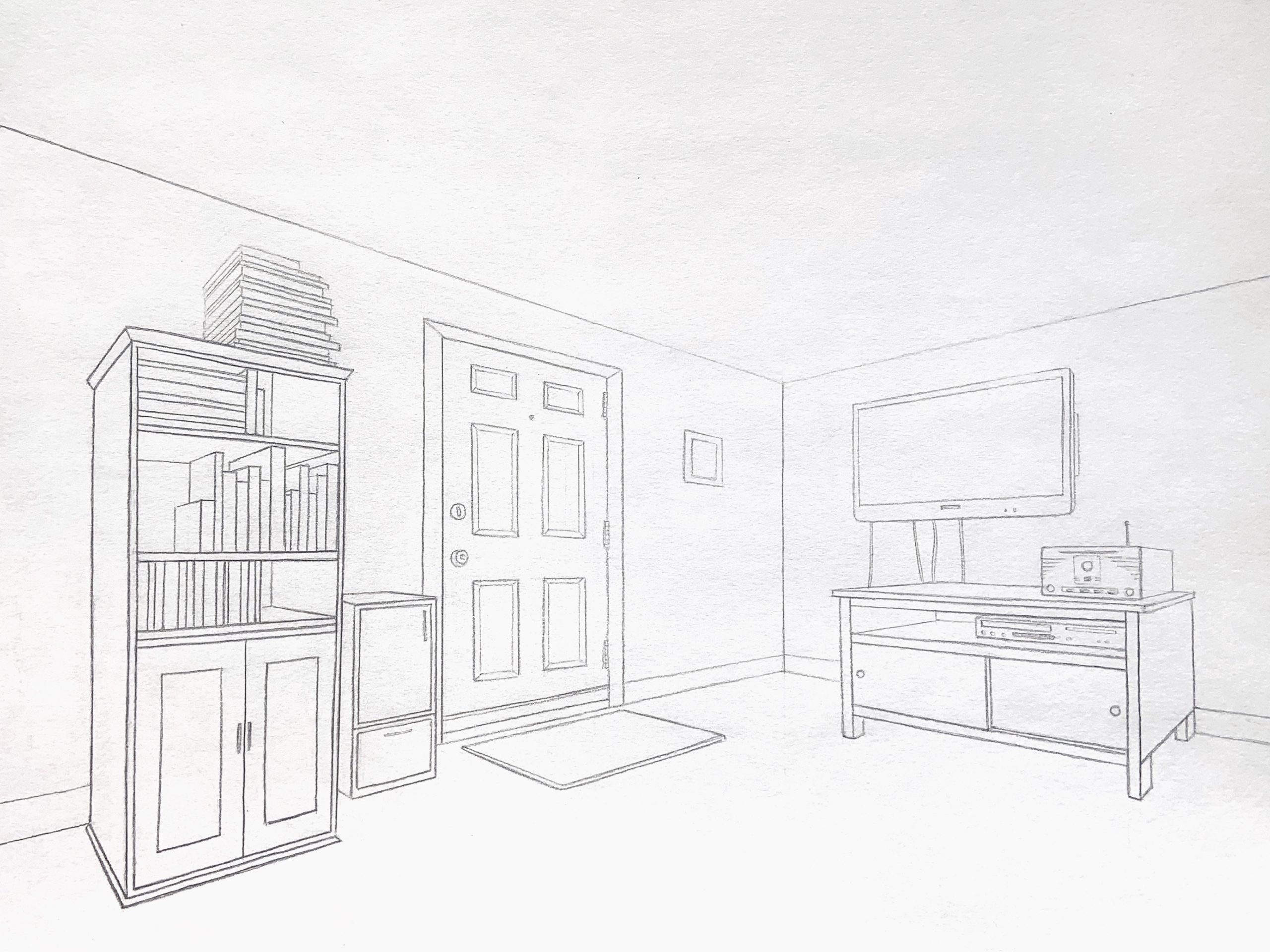
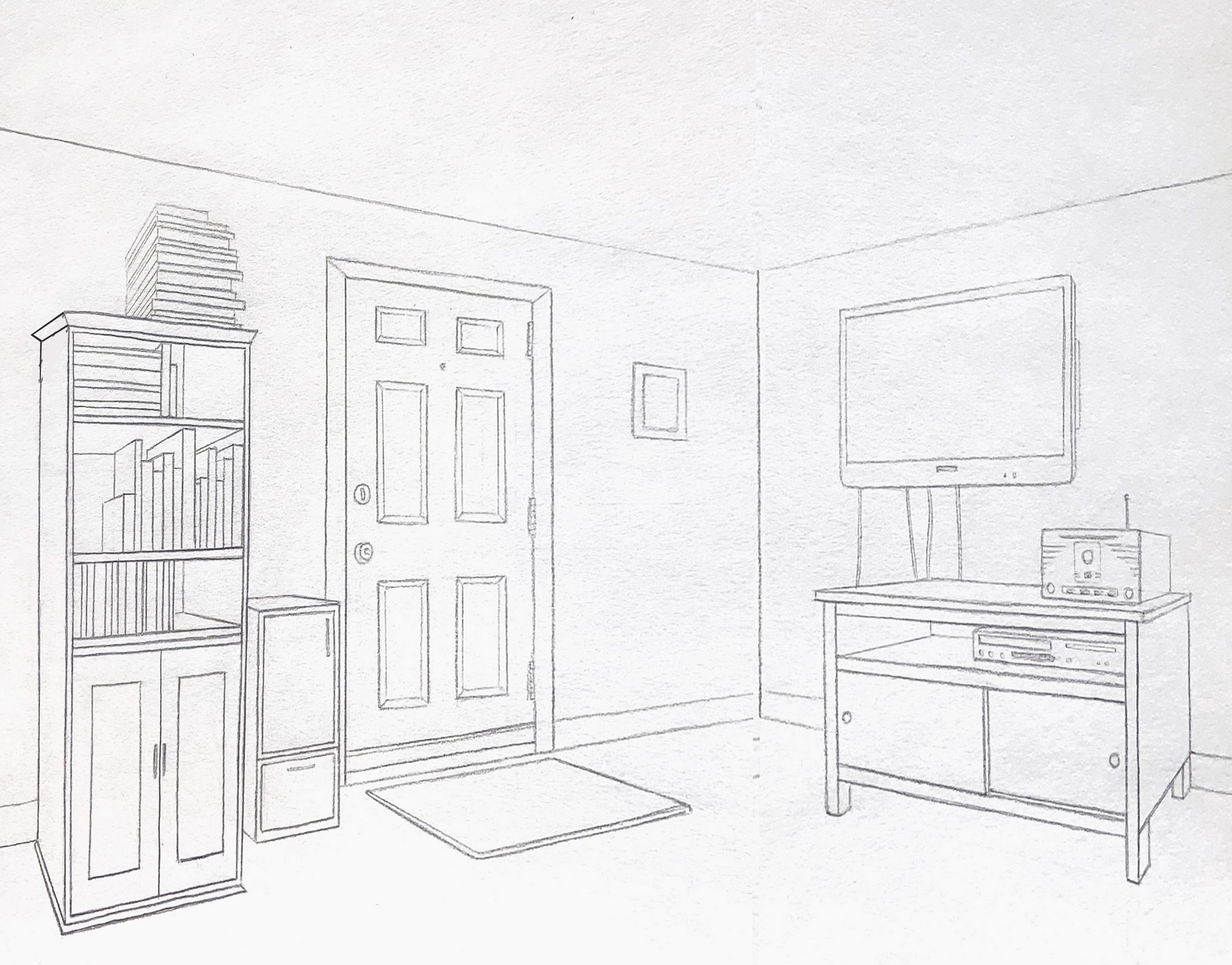
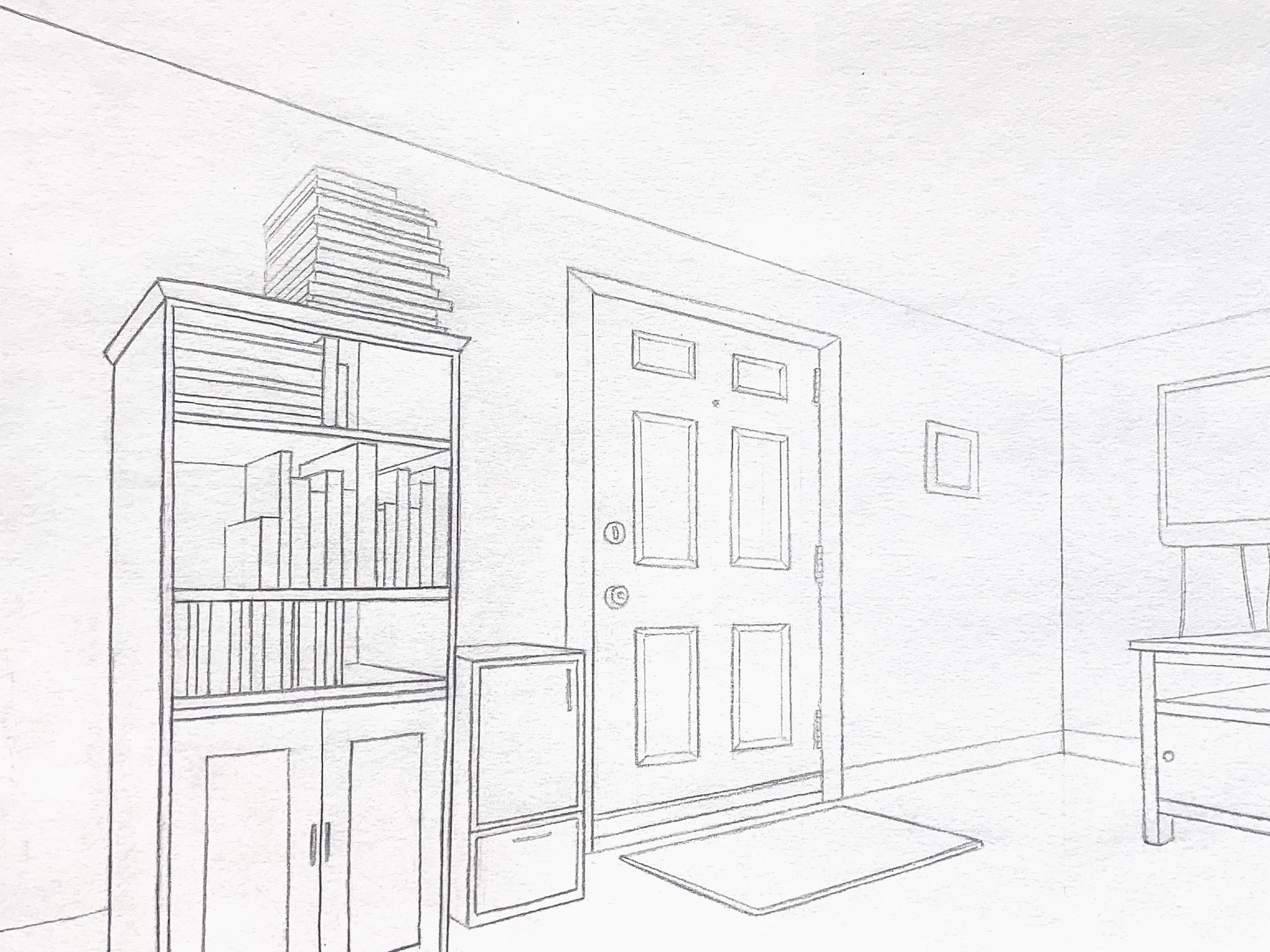
Pretty sure what happened here is that you set your theoretical vanishing points arbitrary to the left and right, and quite close, when in fact they were much farther out. Setting the angles of the ceiling and floor lines (and all other receding lines) by sighting* would have likely produced shallower angles. If I’m correct about that, this is one of the pitfalls of drawing from theory rather than observation.
Using Photoshop, I made the angles of these orthogonals much shallower (my best guess about how it might have looked), which brings the scene in closer. Note also my adjustment to the top of the bookcase on its receding side (on the left), making that angle less severe as well.
*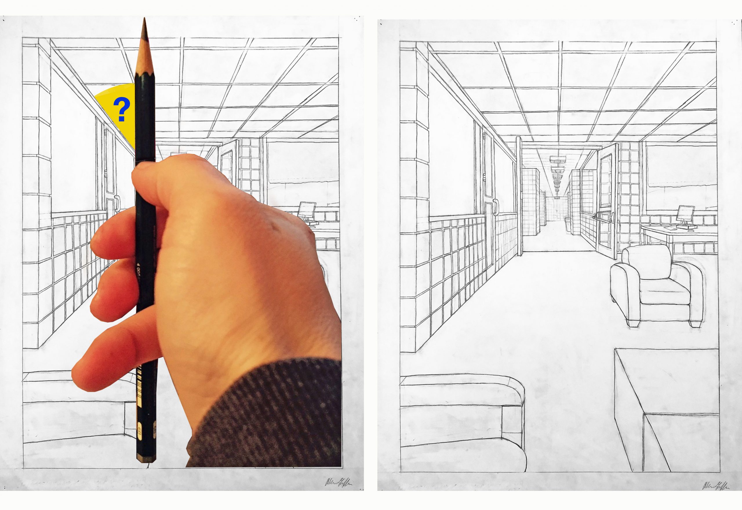
I also cropped the left and right sides just slightly to bring us in closer. I think your cropping on the one below is too severe, and throws too much attention on that one wall only.
See my comments about these two paintings:
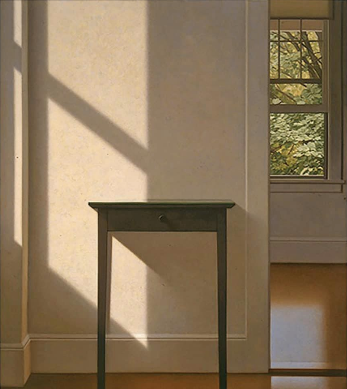 MW, Simple Gifts, 1995, oil on canvas, 54 x 48 inches
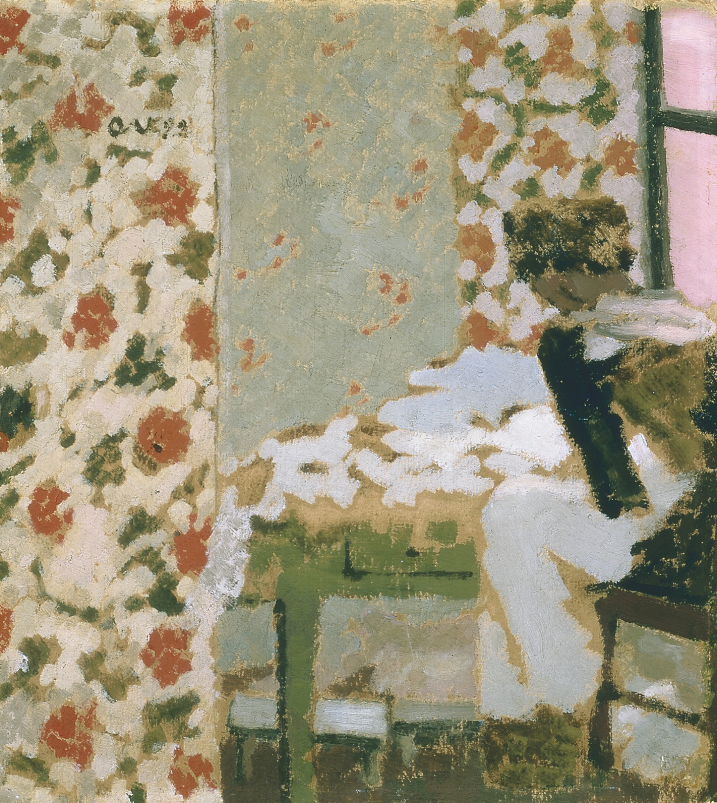 Edouard Vuillard, The Seamstress