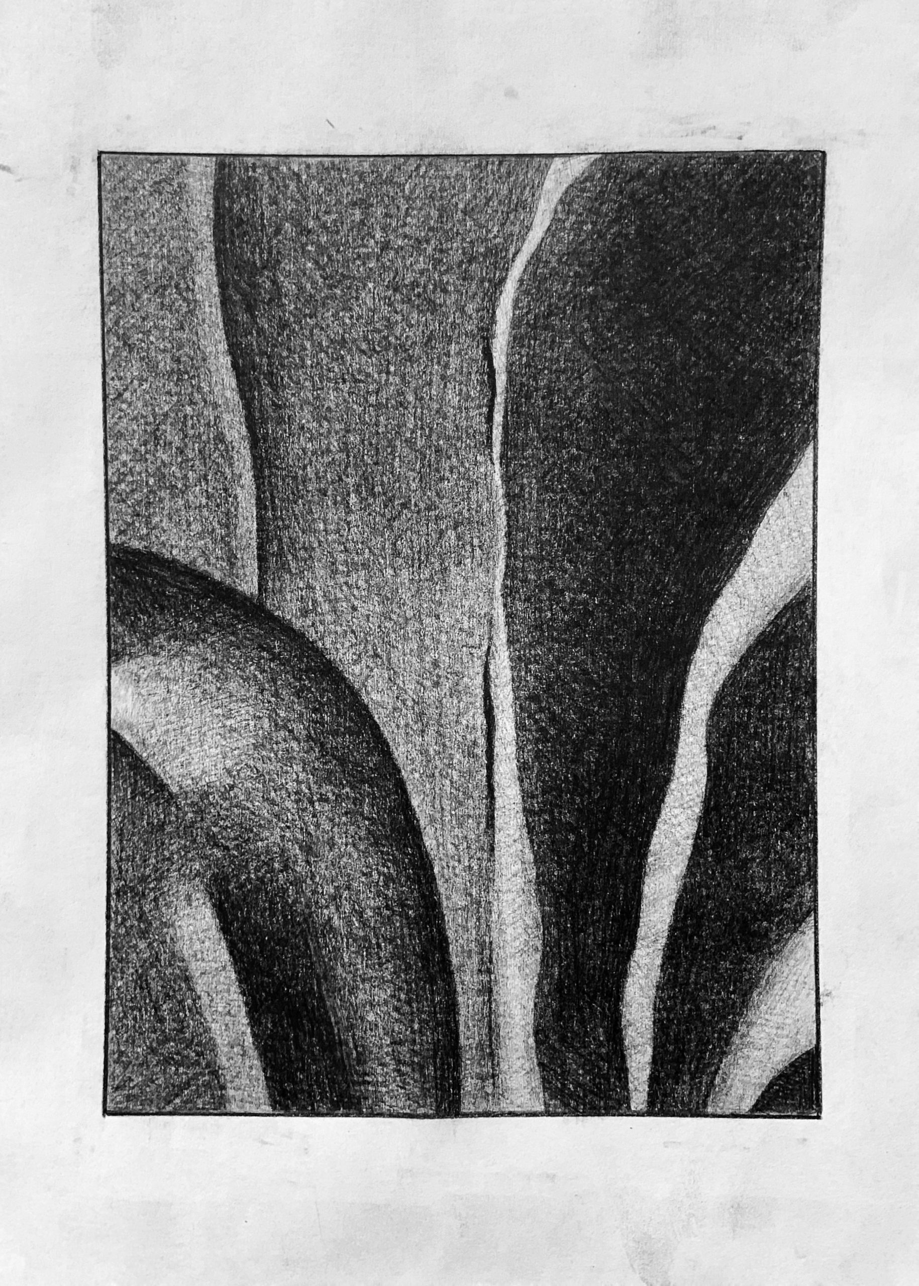
Right half is great, but the lighter stripes aren’t nearly that light. Yours approach the lightness of the paper when they should be mid-dark greys, not light greys. Left half is categorically too light; good value relationships but the whole passage is in a darker key. Only a shade lighter than the right half; not to this degree.
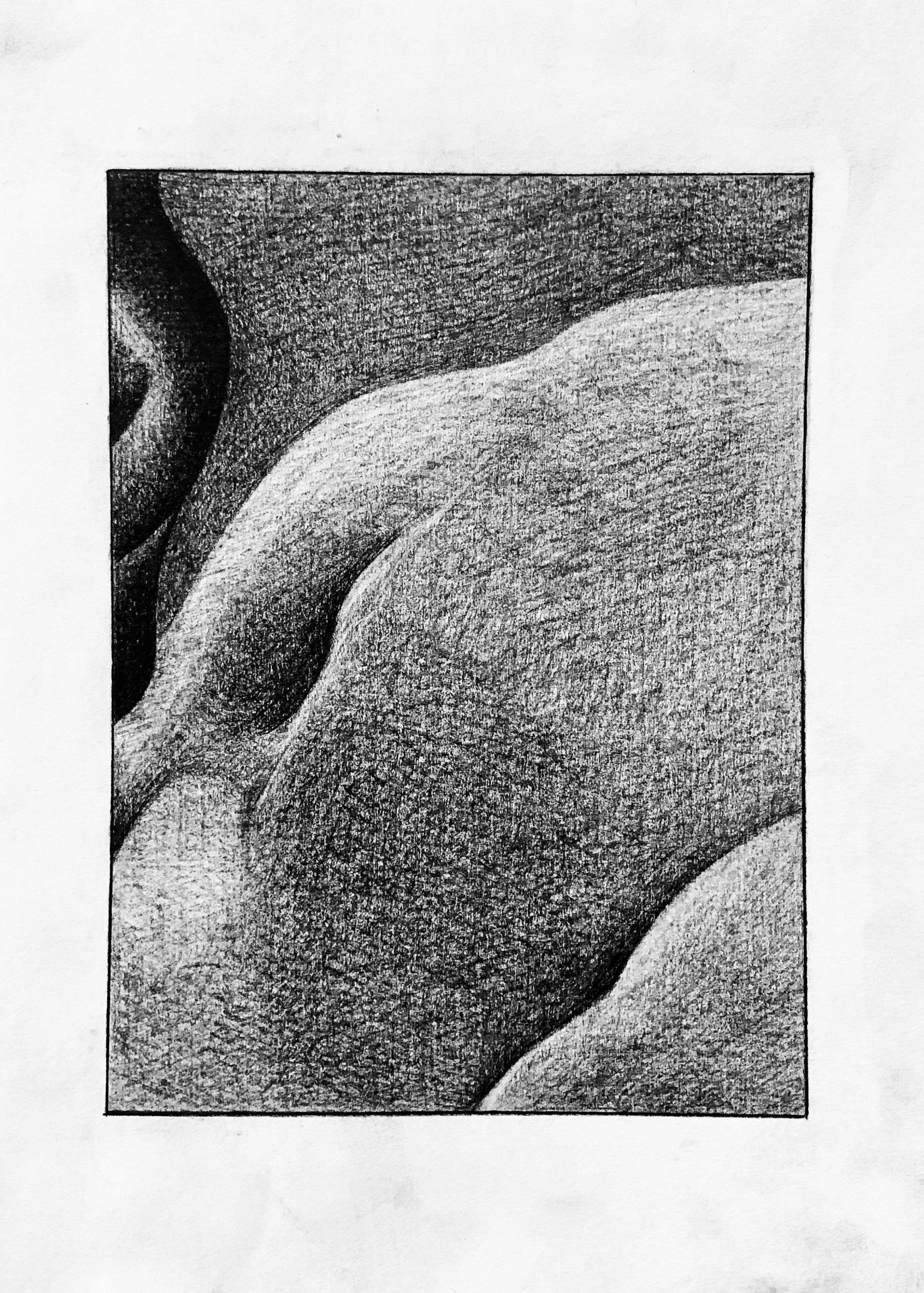
Good. Your lightest values could be a shade or two darker, and that sideways V-shaped highlight on the upper left isn’t nearly that light. It’s a barely perceptible difference from the dark shape it’s part of.
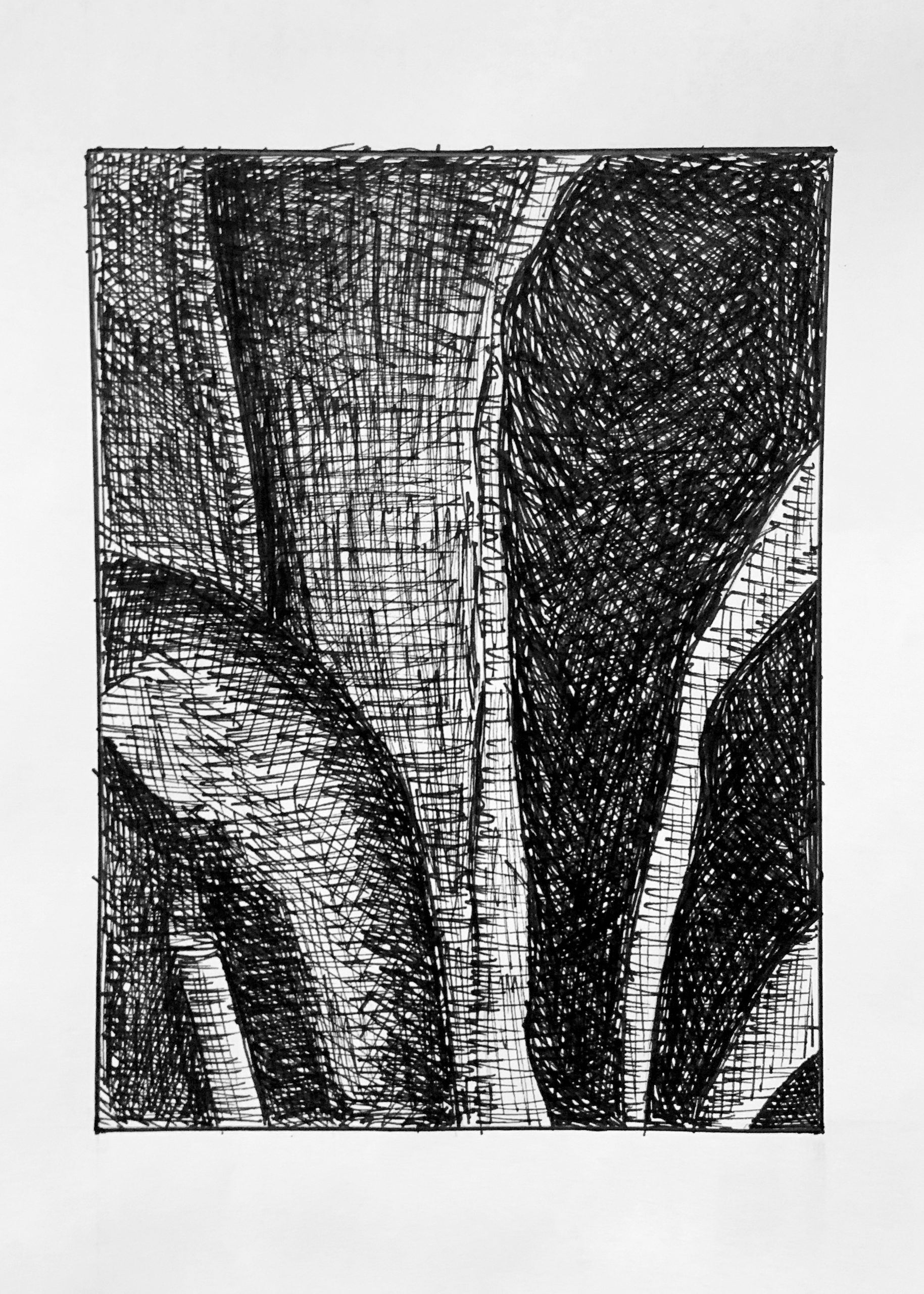
Very good drawing, but same notes as the pencil one.
 Very good. Terrific abstract drawing.
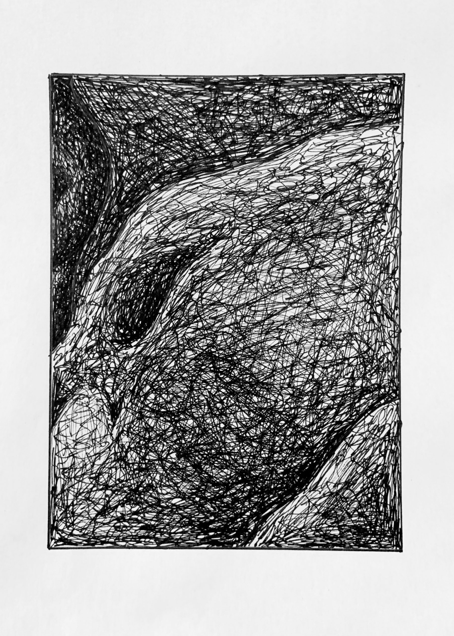
Holding the pencil towards the end is normally very difficult for me, so I enjoyed the practice in using my tool in this way. I found the pencil drawings to be more enjoying personally, with the pen drawings adding in a sense of stress with the lack of as much control over my mark making for the sake of using the medium in a different way. Constant reassessment of each value relative to each other was difficult when it seemed that my lightest values had become dark enough that the darkest were no longer dark enough, but I feel that by the end of the exercise I got a better handle on it.