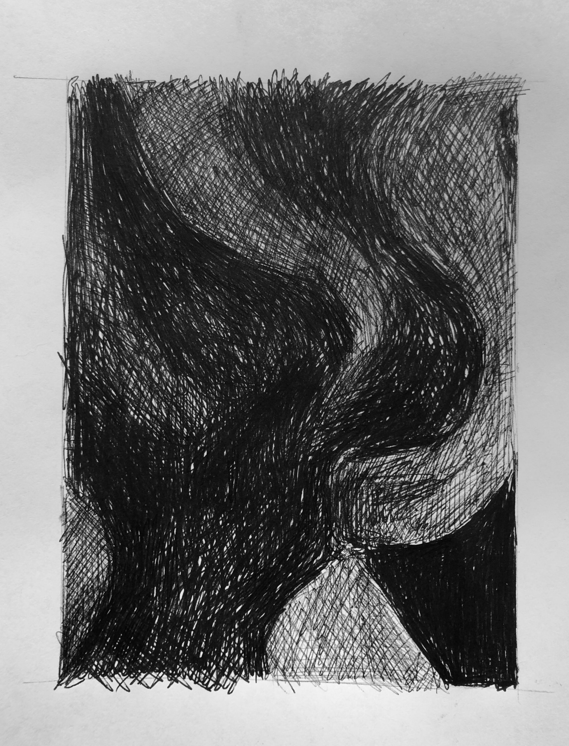
Very good. The nature of that leaf shape poking in from the bottom edge could be more accurate in terms of its curvature, but values are very good.
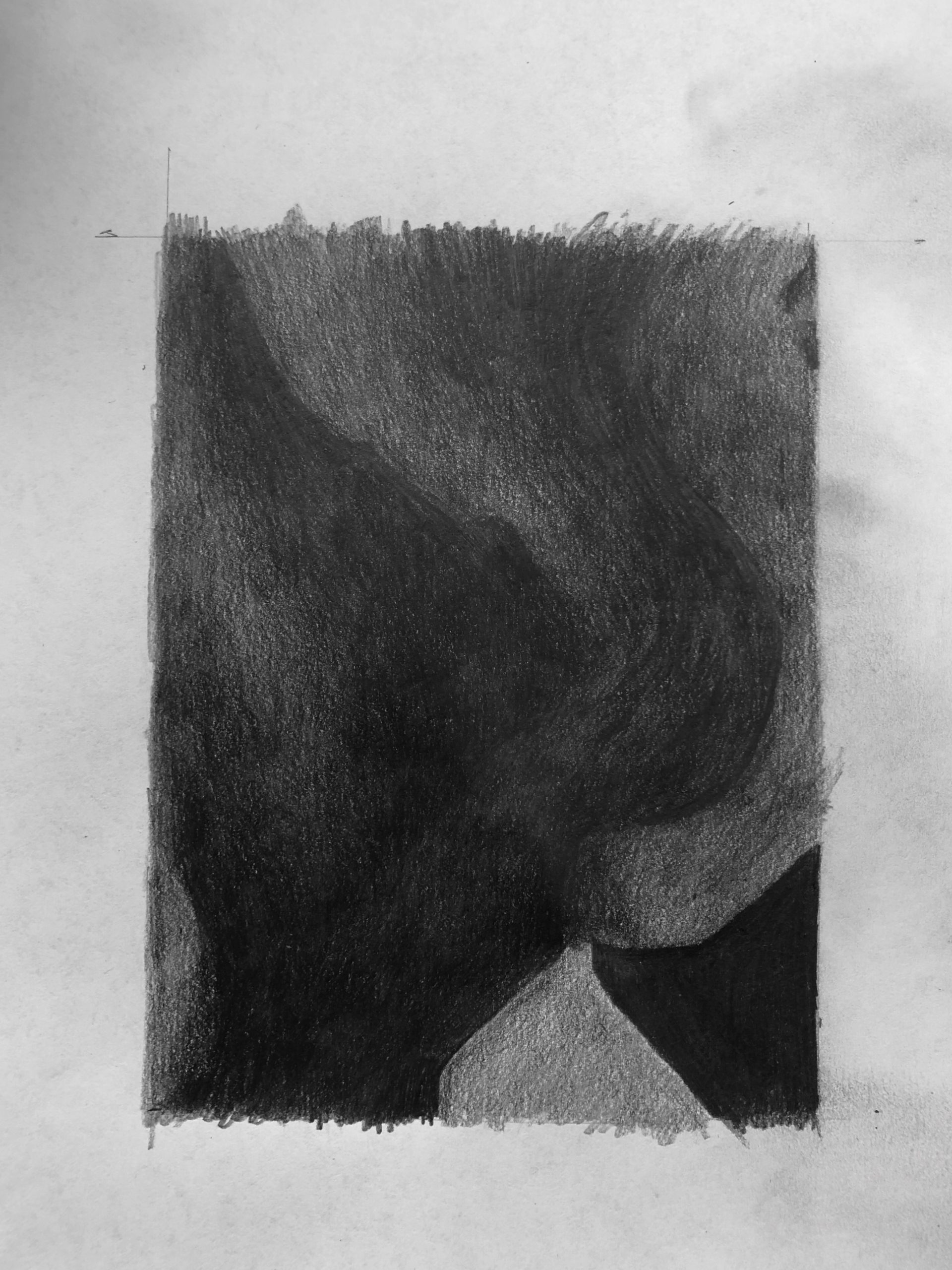
It might be a glare in the photo, but the upper quarter is too light in value. If it’s the photo could you shoot it again? Also that slightly lighter area at the left center isn’t nearly that much lighter than its surroundings–it should be an almost imperceptible lightening of that dark value, not a sea change. The texture of this drawing is mottled. It would be better by very subtly filling in the lighter splotches with a super sharp pencil.
Very good. The stripe on the upper right is much darker (not nearly as light as the others), and so is that triangular shape along the bottom edge.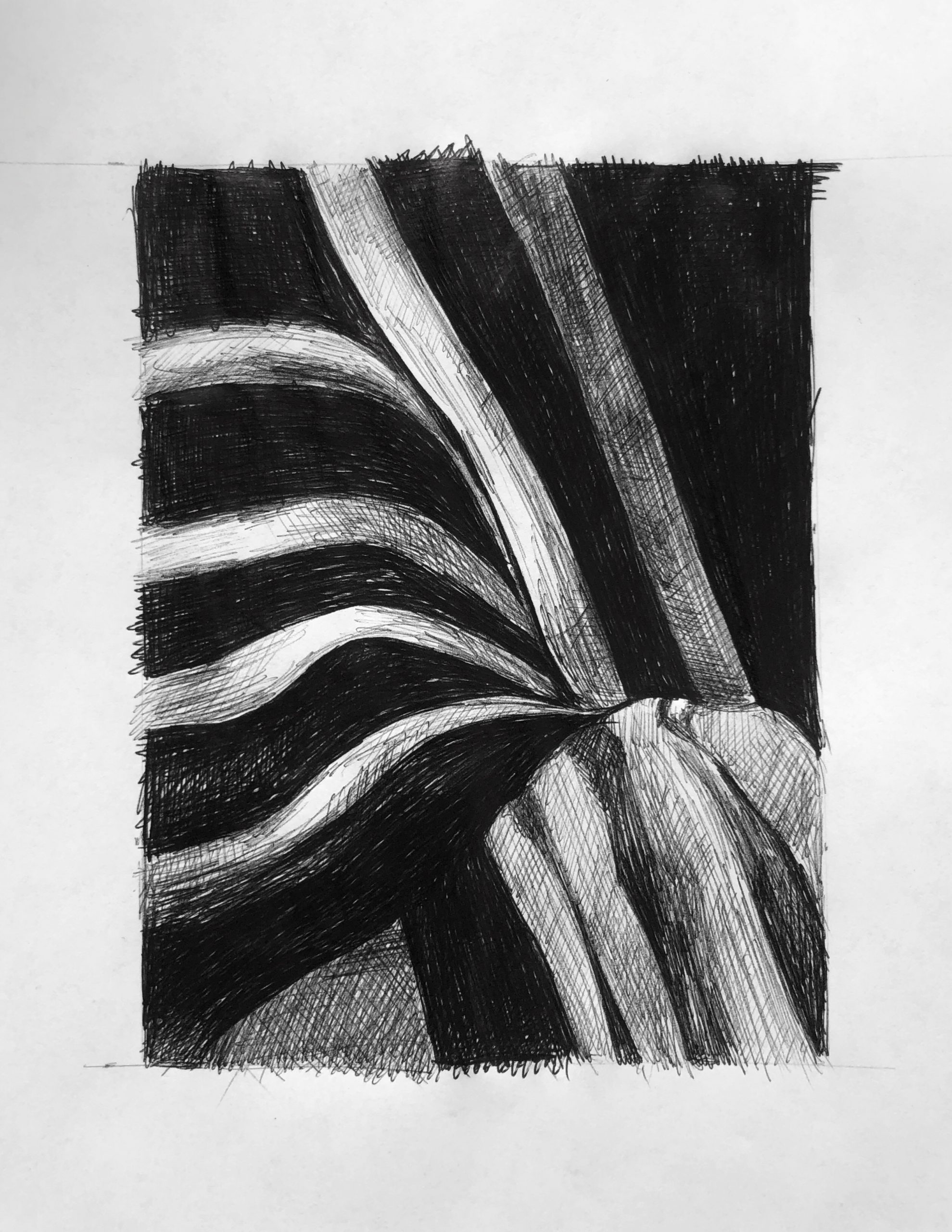
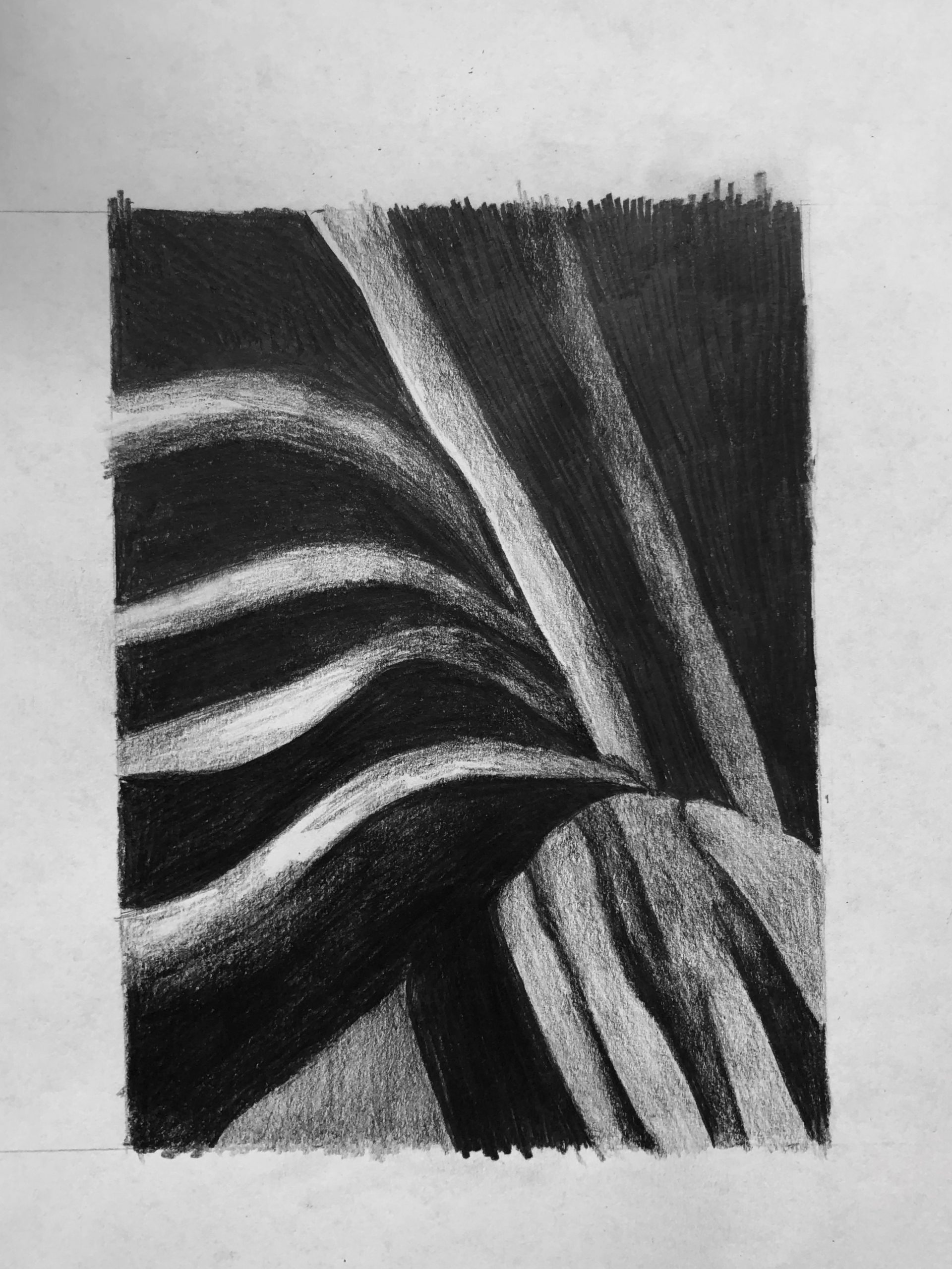
Very good as well, but the lighter values in the stripes aren’t this white. Compare them to the value of the paper; none of them and no part of them is that white.
I actually really loved this process. The past couple of projects focused on creative and individual takes on what we are experiencing because of COVID-19, but this one brought me back to the technicalities that we focused on in the class setting. I enjoyed not having to draw a specific ‘thing’ and instead simply mimicking the values in front of me. I also really loved drawing the same thing with pencil and pen, as the process was very different with both.