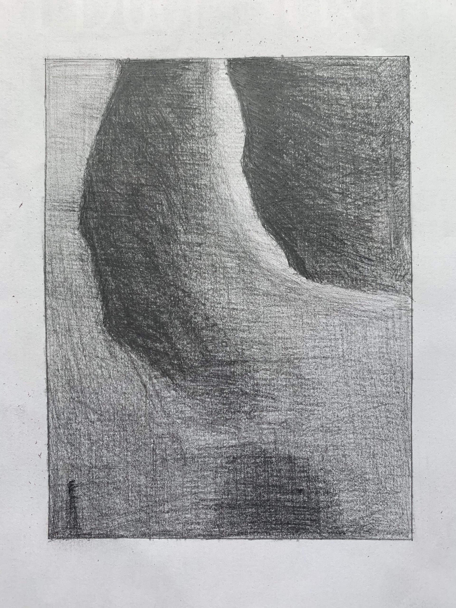
Dark values are fine and the light values are fine (actually, could be a little darker) but the mid-tones (which dominate this section) all need to be darker. That sliver of light in the top center needs to stand out more, as it does in the reference, by having all the other values get darker.
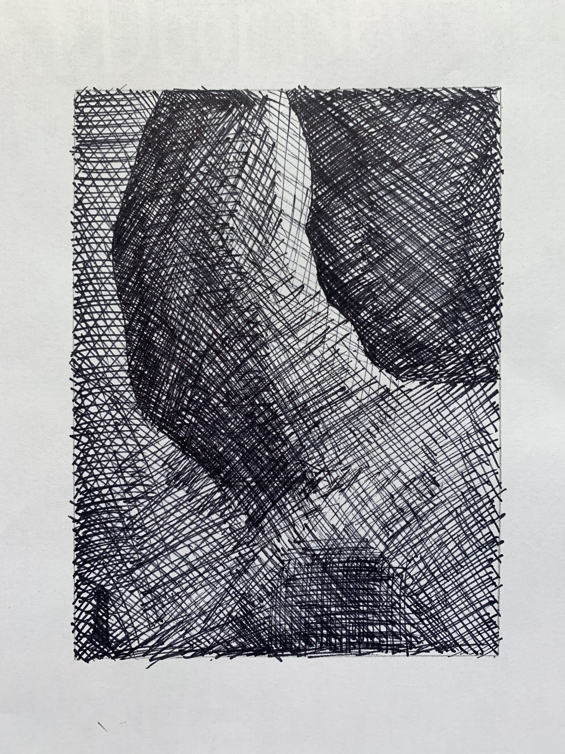 The better of the two of this image, but the midtobe in the lower right quadrant and lower half in general needs to be darker. The tonal shifts in the lower half of this image should be almost imperceptible; you’re bringing them out too much.
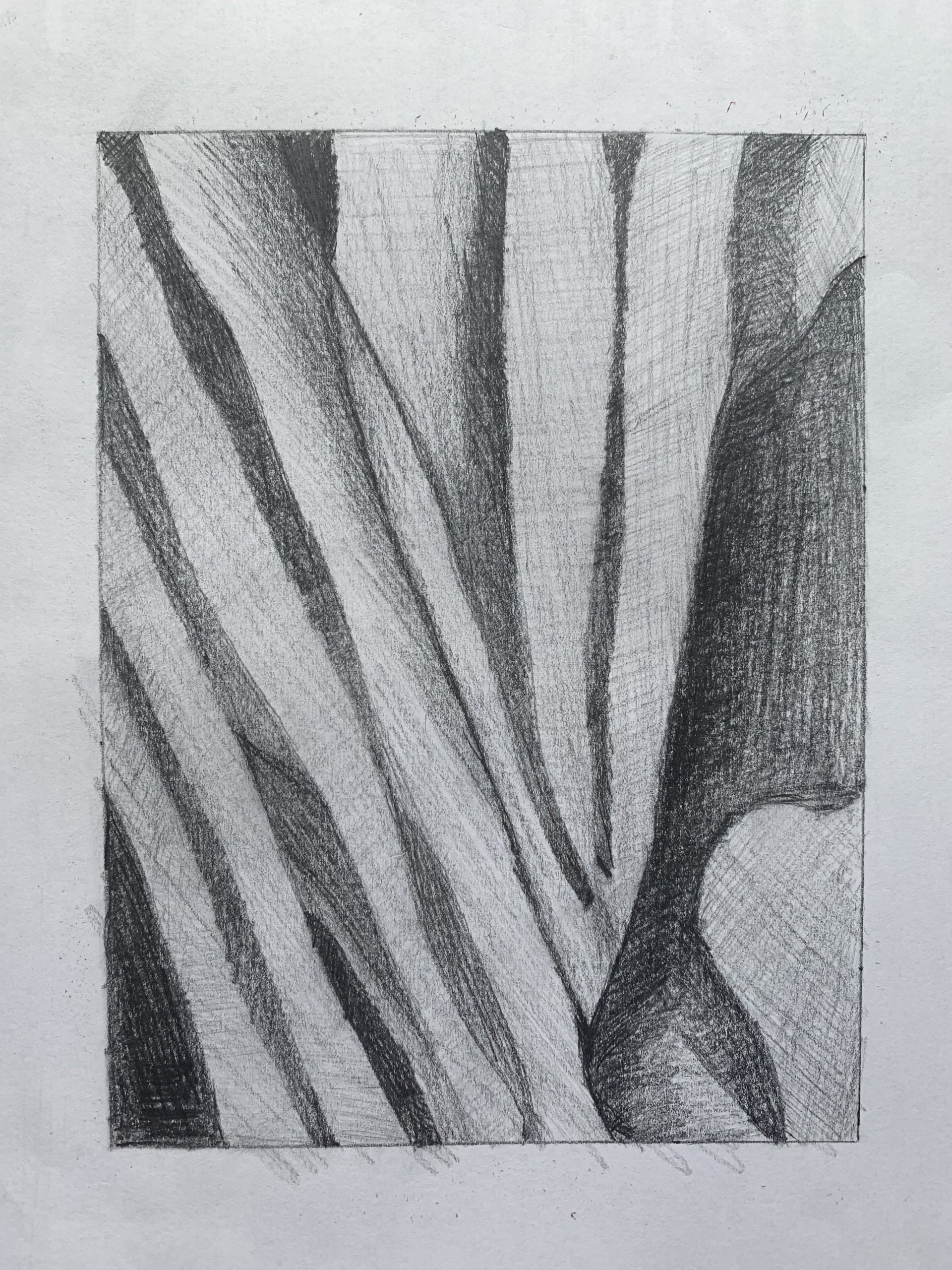
Great configuration but same as above–your mid-tones (which dominate this section) are much too light. Yours are hardly darker than the paper, when almost all of them should be a middle-dark grey. Only a couple of spots that I would describe as a lighter mid-tone. Especially true of those shapes in the lower right, which are much darker.
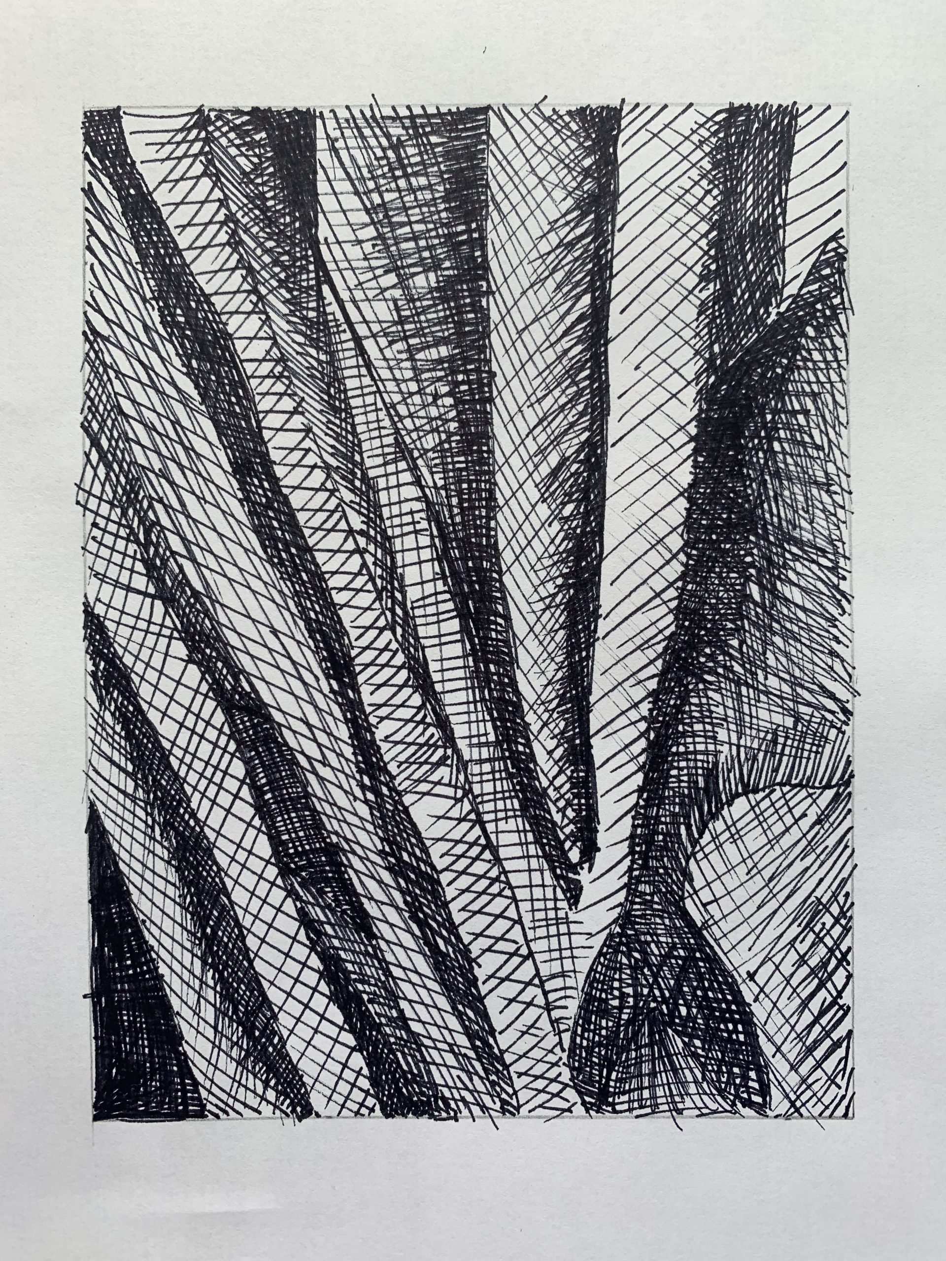
Better value range than the pencil version. Only that lower right shape needs to be darker. The shape at the center right edge also needs to be darker. That section is better in the pencil version.
Struggled pretty hard with these drawings trying to perfect the transitions between the different shades. Especially had trouble with using the pen to show the intense brights in contrast with the darks directly next to them. Overall, this project was a test of my patience as I probably used more than 10 pieces of paper to get to my final versions. Excited to see the final result!