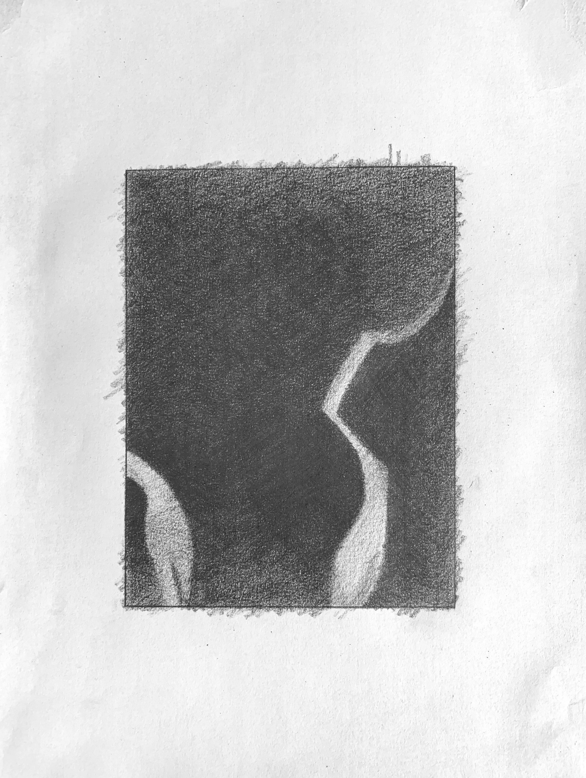
 Very good, but the upper right corner and top edge aren’t nearly that much lighter than the areas below. That slight value change is nearly imperceptible, and much too exaggerated here. Note also that the bottom portion of the lighter shape on the left shades into a darkness almost as dark as the black on either side of it. The top end of this shape is darker as well.
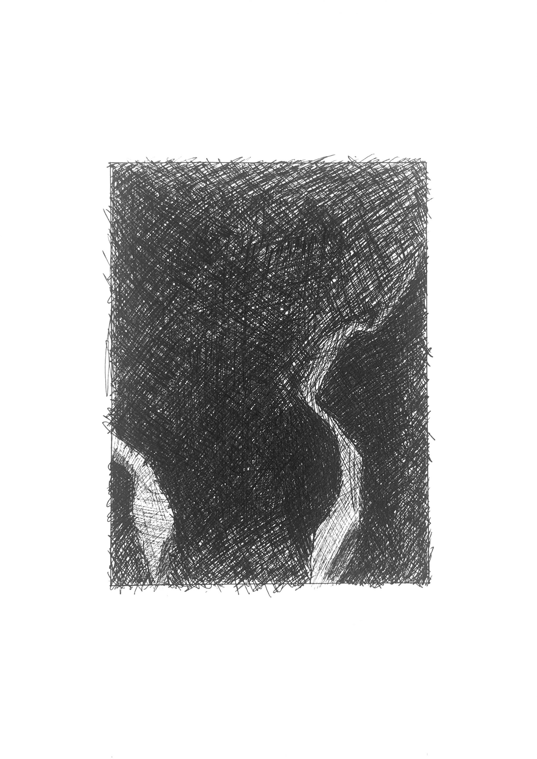 The better of the two versions of this one, but the upper edge and upper right corner are darker still. Better on the light shape in the lower left as well, but its lower portion is still darker.
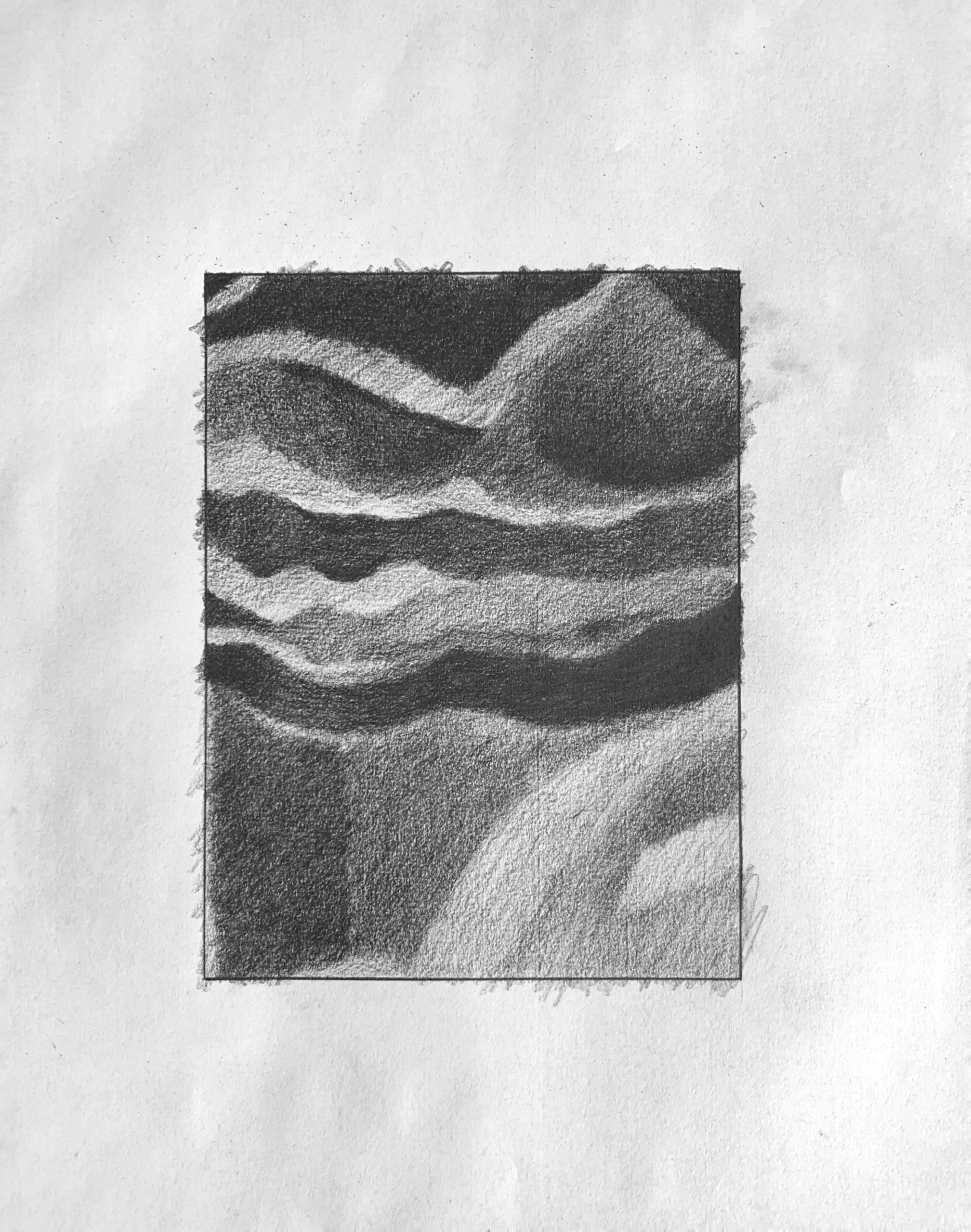 Good, but the mid-values are all darker than this. The darker greys in the upper half are all closer to black than this. The light shape at the lower right is altogether darker as well–not nearly as light as the lightest areas in the upper left. Just to the left of this shape along the bottom edge, is a small shape that you’re making much lighter than it should be.
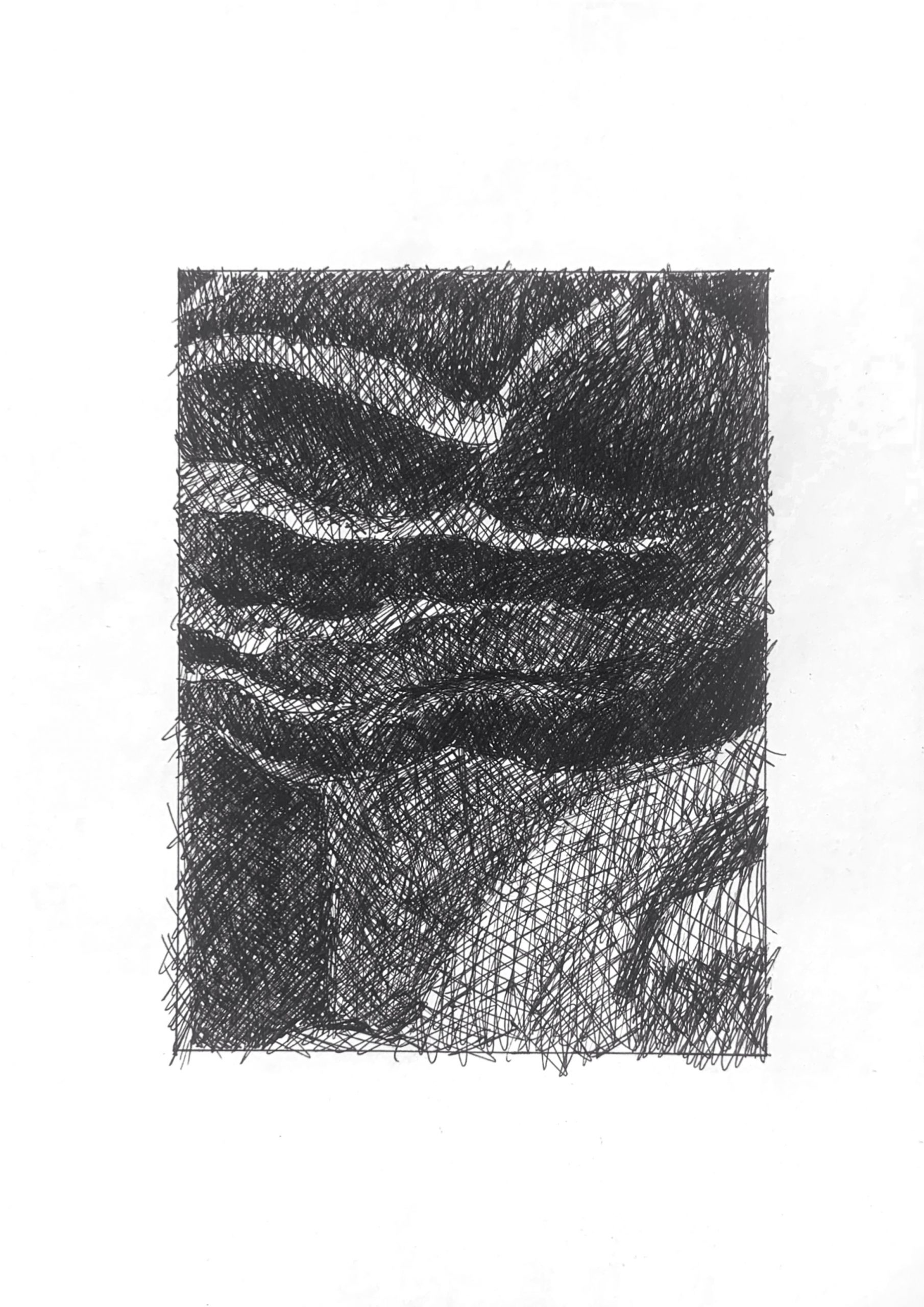 You’ve almost lost the lights in the upper left, but otherwise this is very good–exactly what I was trying to describe above in the pencil version. Don’t worry about those whites–you’re all set.
The first two drawings are of photo slide 10 and last two are of photo slide 23. I thought when I started this project that I would enjoy pencil more than pen but that did not end up being the case. While doing my pencil drawing, I did not feel like I was progressing. I think this stemmed from keeping everything relative — that being — when I added value to one location, I then had to add value everywhere else — this was very frustrating near the end of my drawings. With pen things moved faster and it was easier to add value so that frustration was not felt as much. I think the speed of the pen drawing also helped me get into the zone easier, so I enjoyed doing it more. I think I really struggled with my pencil drawing of slide 23 because there was such a large range of values.