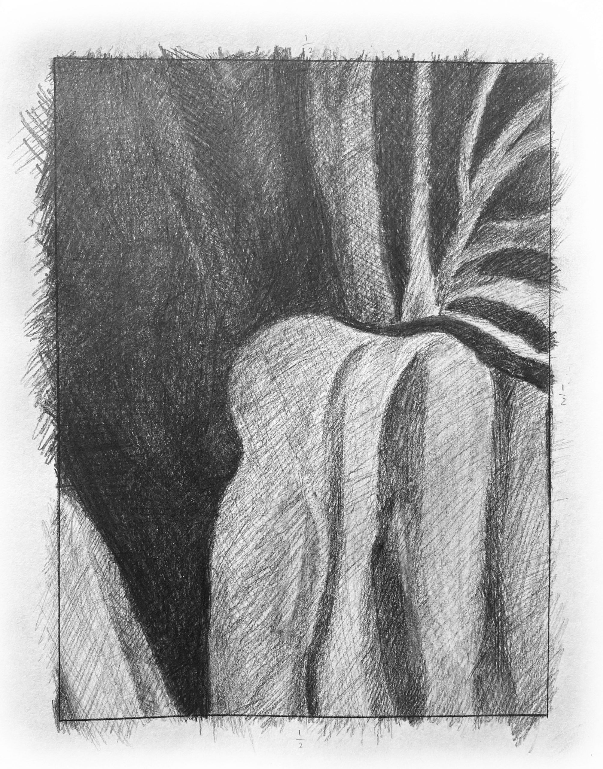
Like the other pencil drawing, your strokes in this one should be much gentler and more tempered. These would be great for the ink drawing but the pencil drawing requires a more refined technique. That can still be accomplished here as described in my notes for the other pencil drawing. The light grey values here are darker still. Once again, compare them to the white of the paper. There’s no value in the reference that approaches the whiteness of the border.
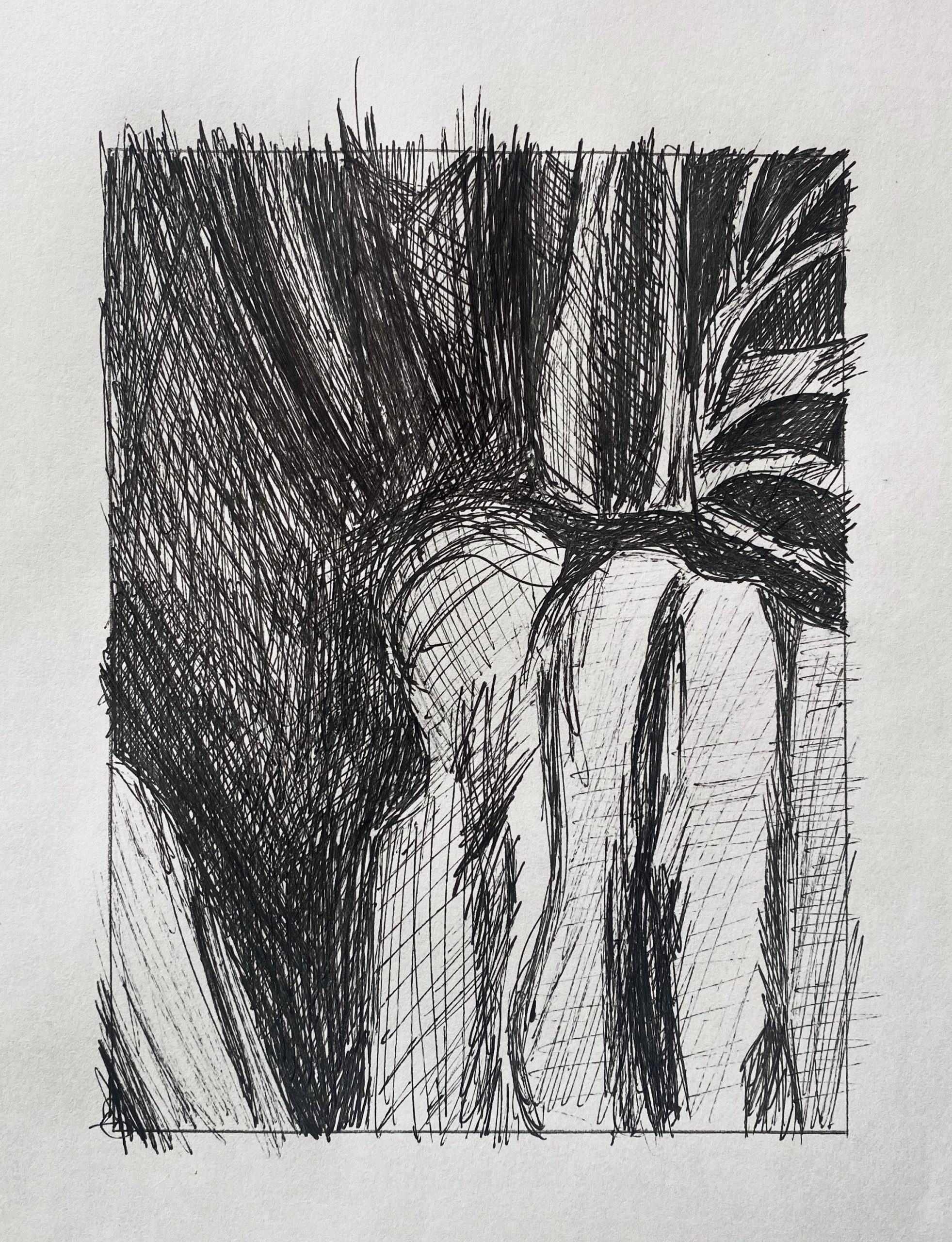
Very good, but the large dark shape to the upper left is much darker. Like your other ink drawing, the freer stroke in the values doesn’t extend to the forms themselves; shapes could be tidied up, even as the hatching strokes remain freer. See the examples I sent a week ago for an example.
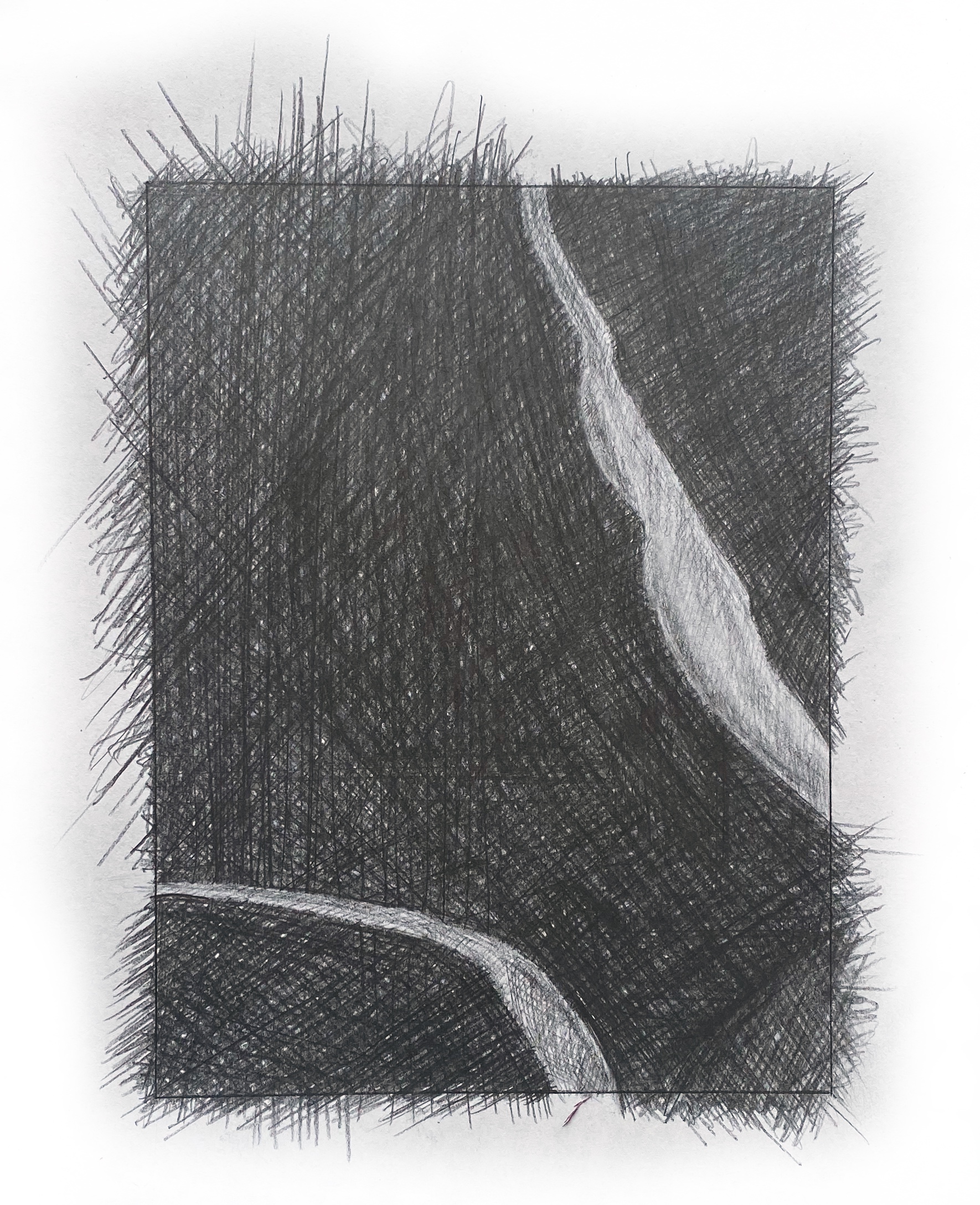
As noted in my email to the class, these strokes are too forceful and untempered. The texture here should be built gradually from many layers of strokes, each lightly applied and “neutralizing” the grain in one another. This can be improved by using a very sharp point to draw into the space and gaps between the darkest strokes, to even the texture.
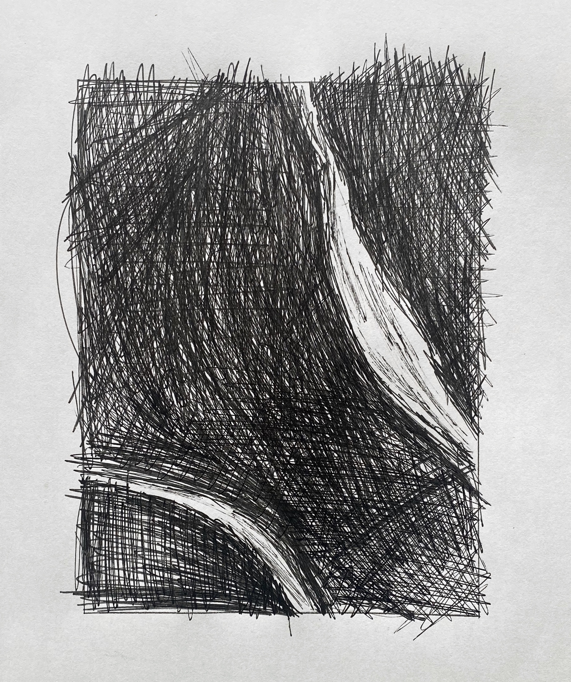 Very good so far, but the darks need to be much darker–many more layers of scribbling. The white stripe on the lower left is a middle-grey, not white. Even with this expressionist technique you can define the edges of shapes more accurately. The hatching might be free but the forms should have as much definition as they do in the reference image.
I enjoyed doing the pen value drawings because I was able to let loose and relieve stress while scribbling away at them. The pencil drawings were more stressful because I was trying to do a fine grain drawing but I don’t think I achieved that. I kept turning my mechanical pencil to use the sharp tip of the pencil yet the pencil drawing looks messy and like it has knots or spots of darkness where there isn’t supposed to be any darkness, and messy lines from all directions.
Between the two drawings I thought it was harder to establish the darks in the drawing dominated by darks (last) and harder to finesse the mid and highlight tones in the drawing with more whites (first), which makes sense because with the more subtle changes in value the harder to observe and replicate.
Overall I am really glad we did this exercise since hatching and value are skills I’ve always wanted to learn!