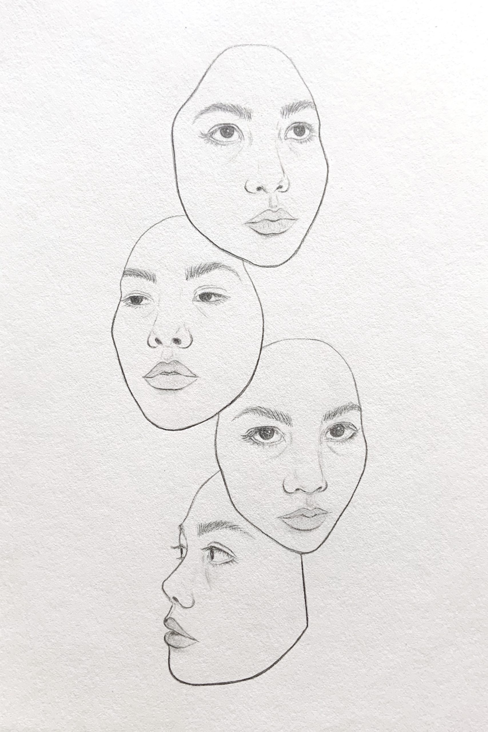
The only self portrait I have drawn in the past 10 years was completed last fall during another period of extreme change and entrapment within a space. The current feeling of days blending together and dulling of emotions expressed outwardly (while my emotions are actually pushed to extremes inside) feels familiar and I thus wanted to come face to face with the representation of myself that is portrayed to my surroundings. I turned to confront the reality that I am always present with myself, a reflection that is surely shared today, and focus in on expressions that seem to frequent my face these days. I enjoyed the exploration of line weight and a more abstract composition. I wanted a flat graphic product, but I feel drawn towards reevaluating the sense of depth presented as I see a drawing in between a 2d and 3d spatiality. I don’t know that the side profile at the bottom works in favor of the drawing.
I love this piece. I also agree with the message you were trying to portray – the monotonous days combined with the uncertainty and unknown that this time warrants is a unique concept to portray. The use of a self portrait, especially as a representation, as you said, of yourself that is portrayed t o your surroundings, is one of the most natural and intimate ways that we can ultimately portray ourselves through drawing. You mentioned the risks you took regarding line weight and the abstract composition, and I think they really paid off. I also think that the simplicity of the white background allows the faces to really pop while simultaneously continuing to fill the page. I am trying to think of something that could be improved and the only thing that comes to mind is that the tops of some of the heads seem to be a bit lighter in line weight. However, this may be the lighting. Again, I really love this piece and I think you did a beautiful job.
This drawing really resonates with me and pulls me in. I really like how three of the expressions are looking away, but one really confronts you. I think that is really powerful in conveying dulling emotions but also facing something head on. I think line weight is beautifully done as well, and I like the bottom profile drawing, it really stands out and kind of leads the viewer who started at the top out of the picture. It seems to me like the lighter foreheads is intentional, and that that is a natural way for light to fall on a face, so I’d keep that. Just to find something to critique, I might darken the chin of the face second from the bottom just to make it a bit sharper like the rest.
My apologies for the slow reply. This is an exceptional drawing in a number of ways–for its design and composition, for its striking control of anatomy and portraiture, and for its textbook use of line weight and line quality.
I think the profile view at the bottom works beautifully as a foundation for the four faces, culminating in the top one with an upward glance.
At the same time, and as beautiful as this is–and perhaps because of how beautiful it is–it’s not as expressive of the qualities that you mention. It’s certainly a soulful face, but it’s humanity would work just as well on a book of poetry or an album cover (if you were a poet or a singer-songwriter) as it does as a marker of this time–at least for this viewer.
I’d even say it has a sense of reverie or inner peace; not simply the mask of quietude you show the world (in your statement) but a genuine depth of feeling.
Whatever the interpretation–and that’s what art is for–a beautiful drawing.
The only self portrait I have drawn in the past 10 years was completed last fall during another period of extreme change and entrapment within a space. The current feeling of days blending together and dulling of emotions expressed outwardly (while my emotions are actually pushed to extremes inside) feels familiar and I thus wanted to come face to face with the representation of myself that is portrayed to my surroundings. I turned to confront the reality that I am always present with myself, a reflection that is surely shared today, and focus in on expressions that seem to frequent my face these days. I enjoyed the exploration of line weight and a more abstract composition. I wanted a flat graphic product, but I feel drawn towards reevaluating the sense of depth presented as I see a drawing in between a 2d and 3d spatiality. I don’t know that the side profile at the bottom works in favor of the drawing.
I love this piece. I also agree with the message you were trying to portray – the monotonous days combined with the uncertainty and unknown that this time warrants is a unique concept to portray. The use of a self portrait, especially as a representation, as you said, of yourself that is portrayed t o your surroundings, is one of the most natural and intimate ways that we can ultimately portray ourselves through drawing. You mentioned the risks you took regarding line weight and the abstract composition, and I think they really paid off. I also think that the simplicity of the white background allows the faces to really pop while simultaneously continuing to fill the page. I am trying to think of something that could be improved and the only thing that comes to mind is that the tops of some of the heads seem to be a bit lighter in line weight. However, this may be the lighting. Again, I really love this piece and I think you did a beautiful job.
This drawing really resonates with me and pulls me in. I really like how three of the expressions are looking away, but one really confronts you. I think that is really powerful in conveying dulling emotions but also facing something head on. I think line weight is beautifully done as well, and I like the bottom profile drawing, it really stands out and kind of leads the viewer who started at the top out of the picture. It seems to me like the lighter foreheads is intentional, and that that is a natural way for light to fall on a face, so I’d keep that. Just to find something to critique, I might darken the chin of the face second from the bottom just to make it a bit sharper like the rest.
Hi Devon,
My apologies for the slow reply. This is an exceptional drawing in a number of ways–for its design and composition, for its striking control of anatomy and portraiture, and for its textbook use of line weight and line quality.
I think the profile view at the bottom works beautifully as a foundation for the four faces, culminating in the top one with an upward glance.
At the same time, and as beautiful as this is–and perhaps because of how beautiful it is–it’s not as expressive of the qualities that you mention. It’s certainly a soulful face, but it’s humanity would work just as well on a book of poetry or an album cover (if you were a poet or a singer-songwriter) as it does as a marker of this time–at least for this viewer.
I’d even say it has a sense of reverie or inner peace; not simply the mask of quietude you show the world (in your statement) but a genuine depth of feeling.
Whatever the interpretation–and that’s what art is for–a beautiful drawing.