You need to up your game when it comes to photo editing. I don’t know the original, of course, but my guess is that it’s closer to the following (I made all these adjustments in Snapseed using the tools I’ve outlined in my notes here on Blackboard):
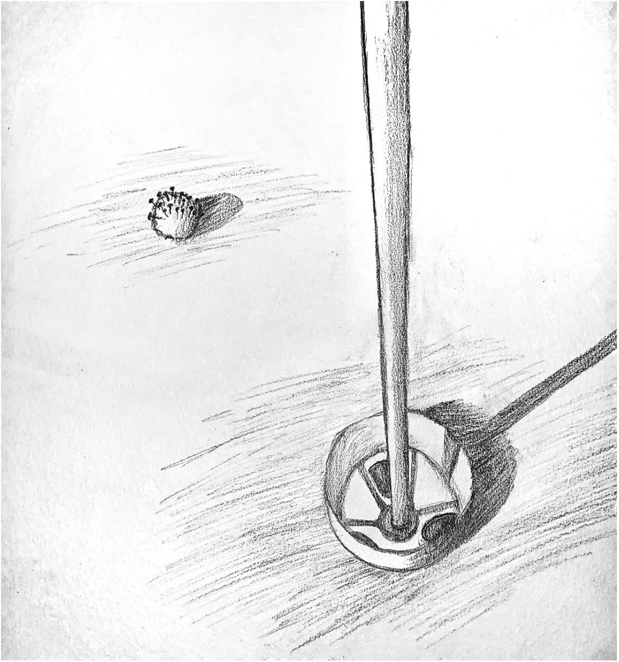
I’m also guessing the spaces above and below the image are borders. If so, they don’t work as borders if there are none to the left and right, but start to look like they might be part of the drawing. My guess is that they’re not (so I trimmed them off) but correct me if I’m wrong.
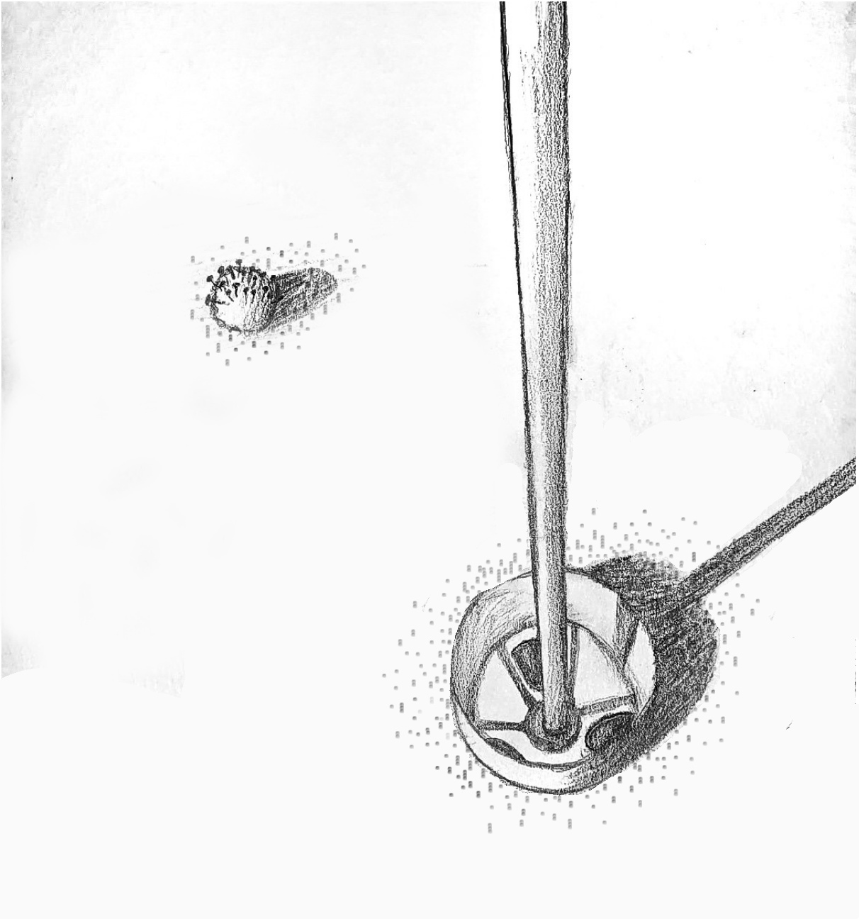
Next suggestion: replace that mindless, all-purpose shading around the ball and the cup with something that says more. I’m suggesting a stipple of dots and dashes that suggest the texture of a putting green. I only did enough to give you the idea, but there could be more (like in yours). You could also replace the hatched shadows (which are fine) with the same texture but darker and denser. The same way you can still see the grass in the shadow this would give a stronger sense of the light falling on the green.
But as an added dividend, the tiny dots look a bit like clouds of germs.
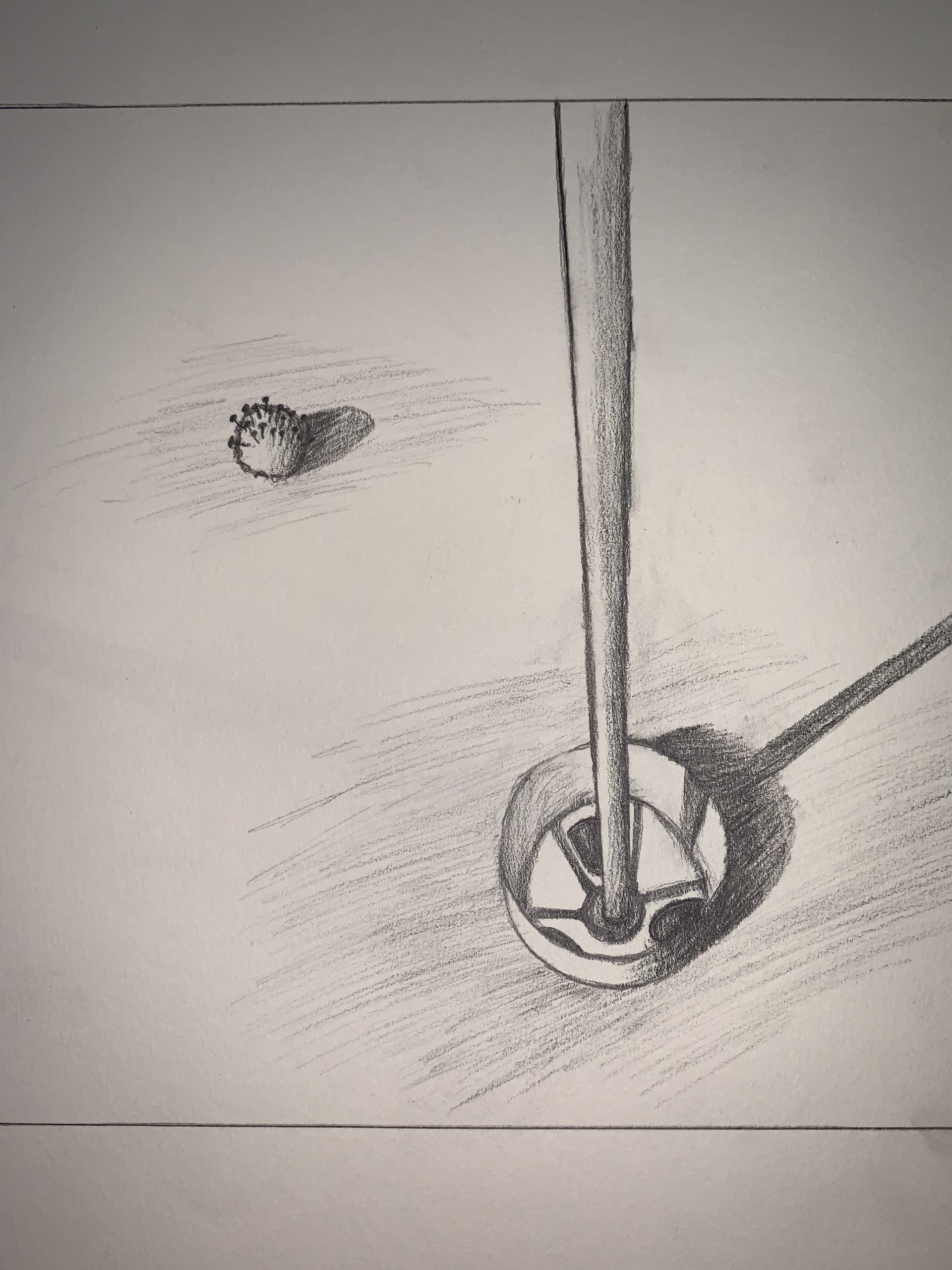
After discussing the idea with professor Wethli, I really wanted to depict something that I have been doing during this COVID-19 crisis. There are a couple of things that I should clarify as I understand that the drawing may be slightly confusing. The first is that the golf hole in the drawing is actually coming out of the ground as the Club has requested that we not reach directly into the holes during this time. The second is the detail on the ball which is an attempt to represent the corona virus chemical structure. I think I could’ve made this drawing clearer if I spent more time with it as well as improve the shading in the drawing. I do, however, enjoy the message and idea behind the drawing and feel as though it will allow me and others to remember this time in a positive way.
This drawing is beautifully done. The shading on the pole coming out of the golf hole is very well done. I think the very dark shadows made by the golf ball and pole make the drawing almost have a sense of foreboding that is aided by the shadow of the pole going off the page. I think that the sense of depth and that the hole is up above the ground is clear. I agree that the drawing would have benefited from fleshing out the COVID-19 symbol. By fleshing out I mean if you just put the nail looking things around the rest of the ball.
This is really interesting to look at, I think because of the simplicity and all of the negative space you outline. I think your stronger points are in your construction of shapes and the range of values that you include here. I also like how you used some perspective, it gives the drawing a coming-at-you feel. I think where your drawing can improve is the line weight. They seem a little bit fleeting and sort of unclear and unsure of where they should be. It may be improved if you just strengthened the lines that outline the shapes, especially rounding out the one constructing the golf hole.
Hi Ian,
My apologies for the delay in getting back to you about this drawing, which has a lot going for it—strong concept (singular and focused), a good point of view (love that dramatic perspective looking down), and good drawing as far as it goes (good job on the dimensions of the cup in perspective, and good shading on the objects); but with so little going on in the drawing, it’s a shame you folded your cards before driving it all the way home.
Just a bit more care with the coronavirus golf ball would make it more undeniable (not covering it entirely makes it look like someone drove little tacks into half of it). Why not all the way? Better to google what the virus looks like and take a little care to give us the image we all recognize.
Not that you should have thought of this, but the putting green offers the possibility of using a more effective means of shading than the all-purpose hatching in yours (see my note to Grace Bilodeau as well). That kind of shading could be anything—always best, especially in such a minimal drawing, to pull out all the stops to create a more believable and convincing mise-en-scene for your story. See my note with the drawings above.
You had a good idea but phoned this in a bit. I encourage you to push things further on our last two projects.