I agree with Isaac–the top of the egg carton is wonky. This wouldn’t be an issue except that it twists the space just behind the egg. In addition, the carton wants to be the “straight man” (as in a comedy act) and a foil to the star–the egg. In other words it needs to be normal. I’ve taken a pass at correcting it below:
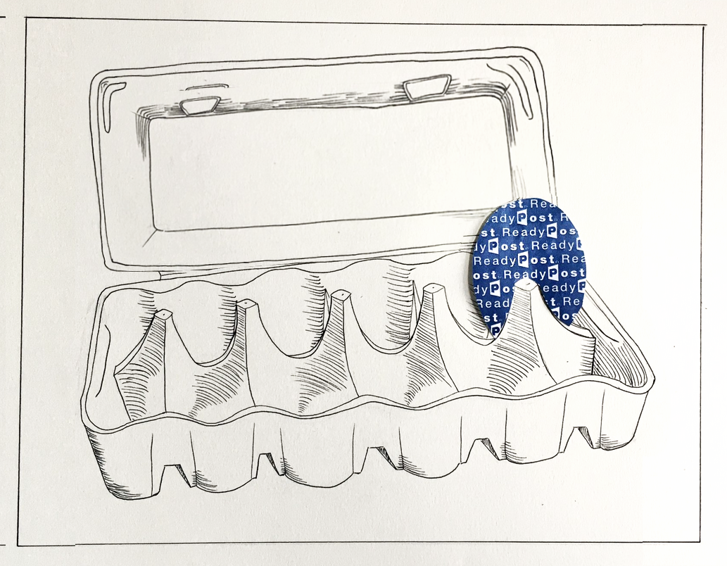
I also tweaked the embossed rectangle inside the lid, and let the egg eclipse it a little more; again, foregrounding the egg a bit. I suspect you drew this directly with your pen, rather than using a pencil under-drawing, so the distorted lid has a certain honesty–but in this case there are other virtues in the drawing to protect.
I also brought in the left and right side of the drawing. This image isn’t so much a still-life as something more iconic. The spaces to the left and right begged the question of what space it was in–bringing in the borders and neutralizing the implied environment (or the lack of one) makes that a moot point and again, foregrounds the carton and its sad egg.
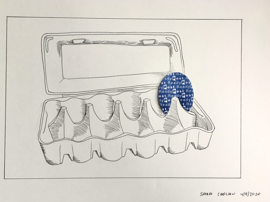
I chose an egg cartoon because of the way that I have come to think about food in the past few weeks. Additionally, the single egg is a good representation of the lonely reality of social distancing and isolation. Finally, I choose to use the inside of an envelope as the medium for the egg as the remaining forms of communication have become the primary means through which my sanity has been maintained.
As for the drawing itself, I think that my hatched was fairly poor, especially on the inside of the egg cartoon. Additionally, my lines could definitely have been straighter.
I think this is a really creative drawing and an interesting take on the assignment. I really like the style of hatching you used, it’s simple but it works well and has some charm to it. I also like how seamlessly the envelope piece fits in. My only critique is that the top part of the egg carton seems a little wonky. Not sure if this was a perspective thing or just a couple skewed lines, but it seems a little off. Other than that, I think this is a fun and creative composition and a valuable statement on the time we’re in.
This is such a unique approach to this assignment. I have also found myself eating a lot more eggs than useful during the quarantine since I find that they last longer and don’t require as many trips to the grocery store! I like the use of color in this. It really draws attention to a single point in the drawing, and the repeating interior of the egg “post ready” seems almost eerie when the egg is sitting there all by itself. I like the hatching that you have, and I think it adds necessary dimension to the complicated shape of the egg carton. I think you could have gone further and approached the hatching from multiple directions, just to make the object really pop forward and look less flat.
Hi Sara,
My apologies for the slow reply. This is a charming drawing that works quite well, but not for any of the reasons you mention. Most enigmatic is an egg made from the inside of a security envelope, and even your explanation doesn’t resolve this enigma—but it works. Perhaps like the ugly duckling it’s just so alien from its kith and kin that it’s no wonder it’s the last egg in the carton that apparently no one has any use for.
But thanks to your craftsmanship—beautiful collage technique—it’s also very proud.
I’m going to be the only one (including you) to disagree about the hatching—it’s perfect. Any more than this and you’d be obligated to carry it all the way. These minimal marks get the job done while keeping the carton a basic line drawing, and the perfect counterpoint to the collaged egg. That little hook in the hatching does a nice job of describing those little wells. Love the hatching in the lid as well—a very distinctive pattern of dashed lines.
Not sure this would tell me much about these times come 2050, but it’s a fine little drawing nevertheless.