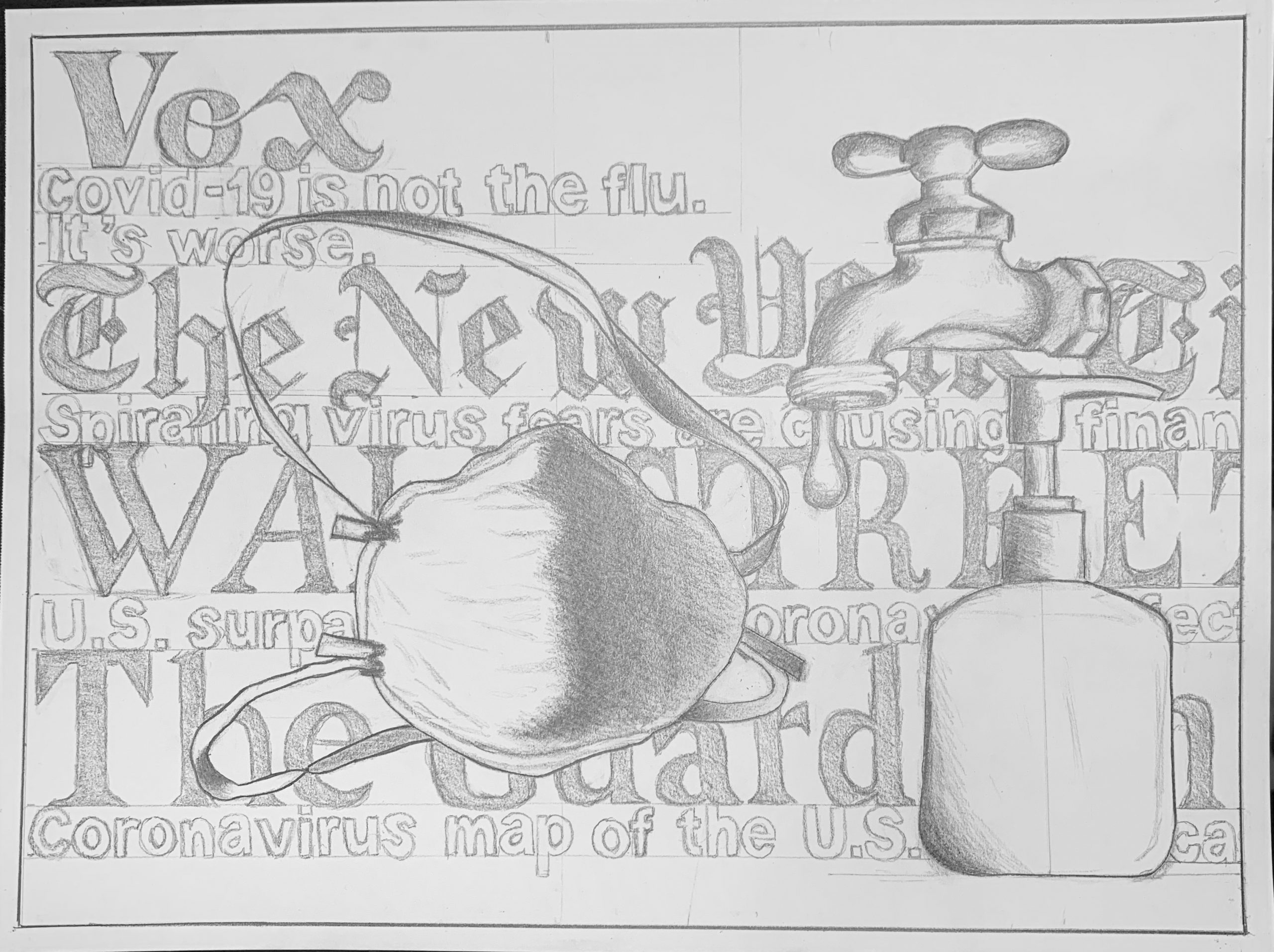
I really enjoyed doing this assignment because it was much more abstract than anything else we have done in the class so far. Personally, quarantine has been characterized by the near constant bombardment of news coverage of COVID-19. Whether it’s when you turn on the TV or check your Instagram the topic feels as though it’s inescapable. The face mask, soap/hand sanitizer and faucet (for washing hands) felt like symbols of this time, which is why I decided to profile them in my piece. I also wanted to articulate the feeling of being completely overwhelmed with constantly updating information, which is why the backdrop of my piece is filled with high profile publications and the titles of news pieces related to COVID-19, to represent the feeling of not being able to escape the topic of COVID-19.
I think this piece really captures the feeling of being overwhelmed during this time. I think the composition is well thought out and I really like the pop the shading brings to the objects. I might recommend adding some variation in line weight. I feel like the objects are fading a bit into the words. Perhaps that is the intention, but I think you could add some interest by darkening the edges of the objects to bring them to the forefront. This is just a stylistic choice, but I might have considered making the headlines in the background less clustered and more chaotic. I feel like the drawing could instill more of that confused feeling if it were more scattered. Overall, I think this was a creative approach and I really appreciate the detail on the objects.
Hi Ben, I really like this interpretation of the assignment. The inclusion of text, especially of the different news outlets, behind the “essentials” effectively conveys that sense of disorientation and confusion. I think you did a really great job with the shading, which lets the faucet, mask, and bottle jump out at me in front of the words. The dimension of the drawing is impressive. I do think the objects could stand out more, maybe from more of a contrast between the value of the words and the value of the shadows behind the objects. I also think that the image does get a little busy, maybe a few less words in the background or a more even distribution of objects could help with that. Overall, I really like the drawing!
My apologies for the slow reply. I’m very impressed with your lettering and design skills–that’s a lot of typography. I also like the way the news items seem to be moving across the “screen” like the “crawl” or news ticker on the bottom of the TV screen or one of those news jumbotrons.
Your drawing style is also wonderfully consistent–great job maintaining such an even keel, and very fine job with your pencil shading.
My only suggestion would be your use of the symbolic objects, whose logic is inconsistent and muddles the message rather than sharpens it, especially since they’re different sizes. Your parenthetical comment about the dripping faucet is also a tip off–even you know it’s not a succinct and immediate reminder of hand washing. And when it comes to sanitizing, why the sanitizer AND the hand washing?
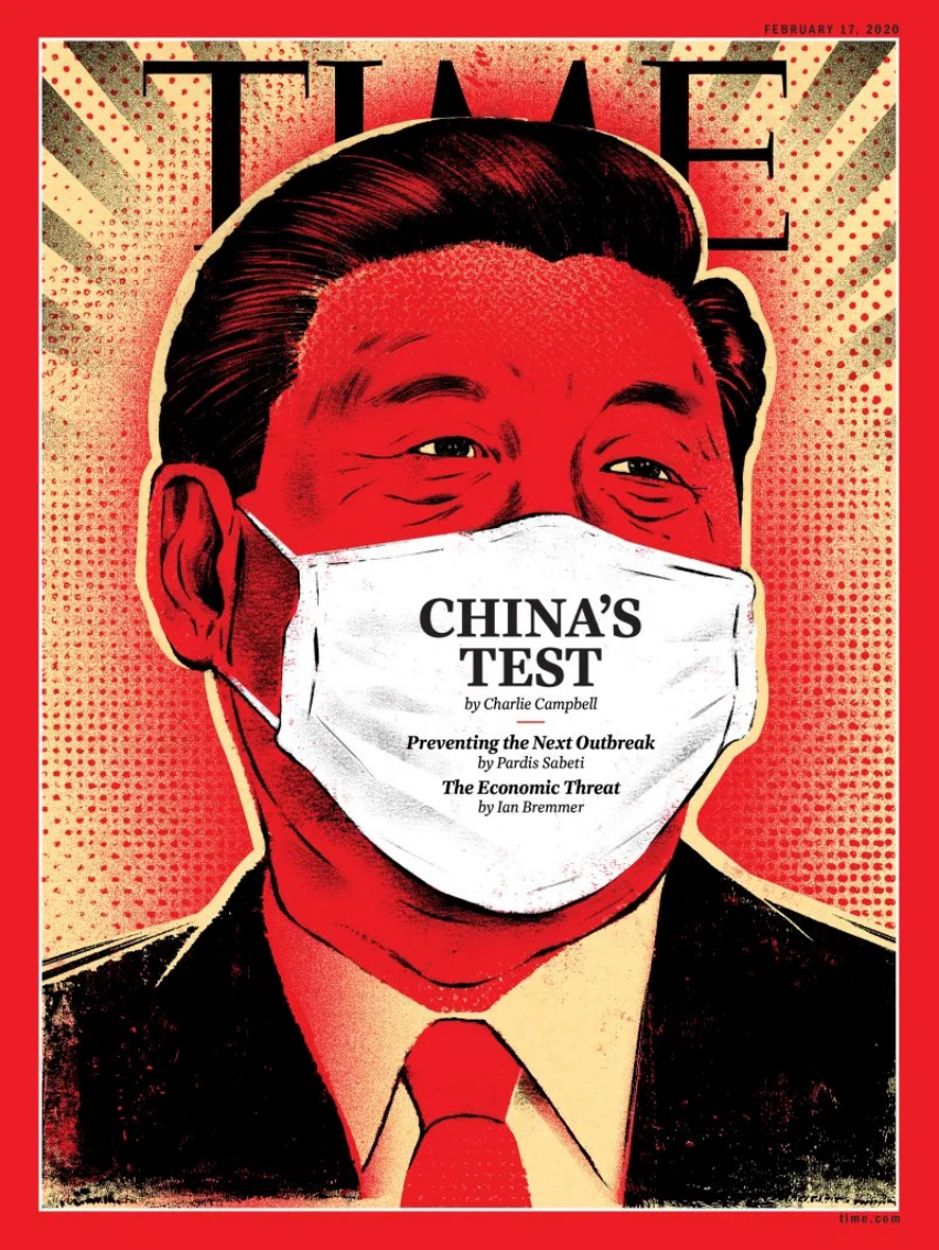
Since your parade of symbols can’t be exhaustive (gloves? PPE? Face shield? The virus itself?) it would be better to go with one iconic visual. I’d go with the mask, centered. Note the magazine cover I’ve added.
Love the way you used the straps on the mask to activate the surrounding space.
Speaking of which, posters and broadsides (of which this is one) are more often vertical. Vertical compositions, like magazines and posters–are more dynamic. Horizontal formats are more passive–unless you want to evoke a TV or movie screen.
This feels like the drawing of a budding graphic designer. Let me know if that’s a field you might be interested in.
I really enjoyed doing this assignment because it was much more abstract than anything else we have done in the class so far. Personally, quarantine has been characterized by the near constant bombardment of news coverage of COVID-19. Whether it’s when you turn on the TV or check your Instagram the topic feels as though it’s inescapable. The face mask, soap/hand sanitizer and faucet (for washing hands) felt like symbols of this time, which is why I decided to profile them in my piece. I also wanted to articulate the feeling of being completely overwhelmed with constantly updating information, which is why the backdrop of my piece is filled with high profile publications and the titles of news pieces related to COVID-19, to represent the feeling of not being able to escape the topic of COVID-19.
I think this piece really captures the feeling of being overwhelmed during this time. I think the composition is well thought out and I really like the pop the shading brings to the objects. I might recommend adding some variation in line weight. I feel like the objects are fading a bit into the words. Perhaps that is the intention, but I think you could add some interest by darkening the edges of the objects to bring them to the forefront. This is just a stylistic choice, but I might have considered making the headlines in the background less clustered and more chaotic. I feel like the drawing could instill more of that confused feeling if it were more scattered. Overall, I think this was a creative approach and I really appreciate the detail on the objects.
Hi Ben, I really like this interpretation of the assignment. The inclusion of text, especially of the different news outlets, behind the “essentials” effectively conveys that sense of disorientation and confusion. I think you did a really great job with the shading, which lets the faucet, mask, and bottle jump out at me in front of the words. The dimension of the drawing is impressive. I do think the objects could stand out more, maybe from more of a contrast between the value of the words and the value of the shadows behind the objects. I also think that the image does get a little busy, maybe a few less words in the background or a more even distribution of objects could help with that. Overall, I really like the drawing!
Hi Ben,
My apologies for the slow reply. I’m very impressed with your lettering and design skills–that’s a lot of typography. I also like the way the news items seem to be moving across the “screen” like the “crawl” or news ticker on the bottom of the TV screen or one of those news jumbotrons.
Your drawing style is also wonderfully consistent–great job maintaining such an even keel, and very fine job with your pencil shading.
My only suggestion would be your use of the symbolic objects, whose logic is inconsistent and muddles the message rather than sharpens it, especially since they’re different sizes. Your parenthetical comment about the dripping faucet is also a tip off–even you know it’s not a succinct and immediate reminder of hand washing. And when it comes to sanitizing, why the sanitizer AND the hand washing?
Since your parade of symbols can’t be exhaustive (gloves? PPE? Face shield? The virus itself?) it would be better to go with one iconic visual. I’d go with the mask, centered. Note the magazine cover I’ve added.
Love the way you used the straps on the mask to activate the surrounding space.
Speaking of which, posters and broadsides (of which this is one) are more often vertical. Vertical compositions, like magazines and posters–are more dynamic. Horizontal formats are more passive–unless you want to evoke a TV or movie screen.
This feels like the drawing of a budding graphic designer. Let me know if that’s a field you might be interested in.