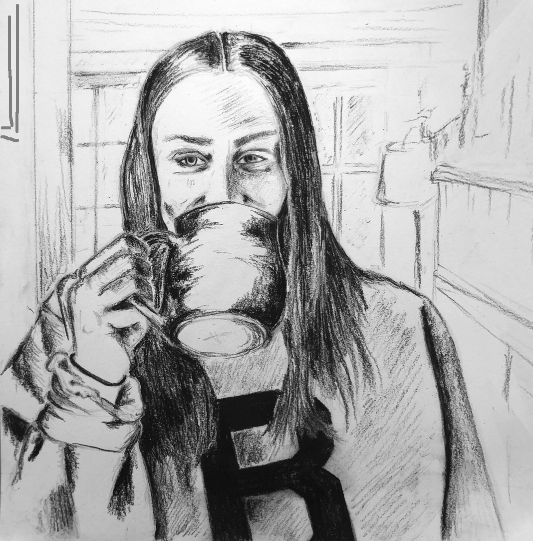
Given what you wrote, and what I see in the drawing, I suggest a composition more like this (see below). I don’t see anything happening in that top third (or slightly more), so I say lose it. There’s also a conventional wisdom in portraiture to place the eyes in the upper half of the composition–yours are on the 50-yard line, and the composition is teetering top to bottom.
Meanwhile I’ve adjusted the perspective on the mantle to gently direct our attention to your eyes, which are the focal point. I’ve also added a framed picture on the left wall to do the same.
I like the way she’s closed in by the space, and I’ve added the perspective elements to ramp up that feeling of feeling safe and cozy but unable to ignore the larger forces looming around us.
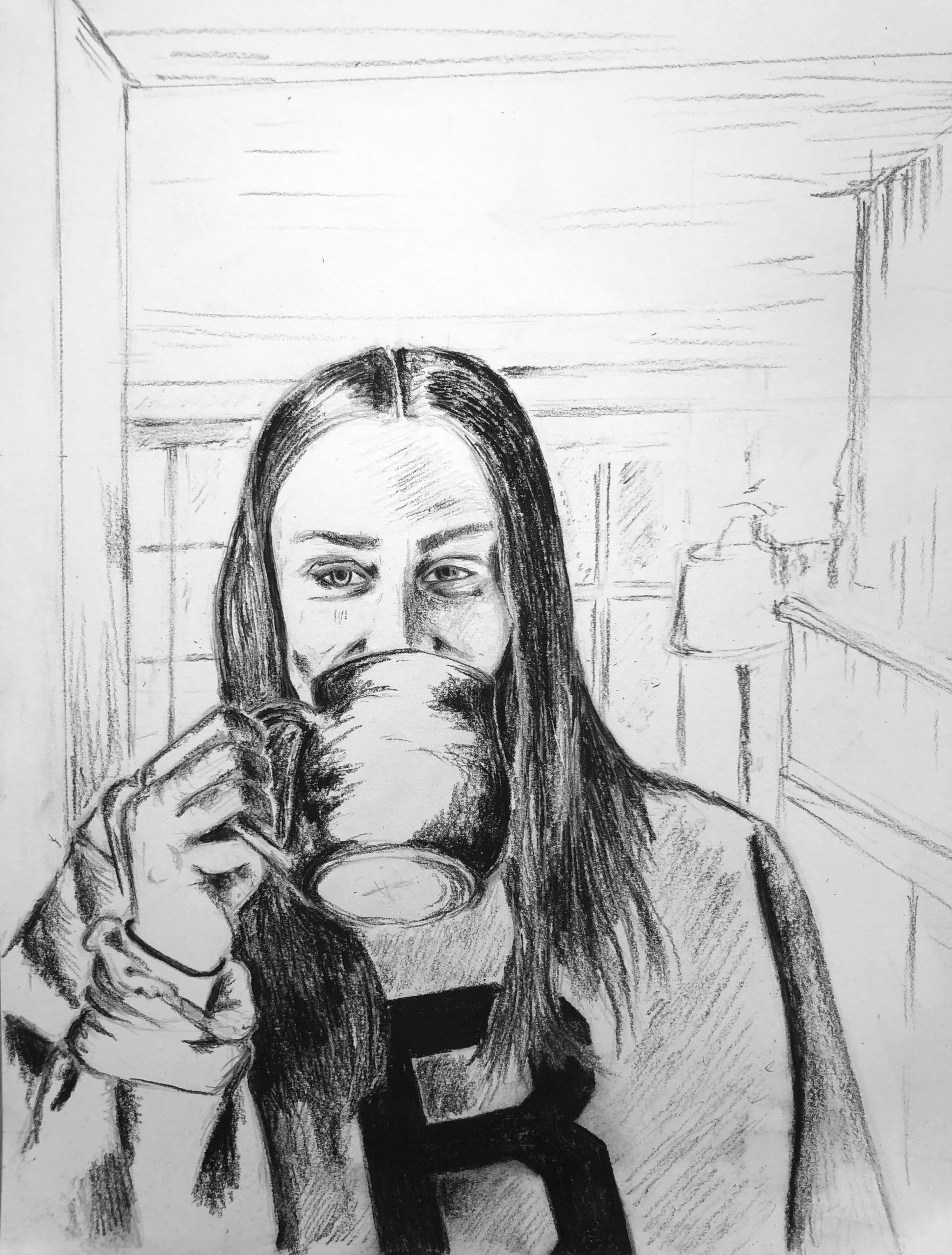
At first, I struggled to come up with an idea for this prom – the juxtaposition between my isolated, quiet life at home with the chaos of the outside world seemed overwhelming. Along with this factor, I was wondering how I could tie in the multitude of these issues – environmental improvements, economic recession, the importance of healthcare workers and the new meaning of essential workers into a single piece. Right now, I feel as if these are issues far out of my control, and my life right now is influenced by the circle of people closest to me at home. However, the suggestion of a self portrait clicked with me. I decided to draw myself, at home, in the kitchen (where I spend most of my time). It seemed like the best way to represent all of my conflicting emotions. I used pencil and charcoal pencil, and although I am happy with the result, I did struggle when deciding about the background. I wanted it to have a presence, but not take too much away from the foreground.
Hi Anika!
I love your choice of subject matter. I feel like when it seems that much is out of our control and many big issues are presenting themselves, sometimes turning to the personal and present can be even more relatable to others also sharing this difficult experience. I think your choice of charcoal was very effective in adding a range of tones, and you paid very good attention to a broad range of line weights. I also like how the right arm, hand, and cup handle are confined to the left third. The background does appear a bit underexposed, so I wonder if sharpening and darkening the lines as they move into the foreground would add presence. It also might be worth a moment to check that the background horizontals are fully horizontal, if that is indeed how they exist from this perspective.
Hi Anika,
This is a really good self portrait. For me drawing yourself drinking from a mug would have been risky, but. you really pulled it off in my opinion. I really like how the background is less developed, it reminds me of examples of I think Edgar Degas (?) that we saw in class where he would draw people with really detailed heads, but simple counter bodies. I agree with Devon that the horizontals in the background could be slightly improved. I don’t know much about light sources but, I think you did a good job with that, it clearly seems too be facing you.
Great drawing, Anika. See my notes above about composition.
Portraits are implicitly a way of revealing a sitter’s personality, emotions, etc., and I love your decision to mask your expression–a wonderful refusal of conventions in a time of disruption. But if I read the expression in your eyes and even your cheek muscles, isn’t that a smile back there? And a mischievous one at that.
As a Time Capsule, the Bowdoin B is a nice touch.