See my comments about each of the following–
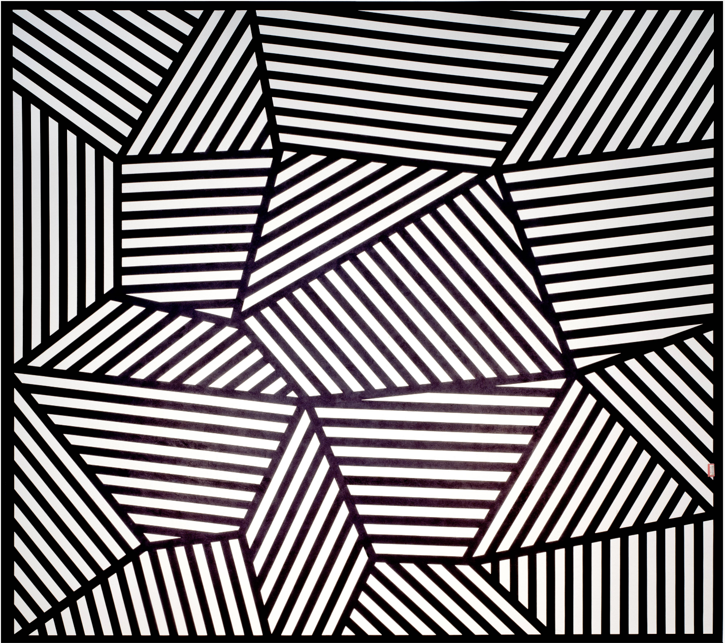
Sol Lewitt, Wall Drawing 565
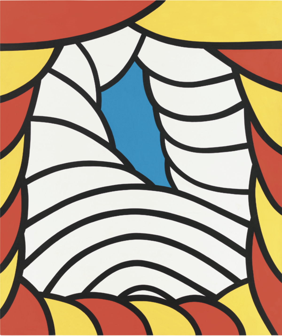
Nicholas Krushenick
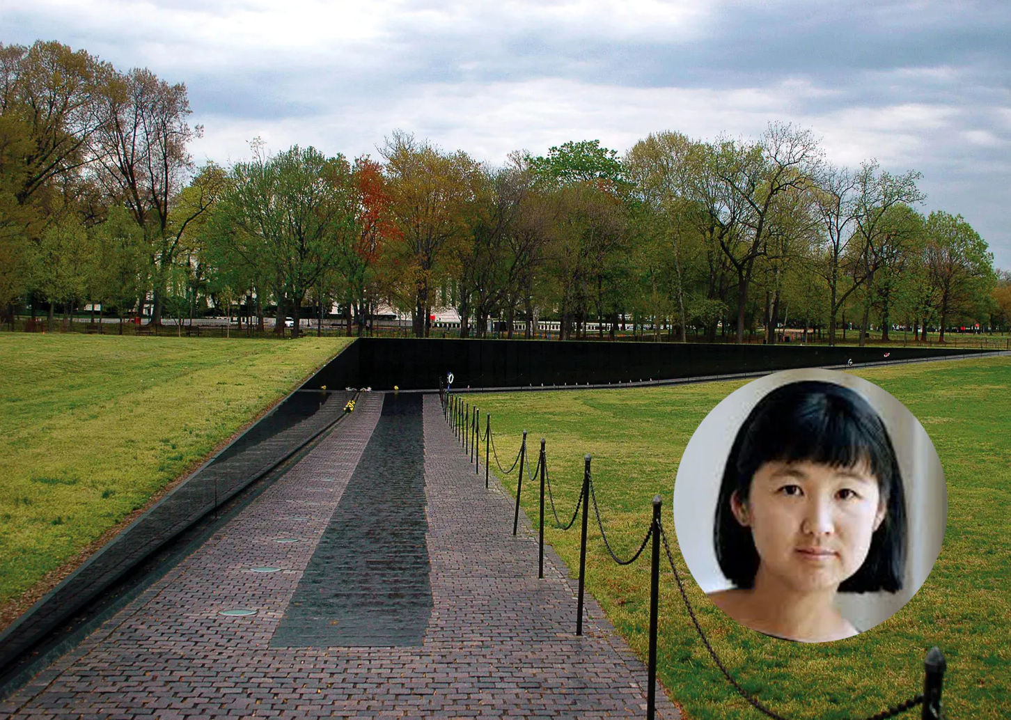
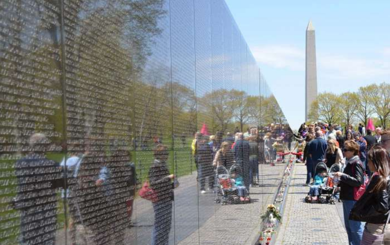
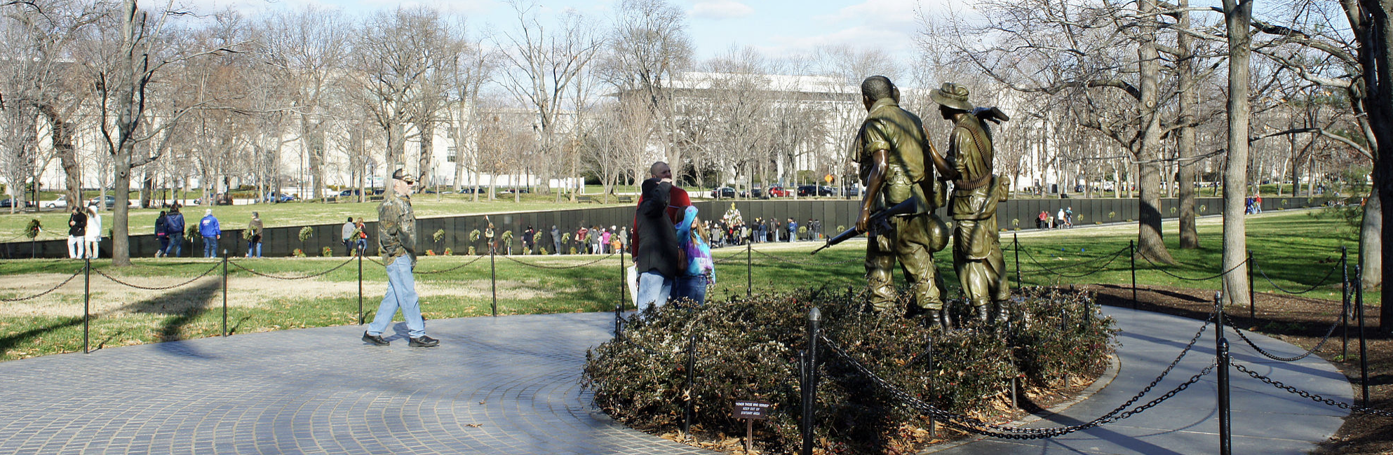
Maya Lin, Vietnam Veterans Memorial
 Bathmophobia
Professor Mark Wethli – Spring 2020
See my comments about each of the following–
Sol Lewitt, Wall Drawing 565
Nicholas Krushenick
Maya Lin, Vietnam Veterans Memorial
Bathmophobia
You must be logged in to post a comment.
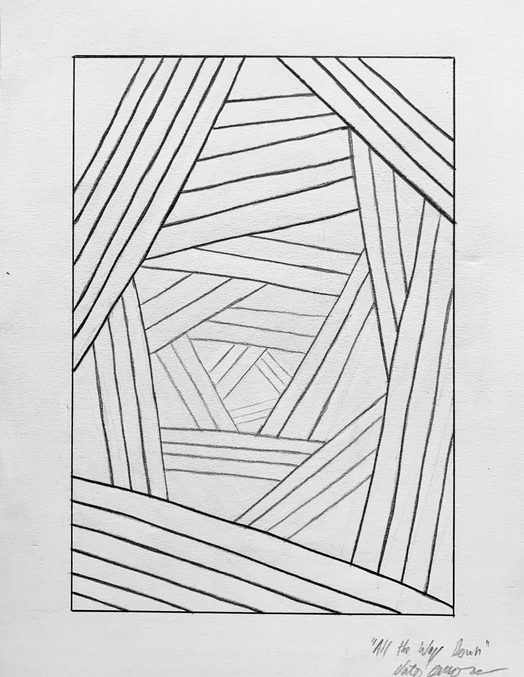
I’ve been feeling kind of stuck lately with classes and with life, so rather than document a specific object, I wanted to instead draw something that communicated this feeling that I’m experiencing. I did a couple different sketches, but I think this pattern creates the sensation of a spiral that’s ever so slightly off-kilter. When I look at this drawing, I get mesmerizing by the forms. My eyes try to follow the pattern inward, but then they get sidetracked by a triangle or rectangle. I get kind of mesmerized when I’m able to take in the entire piece, and that’s a feeling I find calming amid distress. I think the lines could be straighter, as could the gradient of line weight, but I’m satisfied with the composition. I like that the focal point is just a little bit off center. It contributes to uneasy comfort I find in the drawing. This doesn’t represent anything from the present other than a feeling, but I think this drawing documents my current standing as an artist, which is that I really like abstract work.
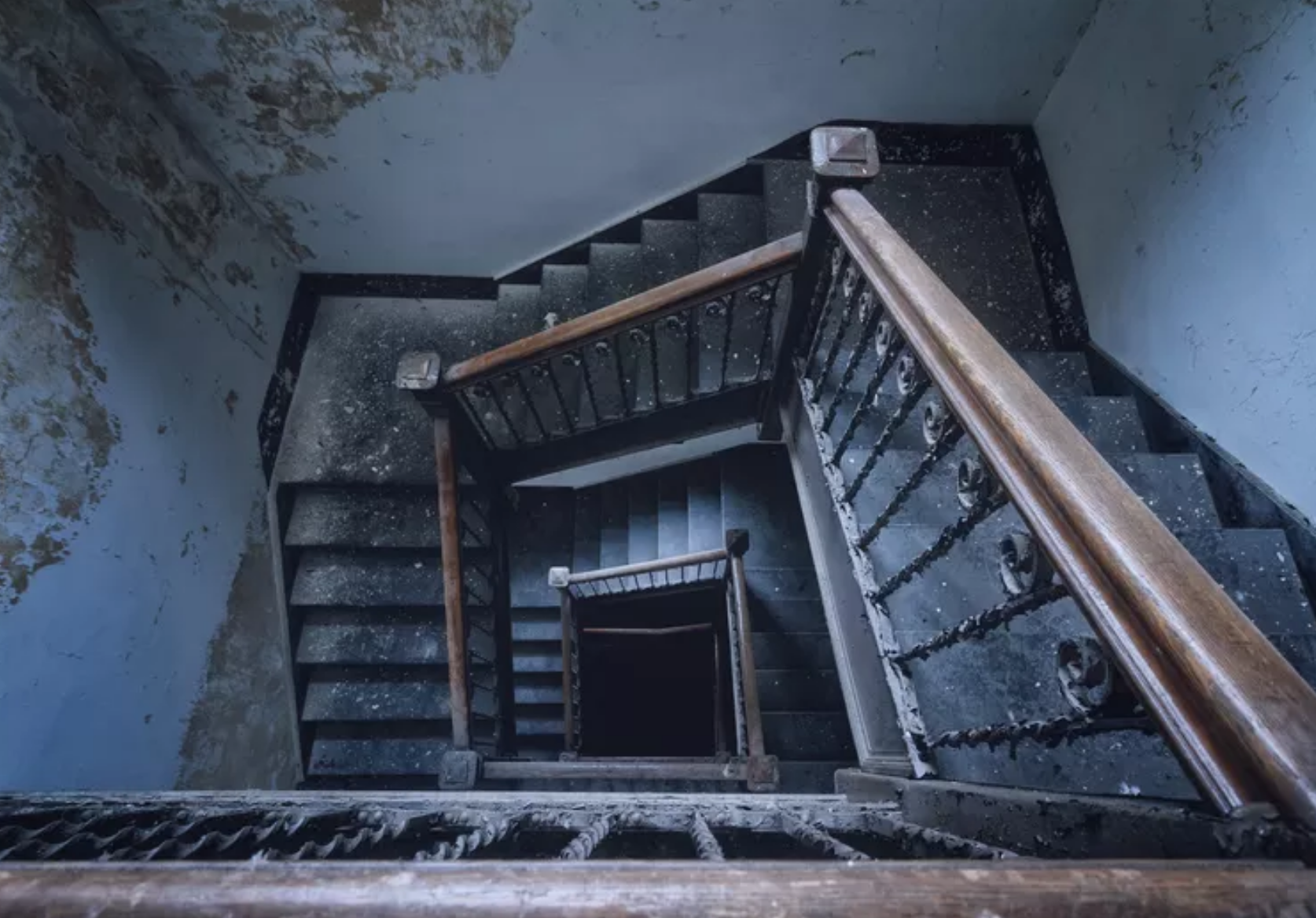
One thing that I immediately found really cool about this was how I felt like I was standing on the ledge of a deep descent into an unknown. The descent feels like the only option and like their is nowhere else to go. I know it’s unintentional but the inconsistent gradient of line weight just pulls my attention more towards the hole in the center of the page. Also, the fact all the lines aren’t straight makes this whole structure feel unstable. Their is a cool sense of urgency. I probably ran too far with this on the edge and need to make a decision or fall type thing but that’s kind of close to your stuck feeling. Also loved how the triangle shape of the lines seemed to spin which you did intend. It felt like swirling a drain.
I agree with Brian, I can feel myself in this drawing and looking down into it. I really like the uniqueness and ambiguity of it. The geometricity is also really cool, and I agree with you that it would be an even stronger drawing if some of the lines were straighter. Since the drawing is centered around straight lines, it’s important that they are actually straight. I think the strongest thing about your drawing is how well you varied line weight from front to back in order to create depth. It really gives a feeling of 3D and length that is really impressive.
My apologies for the slow reply, but this is a terrific drawing, Nate, and so glad to see that you chose to address this project abstractly. Great comments from Bryant and Olivia as well.
In the ongoing debate between abstraction and representation, I’m reminded (of all things) of the Vietnam Veterans Memorial in Washington, DC. When the winning design, by Maya Lin, was unveiled, there was a predictable uproar about the war was being memorialized by a black scar in the ground (see photos above).
A veterans group raised funds for a more traditional, figurative sculpture, which was placed nearby. It’s fine, but after a long history of similar sculptures there’s something common place about it. In no time at all the veterans and their families began flocking to the Lin piece, whose shiny granite walls, etched with the names of our war dead, also reflected their faces.
A long way around of saying that sometimes abstraction can be more timeless and inclusive than representation, and good for you for taking this route. I think yours is a good example.
Your comments and the others about the design are spot on—great decisions. In terms of the line weight it’s fine the way it is (very good, in fact) but could also be done much more graphically, like the Sol Lewitt mural or the Nicholas Krushenick painting it brought to mind (above).
It also recalls numerous scenes in movies looking down stairwells, often in chase scenes. In looking up an image, I just came across a name for the discomfort some of us feel with this kind of view-bathmophobia (a fear of slopes or stairs).
But I’m with you—this does a great job of suggesting disequilibrium while also being somehow pleasing and comforting to look at. I’m sure the Germans have a name for that one.
Very fine work–