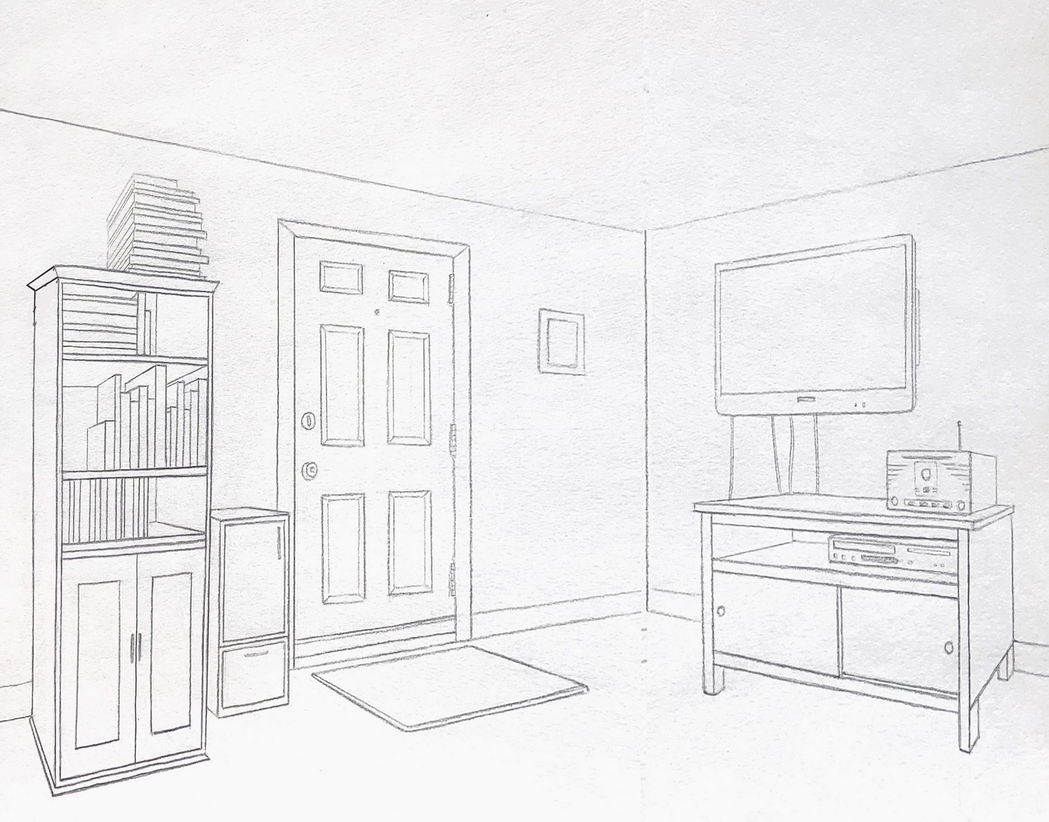
Pretty sure what happened here is that you set your theoretical vanishing points arbitrary to the left and right, and quite close, when in fact they were much farther out. Setting the angles of the ceiling and floor lines (and all other receding lines) by sighting* would have likely produced shallower angles. If I’m correct about that, this is one of the pitfalls of drawing from theory rather than observation.
Using Photoshop, I made the angles of these orthogonals much shallower (my best guess about how it might have looked), which brings the scene in closer. Note also my adjustment to the top of the bookcase on its receding side (on the left), making that angle less severe as well.
*
I also cropped the left and right sides just slightly to bring us in closer. I think your cropping on the one below is too severe, and throws too much attention on that one wall only.
See my comments about these two paintings:
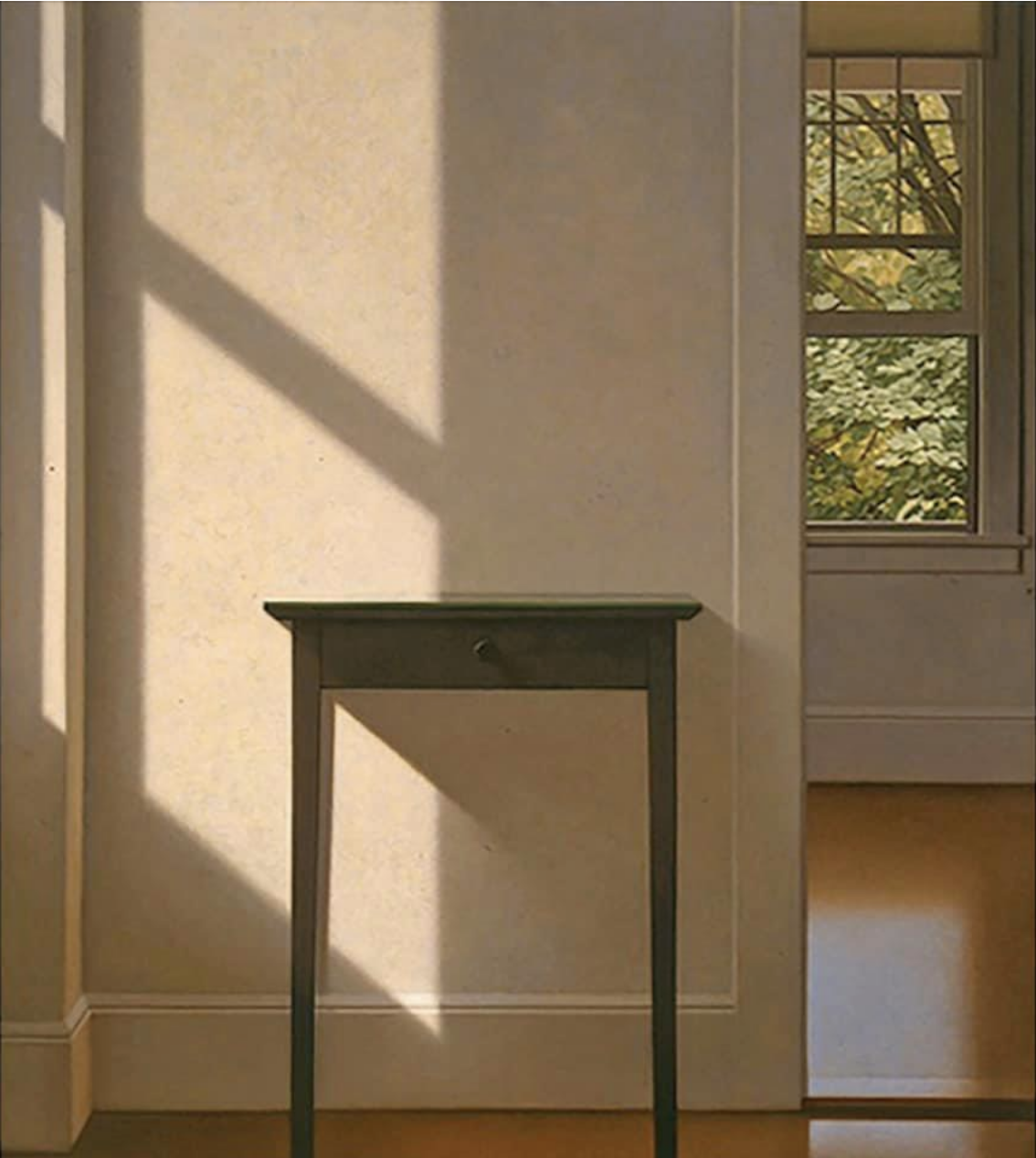 MW, Simple Gifts, 1995, oil on canvas, 54 x 48 inches
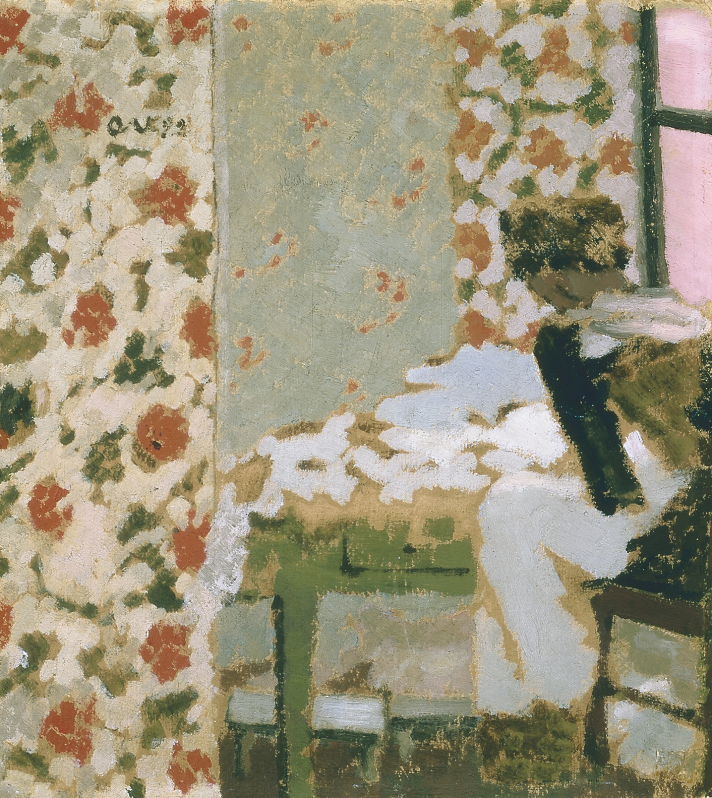 Edouard Vuillard, The Seamstress
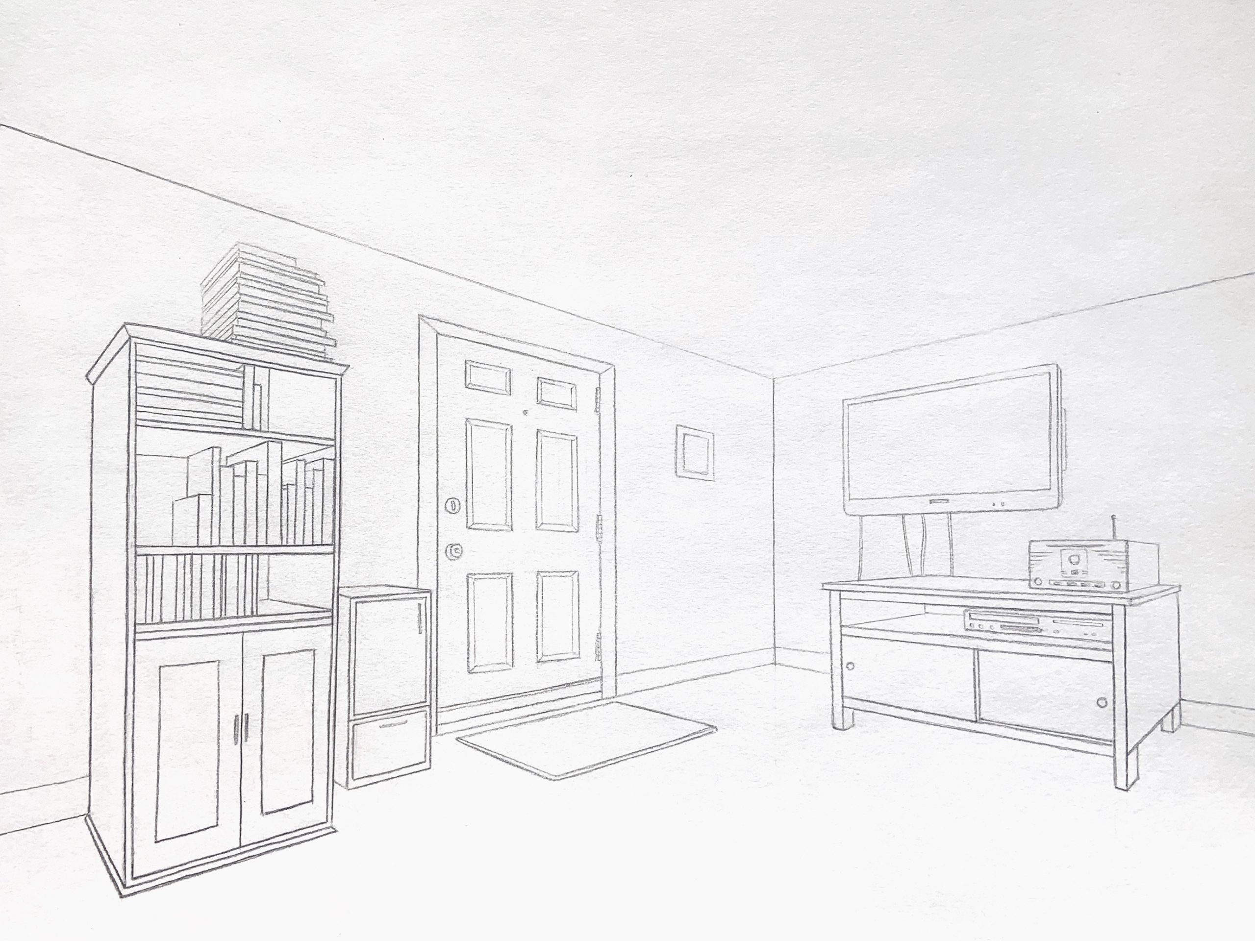
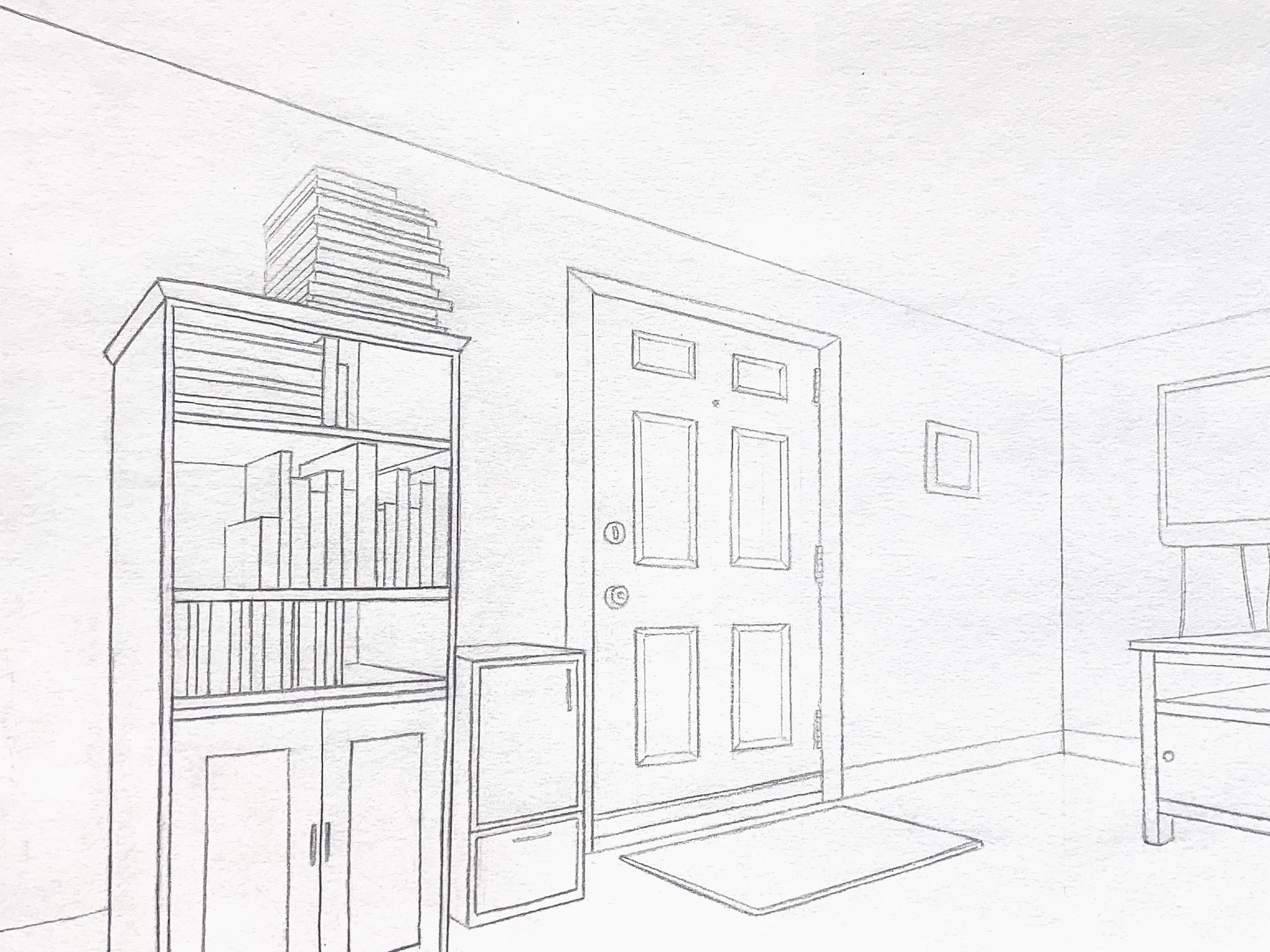
In this depiction of my living room, I wanted to return to perspective drawing with a focus on the hard lines and corners of a space. As I pass more time here, the room becomes increasingly geometric, hardened, and I am increasingly aware of the spaces and lack of space between unnatural objects. From the perspective I chose, I am viewing the room almost from outside of it and it appears more expansive than the reality. I drew from life, but I would like to look at the scene through a photo to consider light and observe any distortions in my perception of the room. I would have liked to create a closer, more claustrophobic composition while maintaining the relative locations of the vanishing points with a larger piece of paper. I wonder if anyone has suggestions regarding an effective crop.
This drawing is immaculately done. The lines are incredibly clear and even. I really love way you used perspective and the dimensions of the piece to illustrate an almost false sense of expansiveness.
To answer you question about how to make things feel more claustrophobic, I think texture would really help. Right now because things are so clean and bare, it feels like there is a lot of space. However, if you filled in those spaces with the texture of the wall, ceiling, door, doormat and even little details of life in the books, the drawing would begin to feel more full. A side product of that would also be getting a chance to see more of your personal touch.
I second all of what Sara said. The perspective is excellent. The line quality is pristine, and everything is so straight! I love the line weight, especially. You’ve done a really great job drawing what you see. The drawing feels complete, and it looks really good.
I do see what you’re saying about the composition, though, but it seems like you want something that is at odds with your drawing. Did you feel claustrophobic when you were drawing? Because as a viewer, I feel very comfortable. Everything is so neat and organized. It’s tough because the floor and ceiling are mostly negative space so even though the room may be small, the drawing feels very open. If you want a more claustrophobic drawing, then I think you have to find a way to activate more of the negative space. Texture could help, but I would suggest changing your perspective. Don’t crop, draw this again if you want, but try putting objects closer to the frame or even using the frame to cut through objects, which you kind of do in version 2. Again, I like the drawing as it is, but if you want to change the composition, then I think you have to take a bigger risk when you draw. This feels like a very comfortable drawing. That’s the effect I get, and if you don’t like that, then I think you have to do something that’s outside of your comfort zone. You clearly have the technical skills down, just have fun with the composition. Try out a couple different things. Change your process. When you draw, do you go from the center and work your way out or go from the edge and work your way in? Just as an exercise, I wonder what would happen if you did the opposite for your next drawing. This looks really good, and I’m excited to see what you do for the next assignment.
Great job on this, Devon, especially when it comes to a textbook perspective and amazing line quality and control.
There are two reasons the room doesn’t look smaller and more intimate (or claustrophobic)–one is your approach to the perspective drawing (see my notes above) and the lack of “lived in” appearances. Even when rooms are tidy there’s usually more evidence of habitation. This could almost be a display area at Ikea it’s so tidy and orderly–not meaning to cast aspersions on “tidy and orderly”–just making a rhetorical point.
But the lack of a window indeed adds a sense of claustrophobia.
Sara’s and Nate’s comments are very good, but I’m not sure simply adding textures and patterns is enough. You mention how the room has “hardened” the longer you’ve been there, and if that’s how you feel, that indeed comes across. I sense you find this room alienating (in both your writing and the drawing itself)–if so, this drawing expresses that very well.
For many years I also painted rooms that were very geometric (in and of themselves but also the lines and shapes of the painting)–see above- but I hoped they would be calming and meditative (with the help of light to alleviate the geometric order). Only to suggest that so much is revealed in the manner in which images are made, which can tip the scales of meaning either way.
Nate’s on the right track when he suggests trying a different point of view. You’re basically looking into the corner at a neutral, fairly static 45 degree angle. Stepping to the left or the right would have created more asymmetry and a livelier viewpoint. In my work I always took pains to avoid orthogonals altogether because they tend to make the eye race forward and back. I made my interiors parallel to the picture plane to achieve that sense of calm I was after.
I’ve also added an interior by a French painter named Edouard Vuillard (a personal favorite of many artists), and what Nate and Sara suggest about richer patterns–assuming such patterns are present in the room–might be borne out. Note that Vuillard keeps the diagonals to a minimum as well.
Perhaps taking on this scene in a way that foregrounds theoretical perspective is at odds with the feeling of claustrophobia that you were after (other than being windowless), since perspective tends to push everything away.
A very good drawing nevertheless.