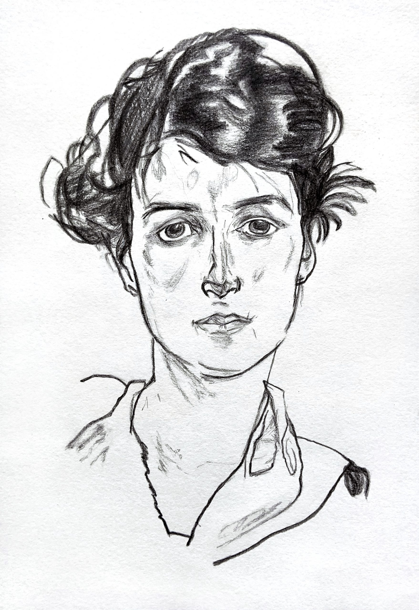
9 x 6.25 in on drawing paper
(MW): What can I say? This is an extraordinary rendition of the Schiele.
The only thing that might be noted, and is neither here nor there, is that the eyelid on our left slopes down a bit more (his is more arched), making her look a bit more tired or sad, and also eclipses the iris a bit lower, making her look less alert than the original. But that’s not a criticism or a suggestion–simply an observation.
Great use of the side of the graphite (in a wooden pencil) to achieve these effects.
Exceptional work–
__________
I admire Schiele’s work and this portrait interested me because of its focus on contours and lines that don’t feel quite smooth and rhythmic, but rather expressive in their weight variance and jagged edges. I had a lot of fun with the face. The eyes have an expressiveness in their semi-geometric imperfect shapes and shadowing – I feel my results were mixed and definitely could have improved upon the shadowing and openness. I used a wooden pencil and feel that it was definitely the better tool for this style. The hair was very difficult, with many interlocking forms that seem to blend into one another but simultaneously stand out. I used the flat side of the graphite for wider strokes, but some forms feel glaring while I also struggled to reach a depth of darkness. I am unsure if I rendered small bits of shadow (?) on the face correctly and would love thoughts on what to try.
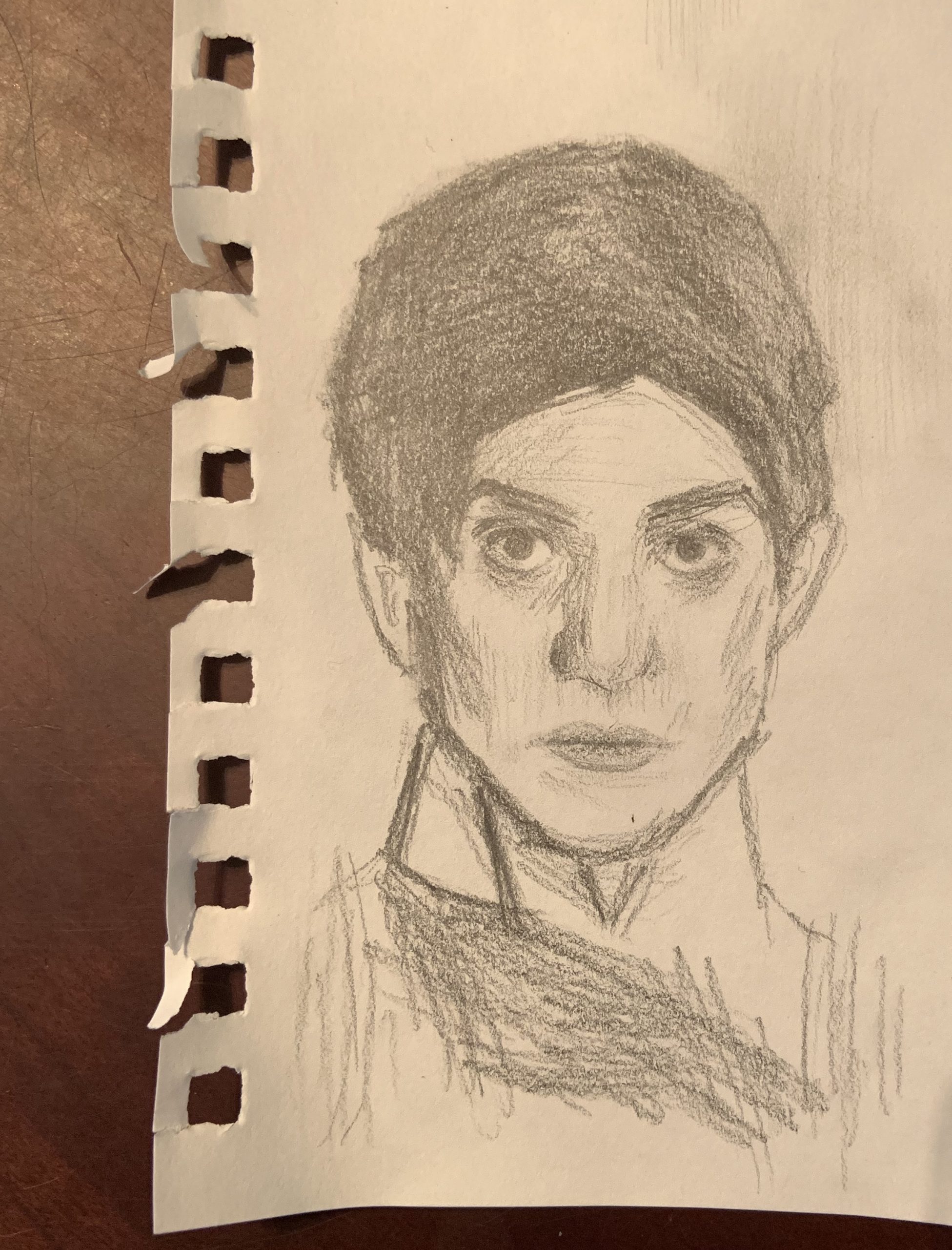
<3 inches wide on drawing paper with the Sharpwriter pencil.
Devon, this looks great to me. I compared your version with the original and I’m honestly having a hard time finding many differences/inconsistencies. I think the left eye is a bit drooped/off in some way, but you did an amazing job in mimicking the line quality and expression. Your proportions look really on point and carefully observed. You seemed to do a great job on the hair, it’s smudged in the right places and more detailed in others. I don’t see what you did poorly, I think maybe because I have an untrained eye. I wish I could give more constructive feedback, but great job.
This is a very impressive piece of artwork. The shadows and lines on the face and hair are very precise and make for a very realistic portrait. Every aspect of the portrait looks as if it had special attention paid to it and your hard work and dedication really shows through. The eyes are very well done, especially her left eye (our right) and the mouth looks very realistic as well. The nose appears as if it may be a bit too long, but I find noses to be particularly challenging to draw, and they never turn out exactly how I want them to. Very impressive work nonetheless, I think you’re in great shape for next week’s assignment!