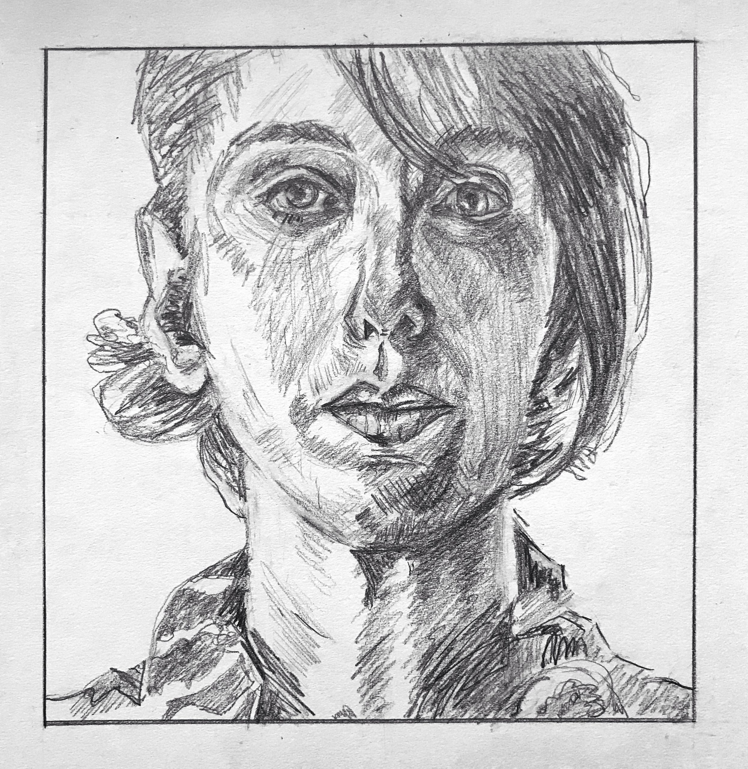
Very fine work, Lily, in every respect. Just a few small notes:
You’ve given her more eye liner than the original but at no expense to planes or anatomy–just as an aside.
Follow O’Neil’s lead when it comes to open contours–there’s one on her left ear lobe (our left) and one along the left side of her neck. The left side of her nose and the center of her upper lip are two more. These not only connect her to the ground (or one plane to another) put add a sense of light bathing the form.
On both cheeks, note how the direction and pattern of the hatching, which is just a bit higher resolution (finer strokes) than yours, expresses the volume of these forms. It’s not just a value (shadow) but changing planes within the value. Yours are flatter as a result.
Great job on the hair but carrying the strokes off the top edge–yours start just a tad below, losing the sense that the head continues outside the frame, as in hers.
Excellent work.
I thoroughly enjoyed this project, though it seemed intimidating at first. Above is my copy of Mariah O’Neill’s work & below are my attempts from the Proko videos. I didn’t spend much time on them, though they were super helpful in mind once I started in on the other part of the assignment and I think I got the general ideas of structure out of them. I admire O’Neill’s style, I’m not sure why but I gravitated towards her work. Over all I’m pleased with the final portrait and I loved the process of drawing it. I took it in segments, drawing for a few minutes or an hour and then coming back to it to continue. I found this technique worked well for me instead of attempting it all in one go. The eyes were definitely trickiest for me, I guess because they’re so small but require so much detail. The forms in O’Neill’s version are more convincingly round/3-D/live, and I think I could do better with highlighting/shading in a way that makes the face more rounded. The right side of her face could also be shaded more heavily, as right now the left and right sides seem somewhat equal in shadow weight. The ear also confused me, I couldn’t quite figure out the angle. I learned a lot from this project and I’m excited to keep trying portraits.
Hi Lily,
Really great work on this portrait! You did a really great job with sighting and mimicking the shapes on the page and I feel that you created a fantastic likeness of the original. I think that your drawing did in fact do a good job of attaining a sort of roundness/3-dimensionality to the face and feels quite realistic. I feel that your comment about making the face darker is correct and could help to add more of this sense of structure and roundness you’re looking for. I think the whole drawing could use a touch more darkness, with some areas having particularly concentrated darkness (above ear on left, surrounding the eye in shadow, under the chin on the right half of the paper) and perhaps more hatching in thin strokes placed closer to each other (like on the cheek in the light) ti reach this goal. Beautiful portrait!
This is a very impressive portrait as well! Your hatching pencil strokes appear to be very neat and concise, overall creating a very realistic and clean piece of work. Nice job! Your facial features appear to be spot on, especially her right eye and her mouth. Looks like your practice work definitely paid off. Your left eye maybe could be positioned a bit higher up, but that is a minor detail. My only other suggestions are the shading under the left side of her mouth where it looks like a too drastic transformation from light to dark and the hair to the viewers right looks a bit too clumped and almost circular, but I don’t remember the original portrait exactly. This is a well done piece of work and I’m excited to see what you come up with next week!