Great job, Sara. My only suggestion is to learn from his example about line weight. There are far fewer lines in the hair and more openings between them. The background lines also need to be fainter to allow them to fade back. You did much better with the pinstripes on the shirt, but otherwise this drawing suggests you need to develop more range in your line weight.
Great job channeling his slightly louche and insouciant drawing style; a perfect fit with this pose, disheveled look, loosened tie, etc.
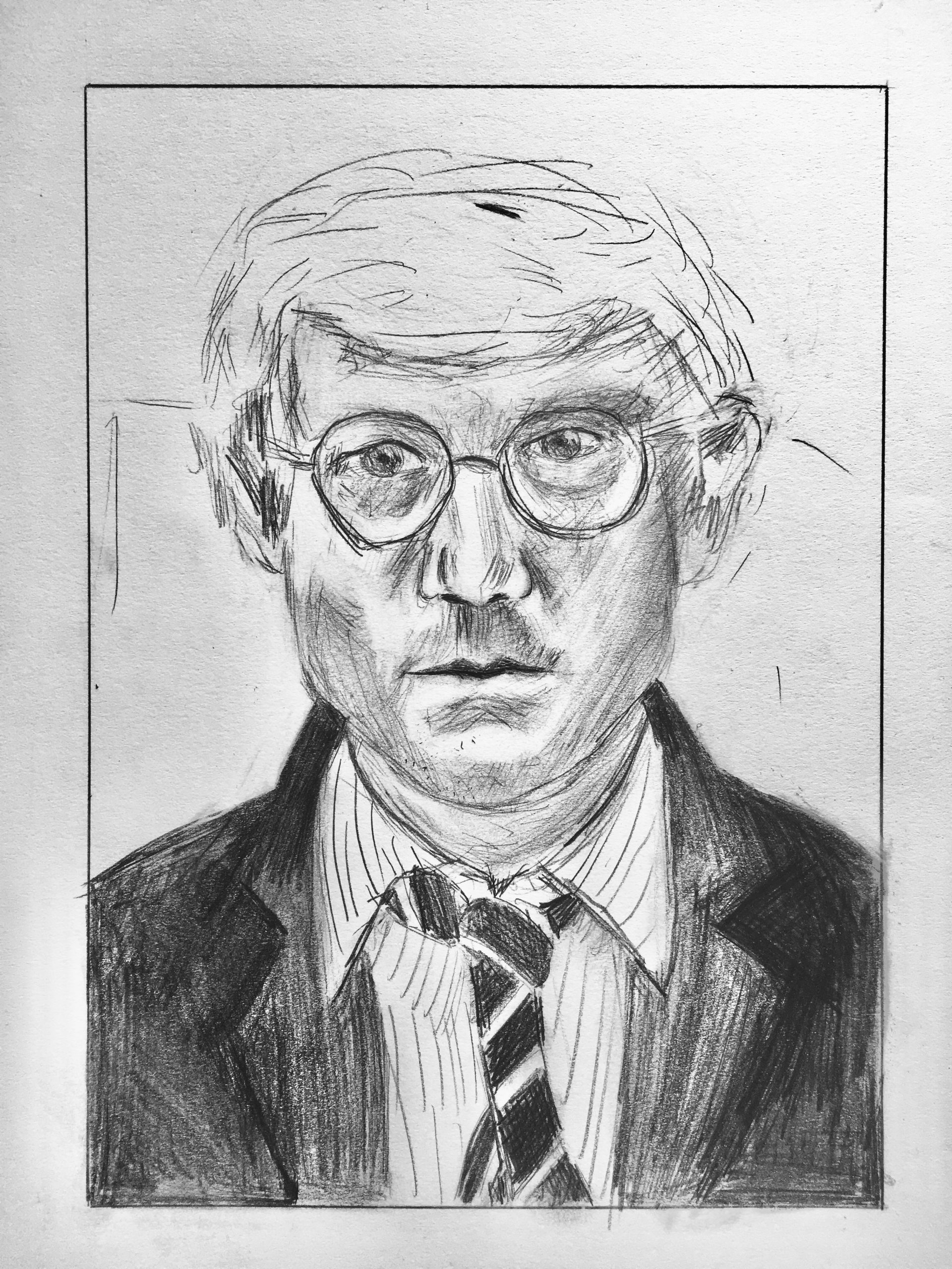
I chose to do this portrait primarily because I love David Hockey. That may be a silly reason for choosing to draw a portrait of him, as this looks nothing like the majority of his work, but the simple answer is that it made me happy to look at him for a while. 🙂
I like the portrait itself because of its hatching style and the looseness of his lines, especially as you go further up the page. I think my portrait largely captures the feelings and lines of the original, however his lines are softer than mine.
In terms of the image itself, his right lapel should be a bit darker and something is a little weird about his right eye. His glasses could also be a bit cleaner.
Over all I think I did an okay job, I think I just loose his touch at certain points.
I really like your portrait. Also, that seems like a pretty good reason to choose this portrait if you ask me. I think you did a particularly good job with the shape of the eyes, replicating Hockey’s line of sight, and the lips and chin area.
I agree that you did a very good job capturing the carefree feeling of Hockey’s line, specifically around the hair, ears, and eyebrows. I also think that you are correct that Hockey’s values have a sense of gentleness. That could be a result of smudging and then shading over that smudge, so it keeps texture. I think for the right eye you could add more value to the eye itself, the bag, and on the eyelid. Also, I think that the eyeglasses and eye would feel like they were more supported in the space if you brought the values of the cheek outside the glasses further in towards the frame. All that being said, if you don’t change anything, I still think this is a very good replication of Hockey’s portrait.